Pakete, Repositories und App-Kategorien suchen

Cover von cool_dropdown
Paketdetailsv2.1.1

cool_dropdown

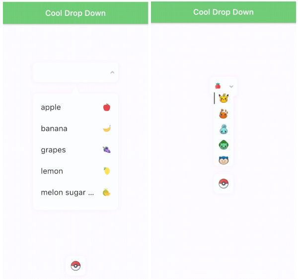
Anpassbare coole Dropdown-Oberfläche. Sie können den ausgewählten Eintrag, das BoxDecoration der Dropdown-Box und die Dropdown-Eingabe anpassen.

AndroidiOSWebmacOSWindowsLinux
30-Tage-Downloads
1540
Likes
209
Pub-Punkte
150

Paket installieren

flutter pub add cool_dropdown

Paketübersicht

Aus öffentlichen Paketdaten erstellte Orientierung.

Eine anpassbare Dropdown-UI-Komponente für Flutter, die Entwicklern ermöglicht, das Erscheinungsbild des ausgewählten Elements, die BoxDecoration der Dropdown-Box und das Eingabefeld anzupassen. Sie unterstützt mehrere Plattformen wie Android, iOS, Web, macOS, Windows und Linux. Das Paket verbessert die Benutzererfahrung durch flüssige Animationen und flexible Gestaltungsmöglichkeiten und ist daher ideal für Formulare und Auswahlinterfaces. Mit Fokus auf Einfachheit und Anpassbarkeit wurde sie nahtlos in bestehende Flutter-Projekte integriert.

Anwendungsfälle

  • Formulareingaben mit benutzerdefinierten Dropdowns
  • Benutzerpräferenz-Auswahl
  • Dynamische Optionenauswahl
  • Verbesserungen der mobilen und Web-Oberfläche
  • Anpassbare Benutzeroberflächenkomponenten

Hauptmerkmale

  • Anpassbarer ausgewählter Elementstil
  • Konfigurierbares BoxDecoration für Dropdown
  • erweiterbarer Eingabefeld-Entwurf
  • Plattformübergreifende Kompatibilität
  • Glatte Animationsübergänge
  • Einfache Integration mit Flutter-Formularen

Geeignet für

  • Entwickler, die stilisierte Dropdowns suchen
  • Projekte, die eine konsistente Benutzeroberfläche über Plattformen hinweg erfordern
  • Apps mit komplexen Formularinteraktionen
  • Designorientierte Flutter-Anwendungen
  • Teams, die auf Anpassungsfähigkeit und Flexibilität setzen

Hinweise

  • Erfahrung mit BoxDecoration und Flutter-Layout erforderlich
  • Kann zusätzliche Stilisierung für Randfälle benötigen
  • Eingeschränkte eingebaute Validierung
  • Am besten geeignet für einfache bis mittelkomplexe Dropdown-Anforderungen

Original-README

Originaler README-Schnappschuss aus dem verknüpften Quell-Repository. Aktuelle Inhalte finden Sie im Repository.

Cool drop down

pub package version

Features

  • All customizable style(font, fontsize. color, icon, result, dropdown decoration...).

  • Auto scroll to selected item position.

  • Dropdown is automatically placed. It's based on the position of the result on the screen(top/bottom).

  • Marquee effect.

  • Customizable animation.

  • Error handling.

  • "COOL"

Samples

Installing

command:

 $ flutter pub add cool_dropdown

pubspec.yaml:

dependencies:
  cool_dropdown: ^(latest)

Cool Dropdown options

Option Type Default Description
dropdownList List<CoolDropdownItem> [] Dropdown item list.
defaultItem CoolDropdownItem? null Default item of the dropdown.
onChange Function(T) required When user selects one of the items, you will get T type value.
onOpen Function(bool) null When user either open or close the dropdown, you will get bool value.
resultOptions ResultOptions -
dropdownOptions DropdownOptions - Check below.
dropdownItemOptions DropdownItemOptions - Check below.
dropdownTriangleOptions DropdownTriangleOptions - Check below.
dropdownController DropdownController required Check below.

Result Options(result<v1.3.0> -> ResultOptions<v.2.0.0>)

Option Type Default Description
width double 220
height double 50
space double 10 Space between (label + icon) and arrow icon.
padding EdgeInsets EdgeInsets.zero
alignment Alignment Alignment.center Alignment of (label + icon).
render ResultRender ResultRender.all Set the order of the result elements to render.
boxDecoration BoxDecoration BoxDecoration of the result box.
openBoxDecoration BoxDecoration BoxDecoration of when result box is open.
errorBoxDecoration BoxDecoration BoxDecoration of when result box is on error.
textStyle TextStyle TextStyle of the label in result box.
placeholderTextStyle TextStyle TextStyle of the placeholder in result box.
textOverflow TextOverFlow TextOverflow of the label in result box.
isMarquee bool false A marquee effect when the label overflows.
duration Duration Duration(milliseconds: 300) When dropdown value is changed.
marqueeDuration Duration Duration(milliseconds: 6000) Duration of the marquee effect
backDuration Duration Duration(milliseconds: 800) Reverse animation duration of the marquee effect
pauseDuration Duration Duration(milliseconds: 800) Pause duration after marquee effect.

Dropdown Options(dropdown<v1.3.0> -> dropdownOptions<v2.0.0>)

Option Type Default Description
width double? result width Dropdown width.
height double 50 Dropdown height.
top double 0 Top position of the dropdown.
left double 0 Left position of the dropdown.
color Color Colors.white Dropdown color.
borderRadius BorderRadius BorderRadius.all(Radius.circular(10)) BorderRadius of the dropdown.
shadow List [] BoxShadow list of the dropdown.
animationType DropdownAnimationType DropdownAnimationType.scale Animation type of the dropdown.
align DropdownAlign DropdownAlign.center The alignment of the dropdown. If the dropdown and result box are different sizes, the dropdown will be aligned to the result box.
align SelectedItemAlign SelectedItemAlign.center The scroll alignment of the selected item in the dropdown.
gap DropdownGap DropdownGap.zero The gap between the dropdown and dropdown items.
padding EdgeInsets EdgeInsets.zero
duration Duration Duration(milliseconds: 300) Duration of the dropdown scroll animation.
curve Curve Curves.easeInOut Curve of the dropdown scroll animation.

Dropdown Item Options(new)

Option Type Default Description
height double 50 Dropdown item height.
padding EdgeInsets EdgeInsets.symmetric(horizontal: 10) Padding of the dropdown item.
alignment Alignment Alignment.centerLeft Vertical alignment of the dropdown item.
mainAxisAlignment MainAxisAlignment MainAxisAlignment.start Horizontal alignment of the dropdown item(label + icon).
render DropdownItemRender DropdownItemRender.all Set the order of the dropdown item elements to render.
boxDecoration BoxDecoration BoxDecoration of the result box.
selectedBoxDecoration BoxDecoration BoxDecoration of when dropdown item is selected.
textStyle TextStyle TextStyle of the label in dropdown item.
selectedTextStyle TextStyle Selected TextStyle of the label in dropdown item.
textOverflow TextOverFlow TextOverflow of the label in dropdown item.
isMarquee bool false A marquee effect when the label overflows.
duration Duration Duration(milliseconds: 300) When dropdown value is changed.
marqueeDuration Duration Duration(milliseconds: 6000) Duration of the marquee effect
backDuration Duration Duration(milliseconds: 800) Reverse animation duration of the marquee effect
pauseDuration Duration Duration(milliseconds: 800) Pause duration after marquee effect.

Dropdown triangle options(new)

Option Type Default Description
width double 10 Triangle width of the dropdown.
height double 10 Triangle height of the dropdown.
left double 0 Left position of the triangle.
borderRadius BorderRadius 0 BorderRadius of the triangle.
align DropdownTriangleAlign DropdownTriangleAlign.center Alignment of the triangle on the dropdown.

Dropdown Controller(new)

Option Type Default Description
duration Duration Duration(milliseconds: 500) Dropdown staggered animation duration.
errorDuration Duration Duration(milliseconds: 500) Result box decoration error animation duration.
resultArrowInterval Interval Interval(0.0, 0.5, curve: Curves.easeOut) Result arrow animation interval.
resultBoxInterval Interval Interval(0.0, 0.5, curve: Curves.easeOut) Result box animation interval.
showDropdownInterval Interval Interval(0.5, 1.0, curve: Curves.easeOut) Show dropdown animation interval.
showErrorCurve Curve Curves.easeIn Show error animation curve.
open method - Open the dropdown.
close method - Close the dropdown.
error method - Occur an error of the dropdown.
resetError method - Reset an error of the dropdown.
resetValue method - Reset the value of the dropdown.

Kategorien

Quell-Repository

Projekte, die dieses Paket verwenden