Pakete, Repositories und App-Kategorien suchen

Cover von cool_stepper
Paketdetailsv1.2.1

cool_stepper

CoolStepper ist ein Widget, das eine Schritt-für-Schritt-Sequenz von Operationen anzeigt. Es kann bei einem Formular-Assistenten oder einer Onboarding-Anleitung hilfreich sein.

AndroidiOSWebmacOSWindowsLinux
30-Tage-Downloads
1270
Likes
147
Pub-Punkte
130

Paket installieren

flutter pub add cool_stepper

Paketübersicht

Aus öffentlichen Paketdaten erstellte Orientierung.

CoolStepper ist ein anpassbarer Flutter-Widget, der Benutzer durch sequenzielle Prozesse wie Formularassistenten oder Onboarding-Flows führt. Er stellt Schritte klar und interaktiv dar und unterstützt reibungslose Übergänge zwischen den Phasen. Dank Unterstützung für alle wichtigen Plattformen – Android, iOS, Web, macOS, Windows und Linux – sorgt er für eine konsistente Benutzererfahrung. Der Widget ist leichtgewichtig und einfach zu integrieren, was ihn ideal für Anwendungen mit schrittweiser Navigation macht.

Anwendungsfälle

  • Onboarding-Tutorials
  • Mehrschrittformulare
  • Checkout-Prozesse
  • Geführte Einrichtungswizard
  • Benutzerregistrierungsabläufe

Hauptmerkmale

  • anpassbare Schrittschaltungen
  • glatte Übergangsanimationen
  • Plattformübergreifende Kompatibilität
  • Einfache Integration in bestehende Benutzeroberflächen
  • Unterstützt horizontale und vertikale Layouts
  • Konfigurierbare aktive/inaktive Zustände

Geeignet für

  • Entwickler, die geführte Workflows erstellen
  • Apps mit intuitiver Navigation
  • Designer, die moderne Schrittkomponenten suchen
  • Projekte mit minimalem Boilerplate
  • Teams, die mehrere Plattformen ansprechen

Hinweise

  • Eingeschränkte eingebaute Validierungslogik
  • Benötigt manuelle Zustandsverwaltung
  • Für komplexe Designs kann eine benutzerdefinierte Gestaltung erforderlich sein
  • Nicht für sehr große Schrittzahlen optimiert
  • Benötigt externe Abhängigkeiten für erweiterte Funktionen
Original-README

Originaler README-Schnappschuss aus dem verknüpften Quell-Repository. Aktuelle Inhalte finden Sie im Repository.

cool_stepper

CoolStepper is a widget that displays a step by step sequence of operations. it could be helpful for a form wizard or onboarding.

Usage

To use this package, add cool_stepper as a dependency in your pubspec.yaml file. And add this import to your file.

import 'package:cool_stepper/cool_stepper.dart';

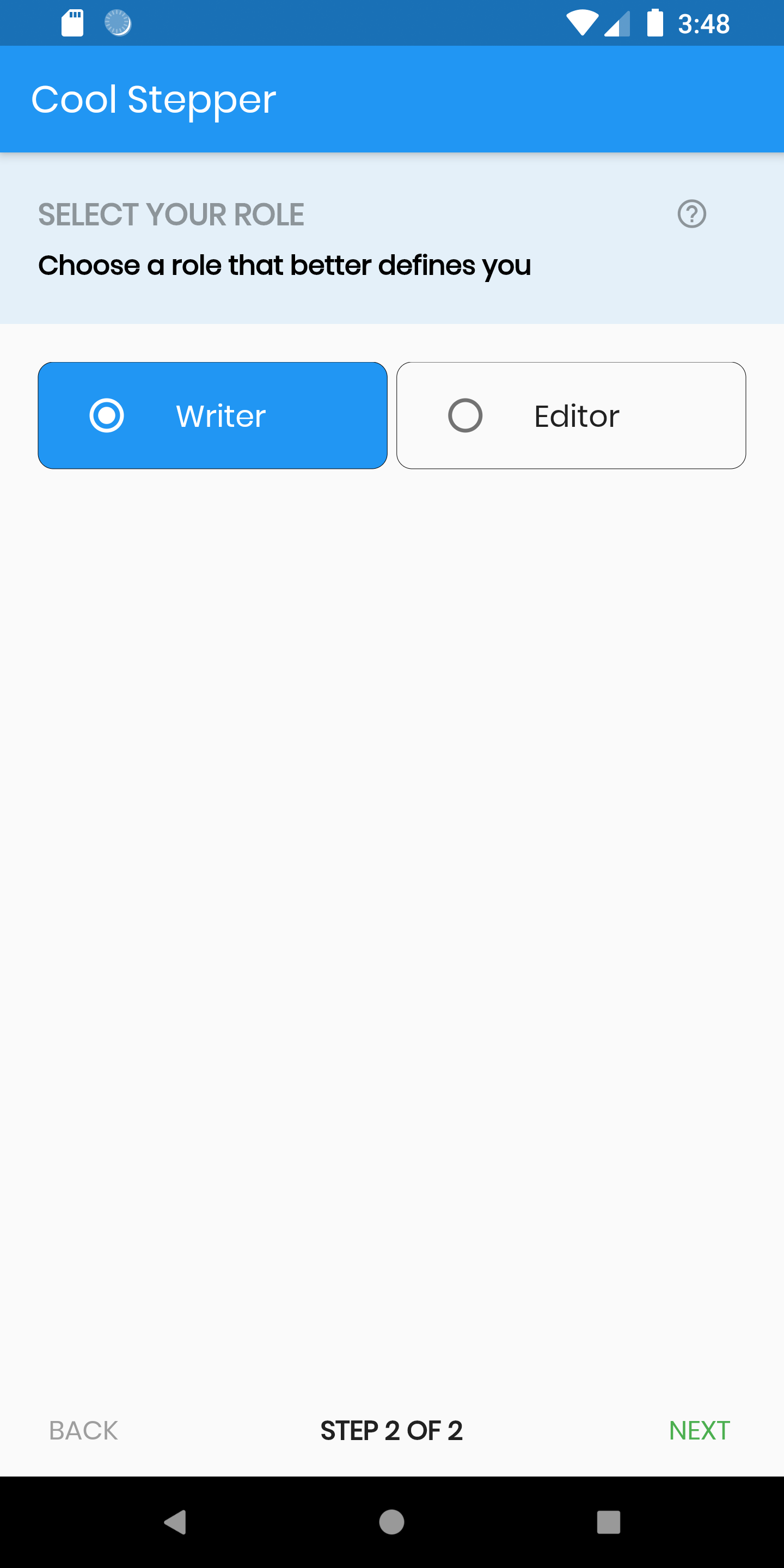
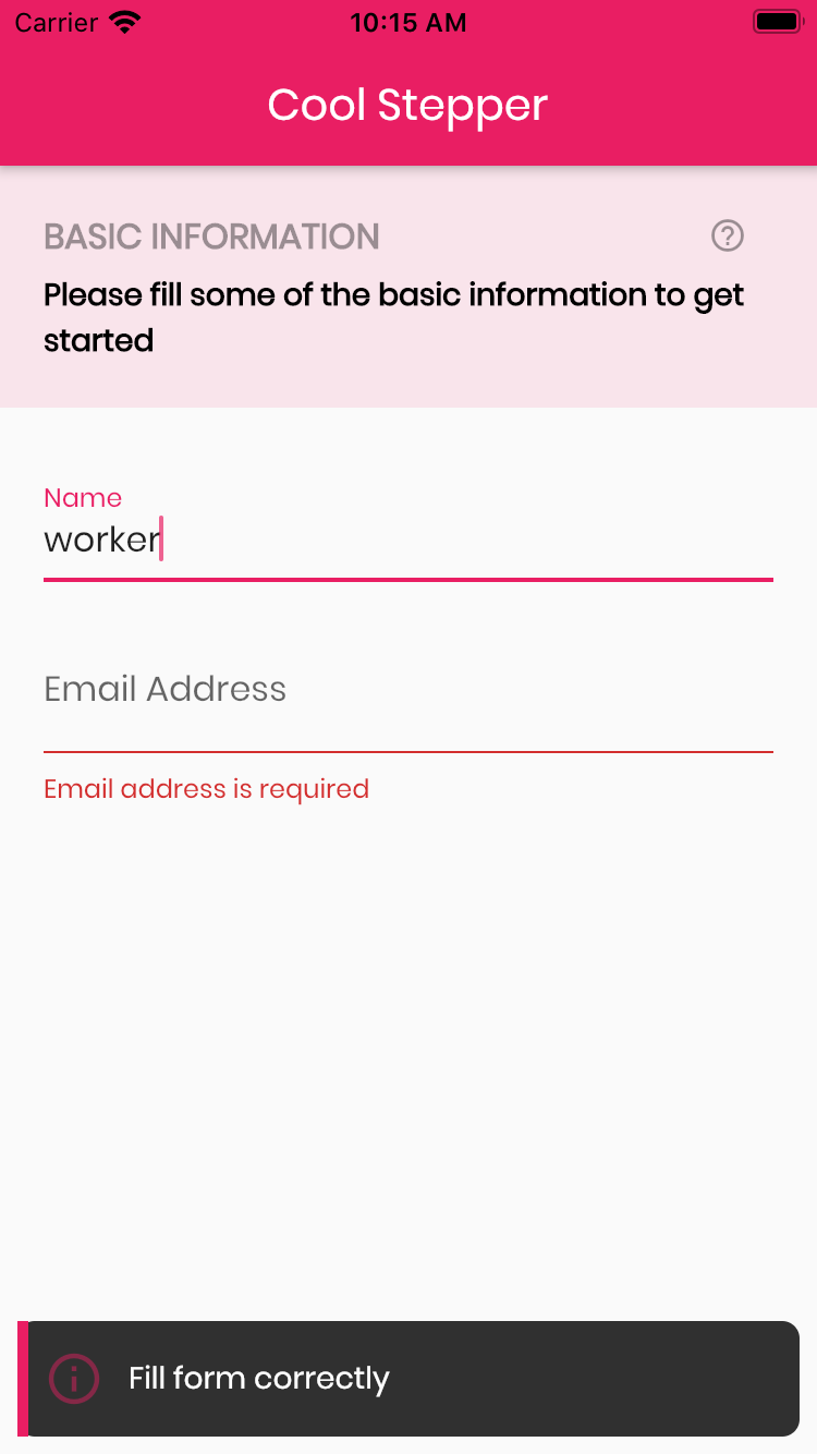
Screenshots

Example
CoolStepper(
   onCompleted: () {},
   steps: List<CoolStep>[
       CoolStep(
        title: "Basic Information",
        subtitle: "Please fill some of the basic information to get started",
        content: Container()
       ),
   ],
);

For each step, return a null, if you want the validation to pass or a String message which would be displayed if you set the showErrorSnackbar attribute to true.

validation: () {
          if (!_formKey.currentState!.validate()) {
            return 'Fill form correctly';
          }
          return null;
        },
CoolStepper Class
Attribute Data type Description Default Value
onCompleted Void Function() @required - A function that is triggers when all steps have been completed Null
steps List @required Null
config CoolStepperConfig Helps to customize your stepper CoolStepperConfig(backText: "BACK", nextText: "NEXT", stepText: "STEP", ofText: "OF")
showErrorSnackbar boolean Shows a snakbar at the bottom of the page when a step validation fails if set to true false
CoolStepperConfig Properties
Attribute Data type Description Default Value
backText String The text that should be displayed for the back button BACK
nextText String The text that should be displayed for the next button NEXT
finalText String The text that should be displayed for the next button on the final step FINISH
stepText String The text that describes the progress STEP
ofText String The text that describes the progress OF
headerColor Color This is the background color of the header Theme.of(context).primaryColor.withOpacity(0.1)
iconColor Color This is the color of the icon Color.black38
icon Icon This icon replaces the default icon Icon(Icons.help_outline,size: 18,Colors.black38)
titleTextStyle TextStyle This is the textStyle for the title text TextStyle(fontSize: 16.0,fontWeight: FontWeight.bold,color: Colors.black38)
subtitleTextStyle TextStyle This is the textStyle for the subtitle text TextStyle(fontSize: 14.0,fontWeight: FontWeight.w600,color: Colors.black)
backTextList List A List of string that when supplied will override 'backText'. Must be one less than the number of steps since for the first step, the backText won't be visible null
nextTextList List A List of string that when supplied will override 'nextText'Must be one less than the number of steps since the 'finalText' attribute is able to set the value for the final step's next button null

Kategorien

Abhängigkeiten

Abhängigkeiten 1 Einträge

Quell-Repository

Projekte, die dieses Paket verwenden

Noch keine Daten verfügbar.