Pakete, Repositories und App-Kategorien suchen

Cover von curved_labeled_navigation_bar
Paketdetailsv2.0.6

curved_labeled_navigation_bar

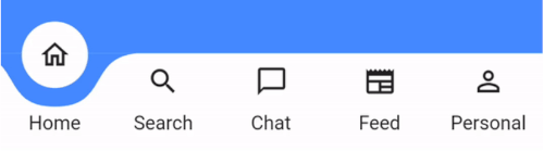
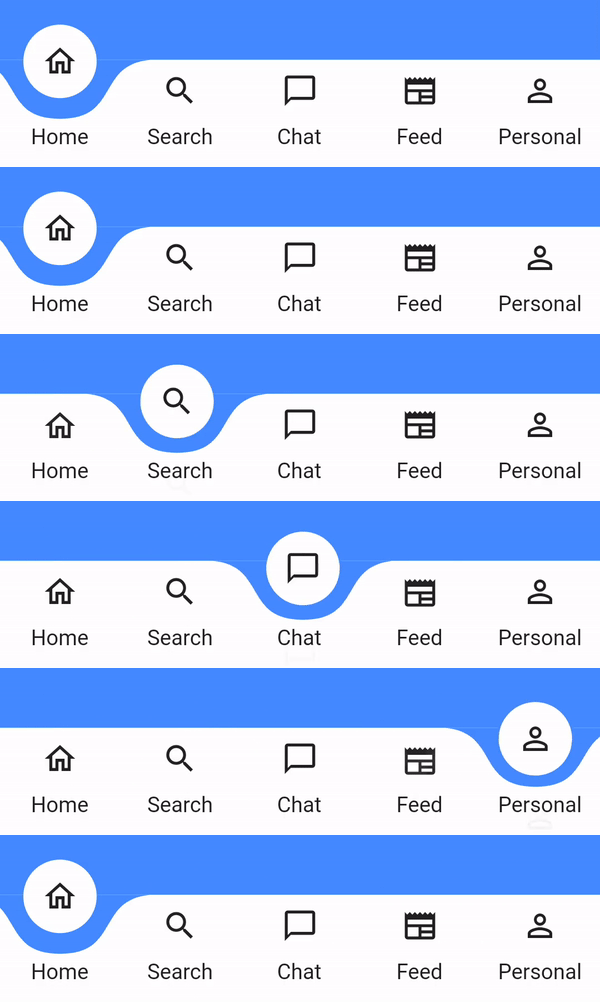
Atemberaubende animierte gekrümmte Form-Navigationsleiste. Einstellbare Farbe, Hintergrundfarbe, Animationskurve und Animationsdauer.

AndroidiOSmacOSWindowsLinux
30-Tage-Downloads
2330
Likes
145
Pub-Punkte
160

Paket installieren

flutter pub add curved_labeled_navigation_bar

Paketübersicht

Aus öffentlichen Paketdaten erstellte Orientierung.

Ein visuell beeindruckender, animierter gekrümmter Navigationsleisten für Flutter-Apps. Er bietet reibungslose Übergänge mit anpassbaren Farben, Hintergrundtönen, Animationskurven und Dauer-Einstellungen. Ideal für moderne Benutzeroberflächen, die ästhetische Anspruch und Benutzerengagement betonen. Das Paket unterstützt mehrere Plattformen wie Android, iOS, macOS, Windows und Linux und sorgt für konsistente Gestaltung über Geräte hinweg. Seine dynamischen Animationen verbessern die Benutzererfahrung, ohne die Implementierung zu komplizieren.

Anwendungsfälle

  • Moderne App-Oberflächen
  • Mobile und Desktop-Anwendungen
  • Interaktive Benutzeroberflächenkomponenten
  • Benutzerdefinierte untere Navigationsleisten
  • Verbesserte Benutzererfahrung

Hauptmerkmale

  • Animierbare gekrümmte Form
  • Anpassbare Farben
  • Anpassbare Animationskurve
  • Konfigurierbare Animationsdauer
  • Plattformübergreifende Unterstützung
  • Beschriftete Navigationspunkte

Geeignet für

  • designorientierte Entwickler
  • Apps mit visuellem Flair
  • UI/UX-Designer
  • Flutter-Anfänger, die fortgeschrittene Widgets suchen
  • Projekte mit individuellen Navigationsanforderungen

Hinweise

  • Kann die Leistung auf Low-End-Geräten beeinträchtigen
  • Erfordert sorgfältige Farbkontraste für Barrierefreiheit
  • Animations-Einstellungen müssen auf verschiedenen Geräten getestet werden
  • Beschränkt auf den Einsatz in der unteren Navigation
  • Nicht geeignet für minimalistische Designs

Original-README

Originaler README-Schnappschuss aus dem verknüpften Quell-Repository. Aktuelle Inhalte finden Sie im Repository.

curved_labeled_navigation_bar

pub package

A Flutter package for easy implementation of curved navigation bar. This package is a fork of the original curved_navigation_bar from https://github.com/rafalbednarczuk/curved_navigation_bar with label for CurvedNavigationBarItem.

Label No Label
Gif Gif
Add dependency
dependencies:
  curved_labeled_navigation_bar: ^2.0.6 #latest version
Easy to use
Scaffold(
  bottomNavigationBar: CurvedNavigationBar(
    backgroundColor: Colors.blueAccent,
    items: [
      CurvedNavigationBarItem(
        child: Icon(Icons.home_outlined),
        label: 'Home',
      ),
      CurvedNavigationBarItem(
        child: Icon(Icons.search),
        label: 'Search',
      ),
      CurvedNavigationBarItem(
        child: Icon(Icons.chat_bubble_outline),
        label: 'Chat',
      ),
      CurvedNavigationBarItem(
        child: Icon(Icons.newspaper),
        label: 'Feed',
      ),
      CurvedNavigationBarItem(
        child: Icon(Icons.perm_identity),
        label: 'Personal',
      ),
    ],
    onTap: (index) {
      // Handle button tap
    },
  ),
  body: Container(color: Colors.blueAccent),
)
Attributes
CurvedNavigationBar
Attribute Description
items List of CurvedNavigationBarItem
index Index of NavigationBar, can be used to change current index or to set initial index
color Color of NavigationBar, default Colors.white
buttonBackgroundColor Background color of floating button, default same as color attribute
backgroundColor Color of NavigationBar's background, default Colors.blueAccent
onTap Function handling taps on items
letIndexChange Function which takes page index as argument and returns bool. If function returns false then page is not changed on button tap. It returns true by default
animationCurve Curves interpolating button change animation, default Curves.easeOut
animationDuration Duration of button change animation, default Duration(milliseconds: 600)
height Height of NavigationBar
maxWidth Allows to set the width of the navigation bar lower than the entire screen width by default
iconPadding Padding of icon in floating button
CurvedNavigationBarItem
Attribute Description
child Icon of CurvedNavigationBarItem
label Text of CurvedNavigationBarItem
labelStyle TextStyle for label
Change page programmatically
 // State class
  int _page = 0;
  GlobalKey<CurvedNavigationBarState> _bottomNavigationKey = GlobalKey();

  @override
  Widget build(BuildContext context) {
    return Scaffold(
        bottomNavigationBar: CurvedNavigationBar(
          key: _bottomNavigationKey,
          items: [
            CurvedNavigationBarItem(
              child: Icon(Icons.home_outlined),
              label: 'Home',
            ),
            CurvedNavigationBarItem(
              child: Icon(Icons.search),
              label: 'Search',
            ),
            CurvedNavigationBarItem(
              child: Icon(Icons.chat_bubble_outline),
              label: 'Chat',
            ),
            CurvedNavigationBarItem(
              child: Icon(Icons.newspaper),
              label: 'Feed',
            ),
            CurvedNavigationBarItem(
              child: Icon(Icons.perm_identity),
              label: 'Personal',
            ),
          ],
          onTap: (index) {
            setState(() {
              _page = index;
            });
          },
        ),
        body: Container(
          color: Colors.blueAccent,
          child: Center(
            child: Column(
              children: <Widget>[
                Text(_page.toString(), textScaler: TextScaler.linear(10.0)),
                ElevatedButton(
                  child: Text('Go To Page of index 1'),
                  onPressed: () {
                    // Page change using state does the same as clicking index 1 navigation button
                    final CurvedNavigationBarState? navBarState =
                        _bottomNavigationKey.currentState;
                    navBarState?.setPage(1);
                  },
                )
              ],
            ),
          ),
        ),
    );
  }

Kategorien

Abhängigkeiten

Abhängigkeiten 2 Einträge

Quell-Repository

Projekte, die dieses Paket verwenden

Noch keine Daten verfügbar.