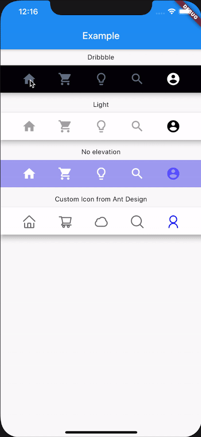
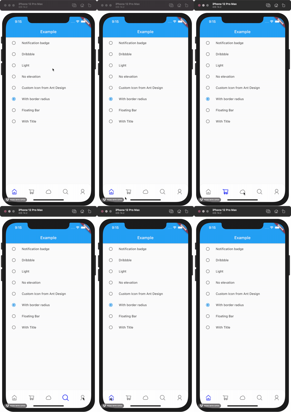
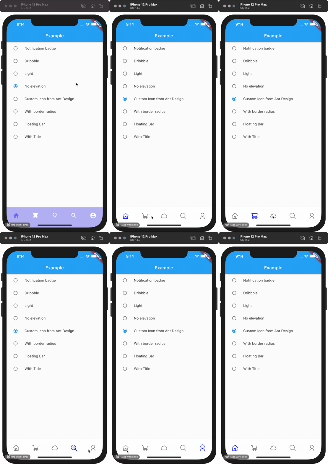
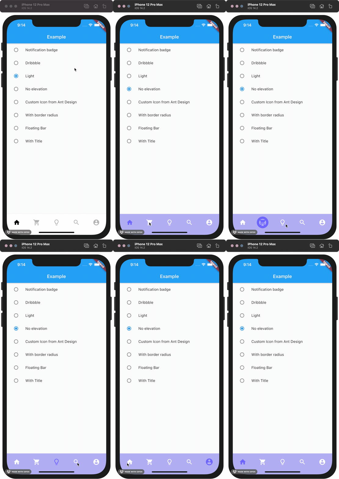
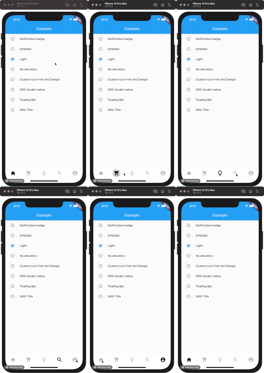
Aus öffentlichen Paketdaten erstellte Orientierung.
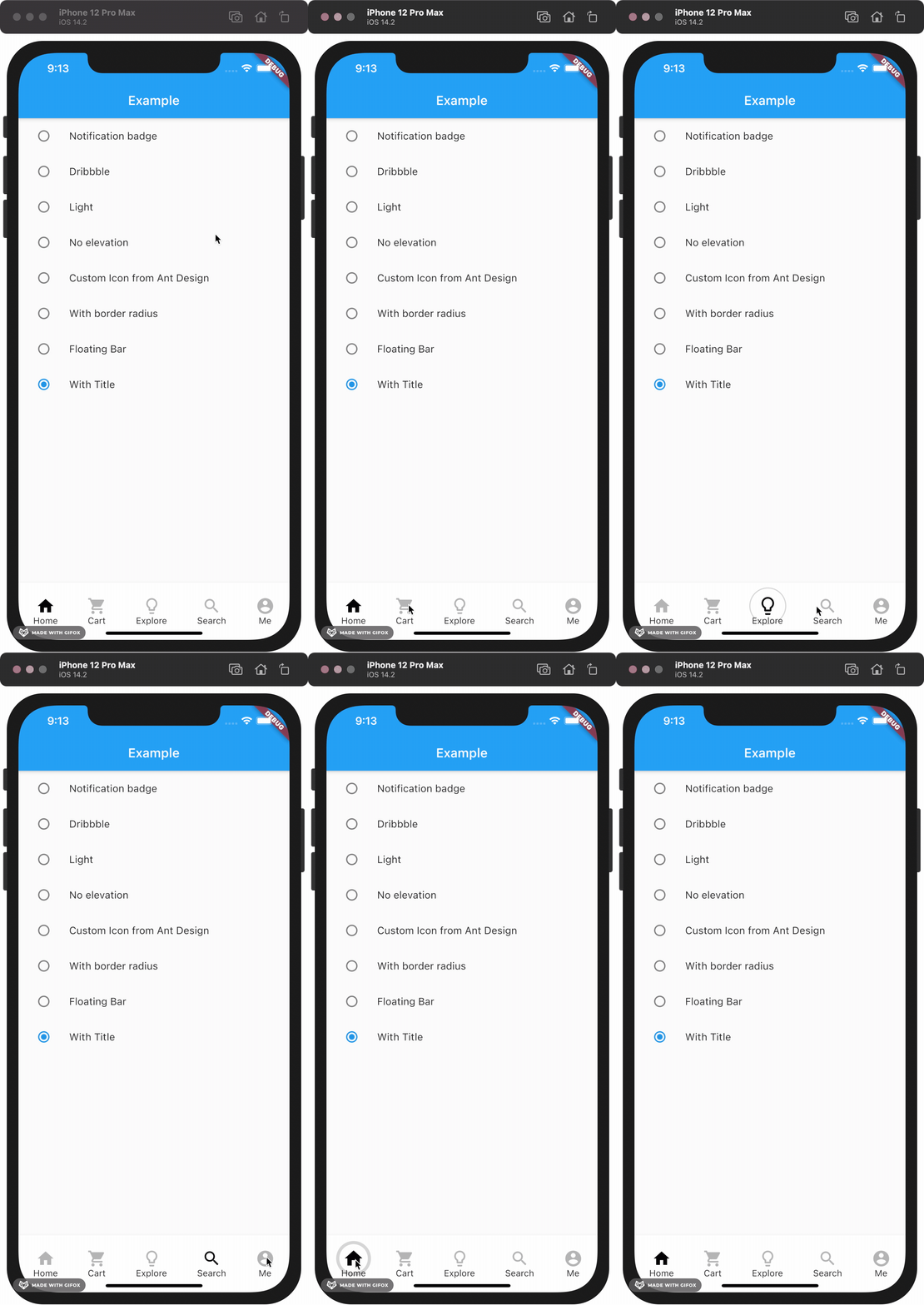
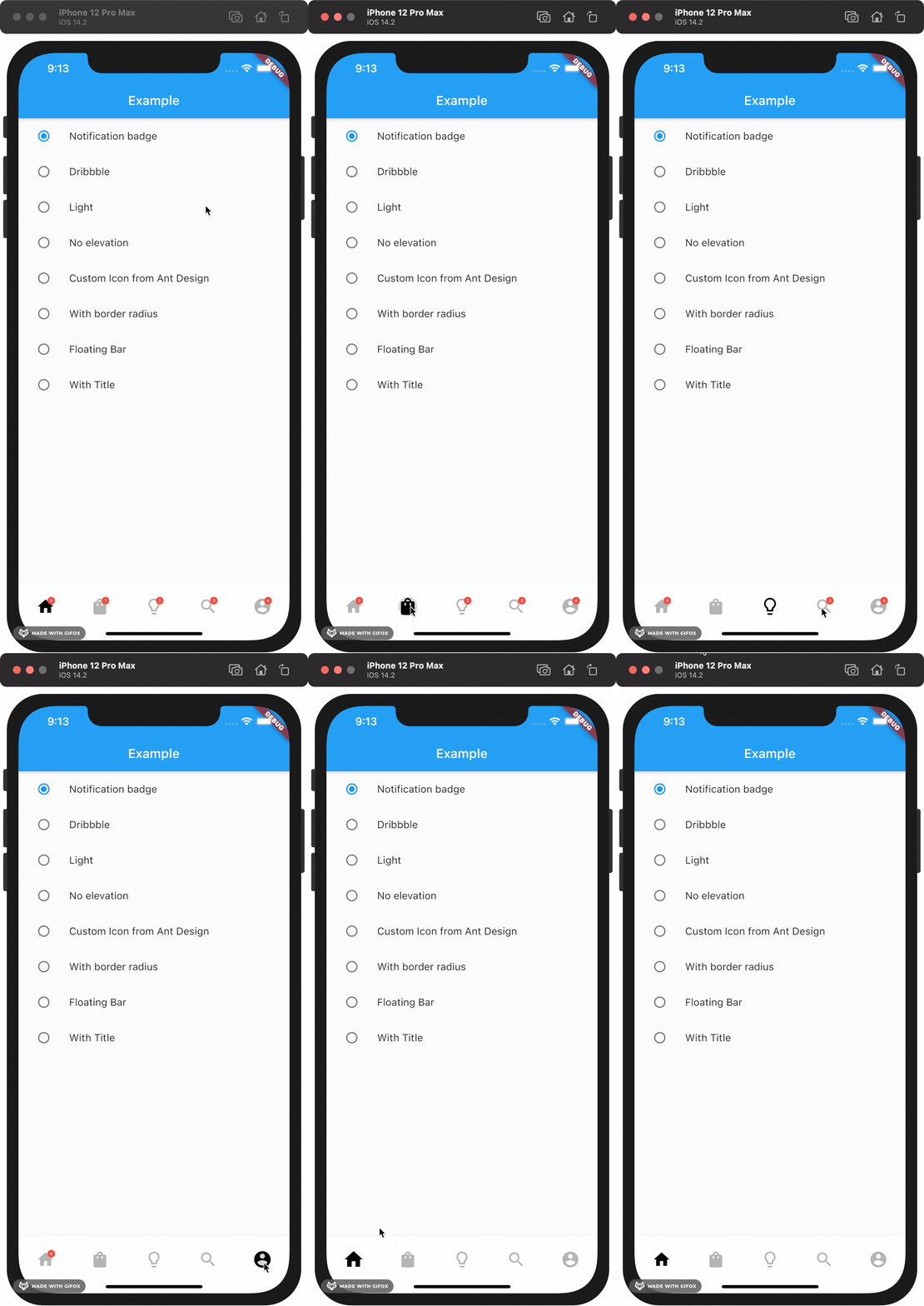
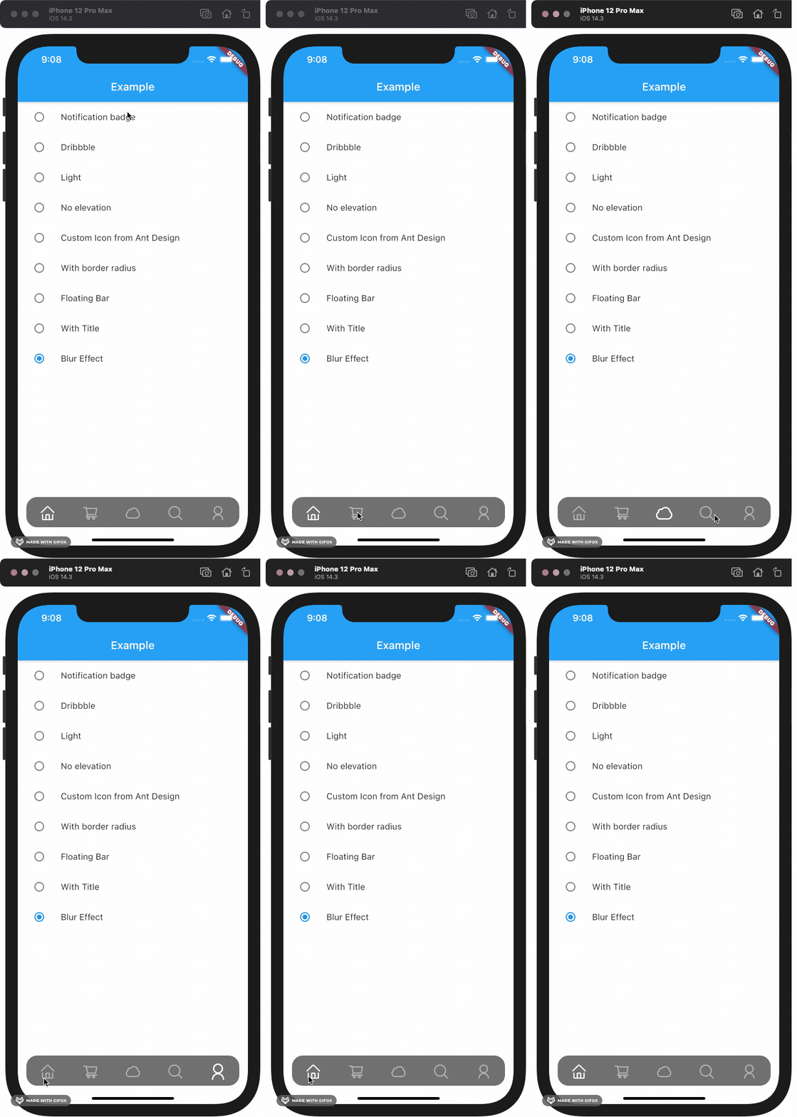
Eine anpassbare Bottom-Navigation-Bar mit einem Blasen-Klick-Effekt, inspiriert von Folge 35 von The Boring Flutter Development Show. Sie verbessert die Benutzerinteraktion durch flüssige Animationen und visuelle Rückmeldungen beim Tippen. Das Paket unterstützt mehrere Plattformen wie Android, iOS, Web, macOS, Windows und Linux und ist daher ideal für plattformübergreifende Anwendungen. Entwickler können das Aussehen und Verhalten problemlos an die Designsprache ihrer App anpassen.
Anwendungsfälle
Plattformübergreifende mobile und Web-Anwendungen
Apps, die animierten Navigationsfeedback benötigen
Benutzerdefinierte UI-Entwürfe mit interaktiven Elementen
Verbesserung der Benutzererfahrung in der unteren Navigation
Spielerische Animationen in Navigationsleisten integrieren
Hauptmerkmale
Bubble-Klick-Animations-Effekt
Hochgradig anpassbare Erscheinung
Unterstützt mehrere Plattformen
Einfache Integration mit Flutter
Glatte Touch-Rückmeldung
Konfigurierbarer Abstand und Größe der Elemente
Geeignet für
Flutter-Entwickler, die animierte Navigationsleisten suchen
designorientierte Anwendungen
Projekte, die interaktive Benutzeroberflächenkomponenten erfordern
Entwickler, die von The Boring Flutter Development Show inspiriert wurden
Apps für die mehrplattformige Bereitstellung
Hinweise
Kann die Leistung auf Low-End-Geräten beeinträchtigen
Erforderliche sorgfältige Planung von Farbe und Größe für optimale Optik
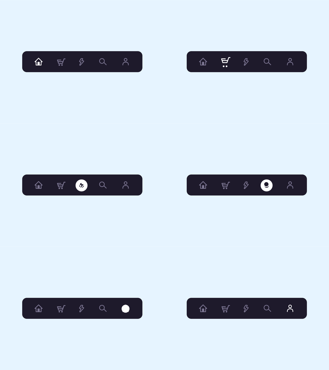
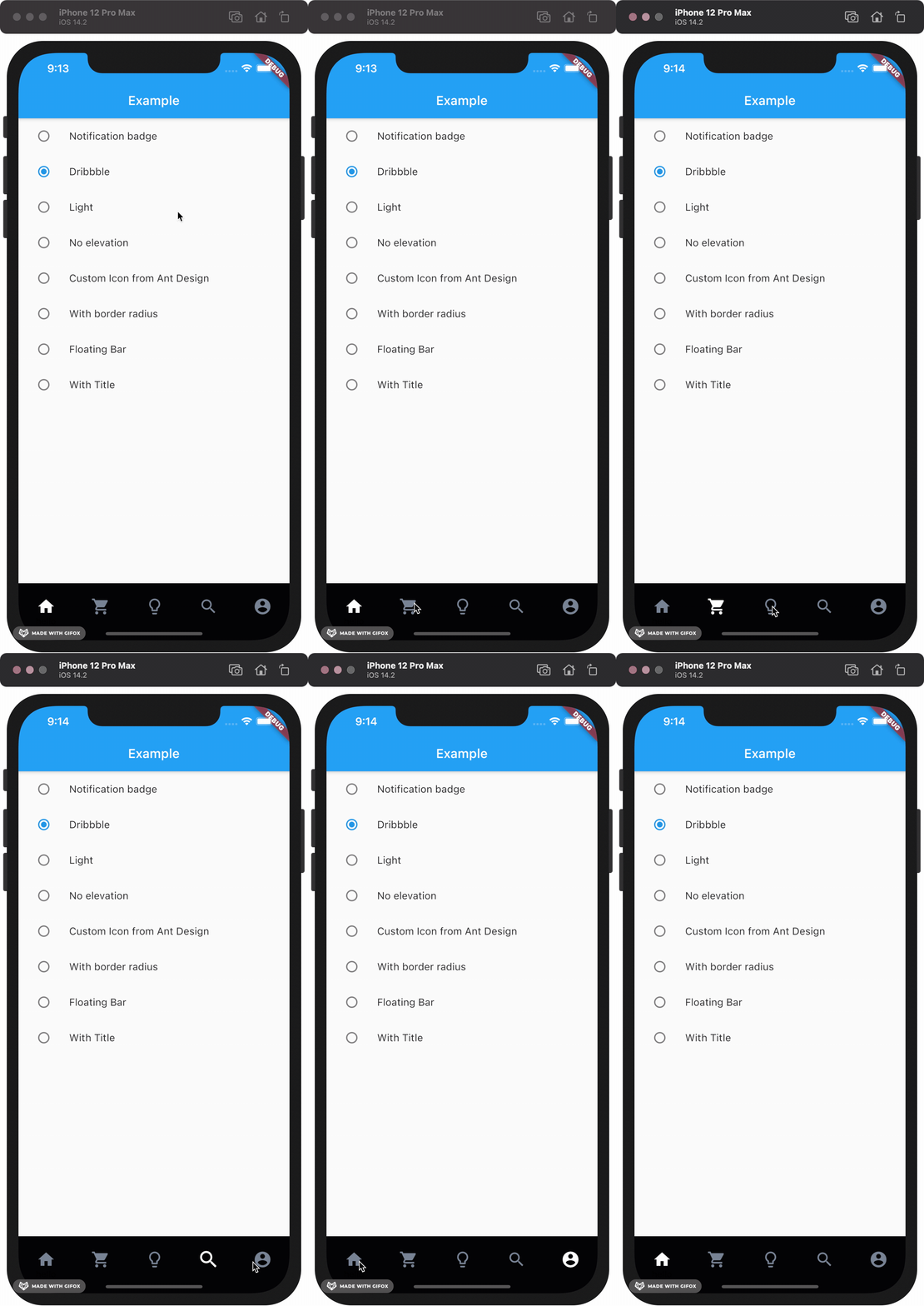
This package gives you a cute bubble effect when you click on the navigation bar.
Dribbble:
Implemented:
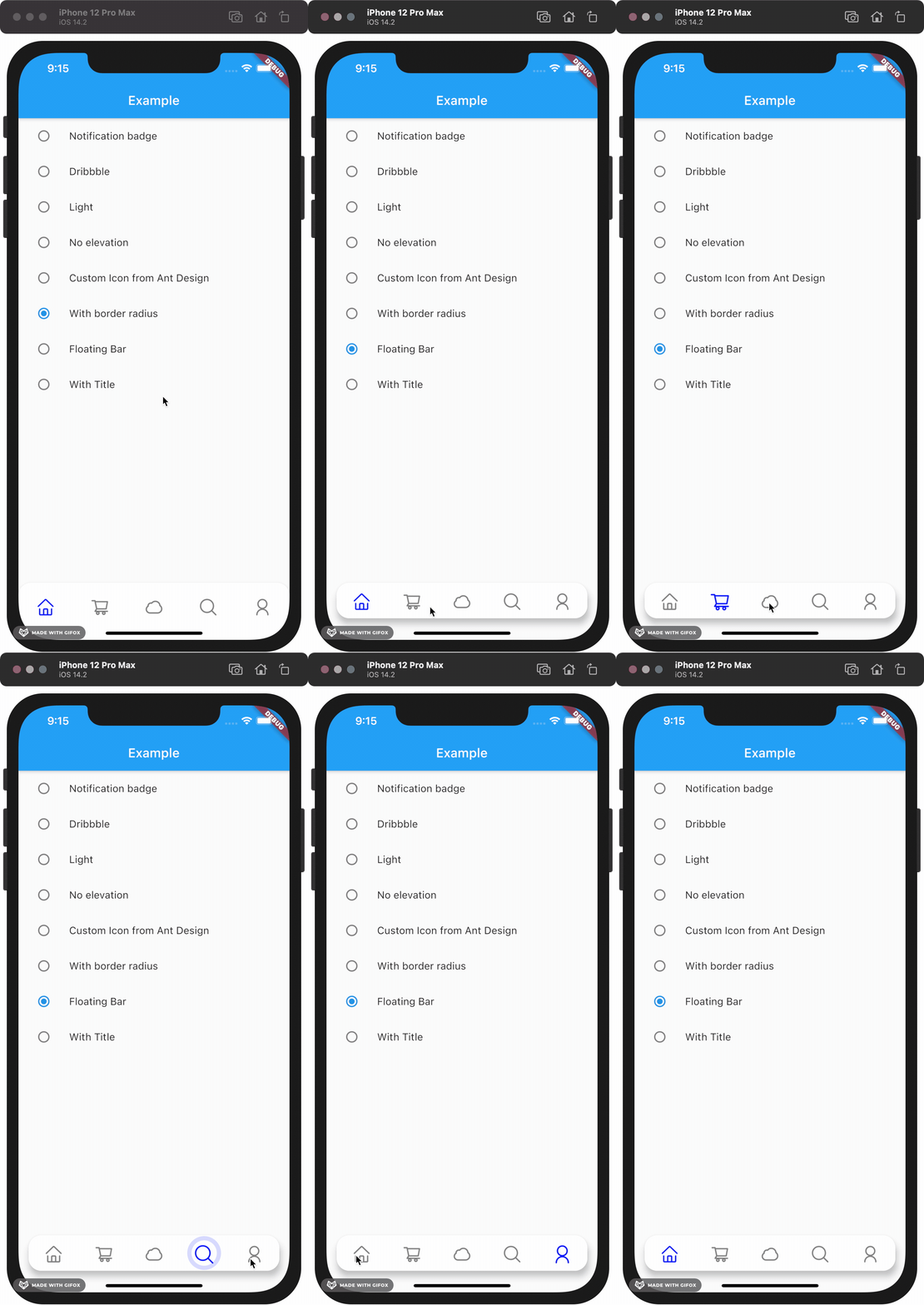
Gallery
How to install
Add this to your package's pubspec.yaml file:
dependencies:custom_navigation_bar:lastestversion
Documentation
Attention
If you update from version under 0.6.0, there are some breaking changes in the version 0.6.0. The icon in CustomNavigationBarItem has changed from IconData to Widget.
old version
CustomNavigationBarItem(
{@requiredthis.icon,
IconData selectedIcon,
this.selectedTitle,
this.unSelectedTitle,
this.badgeCount = 0,
this.showBadge = true})
: selectedIcon = selectedIcon ?? icon;
////// The icon of the item/// Typically the icon is an [Icon].///finalIconData icon;
new version
CustomNavigationBarItem(
{@requiredthis.icon,
Widget selectedIcon,
this.title,
Text selectedTitle,
this.badgeCount = 0,
this.showBadge = false})
: selectedIcon = selectedIcon ?? icon,
selectedTitle = selectedTitle ?? title;
////// The icon of the item/// Typically the icon is an [Icon].///finalWidget icon;
You can customize these attributes in the navigation bar.
Attributes
Type
Description
Default
scaleFactor
double
scale factor for the icon scale animation.
0.2
elevation
double
The z-coordinate of this CustomNavigationBar
8.0
items
List
item data in CustomNavigationBar
required
selectedColor
Color
[Color] when [CustomNavigationBarItem] is selected
[blueAccent]
unSelectedColor
Color
[Color] when [CustomNavigationBarItem] is not selected.
grey[600]
onTap
Function(int)
callback function when item tapped
null
currentIndex
int
current index of navigation bar.
0
iconSize
double
size of icon. also represent the max radius of bubble effect animation.
24.0
backgroundColor
Color
Background color of [CustomNavigationBar]
Colors.white
strokeColor
Color
stroke color
blueAccent
bubbleCurve
Curve
animation curve of bubble effect
linear
scaleCurve
Curve
animation curve of scale effect
linear
borderRadius
Radius
border radius of navigation bar
Radius.zero
isFloating
bool
control if CustomNavigationBar is floating
false
blurEffect
bool
control if CustomNavigationBar show blur effect
false
opacity
double
control CustomNavigationBar blur effect opacity when blurEffect is true
0.8
brightness
Brightness
describes the contrast of a theme or color palette. If you want adaptive system display setting like iOS dark mode , you should set Brightness.dark or Brightness.light . if this attribute be set , other attributes with "*Color" (like selectedColor) will not take effect , should use lightThemeData or darkThemeData
null
lightThemeData
CustomNavigationBarThemeData
when brightnessis light,you can custom the light theme color if you want it
null
darkThemeData
CustomNavigationBarThemeData
when brightnessis dark,you can custom the dark theme color if you want it
null
Attention: If you set isFloating to true, I would recommand you to set extendBody to true in Scaffold for a better performance.
And for customize icon in the navigation bar, just put the icons you want in the CustomNavigationBarItem like this.