Pakete, Repositories und App-Kategorien suchen

Cover von custom_pointed_popup
Paketdetailsv0.0.4

custom_pointed_popup

Popup, der auf jedem Zielwidget mit maßgeschneidertem Pfeildesign angezeigt werden kann.

AndroidiOSWebmacOSWindowsLinux
30-Tage-Downloads
116
Likes
23
Pub-Punkte
130

Paket installieren

flutter pub add custom_pointed_popup

Paketübersicht

Aus öffentlichen Paketdaten erstellte Orientierung.

Ein Flutter-Paket, das die Anzeige anpassbarer, spitzen Popups ermöglicht, die an ein bestimmtes Widget angeheftet sind. Es unterstützt einzigartige Designs mit einer gerichteten Spitze und ist ideal für Tooltips oder kontextbezogene Hinweise. Der Popup kann präzise relativ zu seinem Zielpositioniert werden und ist auf allen wichtigen Plattformen einschließlich Mobilgeräten, Web und Desktop kompatibel. Er verbessert die Benutzererfahrung durch visuelle Rückmeldung, ohne den UI-Fluss zu stören.

Anwendungsfälle

  • Tooltips auf Schaltflächen anzeigen
  • Benutzerdefinierte Kontextmenüs erstellen
  • Formularfelder hervorheben
  • Interaktive Anleitung bereitstellen
  • Dynamische Informationen in der Nähe von Widgets anzeigen

Hauptmerkmale

  • Anpassbare Cursorform
  • Genauige Positionierung relativ zum Ziel-Widget
  • Unterstützung für mehrere Plattformen-Rendering
  • Erweiterbarer Design durch benutzerdefinierte Widgets
  • Glatte Animationsübergänge

Geeignet für

  • UI/UX-Designer, die interaktive Elemente suchen
  • Entwickler, die geführte Onboarding-Flows erstellen
  • Anwendungen, die kontextbezogene Hilfesysteme erfordern
  • Projekte mit reichhaltigen interaktiven Oberflächen
  • Teams, die Flutter für plattformübergreifende Apps verwenden

Hinweise

  • Erfordert sorgfältige Layoutverwaltung
  • Für komplexe Designs sind möglicherweise zusätzliche Stile erforderlich
  • Leistungseinbußen bei vielen gleichzeitigen Popups
  • Eingeschränkte integrierte Themen, erfordern benutzerdefinierte Implementierung
  • Aufgrund von Größenbeschränkungen nicht geeignet für große Inhaltbereiche

Original-README

Originaler README-Schnappschuss aus dem verknüpften Quell-Repository. Aktuelle Inhalte finden Sie im Repository.

custom_pointed_popup

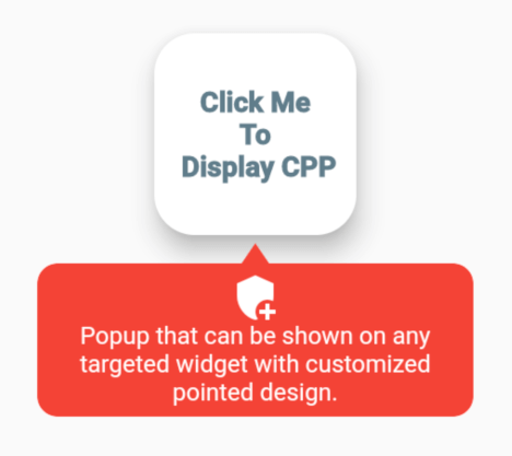
Popup that can be shown on any targeted widget with customized pointed design.

Screenshots

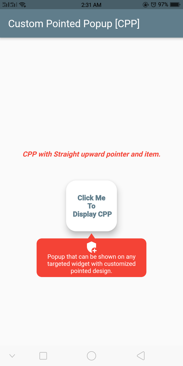
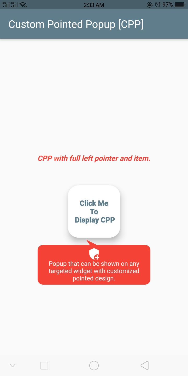
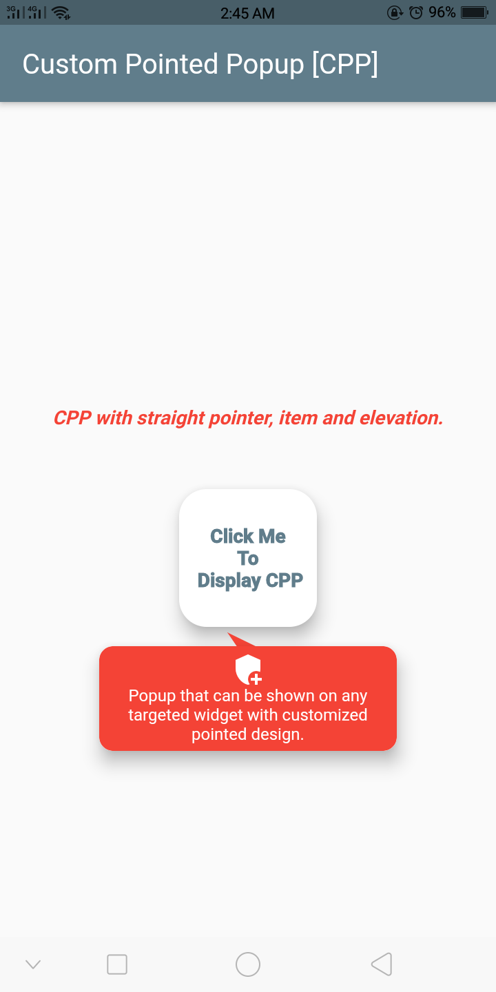
alt text alt text alt text alt text

Getting Started

Example
  final GlobalKey widgetKey = GlobalKey();

  CustomPointedPopup getCustomPointedPopup(BuildContext context) {
    return CustomPointedPopup(
      backgroundColor: Colors.red,
      context: context,
      lineColor: Colors.tealAccent,
      widthFractionWithRespectToDeviceWidth: 3,
      displayBelowWidget: true,
      triangleDirection: TriangleDirection.FullLeft,
      popupElevation: 10,

      ///you can also add border radius
      ////popupBorderRadius:,
      item: CustomPointedPopupItem(
        title: 'Popup that can be shown on any targeted widget with customized pointed design.',
        textStyle: Theme.of(context).textTheme.caption!.copyWith(
              color: Theme.of(context).cardColor,
            ),
        iconWidget: Icon(
          Icons.add_moderator,
          color: Theme.of(context).cardColor,
        ),

        ///Or you can add custom item widget below instead above 3
        ///itemWidget: Container(),
      ),
      onClickWidget: (onClickMenu) {
        print('popup item clicked');
      },
      onDismiss: () {
        print('on dismissed called');
      },
    );
  }

  @override
  Widget build(BuildContext context) {
    return Scaffold(
      appBar: AppBar(
        title: Text(
          'Custom Pointed Popup [CPP]',
        ),
      ),
      body: Container(
        child: Center(
          child: Column(
            mainAxisAlignment: MainAxisAlignment.center,
            children: [
              Text(
                'CPP with straight pointer & item.',
                style: TextStyle(
                  color: Colors.red,
                  fontSize: 14.0,
                  fontStyle: FontStyle.italic,
                  fontWeight: FontWeight.bold,
                ),
              ),
              SizedBox(
                height: 40,
              ),
              GestureDetector(
                onTap: () {
                  getCustomPointedPopup(context)
                    ..show(
                      widgetKey: widgetKey,
                    );
                },
                child: Card(
                  key: widgetKey,
                  elevation: 10,
                  shape: RoundedRectangleBorder(
                    borderRadius: BorderRadius.circular(20),
                  ),
                  child: Container(
                    height: 100,
                    width: 100,
                    child: Center(
                      child: Text(
                        'Click Me \nTo\n Display CPP',
                        textAlign: TextAlign.center,
                        overflow: TextOverflow.clip,
                        style: TextStyle(
                          color: Colors.blueGrey,
                          fontWeight: FontWeight.w900,
                          fontSize: 14.0,
                        ),
                      ),
                    ),
                  ),
                ),
              ),
            ],
          ),
        ),
      ),
    );
  }

Important Class, Function And Enum

The important class to know. CustomPointedPopupItem - Model item to display inside the pointed popup:

Attribute Type Default Required Description
iconWidget Widget No This will create an icon inside the pointed popup.
title String No Title or text for the pointed popup.
textStyle TextStyle No Text style for the title.
textAlign TextAlign No Alignment for the title.
itemWidget Widget No Custom item widget or child for the pointed popup. No need to add iconWidget & title if you added this.

The important function to know. show - Function to show the custom pointed popup:

Attribute Type Default Required Description
rect Rect No The rect bound that the popup should appear around it.
widgetKey GlobalKey No The key to widget.
item CustomPointedPopupItem [class] No If you want the dynamic item widget or child inside the popup per action, you can add the item here.

The important enum to know. TriangleDirection - Enum to choose the direction of pointer or triangle shape:

Value Description
Straight This will create an pointer with straight upward.
Right This will create an pointer with slightly bended towards right.
FullRight This will create an pointer with fully bended towards right.
Left This will create an pointer with slightly bended towards left.
FullLeft This will create an pointer with fully bended towards left.

In order to create a custom pointed popup on the widget, there are several attributes that are supported by custom_pointed_popup:

Attribute Type Default Required Description
item CustomPointedPopupItem [class] Yes To create the item widget or child in pointed popup.
customHeight double Yes The custom height of the pointed popup.
displayBelowWidget bool false No If true always display the popup below the widget else automatically calculate the space and display the popup either up or below the widget.
triangleDirection TriangleDirection [enum] TraingleDirection.Straight No Determines the direction of pointer or triangle shape.
popupBorderRadius BorderRadius BorderRadius.circular(10.0) No Defines the border of the custom pointed popup.
popupElevation double 0 No The elevation of the pointed popup.
stateChanged Function(bool isShow) No This event function will fire immediately the the popup state changes.
backgroundColor Color Colors.red No Background color for pointed popup.
widthFractionWithRespectToDeviceWidth int 3 No Width ratio with respect to the device width.
onDismiss VoidCallBack No Callback function that fire when the custom pointed popup dismissed.
onClickWidget Function(CustomPointedPopupItem item) No Callback function that fire when the child of popup is clicked.
context BuildContext Yes Context where the popup to be shown.

##If you have any queries, email me to dipak.shrestha@eemc.edu.np

CREDITS

Contributors

Made with contributors-img.

Kategorien

Quell-Repository

Projekte, die dieses Paket verwenden

Noch keine Daten verfügbar.