Pakete, Repositories und App-Kategorien suchen

Cover von dashboard
Paketdetailsv0.0.4

dashboard

Dynamisches Dashboard-Widget, das Ihren Benutzern die Erstellung eigener Layouts ermöglicht. Größenänderung, Verschiebung, indirekte Größenänderung/Verschiebung und automatische Neugestaltung werden unterstützt.

AndroidiOSWebmacOSWindowsLinux
30-Tage-Downloads
1530
Likes
230
Pub-Punkte
150

Paket installieren

flutter pub add dashboard

Paketübersicht

Aus öffentlichen Paketdaten erstellte Orientierung.

Das Dashboard-Paket bietet ein dynamisches, vom Benutzer konfigurierbares Widget zur Erstellung anpassbarer Layouts. Benutzer können Widgets innerhalb des Dashboards frei vergrößern, verschieben und neu anordnen, mit Unterstützung für indirektes Vergrößern und automatisches Neulayout. Ideal für Dashboards, die interaktive Anpassung erfordern, funktioniert auf allen wichtigen Plattformen wie Android, iOS, Web, macOS, Windows und Linux. Das Paket ist für Entwickler gedacht, die flexible, responsive Benutzeroberflächen suchen, die sich in Echtzeit an die Nutzerpräferenzen anpassen.

Anwendungsfälle

  • Anpassbare Analyse-Dashboards
  • Benutzerdefinierte Layout-Schnittstellen
  • Interaktive Admin-Panels
  • Echtzeit-Datenvisualisierung
  • Reaktive gridbasierte Anwendungen

Hauptmerkmale

  • Widget-Umpositionierung per Drag-and-Drop
  • Größenanpassbare Widgets mit automatischer Neugestaltung
  • Indirekte Größenänderung/Verschiebung Unterstützung
  • Plattformübergreifende Kompatibilität
  • Dynamische Layout-Persistenz
  • Konfigurierbares Rastersystem

Geeignet für

  • Entwickler, die interaktive Dashboards erstellen
  • Apps mit benutzeranpassbaren Benutzeroberflächen
  • Projekte mit dynamischen Inhaltsgittern
  • Frontend-Teams, die sich auf die Benutzererlebnisflexibilität konzentrieren
  • Web- und Mobile-Anwendungen mit responsive Layouts

Hinweise

  • Kann eine Leistungsoptimierung für große Anzahlen von Widgets erfordern
  • Die Anfangskonfiguration beinhaltet die Konfiguration von Gitter- und Widget-Beschränkungen
  • Eingeschränkte integrierte Gestaltungsoptionen jenseits des grundlegenden Layouts
  • Am besten geeignet für interaktive Schnittstellen mittlerer bis großer Skalierung
  • Erfordert sorgfältige Handhabung der Zustandsverwaltung während Drag-Vorgängen

Original-README

Originaler README-Schnappschuss aus dem verknüpften Quell-Repository. Aktuelle Inhalte finden Sie im Repository.

Dynamic dashboard widget that allows your users to create their own layouts. Rezise, move, indirect resize/move, auto re-layout are supported.

Features

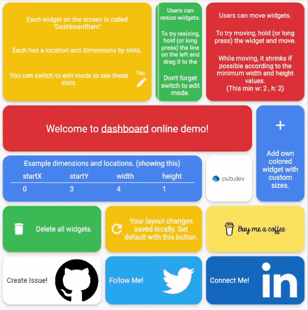
Try online demo

Dashboard can be thought of as a dynamic grid. Your users can create their own layouts, add new widgets or remove widgets.

Layout divides the screen into horizontal slots according to the entered value. The aspect ratio of the slots also determine their height. Widgets called DashboardItem are placed in these slots. This layout can be changed later.

Resize

Dashboard Items can be resized both by long pressing on mobile and by holding and moving on desktop/browser.

Move

Dashboard Item locations can be changed by long pressing on mobile or by holding and pulling on desktop/browser.

Slots Changes

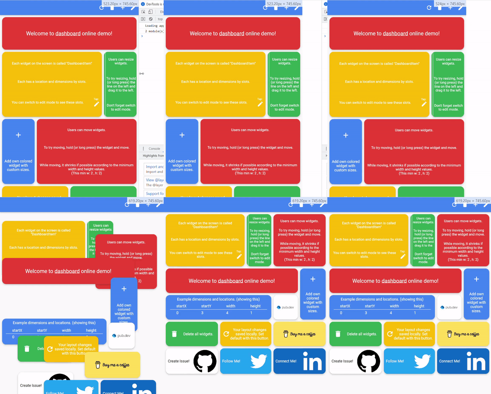
With dynamic slot count, you can re-layout window size changes.

>

Storage Delegate

The layout information of the users can be stored in the database or on the local disk.

Define your storage delegate.

class MyItemStorage extends DashboardItemStorageDelegate {  

  @override  
  FutureOr<List<DashboardItem>> getAllItems(int slotCount) {  
    // return items from db.
  }  
  
  @override  
  FutureOr<void> onItemsUpdated(  
      List<DashboardItem> items, int slotCount) {
      // save new layouts to db.
  }
  //[...]
}

And use it.

DashboardItemController.withDelegate(
    itemStorageDelegate: MyItemsStorage())

Getting started

Define Dashboard
Dashboard(  
  dashboardItemController: itemController,  
  itemBuilder: (item) {
	//return widget
  },  
);
Define Items

Items can come from the database, or can be defined as fixed.

Fixed:

DashboardItemController(items: [
  DashboardItem(width: 2, height: 3, identifier: "id_1"),  
  DashboardItem(  
      startX: 3, startY: 4, width: 3, height: 1, identifier: "id_2"),  
]);

Or with delegate:

DashboardItemController<ADashboardItemImp>.withDelegate(  
    itemStorageDelegate: MyItemStorage())

See example

Define Builder

The Builder is invoked with a DashboardItem and returns a widget.

Dashboard(  
  dashboardItemController: itemController,  
  itemBuilder: (item) {
	return Text(item.identifier);
  },  
);

Parameters

Item Style

Each item is wrapped with a Material widget. You can enter the parameters of the Material widget with item style.

All is optional.

ItemStyle(  
  color: Colors.red,  
  borderRadius: BorderRadius.circular(10),  
  shape: const RoundedRectangleBorder(),  
  shadowColor: Colors.black,  
  animationDuration: const Duration(milliseconds: 200),  
  borderOnForeground: false,  
  clipBehavior: Clip.antiAliasWithSaveLayer,  
  elevation: 10,  
  textStyle: const TextStyle(color: Colors.black),  
  type: MaterialType.card  
);
Slide

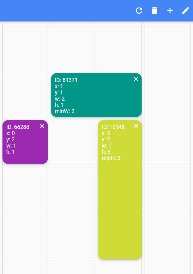
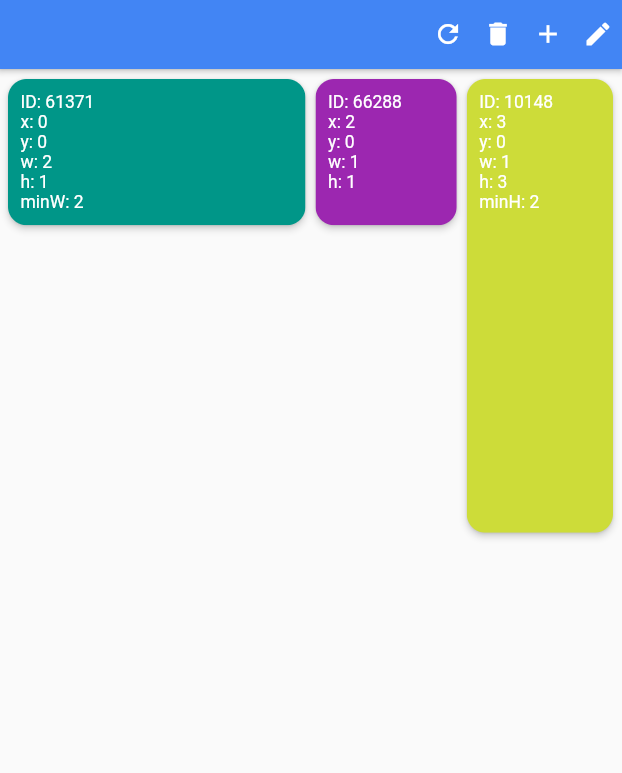
Slide to top items initially. Auto relayout places items to top as possible.

slideToTop: true

Before:

>

After:

>

Shrink

Shrink items when re-layout or editing is possible.

Edit Mode Settings

See code comments for edit mode settings parameters.

All is optional.

    EditModeSettings(

        // animation settings
        curve: Curves.easeInOutCirc,
        duration: const Duration(milliseconds: 200),
        
        // fill editing item actual size
        fillEditingBackground: true,

        // space that can be held to resize
        resizeCursorSide: 20,
        
        // draw lines for slots
        paintBackgroundLines: true,
        
        // shrink items when editing if possible and necessary
        shrinkOnMove: true,
        
        // long press to edit
        longPressEnabled: true,
        
        // pan to edit
        panEnabled: true,
        
        backgroundStyle: const EditModeBackgroundStyle(
            fillColor: Colors.red,
            lineWidth: 1.5,
            lineColor: Colors.black,
            
            // line by vertical space
            dualLineHorizontal: true,

            // line by horizontal space
            dualLineVertical: true));
Storage Delegate

See example

Additional

"Buy Me A Coffee"

TODO

  • [ ] Define and fix animation bugs.
  • [ ] Check performance improvements.
  • [ ] Write tests.
  • [ ] Add more documentation.
  • [ ] Add more example.
  • [ ] Create Youtube video.

Kategorien

Quell-Repository

Projekte, die dieses Paket verwenden