Pakete, Repositories und App-Kategorien suchen

Cover von dashed_circular_progress_bar
Paketdetailsv0.0.6

dashed_circular_progress_bar

Die gestrichelte kreisförmige Fortschrittsleiste zeigt den Fortschritt einer Aufgabe in einem Kreis an, der in Farbe, Stil und Form angepasst werden kann.

AndroidiOSWebmacOSWindowsLinux
30-Tage-Downloads
4470
Likes
117
Pub-Punkte
160

Paket installieren

flutter pub add dashed_circular_progress_bar

Paketübersicht

Aus öffentlichen Paketdaten erstellte Orientierung.

Ein anpassbarer gestrichelter kreisförmiger Fortschrittsbalken für Flutter, der den Aufgabenfortschritt visuell in einer kreisförmigen Darstellung darstellt. Unterstützt verschiedene Farben, Strichstile und Formen und ist ideal für Ladeindikatoren oder die Verfolgung von Fortschritten in Apps. Das Widget ist leichtgewichtig und kompatibel mit allen wichtigen Plattformen wie Android, iOS, Web, macOS, Windows und Linux. Es kann einfach über den pub-Befehl integriert und an die App-Themen angepasst werden.

Anwendungsfälle

  • Ladeanzeiger
  • Fortschrittsverfolgung in Formularen
  • Aufgabenabwicklung Visualisierung
  • Benutzerdefinierte UI-Elemente
  • Interaktive Dashboards

Hauptmerkmale

  • Strichmuster mit Strichen
  • Anpassbare Farbe und Breite
  • Kreisförmige Form mit einstellbarer Größe
  • Plattformübergreifende Kompatibilität
  • Einfache Integration über pub
  • Unterstützt Animation

Geeignet für

  • App-Entwickler, die visuelle Rückmeldung suchen
  • Designer, die einzigartige Fortschrittsindikatoren wünschen
  • Projekte, die plattformunabhängige Komponenten erfordern
  • UI-intensive Anwendungen
  • Minimalistische Designästhetik

Hinweise

  • Beschränkt auf kreisförmige Anordnung
  • Keine eingebauten Textbeschriftungen
  • Benötigt manuelle Animationssteuerung
  • Nicht geeignet für linearen Fortschritt
  • Kann zusätzliche Stilisierung für den Dunkelmodus erfordern

Original-README

Originaler README-Schnappschuss aus dem verknüpften Quell-Repository. Aktuelle Inhalte finden Sie im Repository.

Dashed circular progress bar

Open source flutter package, Dashed circular progress bar for flutter apps.

Getting Started

Installing

Add this line to the pubspec.yaml file below the dependencies:

dependencies:
  dashed_circular_progress_bar: ^0.0.6

Now to use, import this package into the desired file as follows:

import 'package:dashed_circular_progress_bar/dashed_circular_progress_bar.dart';

Basic examples

Here are some simple examples you can use to create this package:

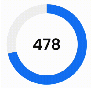
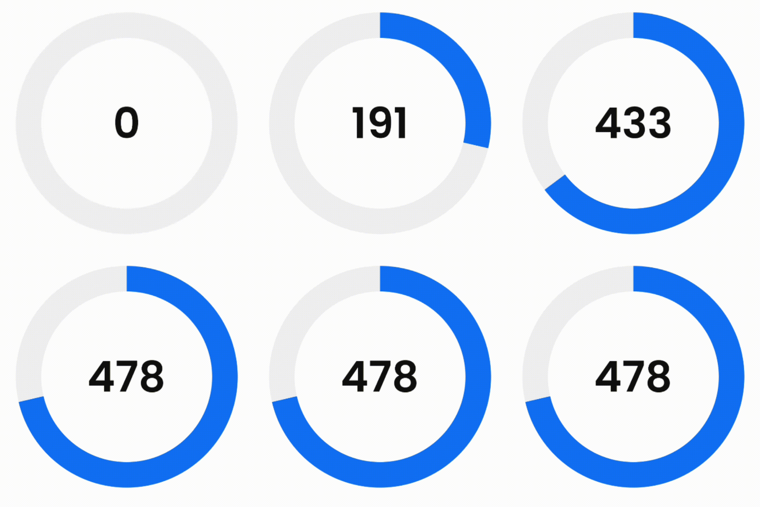
Example 1 - Simple progress bar
simple_example_gif

First of all, to access the amount of progress when doing animation, you need to define a ValueNotifier:

final ValueNotifier<double> _valueNotifier = ValueNotifier(0);

Then add it to the widget:

DashedCircularProgressBar.aspectRatio(
  aspectRatio: 1, // width ÷ height
  valueNotifier: _valueNotifier,
  progress: 478,
  maxProgress: 670,
  corners: StrokeCap.butt,
  foregroundColor: Colors.blue,
  backgroundColor: const Color(0xffeeeeee),
  foregroundStrokeWidth: 36,
  backgroundStrokeWidth: 36,
  animation: true,
  child: Center(
    child: ValueListenableBuilder(
      valueListenable: _valueNotifier,
      builder: (_, double value, __) => Text(
        '${value.toInt()}%',
        style: const TextStyle(
          color: Colors.black,
          fontWeight: FontWeight.w300,
          fontSize: 60
        ),
      ),
    ),
  ),
)
Example 2 - Dashed background progress bar
simple_example_gif
DashedCircularProgressBar.aspectRatio(
  aspectRatio: 2, // width ÷ height
  progress: 34,
  startAngle: 270,
  sweepAngle: 180,
  circleCenterAlignment: Alignment.bottomCenter,
  foregroundColor: Colors.black,
  backgroundColor: const Color(0xffeeeeee),
  foregroundStrokeWidth: 3,
  backgroundStrokeWidth: 2,
  backgroundGapSize: 2,
  backgroundDashSize: 1,
  seekColor: Colors.yellow,
  seekSize: 22,
  animation: true,
)
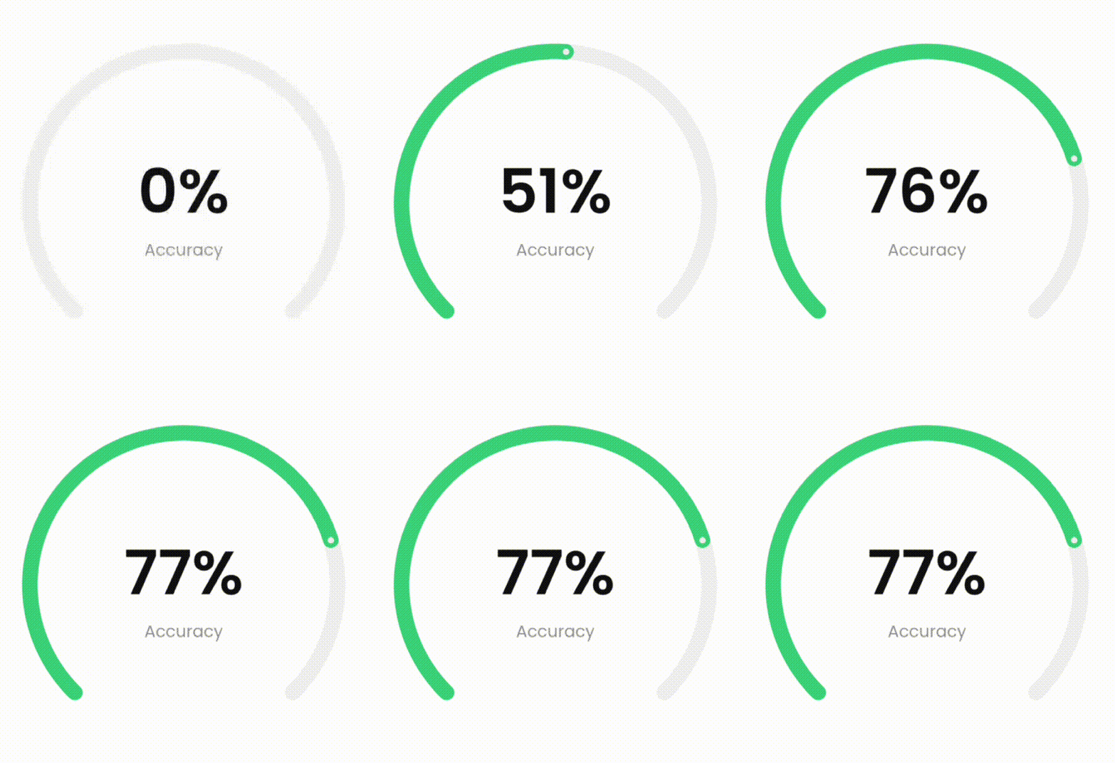
Example 3 - More complex progress bar
more_complex_example_gif
DashedCircularProgressBar.aspectRatio(
  aspectRatio: 1, // width ÷ height
  valueNotifier: _valueNotifier,
  progress: 37,
  startAngle: 225,
  sweepAngle: 270,
  foregroundColor: Colors.green,
  backgroundColor: const Color(0xffeeeeee),
  foregroundStrokeWidth: 15,
  backgroundStrokeWidth: 15,
  animation: true,
  seekSize: 6,
  seekColor: const Color(0xffeeeeee),
  child: Center(
    child: ValueListenableBuilder(
      valueListenable: _valueNotifier,
      builder: (_, double value, __) => Column(
        mainAxisSize: MainAxisSize.min,
        children: [
          Text(
            '${value.toInt()}%',
            style: const TextStyle(
              color: Colors.black,
              fontWeight: FontWeight.w300,
              fontSize: 60
            ),
          ),
          Text(
            'Accuracy',
            style: const TextStyle(
              color: Color(0xffeeeeee),
              fontWeight: FontWeight.w400,
              fontSize: 16
            ),
          ),
        ],
      )
    ),
  ),
)
Example 4 - Dashed progress bar

You can also use the desired dimensions instead of aspect ratio.

dashed_example_gif
DashedCircularProgressBar.square(
  dimensions: 350,
  progress: 180,
  maxProgress: 360,
  startAngle: -27.5,
  foregroundColor: Colors.redAccent,
  backgroundColor: const Color(0xffeeeeee),
  foregroundStrokeWidth: 7,
  backgroundStrokeWidth: 7,
  foregroundGapSize: 5,
  foregroundDashSize: 55,
  backgroundGapSize: 5,
  backgroundDashSize: 55,
  animation: true,
  child: const Icon(
    Icons.favorite,
    color: Colors.redAccent,
    size: 126
  ),
)
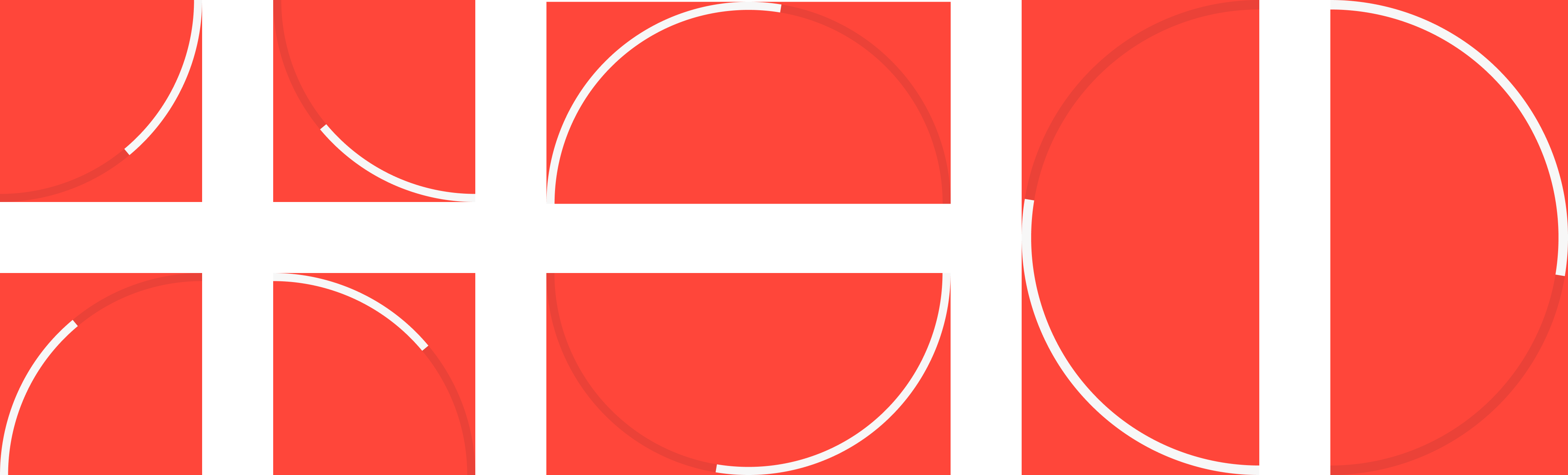
Example 5 - Play with circle center alignment

By changing the center, you can specify the location of the progress bar.

play_with_circle_center_alignment_example.png

For example to make a progress bar in the shape of the first image (first row, first image from the left):

DashedCircularProgressBar.aspectRatio(
  aspectRatio: 1, // width / height
  progress: 60,
  startAngle: 90,
  sweepAngle: 90,
  corners: StrokeCap.butt,
  foregroundStrokeWidth: 7,
  backgroundStrokeWidth: 7,
  circleCenterAlignment: Alignment.topLeft,
  foregroundColor: Colors.white,
  backgroundColor: const Color(0x22000000),
  animation: true
)

Parameters description

Parameter Default Description
width
double
0 Progress bar width.
height
double
0 Progress bar height.
aspectRatio
double
0 Progress aspect ratio.
progress
double
0 Current value of progress bar.
maxProgress
double
100 Maximum value of progress.
startAngle
double
0 The starting angle of the arc.
sweepAngle
double
360 The sweep angle of the arc.
foregroundStrokeWidth
double
2 Foreground arc thickness.
backgroundStrokeWidth
double
2 Background arc thickness.
foregroundColor
Color
Colors.blue Foreground arc color.
backgroundColor
Color
Colors.white Background arc color.
corners
StrokeCap
StrokeCap.round Styles to use for arcs endings.
foregroundGapSize
double
0 Foreground arc gap size.
foregroundDashSize
double
0 Foreground arc dash size.
backgroundGapSize
double
0 Background arc gap size.
backgroundDashSize
double
0 Background arc dash size.
seekSize
double
0 Progress bar seek size.
seekColor
Color
Colors.blue Progress bar seek color.
circleCenterAlignment
Alignment
Alignment.center Align center of progress bar.
animation
bool
false Active progress bar animation.
animationDuration
Duration
Duration(seconds: 1) Progress bar animation duration.
animationCurve
Curve
Curves.easeOut Progress bar animation curve.
onAnimationEnd
void Function()?
null This function is called when animation ended.
ltr
bool
true Specifies how to draw arcs from right to left or vice versa.
child
Widget?
null This widget is placed on the progress bar.
valueNotifier
ValueNotifier?
null Animated value notifier.

Kategorien

Quell-Repository

Projekte, die dieses Paket verwenden

Noch keine Daten verfügbar.