Aus öffentlichen Paketdaten erstellte Orientierung.
Das day_picker-Paket ist eine Flutter-Bibliothek, die die Auswahl von Tagen innerhalb einer Woche vereinfacht. Es bietet ein sauberes, anpassbares Widget, mit dem Benutzer bestimmte Wochentage auswählen können, was es ideal für Planung, Terminvereinbarungen oder wiederkehrende Ereignisse macht. Das Paket unterstützt mehrere Plattformen wie Android, iOS, Web, macOS, Windows und Linux und sorgt für konsistentes Verhalten über Geräte hinweg. Mit intuitiven UI-Komponenten und einfacher Integration über pub verbessert es die Datumsinteraktionen in Flutter-Anwendungen.
Anwendungsfälle
Wiederkehrende Ereignisse planen
Wöchentliche Planung von Routinen
Terminkalender einrichten
Benutzereinstellungen konfigurieren
Aufgabenverwaltungstools erstellen
Hauptmerkmale
Wochentag-Auswahl-Schnittstelle
Plattformübergreifende Kompatibilität
Anpassbare Benutzeroberfläche
Einfache Integration mit pub
Unterstützt alle wichtigen Flutter-Plattformen
Geeignet für
App-Entwickler, die Kalenderfunktionen erstellen
Teams, die Produktivitäts- oder Planungsanwendungen erstellen
Entwickler, die einfache Wochentag-Auswahl benötigen
Flutter-Anfänger erkunden Datumsauswahl
Hinweise
Nur Auswahl von Wochentagen begrenzt
Keine Datumsbereichsunterstützung
Enthält keine Monats-/Jahresnavigation
Am besten geeignet für wöchentlich ausgerichtete Workflows
Benötigt manuelle Behandlung der Logik ausgewählter Tage
Original-README
Originaler README-Schnappschuss aus dem verknüpften Quell-Repository. Aktuelle Inhalte finden Sie im Repository.
Day Picker
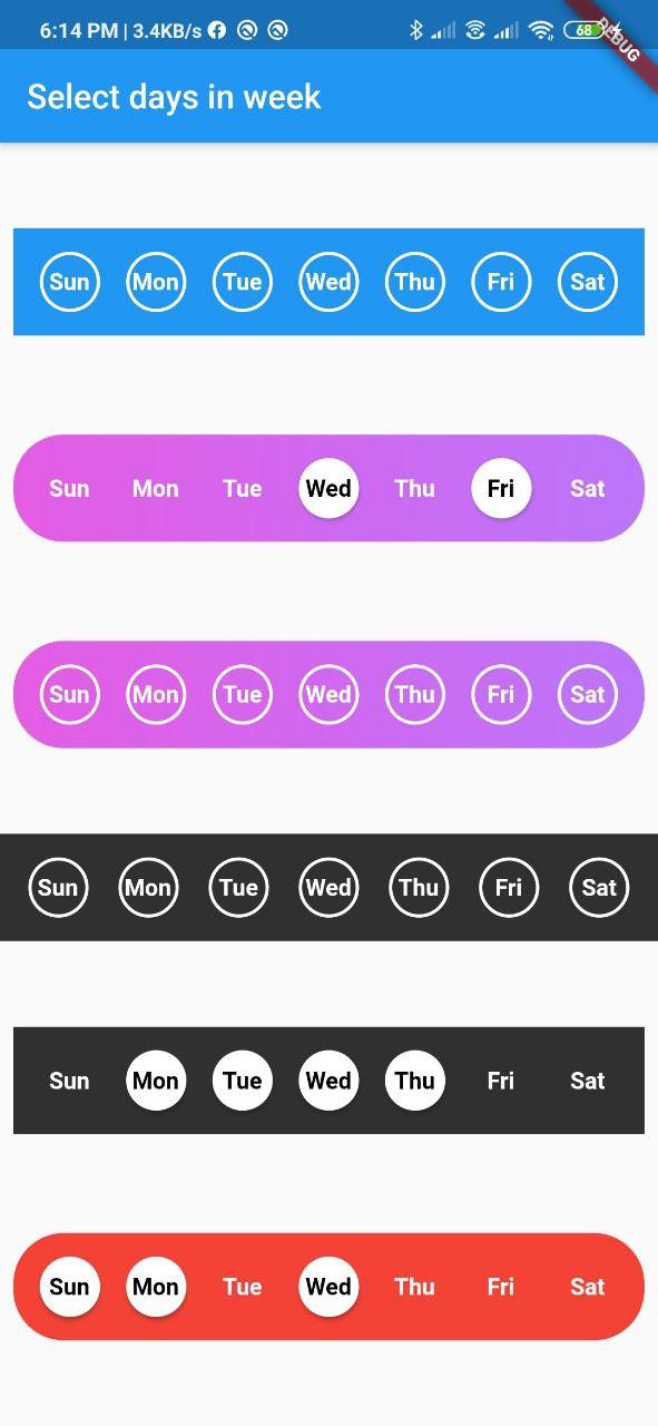
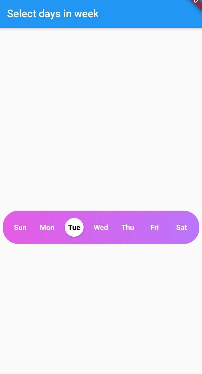
A Flutter widget library which helps us to select days in a week.
DayInWeek consist of three Properties [dayName], [dayKey] and [isSelected].
By default [isSelected] value will be false
Example:
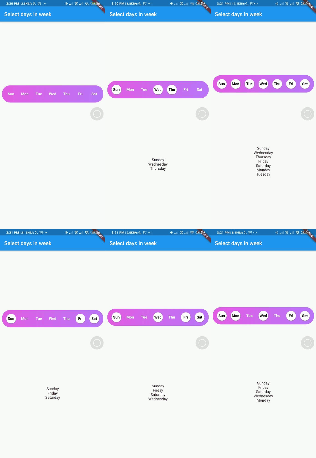
voidhandleOnSelect(List<String> days){
//TODO: Manipulate the List of days selectedprint(days);
}
Customization
Property
Type
Description
onSelect
List<String>
Callback invoked when days are selected
days
List<DayInWeek>
List of days that need to be passed
padding
double
Padding between container and the buttons [by default it is 8.0]
boxdecoration
BoxDecoration
provides variety of ways to style the background container[gradient, color, border radius]
backgroundColor
Color
Property to change the color of the container
fontSize
double
Property to change size of font
fontWeight
FontWeight
Property to change the font weight of text
daysFillColor
Color
Property to change the color of rounded buttons when the days are selected
daysBorderColor
Color
Property to change the border color of rounded button
selectedDayTextColor
Color
property to change the text color of the selected days
unSelectedDayTextColor
Color
property to change the text color when the days are not selected
border
bool
Set this property to false if border is not needed around the rounded buttons[by default this property will be true]
With the implementation of the setDaysState method, developers can dynamically modify which days are selected within their application's code, even after the SelectWeekDays widget has already been constructed.
By utilizing the Global Key that is passed into the widget, one can easily update the selected dates as desired.
Contributions
Contributions of any kind are more than welcome😊! Feel free to fork and improve day_picker or open an issue.