Pakete, Repositories und App-Kategorien suchen

Cover von dot_curved_bottom_nav
Paketdetailsv0.0.2

dot_curved_bottom_nav

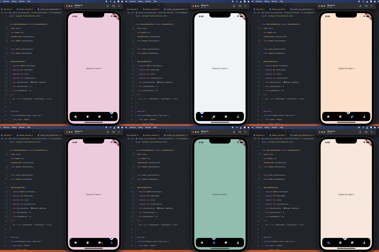
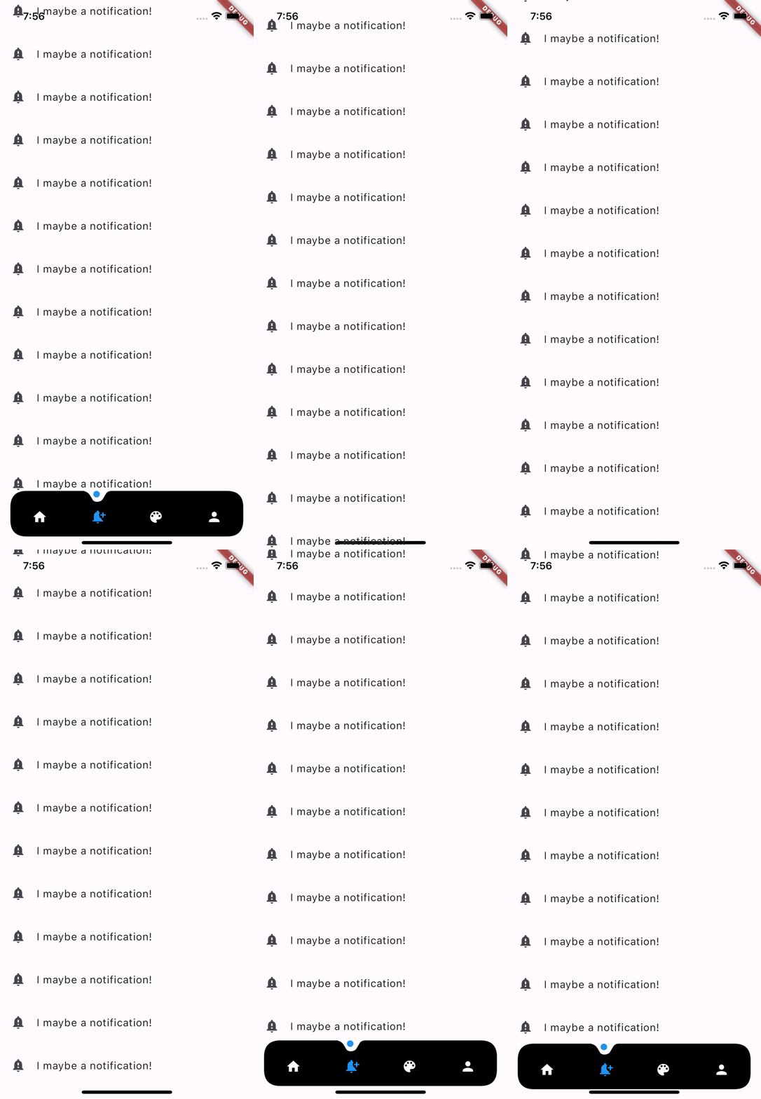
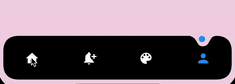
Atemberaubende animierte gekrümmte Form um die Indikator-Navigationbar. Einstellbare Farbe, Hintergrundfarbe, Animationskurve und Animationsdauer.

AndroidiOSWebmacOSWindowsLinux
30-Tage-Downloads
169
Likes
51
Pub-Punkte
150

Paket installieren

flutter pub add dot_curved_bottom_nav

Paketübersicht

Aus öffentlichen Paketdaten erstellte Orientierung.

Ein visuell beeindruckendes Flutter-Paket, das eine animierte gekrümmte Form unter dem Indikator in einer unteren Navigationsleiste erstellt. Es ermöglicht die Anpassung der Kurvenfarbe, Hintergrundfarbe, Animationskurve und Dauer und verbessert die Benutzererfahrung durch sanfte, dynamische Übergänge. Ideal für moderne App-Oberflächen, die ein poliertes, interaktives Gefühl für die untere Navigation suchen. Das Paket unterstützt alle wichtigen Plattformen, einschließlich Android, iOS, Web, macOS, Windows und Linux.

Anwendungsfälle

  • Verbesserung der App-Navigation durch animierte visuelle Rückmeldung
  • Erstellen moderner Benutzeroberflächen mit abgerundeten unteren Balken
  • Anpassen von Navigationsindikatoren mit dynamischen Animationen
  • Verbesserung der Benutzerengagement durch visuelle Aufwertung
  • Responsive Unternavigation über mehrere Plattformen gestalten

Hauptmerkmale

  • Animierte gekrümmte Form unter dem Navigationsindikator
  • Anpassbare Farbe und Hintergrundfarbe
  • Anpassbare Animationskurve und Dauer
  • Glatte, fließende Animationen
  • Plattformübergreifende Kompatibilität
  • Einfache Integration über den Befehl pub add

Geeignet für

  • UI-Designer, die fortgeschrittene Navigationseffekte suchen
  • Entwickler, die moderne mobile und Web-Apps erstellen
  • Apps, die animierte untere Navigation erfordern
  • Teams, die sich auf visuelle Aufwertung und Interaktivität konzentrieren
  • Flutter-Entwickler, die untere Navigationsleisten verwenden

Hinweise

  • Kann die Leistung auf Low-End-Geräten beeinträchtigen
  • Erfordert sorgfältige Abstimmung der Animations-Einstellungen
  • Beschränkt auf Nutzungsszenarien der unteren Navigationsleiste
  • Nicht geeignet für einfache oder minimalistische Designs
  • Abhängig von der korrekten Implementierung der Navigationsstruktur
Original-README

Originaler README-Schnappschuss aus dem verknüpften Quell-Repository. Aktuelle Inhalte finden Sie im Repository.

Stunning Curved Bottom Navigation

Title Image

Preview

Preview

Optional Hide On Scroll

Preview

Getting Started

Add the dependency at pubspec.yaml:

dependencies:
  dot_curved_bottom_nav: ^0.0.1

Basic Usage

bottomNavigationBar: DotCurvedBottomNav(
    scrollController: _scrollController,
    hideOnScroll: true,
    indicatorColor: Colors.blue,
    backgroundColor: Colors.black,
    animationDuration: const Duration(milliseconds: 300),
    animationCurve: Curves.ease,
    selectedIndex: _currentPage,
    indicatorSize: 5,
    borderRadius: 25,
    height: 70,
    onTap: (index) {
    setState(() => _currentPage = index);
    },
    items: [
    Icon(
        Icons.home,
        color: _currentPage == 0 ? Colors.blue : Colors.white,
    ),
    Icon(
        Icons.notification_add,
        color: _currentPage == 1 ? Colors.blue : Colors.white,
    ),
    Icon(
        Icons.color_lens,
        color: _currentPage == 2 ? Colors.blue : Colors.white,
    ),
    Icon(
        Icons.person,
        color: _currentPage == 3 ? Colors.blue : Colors.white,
    ),
    ],
),

Properties

Property Description
scrollController Used to listen when the user scrolls and hides the bottom navigation
hideOnScroll Used to enable or disable hide on scroll behavior. (NOTE: scrollController must be provided when hideOnScroll is TRUE)
indicatorColor Color of the indicator displayed on currently selected item
backgroundColor Configures the background color of the bottom navigation
animationDuration Configures animation duration of hiding and indicator movement between items
animationCurve Configures curve of the animation of indicator movement and hide on scroll animation
selectedIndex Configures currently selected item / page
indicatorSize Configures the size of indicator displayed on top of the item
borderRadius Configures border radius of border DotCurvedBottomNav
height Configures height of DotCurvedBottomNav
onTap Configures callback function that is invoked whenever user taps on an item
items Configures list of items of bottom nav

TODO:

  1. Add More Indicator shapes e.g diamond shape with diamond cut out and more.

Contributions

Feel free to create an issue if you find a bug or if you need new features. Of course PRs are welcome!

If you want to connect with me on LinkedIn: Muzammil Hussain


If you like this work, please consider 👍 the package and ⭐ the repo. It is appreciated.

Kategorien

Quell-Repository

Projekte, die dieses Paket verwenden

Noch keine Daten verfügbar.