Pakete, Repositories und App-Kategorien suchen

Cover von dot_navigation_bar
Paketdetailsv1.0.2

dot_navigation_bar

Einfache, fließende Animationen, die eine ansprechende und saubere UI/UX-Bottom-Navigation bereitstellen.

AndroidiOSWebmacOSWindowsLinux
30-Tage-Downloads
1200
Likes
436
Pub-Punkte
150

Paket installieren

flutter pub add dot_navigation_bar

Paketübersicht

Aus öffentlichen Paketdaten erstellte Orientierung.

Ein Flutter-Paket, das eine schlanke, animierte Bottom-Navigation-Bar mit fließenden Übergängen und einem sauberen UI/UX-Design liefert. Es verbessert die App-Navigation durch subtile punktbasierte Indikatoren und bietet eine elegante Alternative zu herkömmlichen Tab-Bars. Ideal für Apps, die moderne, minimalistische Navigationsmuster über mehrere Plattformen hinweg suchen. Das Paket unterstützt alle wichtigen Plattformen, einschließlich Android, iOS, Web, macOS, Windows und Linux, um eine konsistente Benutzererfahrung sicherzustellen. Mit minimalem Setup über pub add lässt es sich nahtlos in bestehende Projekte integrieren.

Anwendungsfälle

  • Mobile App-Navigation
  • Webanwendungs-Schnittstellen
  • Plattformübergreifende Desktop-Anwendungen
  • Minimale Benutzeroberflächendesigns
  • Verbesserte Benutzererfahrung durch Animationen

Hauptmerkmale

  • Glatte Animationen
  • Sauberer punktbasierter Design
  • Plattformübergreifende Unterstützung
  • Einfache Integration
  • Anpassbare Erscheinung
  • Reaktives Layout

Geeignet für

  • Entwickler, die UI/UX priorisieren
  • Apps mit einfachen Navigationsanforderungen
  • Projekte, die leichte Komponenten erfordern
  • designorientierte Anwendungen
  • Multiplattform-Flutter-Apps

Hinweise

  • Eingeschränkte Anpassung über die grundlegende Gestaltung hinaus
  • Passt möglicherweise nicht zu komplexen Navigationsstrukturen
  • Am besten für Apps mit 3–5 Registerkarten
  • Nicht ideal für hochinteraktive Navigationsleisten
  • Erfordert sorgfältige Planung des Farbkontrasts

Original-README

Originaler README-Schnappschuss aus dem verknüpften Quell-Repository. Aktuelle Inhalte finden Sie im Repository.

Dot Navigation Bar


undefined undefined
undefined undefined undefined undefined undefined
undefined undefined

A bottom navigation bar that you can customize with the options you need, without any limits. You can also customize the appearance of the navigation bar with simple smooth animations, providing a nice and clean UI/UX.

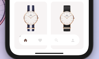
style1 Example flutter project


NEW


  • Round nav bar
  • Example file
  • Floating nav bar
  • shadow to Floating nav bar

Getting Started

To install, add it to your pubspec.yaml file:

dependencies:
    dot_navigation_bar:

import 'package:dot_navigation_bar/dot_navigation_bar.dart';

How to use it

call DotNavigationBar's constructor:

If you want to show body behind the navbar, it should be true

      extendBody: true,

if you are not intersted inmaking round nav bar with show body behind the navbar you have to make that

      extendBody: false,
Widget build(BuildContext context) {
  return Scaffold(
    body: Center(),
    extendBody: true,//<------like this 
    bottomNavigationBar:  DotNavigationBar(
          currentIndex: _SelectedTab.values.indexOf(_selectedTab),
          onTap: _handleIndexChanged,
          dotIndicatorColor: Colors.black,
          // enableFloatingNavBar: false
          items: [
            
            
          ],
        ),
  );
}

basic implementation

   Widget build(BuildContext context) {
    return Scaffold(
      body: Container(
        child: Image.asset("assets/IMG.png"),
      ),
      bottomNavigationBar:  DotNavigationBar(
          currentIndex: _SelectedTab.values.indexOf(_selectedTab),
          onTap: _handleIndexChanged,
          // dotIndicatorColor: Colors.black,
          items: [
            /// Home
            DotNavigationBarItem(
              icon: Icon(Icons.home),
              selectedColor: Colors.purple,
            ),

            /// Likes
            DotNavigationBarItem(
              icon: Icon(Icons.favorite_border),
              selectedColor: Colors.pink,
            ),

            /// Search
            DotNavigationBarItem(
              icon: Icon(Icons.search),
              selectedColor: Colors.orange,
            ),

            /// Profile
            DotNavigationBarItem(
              icon: Icon(Icons.person),
              selectedColor: Colors.teal,
            ),
            
          ],
        ),
    );
  }

The constructor has 18 attributes related to the Widget:

  • items: A list of tabs to display, ie Home, Profile,Cart, etc
  • currentIndex: The tab to display.
  • onTap:Returns the index of the tab that was tapped.
  • selectedItemColor:The color of the icon and text when the item is selected.
  • unselectedItemColor: The color of the icon and text when the item is not selected.
  • margin:A convenience field for the margin surrounding the entire widget.
  • itemPadding:The padding of each item.
  • duration: The transition duration.
  • curve: The transition curve.
  • dotIndicatorColor:The color of the Dot indicator.
  • marginR:margin for the bar to give some radius .
  • paddingR:padding for the bar to give some radius.
  • borderRadius:border radius for nav bar.
  • backgroundColor:bgd colors for the nav bar.
  • boxShadow: floating nav bar shadow ,it takes List of BoxShadow
  • enableFloatingNavBar: make Floating nav bar enabled.
  • enablePaddingAnimation: enable the animation on item during item change.
  • splashColor: Color of the item's Splash Color. To disable, use Colors.transparent.

default values

marginR = const EdgeInsets.symmetric(horizontal: 50, vertical: 20),

paddingR = const EdgeInsets.only(bottom: 5, top: 10),

borderRadius = 30,

backgroundColor = Colors.white, enableFloatingNavBar=true, enablePaddingAnimation=true

Contributors

@iamvivekkaushik @buraktabn @Zheng Xiangrui

Kategorien

Quell-Repository

Projekte, die dieses Paket verwenden
