Pakete, Repositories und App-Kategorien suchen

Cover von drop_down_list
Paketdetailsv2.1.1

drop_down_list

Ein anpassbarer Dropdown-Widget, der Einzel- und Mehrfachauswahl unterstützt, mit integrierter Suche in einem Bottom-Sheet und generischem Support für flexible, typensichere Behandlung benutzerdefinierter Daten.

AndroidiOSWebmacOSWindowsLinux
30-Tage-Downloads
3200
Likes
350
Pub-Punkte
150

Paket installieren

flutter pub add drop_down_list

Paketübersicht

Aus öffentlichen Paketdaten erstellte Orientierung.

Ein flexibler und anpassbarer Dropdown-Widget für Flutter, der sowohl Einzel- als auch Mehrfachauswahl unterstützt. Er verfügt über eine integrierte Suchleiste in einer Bottom-Sheet, die eine effiziente Filterung von Optionen ermöglicht. Das Paket bietet generische Typsicherheit zur Verarbeitung benutzerdefinierter Datentypen und sorgt so für robusten und wartbaren Code. Für den Einsatz auf mehreren Plattformen konzipiert, funktioniert es nahtlos unter Android, iOS, Web, macOS, Windows und Linux. Ideal für Formulare, Filter und Einstellungen, bei denen Benutzer aus einer Liste mit verbesserter Benutzerfreundlichkeit auswählen müssen.

Anwendungsfälle

  • Formularingaben mit dynamischen Optionen
  • Große Datensätze filtern
  • Einstellungspanels mit wählbaren Einstellungen
  • Mehrfachauswahl-Menüs in Dashboards
  • Durchsuchbare Listen in mobilen und Web-Anwendungen

Hauptmerkmale

  • Unterstützt Einzel- und Mehrfachauswahl
  • Integrierter durchsuchbarer Bottom Sheet
  • Generische Typsicherheit für benutzerdefinierte Daten
  • Plattformübergreifende Kompatibilität
  • Anpassbare Stilisierung und Verhalten
  • Flexible Datenverarbeitung mit Typsicherheit

Geeignet für

  • Entwickler, die formularintensive Anwendungen erstellen
  • Teams, die wiederverwendbare Dropdown-Komponenten benötigen
  • Projekte, die eine durchsuchbare Auswahl erfordern
  • Anwendungen für mehrere Plattformen
  • Benutzer, die sicherere Dropdown-Logik wünschen

Hinweise

  • Erfordert die Integration mit einem Bottom-Sheet für die Suchfunktion
  • Für komplexe Benutzeroberflächen kann zusätzliche Styling erforderlich sein
  • Am besten geeignet für moderate bis große Optionssätze
  • Eingeschränkte integrierte Überprüfung außer Auswahl
  • Hängt von externen Abhängigkeiten ab, um vollständige Anpassung zu ermöglichen

Original-README

Originaler README-Schnappschuss aus dem verknüpften Quell-Repository. Aktuelle Inhalte finden Sie im Repository.

drop_down_list

Flutter Website Dart Website MIT License

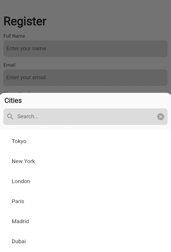
A customizable dropdown widget supporting single/multiple selection, integrated search in a bottom sheet, generic support for flexible, type-safe handling of custom data.

Preview

Dropdown with a Multiple Selection

drop_down_with_multiple_selection

Dropdown with a Single Selection

drop_down_with_single_selection

Basic Usage

Import it to your project file

import 'package:drop_down_list/drop_down_list.dart';

And add it in its most basic form like it:

DropDownState<String>(
  dropDown: DropDown<String>(
    data: <SelectedListItem<String>>[
      SelectedListItem<String>(data: 'Tokyo'),
      SelectedListItem<String>(data: 'New York'),
      SelectedListItem<String>(data: 'London'),
    ],
    onSelected: (selectedItems) {
      List<String> list = [];
      for (var item in selectedItems) {
        list.add(item.data);
      }
      ScaffoldMessenger.of(context).showSnackBar(
        SnackBar(
          content: Text(
            list.toString(),
          ),
        ),
      );
    },
  ),
).showModal(context);

Required parameters of DropDown

Parameter Description
List<SelectedListItem<T>> data The list of generic data items to be displayed in the dropdown

Optional parameters of DropDown

Parameter Description
ItemSelectionCallBack<T>? onSelected A callback function triggered when items are selected from the list
ListItemBuilder<T>? listItemBuilder A function that takes an [index] and [dataItem] as a parameter and returns a custom widget to display for the list item at that index
int? maxSelectedItems The maximum number of items that can be selected when [enableMultipleSelection] is true
VoidCallback? onMaxSelectionReached A callback function triggered when the maximum selection limit is reached
EdgeInsets? listViewPadding The padding applied to the ListView that contains the dropdown items
Widget? listViewSeparatorWidget The widget used as a separator between items in the dropdown list
EdgeInsets? listTileContentPadding The padding applied to the content of each ListTile in the dropdown list
BottomSheetListener? bottomSheetListener A listener that monitors events bubbling up from the BottomSheet
EdgeInsets? dropDownPadding The padding applied to the dropdown container
EdgeInsets? dropDownHeaderPadding The padding applied to the dropdown header
Widget? bottomSheetTitle The widget displayed as the title of the bottom sheet
ButtonStyle? submitButtonStyle Defines a button style to display as the style of the submit button when [enableMultipleSelection] is true
ButtonStyle? clearButtonStyle Defines a button style to display as the style of the clear button when [enableMultipleSelection] is true
EdgeInsets? searchTextFieldPadding The padding applied to the search text field
TextFormField? searchWidget Defines a custom widget to display the text box for searching
EdgeInsets? selectAllTextButtonPadding The padding applied to the "select all" and "deselect all" TextButtons
Widget? selectAllTextButtonChild Defines a custom widget to display as the child of the selectAll text button when [enableMultipleSelection] and [isSelectAllVisible] is true
Widget? deSelectAllTextButtonChild Defines a custom widget to display as the child of the deSelectAll text button when [enableMultipleSelection] and [isSelectAllVisible] is true
SearchDelegate<T>? searchDelegate A delegate used to configure the custom search functionality in the dropdown

Optional parameters of DropDown with Default value

Parameter Default Description
bool enableMultipleSelection false Enables single or multiple selection for the drop down list items
Color listTileColor Colors.transparent Defines the background color of each ListTile in the dropdown list
Widget selectedListTileTrailingWidget Icon(Icons.check_box) The widget displayed as a trailing icon when a list item is selected
Widget deSelectedListTileTrailingWidget Icon(Icons.check_box_outline_blank) The widget displayed as a trailing icon when a list item is not selected
bool useRootNavigator false Specifies whether a modal bottom sheet should be displayed using the root navigator
bool enableDrag true Specifies whether the bottom sheet can be dragged up and down and dismissed by swiping downwards
bool isDismissible true Specifies whether the bottom sheet will be dismissed when the user taps on the scrim
double initialChildSize 0.7 The initial fractional value of DraggableScrollableSheet
double minChildSize 0.3 The minimum fractional value of DraggableScrollableSheet
double maxChildSize 0.9 The maximum fractional value of DraggableScrollableSheet
Color dropDownBackgroundColor Colors.transparent Sets the background color of the dropdown
String submitButtonText 'Submit' Specifies the text displayed on the submit button when [enableMultipleSelection] is true
String clearButtonText 'Clear' Specifies the text displayed on the clear button when [enableMultipleSelection] is true
bool isSearchVisible true Controls the visibility of the search widget
String searchHintText 'Search' Specifies the text displayed on the search widget as hint text
Color searchFillColor Colors.black12 This is the fill color for the input field
Color searchCursorColor Colors.black This is the cursor color for the input field
bool isSelectAllVisible true Controls the visibility of the "select all" widget when [enableMultipleSelection] is true
String selectAllButtonText 'Select All' Specifies the text displayed on the selectAll text button when [enableMultipleSelection] and [isSelectAllVisible] is true
String deSelectAllButtonText 'Deselect All' Specifies the text displayed on the deSelectAll text button when [enableMultipleSelection] and [isSelectAllVisible] is true

Required parameters of DropDownState

Parameter Description
DropDown<T> dropDown The DropDown configuration object that defines the behavior, appearance, and other properties of the dropdown menu

Optional parameters of DropDownState

Parameter Description
ShapeBorder? shapeBorder The shape of the bottom sheet

Method of DropDownState

Method Description
void showModal(BuildContext context) Displays the dropdown menu as a modal bottom sheet

Guideline for contributors

  • Contributions to our repository are always welcome! We encourage contributors to submit pull requests for development and improvements.

Guideline for Reporting an Issue or Feature Request

To help us better understand and resolve the issue, please include the following details when reporting:

  • Library version
  • Code snippet
  • Logs (if applicable)
  • Device specifications (e.g., manufacturer, OS version)
  • Screenshot or video with steps to reproduce the issue
  • Any other relevant libraries used

LICENSE!

drop_down_list is MIT-licensed.

Let us know!

We’d be really happy if you send us links to your projects where you use our open-source libraries. Just send an email to [sales@mindinventory.com](mailto:sales@mindinventory.com) And do let us know if you have any questions or suggestion regarding our work.

Visit our website mindinventory.com

Let us know if you are interested to building Apps or Designing Products.

flutter app development

Kategorien

Quell-Repository

Projekte, die dieses Paket verwenden

Noch keine Daten verfügbar.