Pakete, Repositories und App-Kategorien suchen

Cover von dropdown_textfield
Paketdetailsv1.2.0

dropdown_textfield

Ein DropdownTextField ist ein Material-Design-TextField. Die DropdownButton ist ein Widget, das wir verwenden können, um einen eindeutigen Wert oder mehrere Werte aus einer Menge von Werten auszuwählen.

AndroidiOSWebmacOSWindowsLinux
30-Tage-Downloads
5950
Likes
181
Pub-Punkte
140

Paket installieren

flutter pub add dropdown_textfield

Paketübersicht

Aus öffentlichen Paketdaten erstellte Orientierung.

DropdownTextfield ist ein Flutter-Paket, das einen TextField mit einem DropdownButton kombiniert und Benutzern ermöglicht, aus einer Liste in einer Material-Design-Oberfläche einen oder mehrere Werte auszuwählen. Es verbessert Formulareingaben, indem es eine intuitive Dropdown-Auswahl innerhalb eines Texteingabefelds bereitstellt. Das Widget unterstützt sowohl die Auswahl einzelner als auch mehrerer Werte und ist somit für dynamische Dateneingabeszenarien geeignet. Es ist auf allen wichtigen Plattformen einschließlich Android, iOS, Web, macOS, Windows und Linux kompatibel.

Anwendungsfälle

  • Formulareingaben mit auswählbaren Optionen
  • Mehrfachauswahl-Dropdowns in Formularen
  • Material-Design-konforme Auswahlfelder
  • Dynamische Datenfilterung
  • Benutzerfreundliche Wertauswahl-Schnittstellen

Hauptmerkmale

  • Einzelwert- und Mehrfachauswahl
  • Material-Design-Integration
  • Plattformübergreifende Kompatibilität
  • Anpassbare Dropdown-Elemente
  • Einfache Integration mit bestehenden Formularen

Geeignet für

  • Entwickler, die formularintensive Apps erstellen
  • Designer, die material-konforme Widgets suchen
  • Apps mit flexiblen Auswahl-Eingaben
  • Plattformübergreifende Flutter-Projekte
  • UI-Komponenten, die Dropdown-Funktionalität benötigen

Hinweise

  • Erfordert angemessenes Zustandsmanagement für Mehrfachauswahl
  • Könnte Anpassungen der Gestaltung für benutzerdefinierte Themen erfordern
  • Beschränkt auf vordefinierte Wertmengen
  • Nicht ideal für sehr große Datensätze
  • Abhängig von den Layoutbeschränkungen des übergeordneten Widgets
Original-README

Originaler README-Schnappschuss aus dem verknüpften Quell-Repository. Aktuelle Inhalte finden Sie im Repository.

Flutter DropdownTextfield

A DropdownTextfield is a Material Design TextField. The DropDownButton is a widget that can be used to select one unique value or multiple values from a set of options.

Key Features

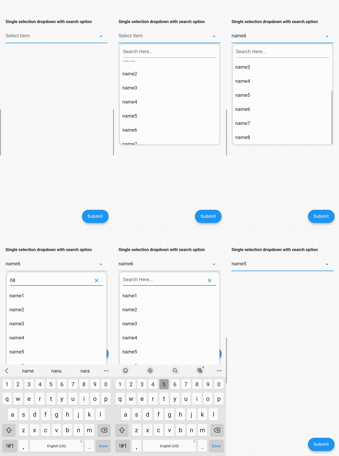
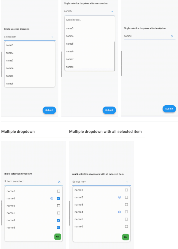
  1. Searchable dropdown
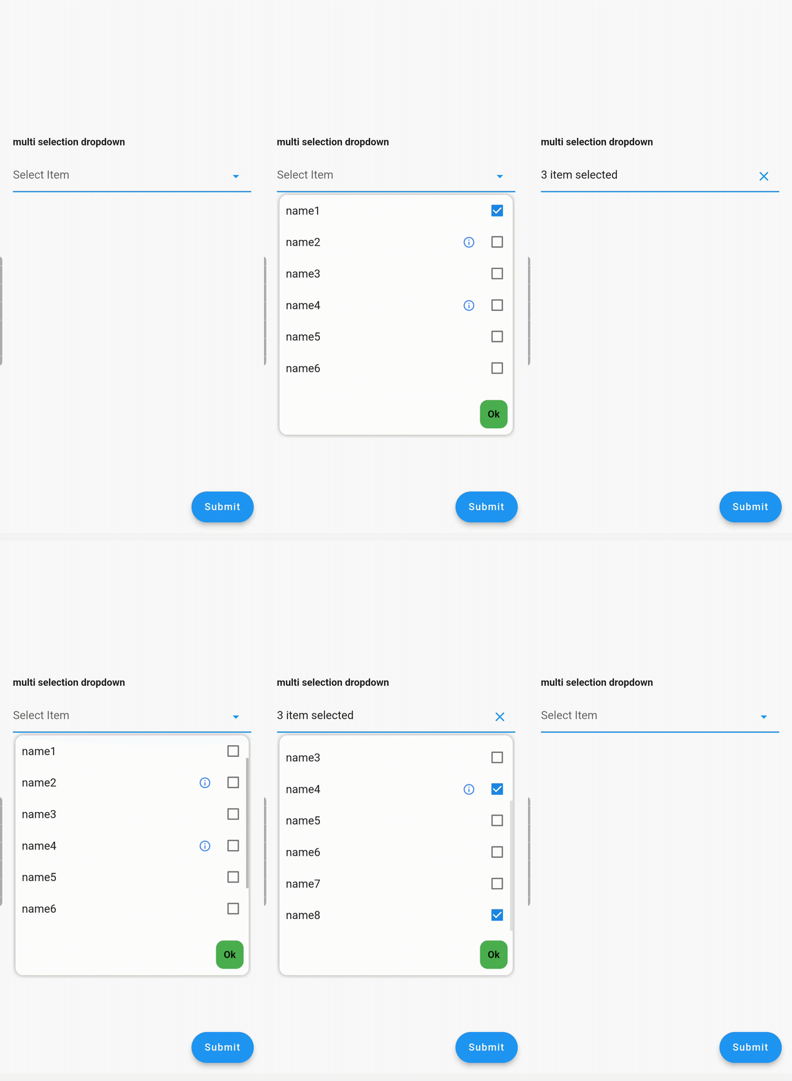
  2. Single & multi-selection
  3. Material dropdown
  4. Easily customizable UI
  5. Easy implementation into StatelessWidget
  6. ToolTip dialogue for multi-selection dropdown items

Examples

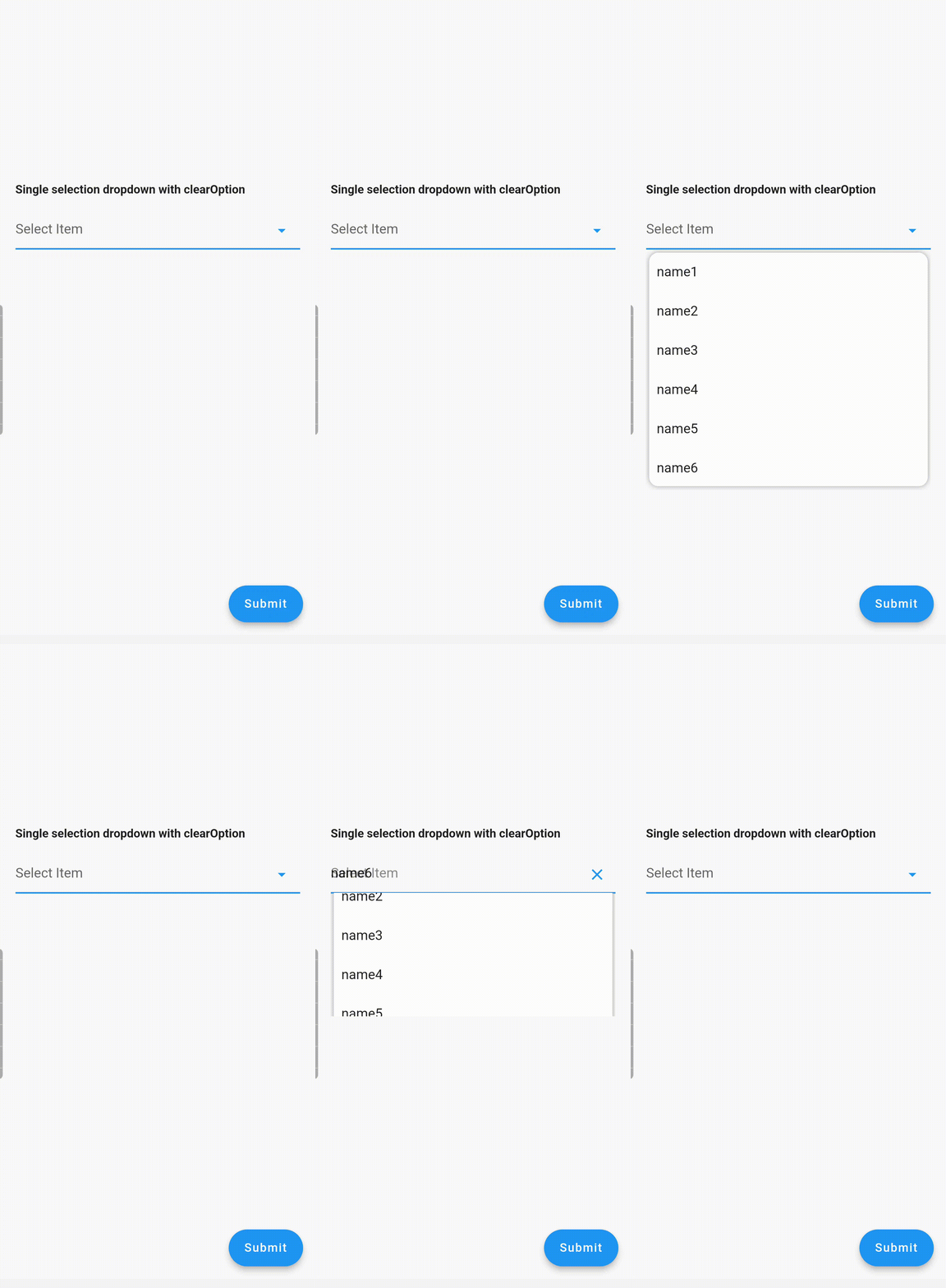
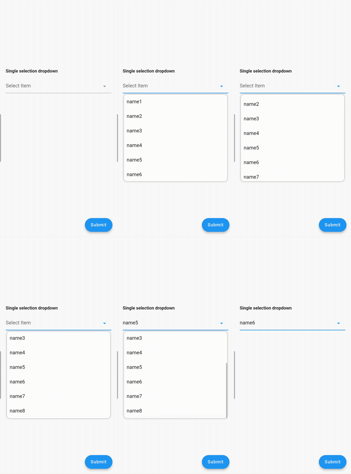
Single Dropdown Single Dropdown with Search Option Single Dropdown with Clear Option
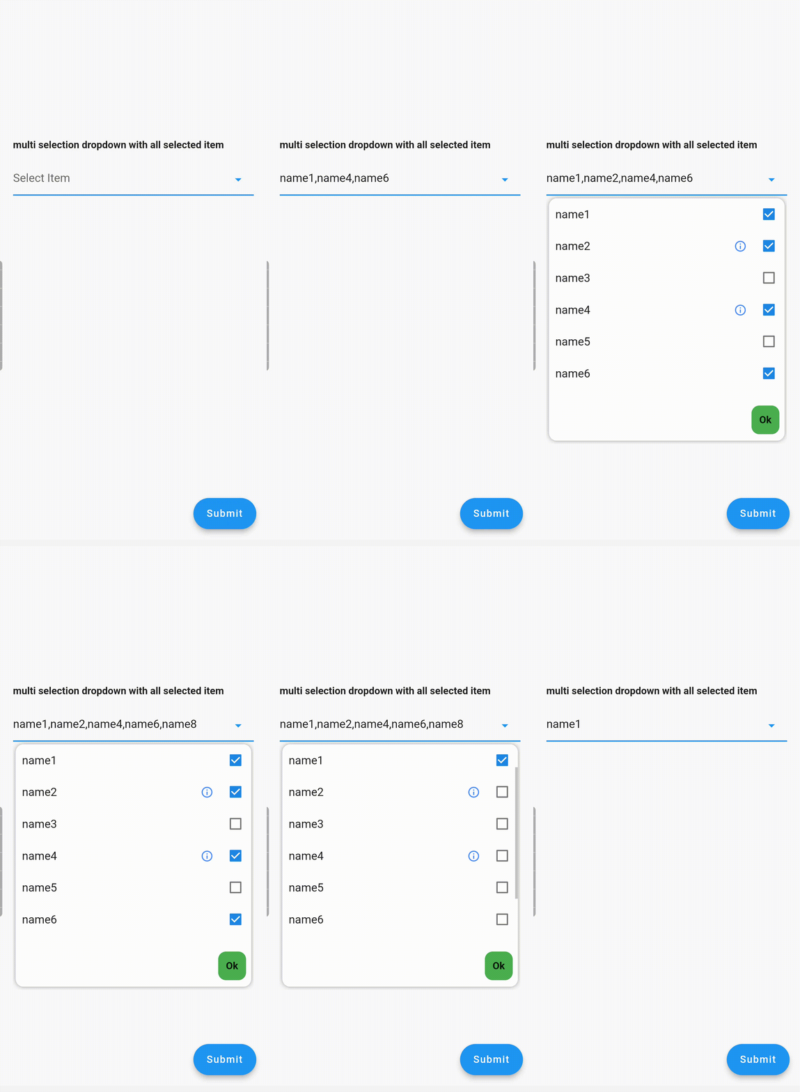
Multiple Dropdown Multiple Dropdown with All Selected Items

Usage

Controllers

You need to use SingleValueDropDownController for single dropdown and MultiValueDropDownController for multiple dropdown.

Properties
  • dropdownRadius: Defines the radius of the dropdown list. Default value is 12.
  • boxDecoration: Add custom BoxDecoration to decorate the dropdown container styling
  • boxMargin: Add custom margins to the dropdown container and override the default vertical: 5, horizontal: 4 margins
  • initialValue: Sets the initial value. If null or not in the dropDownList, it will not display any value.
  • dropDownList: A list of dropdown values of type <DropDownValueModel>.
  • onChanged: Listens for item selection changes. Returns a single DropDownValueModel object for single selection dropdown, and a list of DropDownValueModel objects for multi-selection dropdown.
  • textFieldDecoration: Overrides the default text field decoration.
  • dropDownIconProperty: Customizes the dropdown icon size and color.
  • isEnabled: Set to false to disable the text field. Default value is true.
  • enableSearch: Set to true to enable the search option in the dropdown. Currently available only for single selection dropdown.
  • displayCompleteItem: Set to true to display the complete list of selected items in the text field. Otherwise, it will display as "number_of_items selected".
  • dropDownItemCount: Maximum number of dropdown items to display. Default value is 6.
  • searchKeyboardType: Overrides the default search keyboard type. Applicable only if enableSearch=true.
  • searchTextStyle: Text style for the search text field.
  • searchAutofocus: Set to true to autofocus the search text field. Applicable only if enableSearch=true. Default value is false.
  • searchShowCursor: Set to false to hide the cursor from the search text field. Applicable only if enableSearch=true.
  • clearOption: Set to false to hide the clear suffix icon button from the text field.
  • clearIconProperty: Customizes the clear icon size and color.
  • listSpace: Space between the text field and the list. Default value is 0.
  • listPadding: Padding for dropdown list items.
  • submitButtonText: Text for the multi-dropdown submit button.
  • submitButtonColor: Color of the multi-dropdown submit button.
  • submitButtonTextStyle: Text style for the multi-dropdown submit button.
  • listTextStyle: Text style for dropdown list items.
  • checkBoxProperty: Customizes the properties of multiple checkboxes.

Contributing

Seeking contributions to improve the DropdownTextfield! If you have ideas for new features, optimizations, or bug fixes, please feel free to open a pull request or issue on our GitHub repository. Your contributions are greatly appreciated and will help make this package even better.

Kategorien

Abhängigkeiten

Abhängigkeiten 2 Einträge

Quell-Repository

Projekte, die dieses Paket verwenden

Noch keine Daten verfügbar.