Pakete, Repositories und App-Kategorien suchen

Cover von dynamic_tabbar
Paketdetailsv1.0.9

dynamic_tabbar

Flutter-Paket zur einfachsten Handhabung dynamischer Registerkarten (TabBar und TabBarView).

AndroidiOSWeb
30-Tage-Downloads
3600
Likes
125
Pub-Punkte
150

Paket installieren

flutter pub add dynamic_tabbar

Paketübersicht

Aus öffentlichen Paketdaten erstellte Orientierung.

Ein Flutter-Paket, das die Erstellung und Verwaltung dynamischer Registerkarten mit TabBar und TabBarView vereinfacht. Es ermöglicht Entwicklern, Registerkarten zur Laufzeit einfach hinzuzufügen, zu entfernen oder zu aktualisieren, ohne kompliziertes Zustandsmanagement. Das Paket verwaltet Navigation zwischen Registerkarten, Ansichtswechsel und Zustandsbeibehaltung nahtlos, wodurch es ideal für Apps mit flexiblen Registerkartenlayouts ist. Mit Fokus auf Einfachheit reduziert es Boilerplate-Code und steigert die Produktivität der Entwickler. Kompatibel mit Android, iOS und Web-Plattformen.

Anwendungsfälle

  • Dynamische Dashboardschnittstellen erstellen
  • Erstellen einer anpassbaren Registerkarten-Navigation
  • Benutzergetriebene Tab-Hinzufügung und -Entfernung implementieren
  • Entwicklung von Mehrseiten-Inhaltsansichten
  • Unterstützung von Echtzeit-Tab-Aktualisierungen

Hauptmerkmale

  • Laufzeit-Tab-Manipulation
  • Automatische Zustandsbeibehaltung
  • Minimale Boilerplate-Code
  • Plattformübergreifende Unterstützung (Android, iOS, Web)
  • Einfache API zum Hinzufügen/Entfernen von Registerkarten

Geeignet für

  • Entwickler, die eine einfache Registerkartenverwaltung suchen
  • Apps mit variabler Registeranzahl
  • Dynamische Benutzeroberflächen mit reaktiven Tabs
  • Anfänger lernen Flutter-Tab-Muster
  • Projekte, die leichte Tab-Lösungen benötigen

Hinweise

  • Begrenzte Anpassung über die grundlegende Tab-Stilisierung hinaus
  • Keine integrierte Unterstützung für Wischgesten
  • Erfordert manuelle Behandlung der tab-spezifischen Logik
  • Nicht ideal für sehr komplexe Tab-Hierarchien
  • Abhängig von externer Zustandsverwaltung für erweiterte Anwendungsfälle

Original-README

Originaler README-Schnappschuss aus dem verknüpften Quell-Repository. Aktuelle Inhalte finden Sie im Repository.

dynamic_tabbar

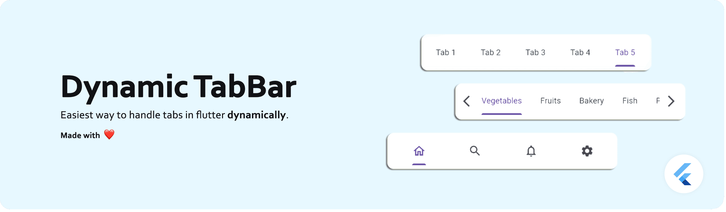
Dynamic TabBar

A Flutter package that simplifies the implementation of dynamic TabBar in your application.

With DynamicTabBarWidget, users can effortlessly manage and navigate through a list of Tabs. The widget is designed to auto-update as Tabs are added or removed, providing a seamless and dynamic user experience.

🚀 Demo: Dynamic Tabbar

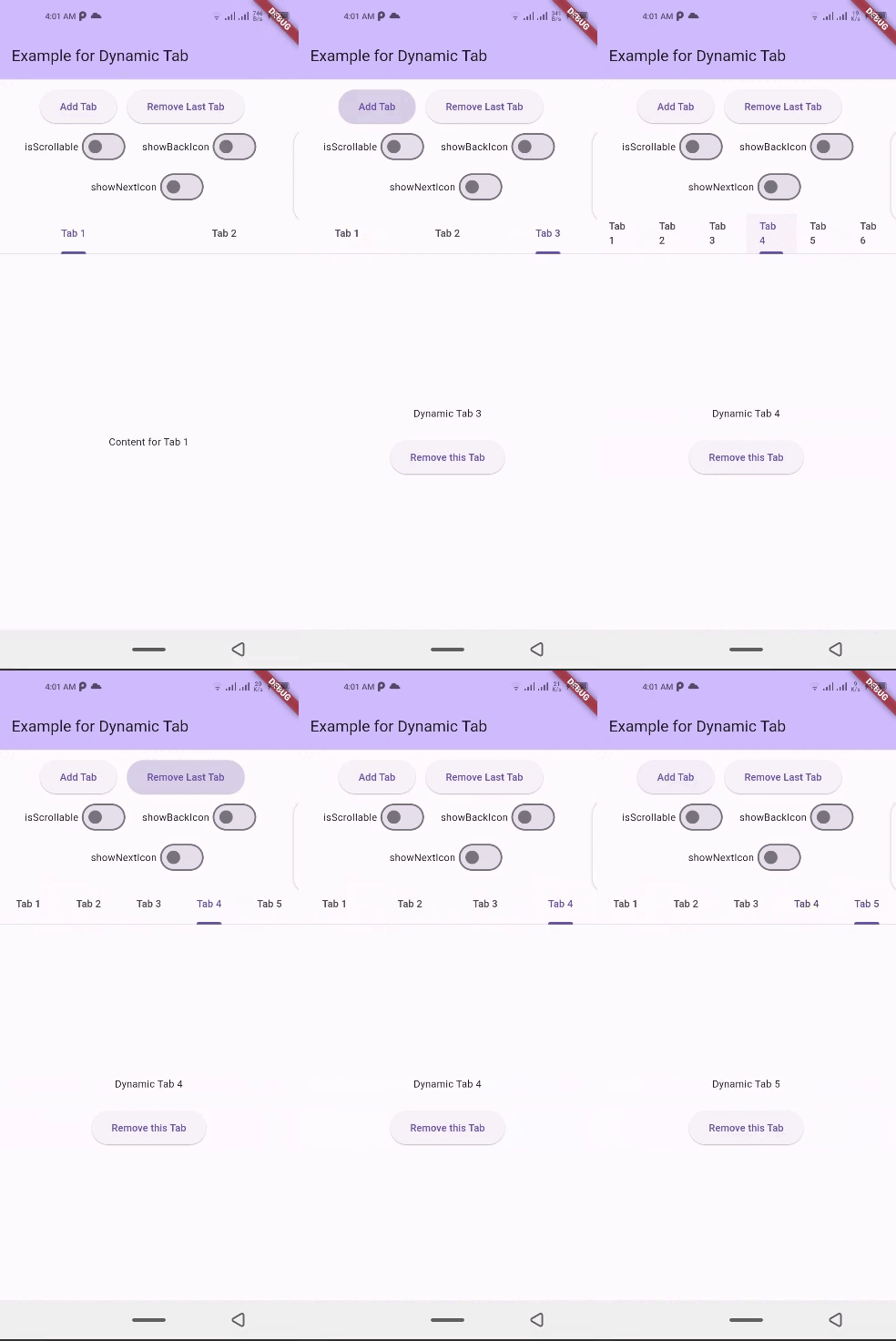
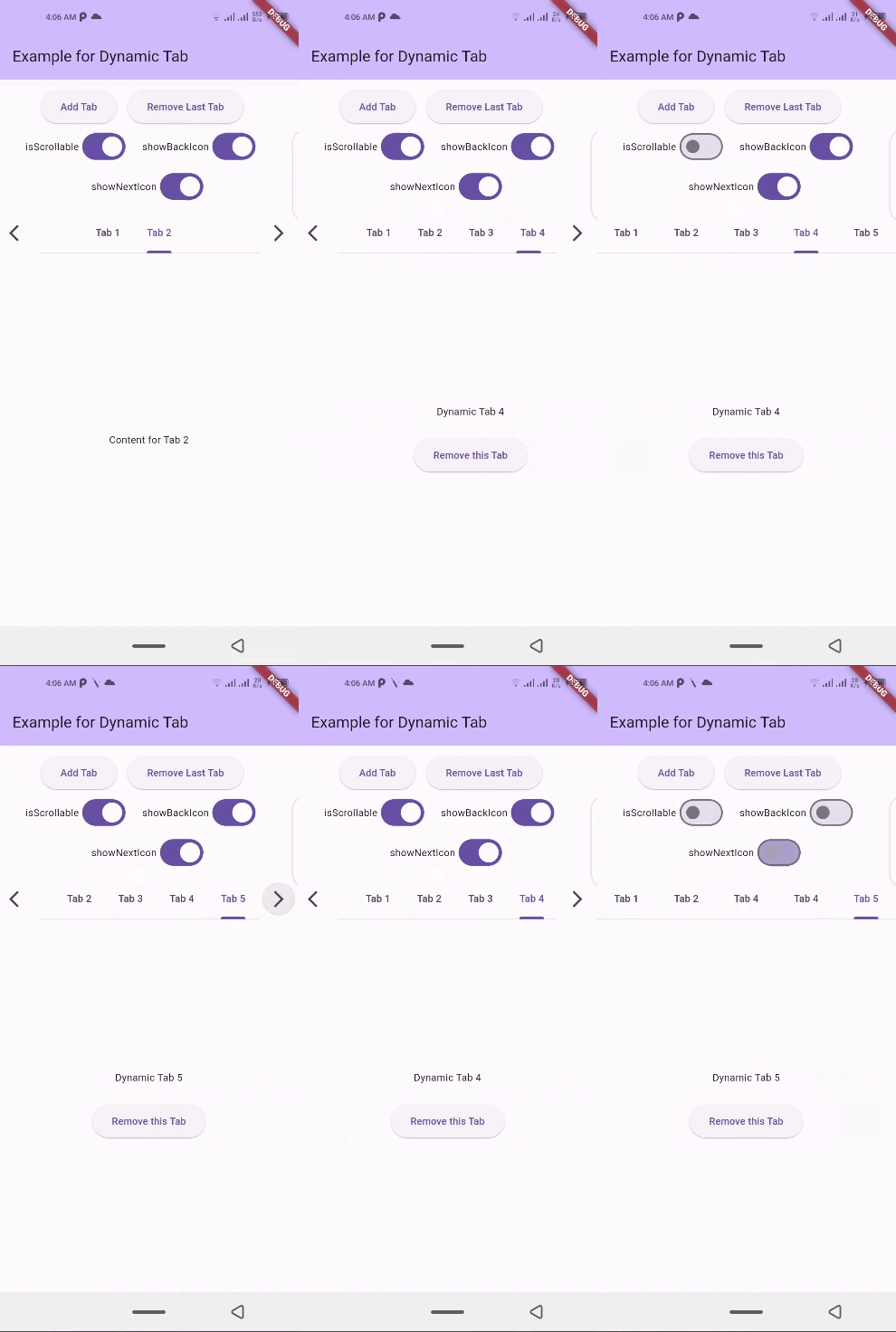
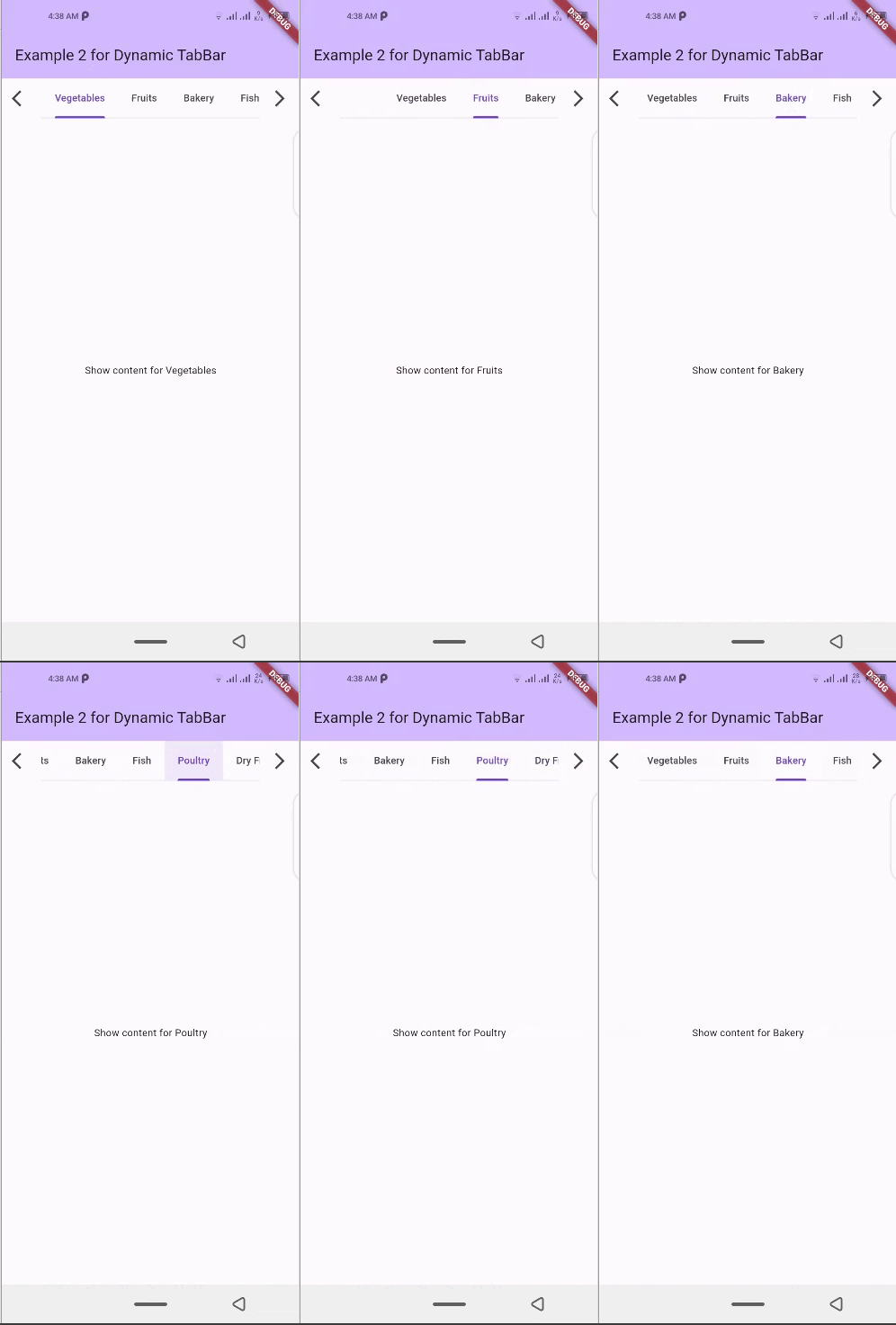
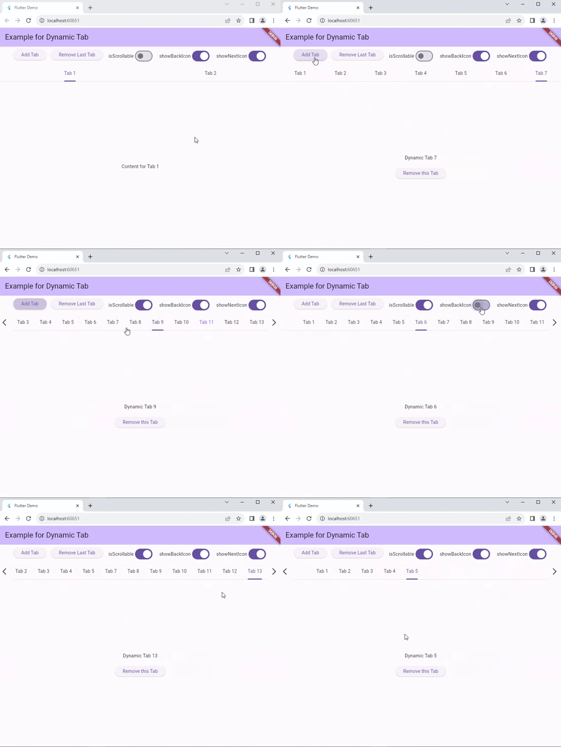
📱 Screenshots

dynamic_tabbar Demo 1 dynamic_tabbar Demo 2 dynamic_tabbar Demo 4 dynamic_tabbar Web Demo

🛠 Installation

  1. Add dependency to pubspec.yaml file:
    Get the latest version from the 'Installing' tab on pub.dev
dependencies:
  dynamic_tabbar: ^latest_version
  1. Import the package
import 'package:dynamic_tabbar/dynamic_tabbar.dart';
  1. Adding DynamicTabBarWidget

With required parameters

 DynamicTabBarWidget(
    dynamicTabs: tabs,
);

With optional parameters

 DynamicTabBarWidget(
    dynamicTabs: tabs,
    isScrollable: isScrollable,
    onTabControllerUpdated: (controller) {},
    onTabChanged: (index) {},
    onAddTabMoveTo: MoveToTab.last,
    onAddTabMoveToIndex : null,
    backIcon: Icon(Icons.arrow_back),
    nextIcon: Icon(Icons.arrow_forward),
    showBackIcon: showBackIcon,
    showNextIcon: showNextIcon,
    leading : leadingWidget,
    trailing : trailingWidget,

    // Default Tab properties can also be updated
    padding: padding,
    indicatorColor: indicatorColor,
    automaticIndicatorColorAdjustment: automaticIndicatorColorAdjustment,
    indicatorWeight: indicatorWeight,
    indicatorPadding: indicatorPadding,
    indicator: indicator,
    indicatorSize: indicatorSize,
    dividerColor: dividerColor,
    dividerHeight: dividerHeight,
    labelColor: labelColor,
    labelStyle: labelStyle,
    labelPadding: labelPadding,
    unselectedLabelColor: unselectedLabelColor,
    unselectedLabelStyle: unselectedLabelStyle,
    dragStartBehavior: dragStartBehavior,
    overlayColor: overlayColor,
    mouseCursor: mouseCursor,
    enableFeedback: enableFeedback,
    onTap: onTap,
    physics: physics,
    splashFactory: splashFactory,
    splashBorderRadius: splashBorderRadius,
    tabAlignment: tabAlignment,

    // Default TabBarView properties can also be updated
    physicsTabBarView: physicsTabBarView,
    dragStartBehaviorTabBarView: physicsTabBarView,
    viewportFractionTabBarView: viewportFractionTabBarView,
    clipBehaviorTabBarView: clipBehaviorTabBarView,
);

🌟 Features

  • Dynamic Tab Management: Users can push or pop items in the List<TabData> tabs array, and the DynamicTabBarWidget will auto-update accordingly.

  • Tab Navigation: Implement the onTabChanged callback to handle tab change events.

  • Customization Options: Customize the appearance and behavior of the DynamicTabBarWidget using parameters like backIcon, nextIcon, showBackIcon, and showNextIcon.

  • Tab Position : Specify the position to which cursor moves to after adding new Tab using the onAddTabMoveTo property.

🧰 Parameters
  • dynamicTabs: List of TabData objects representing the dynamic tabs.

  • isScrollable: Set to true to enable scrollable tabs.

  • onTabChanged: Callback function triggered when a tab is changed.

  • onAddTabMoveTo: Enum value (MoveToTab.idol, MoveToTab.last) specifying where a tab navigator should move when Tab is added.

  • backIcon: Custom icon for the "Back" button, If isScrollable is false, this property is ignored.

  • nextIcon: Custom icon for the "Next" button.

  • showBackIcon: Boolean to show or hide the Back icon button, If isScrollable is false, this property is ignored.

  • showNextIcon: Boolean to show or hide the Next icon button, If isScrollable is false, this property is ignored.

  • leading: Custom leading Widget if needed.

  • trailing: Custom trailing Widget if needed.

  • TabBar default properties...

  • and TabBarView default properties...

📚 How to use

isScrollable
isScrollable: false isScrollable: true
isScrollable.false isScrollable.true
showBackIcon

If isScrollable is false, this property is ignored.

showBackIcon: false showBackIcon: true
isScrollable.true isScrollable.true
showNextIcon

If isScrollable is false, this property is ignored.

showNextIcon: false showNextIcon: true
isScrollable.true isScrollable.true
backIcon

We can use custom Icon for back button, If isScrollable is false, this property is ignored.

backIcon: Icon() backIcon: null
Icon(Icons.keyboard_double_arrow_left) Default back icon will be used
isScrollable.true isScrollable.true
nextIcon

We can use custom Icon for next button, If isScrollable is false, this property is ignored.

nextIcon: Icon() nextIcon: null
Icon(Icons.keyboard_double_arrow_right) Default back icon will be used
nextIcon_custom default_icons

💻 Example

Check out the example app in the example directory for a complete example with additional parameters.

import 'package:flutter/material.dart';
import 'package:dynamic_tabbar/dynamic_tabbar.dart';


class DynamicTabExample extends StatefulWidget {
  const DynamicTabExample({super.key});
  @override
  State<DynamicTabExample> createState() => _DynamicTabExampleState();
}

class _DynamicTabExampleState extends State<DynamicTabExample> {
  bool isScrollable = false;
  bool showNextIcon = true;
  bool showBackIcon = true;

  List<TabData> tabs = [
    TabData(
      index: 1,
      title: const Tab(
        child: Text('Tab 1'),
      ),
      content: const Center(child: Text('Content for Tab 1')),
    ),
    TabData(
      index: 2,
      title: const Tab(
        child: Text('Tab 2'),
      ),
      content: const Center(child: Text('Content for Tab 2')),
    ),
    // Add more tabs as needed
  ];


  @override
  Widget build(BuildContext context) {
    return Scaffold(
      appBar: AppBar(
        title: Text('Example for Dynamic Tab'),
      ),
      body: Column(
        mainAxisSize: MainAxisSize.min,
        children: <Widget>[
          Padding(
            padding: const EdgeInsets.all(8.0),
            child: Wrap(
              direction: Axis.horizontal,
              alignment: WrapAlignment.center,
              children: [
                ElevatedButton(
                  onPressed: addTab,
                  child: const Text('Add Tab'),
                ),
                const SizedBox(width: 12),
                ElevatedButton(
                  onPressed: () => removeTab(tabs.length - 1),
                  child: const Text('Remove Last Tab'),
                ),
                const SizedBox(width: 16),
                Row(
                  mainAxisSize: MainAxisSize.min,
                  children: [
                    const Text('isScrollable'),
                    Switch.adaptive(
                      value: isScrollable,
                      onChanged: (bool val) {
                        setState(() {
                          isScrollable = !isScrollable;
                        });
                      },
                    ),
                  ],
                ),
                const SizedBox(width: 16),
                Row(
                  mainAxisSize: MainAxisSize.min,
                  children: [
                    const Text('showBackIcon'),
                    Switch.adaptive(
                      value: showBackIcon,
                      onChanged: (bool val) {
                        setState(() {
                          showBackIcon = !showBackIcon;
                        });
                      },
                    ),
                  ],
                ),
                const SizedBox(width: 16),
                Row(
                  mainAxisSize: MainAxisSize.min,
                  children: [
                    const Text('showNextIcon'),
                    Switch.adaptive(
                      value: showNextIcon,
                      onChanged: (bool val) {
                        setState(() {
                          showNextIcon = !showNextIcon;
                        });
                      },
                    ),
                  ],
                ),
              ],
            ),
          ),
          Expanded(
            child: DynamicTabBarWidget(
              dynamicTabs: tabs,
              isScrollable: isScrollable,
              onTabControllerUpdated: (controller) {},
              onTabChanged: (index) {},
              onAddTabMoveTo: MoveToTab.last,
              showBackIcon: showBackIcon,
              showNextIcon: showNextIcon,
            ),
          ),
        ],
      ),
    );
  }

  void addTab() {
    setState(() {
      var tabNumber = tabs.length + 1;
      tabs.add(
        TabData(
          index: tabNumber,
          title: Tab(
            child: Text('Tab $tabNumber'),
          ),
          content: Column(
            mainAxisAlignment: MainAxisAlignment.center,
            children: [
              Text('Dynamic Tab $tabNumber'),
              const SizedBox(height: 20),
              ElevatedButton(
                onPressed: () => removeTab(tabNumber - 1),
                child: const Text('Remove this Tab'),
              ),
            ],
          ),
        ),
      );
    });
  }

  void removeTab(int id) {
    setState(() {
      tabs.removeAt(id);
    });
  }
}

📝Contribution

Of course the project is open source, and you can contribute to it repository link

  • If you found a bug, open an issue.

  • If you have a feature request, open an issue.

  • If you want to contribute, submit a pull request.

💳 License

This project is LICENSED under the MIT License. Use it freely, but let's play nice and give credit where it's due!

🎉 Conclusion

I will be happy to answer any questions that you may have on this approach,
If you liked this package, don't forget to show some ❤️ by smashing the ⭐.

Kategorien

Quell-Repository

Projekte, die dieses Paket verwenden

Noch keine Daten verfügbar.