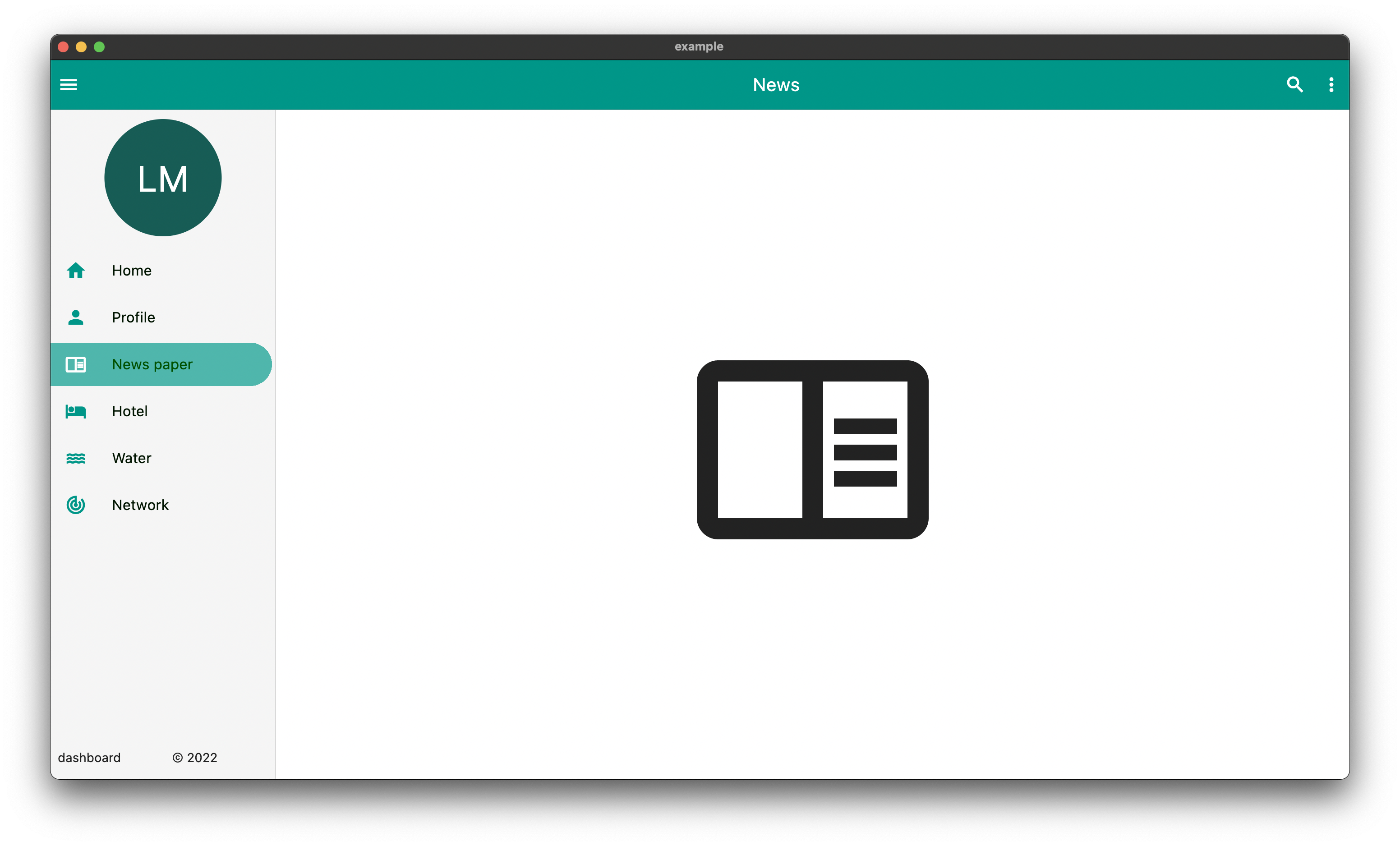
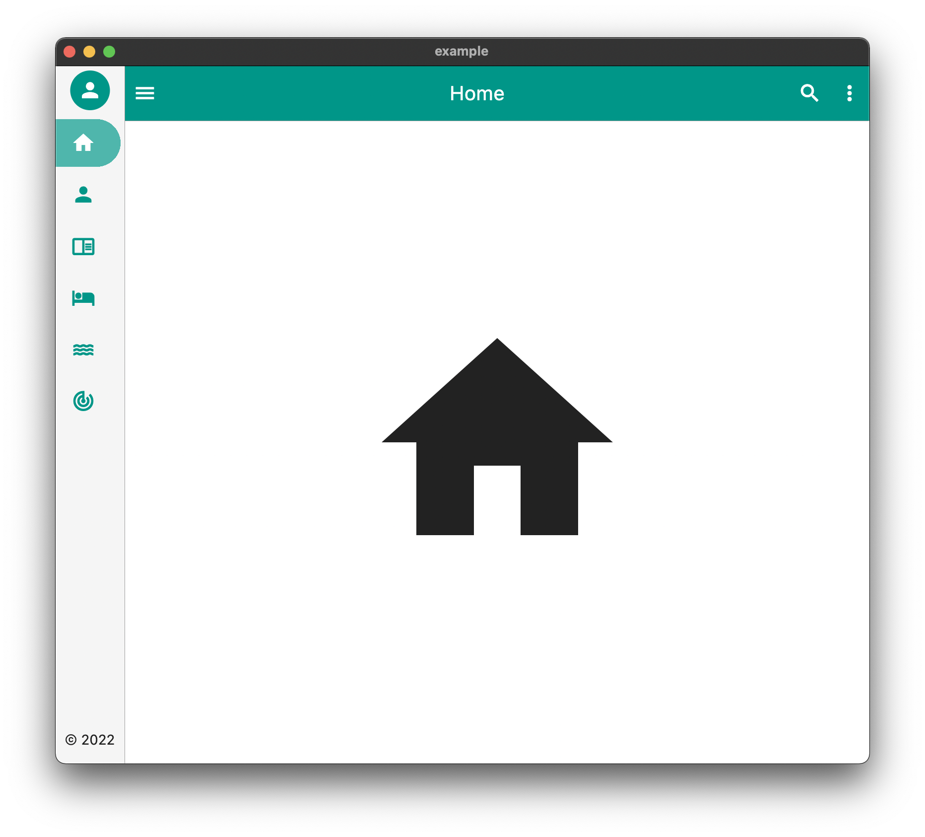
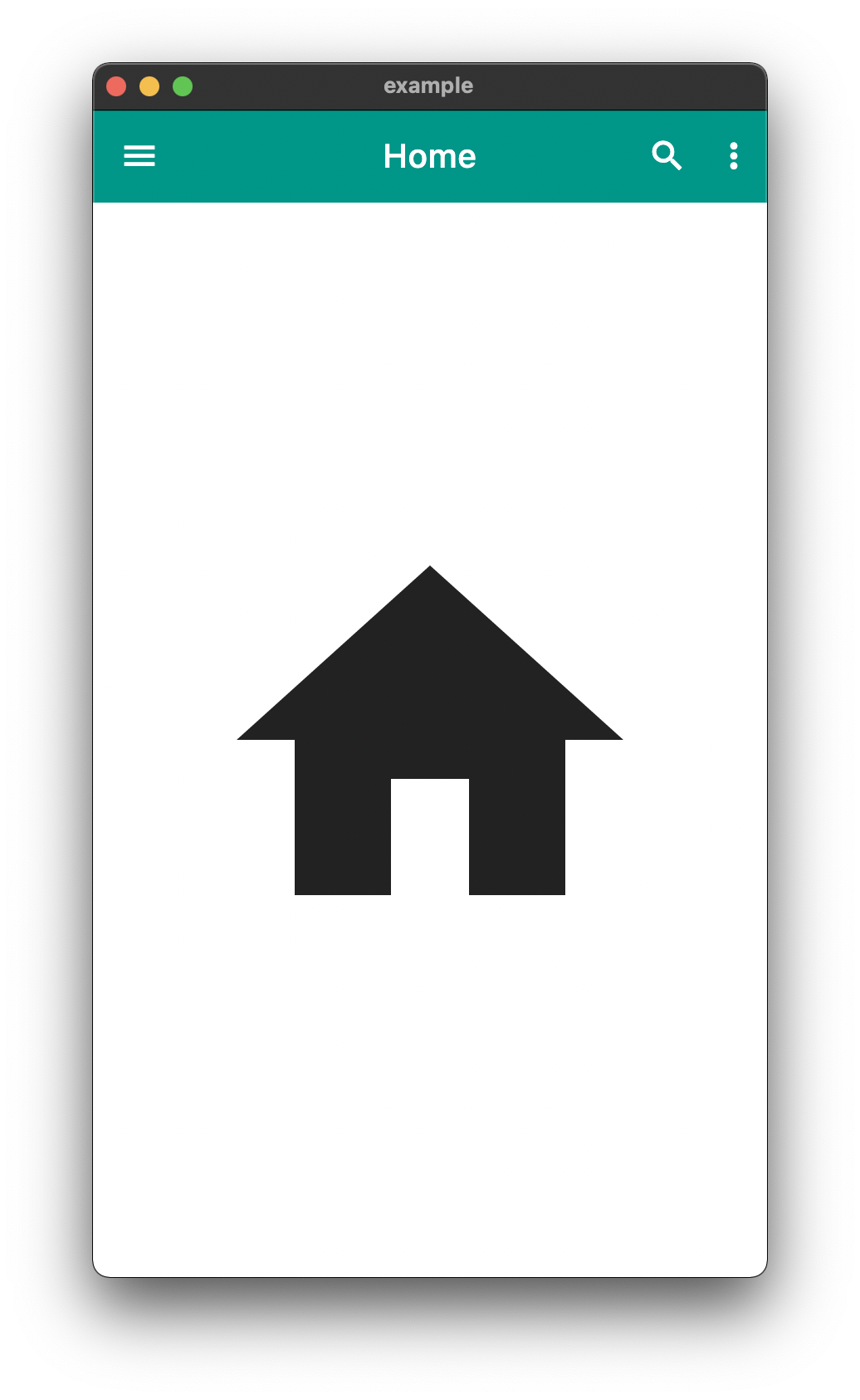
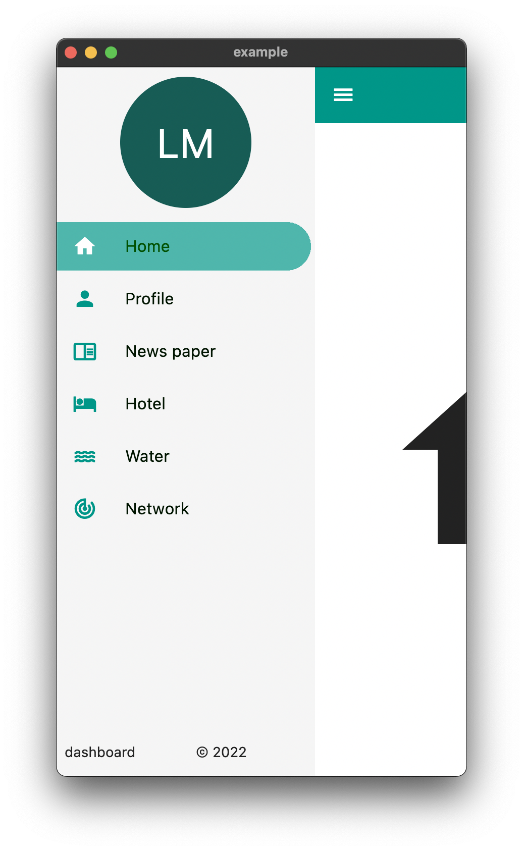
Ein Paket, das die einfache Erstellung von Dashboard-Layouts und anderen Navigationsfunktionen unterstützt. Ziel ist es, die Erstellung von responsiven Dashboards zu vereinfachen.
Aus öffentlichen Paketdaten erstellte Orientierung.
Easy Dashboard ist ein Flutter-Paket, das die Erstellung von responsive Dashboard-Layouts und Navigationsinterfaces vereinfacht. Es beschleunigt den Aufbau anpassungsfähiger Benutzeroberflächen, die nahtlos auf Geräten von Mobilgeräten bis hin zu Web und Desktop funktionieren. Mit integrierter Unterstützung für responsive Designmuster ermöglicht es Entwicklern, Dashboards mit konsistenten Layouts und Navigationsschritten schnell zu strukturieren. Das Paket konzentriert sich darauf, Boilerplate-Code zu reduzieren und die Produktivität bei der Implementierung komplexer Dashboard-Systeme zu steigern.
Anwendungsfälle
Verwaltungsoberflächen erstellen
Erstellen von responsive Daten-Dashboards
Entwurf der Navigation über mehrere Bildschirme
Entwicklung von plattformübergreifenden Überwachungsanwendungen
Layoutbasierte Dashboards implementieren
Hauptmerkmale
Responsive-Layout-Unterstützung
Eingebaute Navigationswerkzeuge
Plattformübergreifende Kompatibilität
Minimale Einrichtung erforderlich
Flexible Widget-Komposition
Geeignet für
Flutter-Entwickler, die Administrationsinterfaces erstellen
Teams, die eine schnelle Dashboard-Prototypen-Erstellung benötigen
Projekte, die responsive Benutzeroberflächen über Geräte hinweg erfordern
Entwickler, die sich auf UI-Konsistenz konzentrieren
Anwendungen mit komplexen Navigationsstrukturen
Hinweise
Kann Anpassungen für sehr einzigartige Layouts erfordern
The above example can be found in the /example folder
API
component
usage
body
The default body for the dashboard
duration
The Duration of the animation when the [EasyDashboard] is opened or closed among others.
mobileBreakpoint
The pixels at which the ui breaks into the mobile view
tabletBreakpoint
The pixels at which the ui breaks into the tablet view
mobileView
Display properties while in tablet view such as dashboard style
tabletView
Display properties while in tablet view such as dashboard style
desktopView
Display properties while in desktop view such as dashboard style
tabletMode
What to show when the mobile break point is reached,
mobileMode
What to show when the tablet break point is reached
desktopMode
What to show when the desktop break point is reached
floatingActionButtonLocation
Floating Action Button Location
floatingActionButton
Floating Action Button
systemOverlayStyle
System Overlay Style
floatingActionButtonAnimator
Floating Action Button Animator
appBarHeight
The height of the app bar
centerTitle
Whether or not the appbar title is centered
backgroundColor
General background color of the [EasyDashboard]
navigationIcon
The icon that will control the responsive navigation of the [EasyDashboard]
navigationIconSplashRadius
The splash radius of the navigation icon when pressed
appBarColor
The color of the app bar
sideBarColor
The color of the sidebar navigation
appBarActions
A list of Widgets for the [AppBar]actions
drawer
An drawer widget that will be displayed on the left side of the [EasyDashboard]. You can use the pre-built [EasyDrawer] to create a faster easier drawer .
Issues and Feedback
This is a fairly new package
Please feel free to report any issues you face
Also PR's and additional feedback is appreciated