Pakete, Repositories und App-Kategorien suchen

Cover von easy_loading_button
Paketdetailsv0.4.0

easy_loading_button

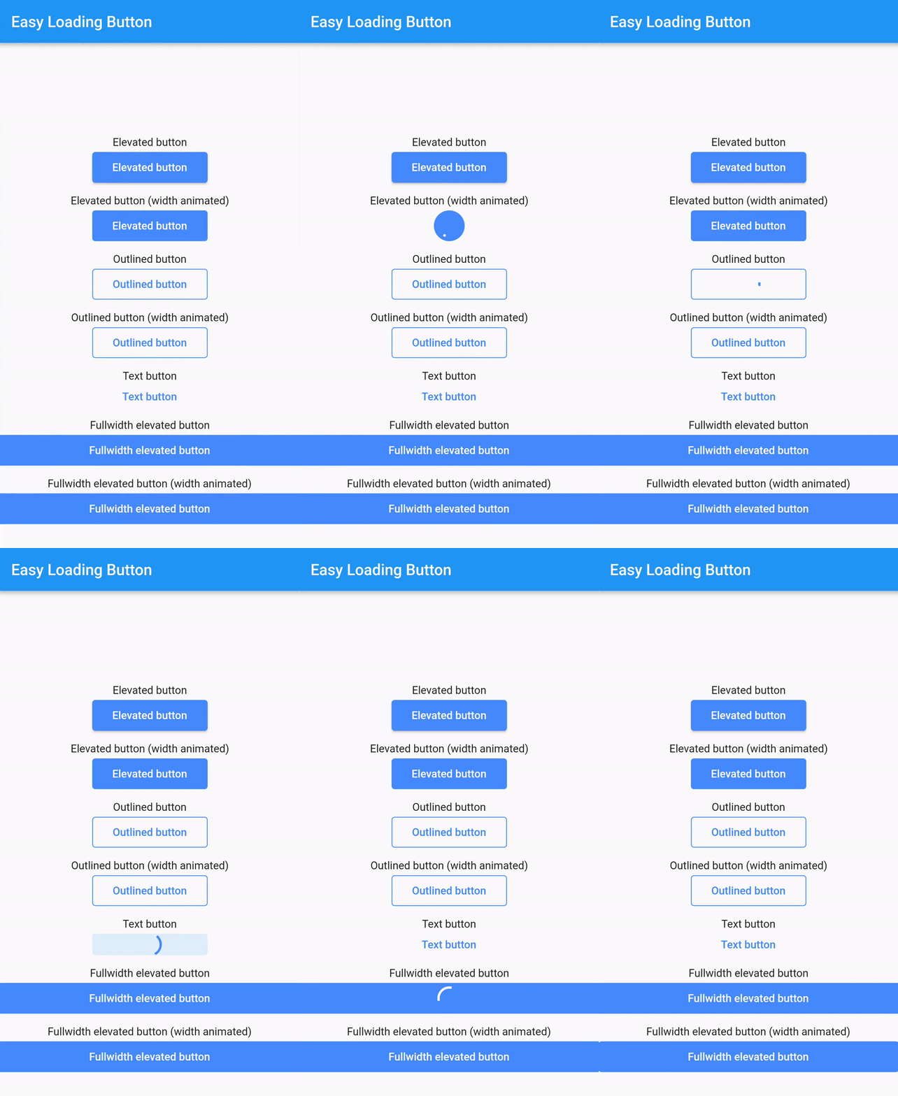
Ein einfacher, leicht zu verwendender und anpassbarer Fortschritts-/Lade-_Material Flutter Button_, der eine Vielzahl von Button-Stilen (hervorgehoben, umrandet, Text) unterstützt.

AndroidiOSWebmacOSWindowsLinux
30-Tage-Downloads
787
Likes
70
Pub-Punkte
150

Paket installieren

flutter pub add easy_loading_button

Paketübersicht

Aus öffentlichen Paketdaten erstellte Orientierung.

EasyLoadingButton ist ein Flutter-Paket, das einen einfachen, anpassbaren Fortschritts-/Ladebutton mit Unterstützung für mehrere Stile wie gehobene, umrandete und Textschaltflächen bereitstellt. Es verbessert die Benutzererfahrung, indem es Lademodus nahtlos während asynchroner Operationen anzeigt. Der Button ist leicht zu integrieren und zu konfigurieren und bietet reibungslose Übergänge zwischen normalen und Lademodi. Ideal für Formulare, Aktionen und jedes UI-Element, das bei der Verarbeitung Rückmeldung erfordert.

Anwendungsfälle

  • Formular-Eingaben
  • Asynchrone Aktion auslöst
  • Anmelde-/Registrierungsschaltflächen
  • Zahlungsabwicklung
  • Daten-Speicherungsoperationen

Hauptmerkmale

  • Mehrere Button-Stile
  • Anpassbare Ladeindikatoren
  • Glatte Zustandsübergänge
  • Einfache Integration
  • Unterstützt alle Flutter-Plattformen
  • Konfigurierbare Farben und Größen

Geeignet für

  • Anfänger-Flutter-Entwickler
  • Einfache App-Oberflächen
  • Schnellprototypen
  • benutzerfreundliche Formulare
  • Apps, die während asynchroner Aufgaben klare Rückmeldung benötigen

Hinweise

  • Eingeschränkte erweiterte Anpassungsoptionen
  • Kann zusätzliche Stilisierung für komplexe Designs erfordern
  • Nicht geeignet für hochdynamische oder animierte Schaltflächen
  • Beruht auf Material-Design-Prinzipien
  • Am besten geeignet für standardmäßige Material-basierte Apps

Original-README

Originaler README-Schnappschuss aus dem verknüpften Quell-Repository. Aktuelle Inhalte finden Sie im Repository.

easy_loading_button

GitHub repo size GitHub code size in bytes GitHub top language GitHub issues GitHub license

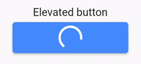
easy_loading_button is a simple, easy to use, and customizeable progress/loading Material Flutter Button that supports variety of button styles (elevated, outlined, text).

Or try the demo on DartPad

Get started

Depend on it

Add this to your package's pubspec.yaml file:

easy_loading_button: ^0.3.2
Install it

You can install packages from the command line:

$ flutter pub get

Alternatively, your editor might support flutter pub get.

Import it

Now in your Dart code, you can use:

import 'package:easy_loading_button/easy_loading_button.dart';

How to use

Add EasyButton to your widget tree:

EasyButton(
  type: EasyButtonType.elevated,

  // Content inside the button when the button state is idle.
  idleStateWidget: const Text(
    'Elevated Button',
    style: TextStyle(
      color: Colors.white,
    ),
  ),

  // Content inside of the button when the button state is loading.
  loadingStateWidget: const CircularProgressIndicator(
    strokeWidth: 3.0,
    valueColor: AlwaysStoppedAnimation<Color>(
      Colors.white,
    ),
  ),

  // Whether or not to animate the width of the button. Default is `true`.
  // If this is set to `false`, you might want to set the `useEqualLoadingStateWidgetDimension` parameter to `true`.
  useWidthAnimation: true,

  // Whether or not to force the `loadingStateWidget` to have equal dimension. Default is `true`.
  // This is useful when you are using `CircularProgressIndicator` as the `loadingStateWidget`.
  // This parameter might also be useful when you set the `useWidthAnimation` parameter to `true` combined with `CircularProgressIndicator` as the value for `loadingStateWidget`.
  useEqualLoadingStateWidgetDimension: true,

  // If you want a fullwidth size, set this to double.infinity
  width: 150.0,

  height: 40.0,
  borderRadius: 4.0,

  // The elevation of the button.
  // This will only be applied when the type parameter value is EasyButtonType.elevated
  elevation: 0.0,

  // The gap between button and it's content.
  // This will be ignored when the `type` parameter value is set to `EasyButtonType.text`
  contentGap: 6.0,

  // Color for the button.
  // For [EasyButtonType.elevated]: This will be the background color.
  // For [EasyButtonType.outlined]: This will be the border color.
  // For [EasyButtonType.text]: This will be the text color.
  buttonColor: Colors.blueAccent,

  onPressed: () {},
),

More parameters:

const EasyButton({
  Key? key,
  required this.idleStateWidget,
  required this.loadingStateWidget,
  this.type = EasyButtonType.elevated,
  this.useWidthAnimation = true,
  this.useEqualLoadingStateWidgetDimension = true,
  this.width = double.infinity,
  this.height = 40.0,
  this.contentGap = 0.0,
  this.borderRadius = 0.0,
  this.elevation = 0.0,
  this.buttonColor = Colors.blueAccent,
  this.onPressed,
}) : super(key: key);

Three types supported:

enum EasyButtonType {
    elevated,
    outlined,
    text,
}

Source

Source code and example of this library can be found in git:

$ git clone https://github.com/usefulteam/easy_loading_button.git

License

MIT License

Credits

Thanks to Yang JIANG for the flutter_progress_button package.

My package was based on it. You can also visit their package pub.dev page.

Kategorien

Quell-Repository

Projekte, die dieses Paket verwenden

Noch keine Daten verfügbar.