Pakete, Repositories und App-Kategorien suchen

Cover von emoji_alert
Paketdetailsv1.1.0

emoji_alert

Flutter Emoji Alert ermöglicht Ihnen die Erstellung schöner und dennoch einfacher Warnmeldungen und Bottom-Sheet-Modals

AndroidiOSWebmacOSWindowsLinux
30-Tage-Downloads
150
Likes
23
Pub-Punkte
150

Paket installieren

flutter pub add emoji_alert

Paketübersicht

Aus öffentlichen Paketdaten erstellte Orientierung.

Emoji Alert ist ein Flutter-Paket, das Entwicklern ermöglicht, visuell ansprechende und einfache Warnmeldungen sowie Bottom-Sheet-Modalen mit Emoji-Unterstützung zu erstellen. Es verbessert die Benutzererfahrung, indem es ausdrucksstarke, farbenfrohe Elemente in standardmäßige UI-Komponenten integriert. Ideal für Apps, die freundliche und ansprechende Rückmeldungen liefern möchten, funktioniert auf allen wichtigen Plattformen wie Android, iOS, Web, macOS, Windows und Linux. Das Paket ist leichtgewichtig und einfach zu integrieren – nur ein Befehl über pub reicht zum Hinzufügen. Der Fokus liegt auf Einfachheit und Ästhetik, ohne Funktionalität einzubüßen.

Anwendungsfälle

  • Benutzerbenachrichtigungen anzeigen
  • Anzeige von App-Statusaktualisierungen
  • Verbesserung von Onboarding-Erlebnissen
  • Feedback nach Aktionen bereitstellen
  • Spaßige Fehlermeldungen erstellen

Hauptmerkmale

  • Eingebaute Emoji-Unterstützung
  • Anpassbare Warnungsstile
  • Plattformübergreifende Kompatibilität
  • Einfache Integration mit Flutter
  • Unterstützung für Bottom-Sheet-Modals
  • Leicht und schnell

Geeignet für

  • Mobile- und Web-Anwendungen
  • Apps für jüngere Zielgruppen
  • Onboarding-Flows
  • Feedback-getriebene Schnittstellen
  • Einfache Benachrichtigungssysteme

Hinweise

  • Beschränkt auf grundlegende Warn- und Bottom-Sheet-Typen
  • Kann bei fortgeschrittenen Anwendungsfällen eine benutzerdefinierte Gestaltung erfordern
  • Abhängig von externem GitHub-Repository für Updates
  • Nicht geeignet für komplexe Dialogworkflows

Original-README

Originaler README-Schnappschuss aus dem verknüpften Quell-Repository. Aktuelle Inhalte finden Sie im Repository.

Flutter Emoji Alert

enter image description here

A new Stylish Emoji Alert with a wide variety of emojis, simple to implement and full customizable.

Features

  • Single line basic alert with default emoji

  • Add dynamic widgets not only text any widget you want

  • Add buttons with their onPress handlers

  • Choose the alert display behavior : Normal Alert or Bottom Sheet dialog

  • Choose an emoji from a variety of emojis

  • Animations when displaying the alert popup


Getting Started

To add emoji_alert to your project add this line to your pubspec.yaml


dependencies:
	emoji_alert:  1.1.0

Or you can reference the github repository directly

	dependencies:
		emoji_alert:
			git: https://github.com/koukibadr/Emoji_Alert.git

Parameters

Attribute Type Default Required Description
description Widget N/A True The alert body content
alertTitle Widget N/A False The alert top content
enableMainButton bool False False Display or not the popup's main button
enableSecondaryButton bool False False Whether display or not the secondary button
onSecondaryButtonPressed Function null False The function that will be invoked on pressing the secondary button
onMainButtonPressed Function null False The function that will be invoked on pressing the main button
emojiType EMOJI_TYPE HAPPY False the emoji that will be displayed possible values: [ANGRY, CONFUSED, COOL, HAPPY, JOYFUL, LAUGHING, SAD, SCARED, SHOCKED, SMILE, WINK]
height double 200 False the height of the popup
emojiSize double 80 False the size of the emoji
background Color White False the popup background color
mainButtonColor Color Blue False The main button background color
secondaryButtonColor Color Blue False the secondary button color, PS: an opacity value will be added to this color
mainButtonText Text Text("Confirm") False the main button text
secondaryButtonText Text Text("Cancel") False the secondary button text
buttonSize double 200 False buttons width size
cancelButtonColorOpacity double 0.2 False an opacity will be added to the secondary button background color
cancelable bool True False Whether the popup can be dismissed on pressing outside it or not
cornerRadiusType CORNER_RADIUS_TYPES BOTTOM_ONLY False the border radius type, possible values: [BOTTOM_ONLY, TOP_ONLY, ALL_CORNERS, NONE]
width double null False the popup width by default it's null
animationType ANIMATION_TYPE ANIMATION_TYPE.NONE False the animation type that will be applied on the emoji [NONE, FADEIN, TRANSITION, ROTATION]

Examples

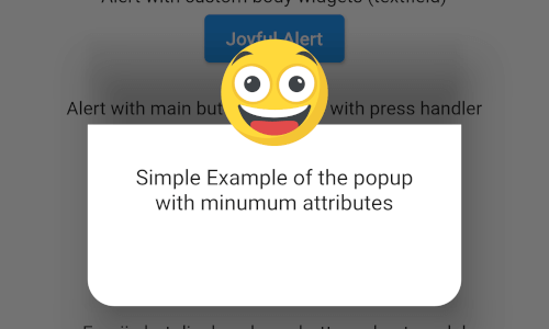
Simple alert with just a text in the body content


EmojiAlert(

description:  Column(

children: [

Text("Simple Example of the popup"),

Text("with minumum attributes"),

],

)).displayAlert(context);

first_example_alert.png

Example with custom widget in the popup content body


EmojiAlert(
	alertTitle:  Text("Joyful Alert", style:  TextStyle(fontWeight:  FontWeight.bold)),
	description:  Column(
		children: [
		Text("You can add also any widget"),
		Container(
			width:  200,
			child:  TextField(
				decoration:  InputDecoration(hintText:  "Input field example"),
			)),
	]
	),
	cancelable:  true,
	emojiType:  EMOJI_TYPE.JOYFUL,
	height:  300,
).displayAlert(context);

second_example_alert.png


EmojiAlert(
	alertTitle:  Text("Angry Alert", style:  TextStyle(fontWeight:  FontWeight.bold)),
	description:  Column(
		children: [
			Text("You can add a main button"),
		],
	),
	enableMainButton:  true,
	mainButtonColor:  Colors.red,
	onMainButtonPressed: () {
		print("Hello");
		Navigator.pop(context);
	},
	cancelable:  false,
	emojiType:  EMOJI_TYPE.ANGRY,
	height:  300,
).displayAlert(context);

third_example_alert.png

Bottom Sheet Modal

to display it as bottom sheet modal you need to use displayBottomSheet function

And you can display it as a bottom sheet modal, the code below is an example


EmojiAlert(
	alertTitle:  Text("Bottom Sheet Modal",
	style:  TextStyle(fontWeight:  FontWeight.bold)),
	description:  Column(
		children: [
			Text("And this is a bottom sheet modal with different Radius",
				style:  TextStyle(color:  Colors.blue),
				textAlign:  TextAlign.center,
			),
		],
	),
	enableMainButton:  true,
	cornerRadiusType:  CORNER_RADIUS_TYPES.TOP_ONLY,
	mainButtonColor:  Colors.green,
	mainButtonText:  Text("Save"),
	onMainButtonPressed: () {
		Navigator.pop(context);
	},
	cancelable:  true,
	emojiType:  EMOJI_TYPE.SMILE,
	width:  300,
	height:  300,
).displayBottomSheet(context);

fifth_example_alert.png

With Animation

in this example we used TRANSITION animation but you can choose any other built-in animations (see attributes description above)

EmojiAlert(
	description:  Column(
		children: [
			Text("Simple Example with animation"),
			Text("This is a transition animation"),
		],
	),
	animationType:  ANIMATION_TYPE.TRANSITION
).displayAlert(context);

the result:

animation_example.gif

Contribution

Of course the project is open source, and you can contribute to it repository link

  • If you found a bug, open an issue.

  • If you have a feature request, open an issue.

  • If you want to contribute, submit a pull request.

Kategorien

Quell-Repository

Projekte, die dieses Paket verwenden

Noch keine Daten verfügbar.