Aus öffentlichen Paketdaten erstellte Orientierung.
Ein Flutter-Paket, das das Layout-Raster-System von Figma als visuelle Hilfestellung implementiert und Entwicklern hilft, UI-Elemente konsistent mit Designvorgaben auszurichten. Es unterstützt Figma-Grid-Funktionen wie Spaltenanzahl, Randgröße und Versatz und ermöglicht eine präzise Anpassung der Layouts zwischen Design und Implementierung. Das Raster wird als Overlay auf dem Bildschirm angezeigt, was es ideal für Prototyping und Entwicklung macht. Kompatibel mit allen wichtigen Plattformen verbessert es die Zusammenarbeit zwischen Designern und Entwicklern, indem es die Lücke zwischen Figma-Designs und Live-Flutter-Apps schließt.
Anwendungsfälle
Übereinstimmung von Figma-Designs in Flutter-Apps
Prototyping mit visueller Rasterausrichtung
Zusammenarbeit zwischen Designern und Entwicklern
Konsistente Abstände in UI-Layouts sicherstellen
Visuelle Debugging von Layoutbeschränkungen
Hauptmerkmale
Figma-inspiriertes Rastersystem
Echtzeit-Visualisierungs-Gitterüberlagerung
Unterstützt Spalten, Ränder und Verschiebungen
Plattformübergreifende Kompatibilität
Einfache Integration über pub add
Anpassbare Rasterdarstellung
Geeignet für
Designer, die mit Flutter arbeiten
Flutter-Entwickler, die Figma-Designs folgen
Teams, die Figma für UI/UX-Arbeitsabläufe nutzen
Projekte, die eine pixelgenaue Layoutausrichtung erfordern
Frontend-Teams, die sich auf Designkonsistenz konzentrieren
Hinweise
Raster dient nur der visuellen Hilfe, nicht zur Layoutlogik
Nicht für die Produktionsschnittstellen-Rendern vorgesehen
Kann die Leistung beeinträchtigen, wenn sie übermäßig verwendet wird
Soll in Release-Builds deaktiviert sein
Benötigt manuelle Konfiguration für verschiedene Bildschirme
Original-README
Originaler README-Schnappschuss aus dem verknüpften Quell-Repository. Aktuelle Inhalte finden Sie im Repository.
Figma layout grid
figma_layout_grid is a Flutter package which imitates Figma's layout grid and all its functionalities. It helps you determine whether your UI components match the design file and align properly.
Basic usage
Wrap a widget with LayoutGrid in order to render a layout grid on top of it.
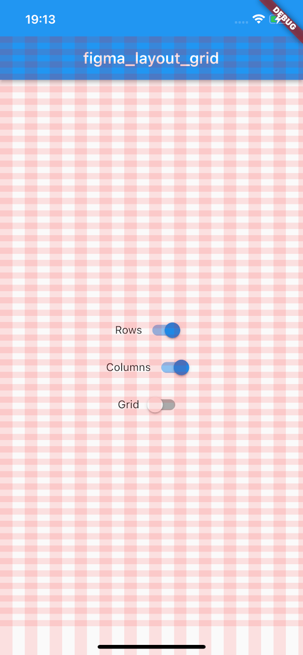
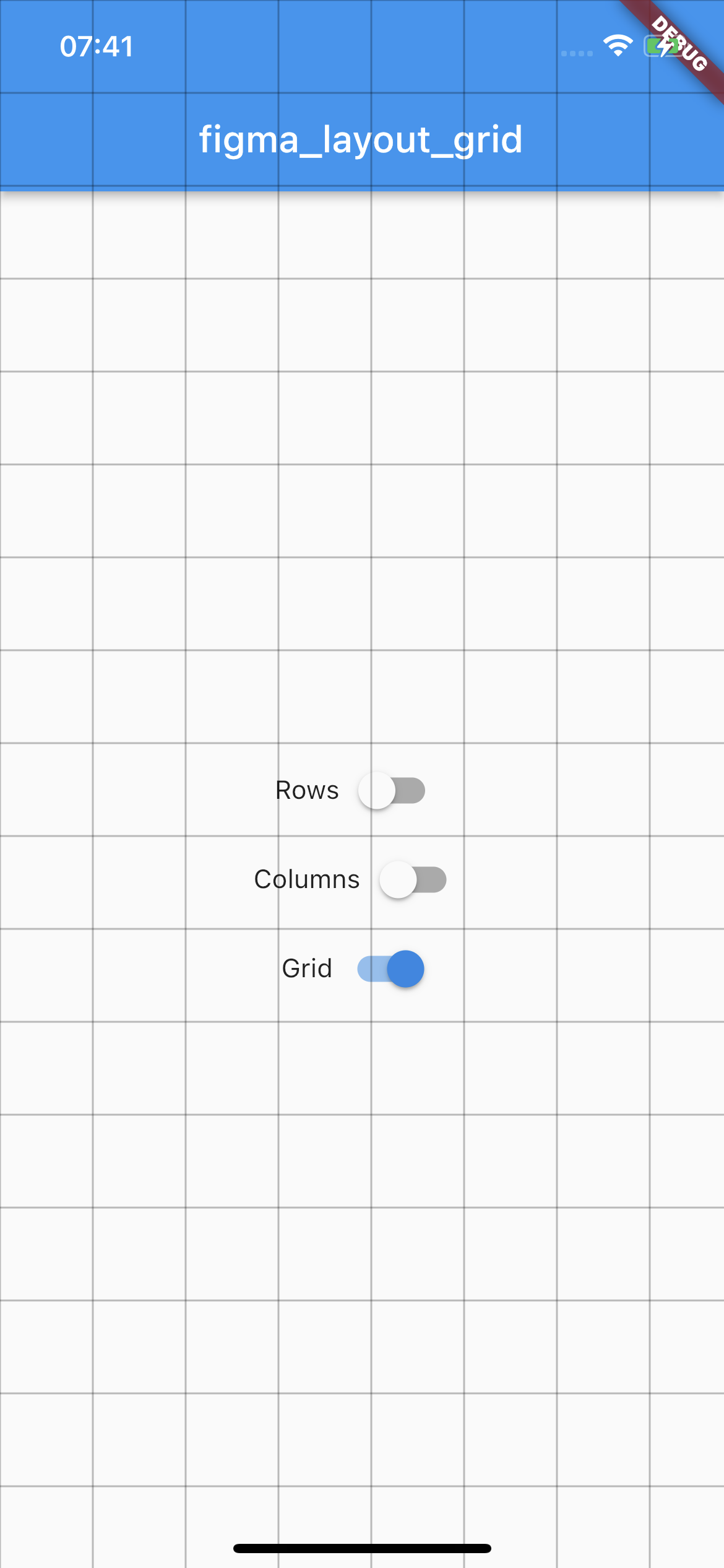
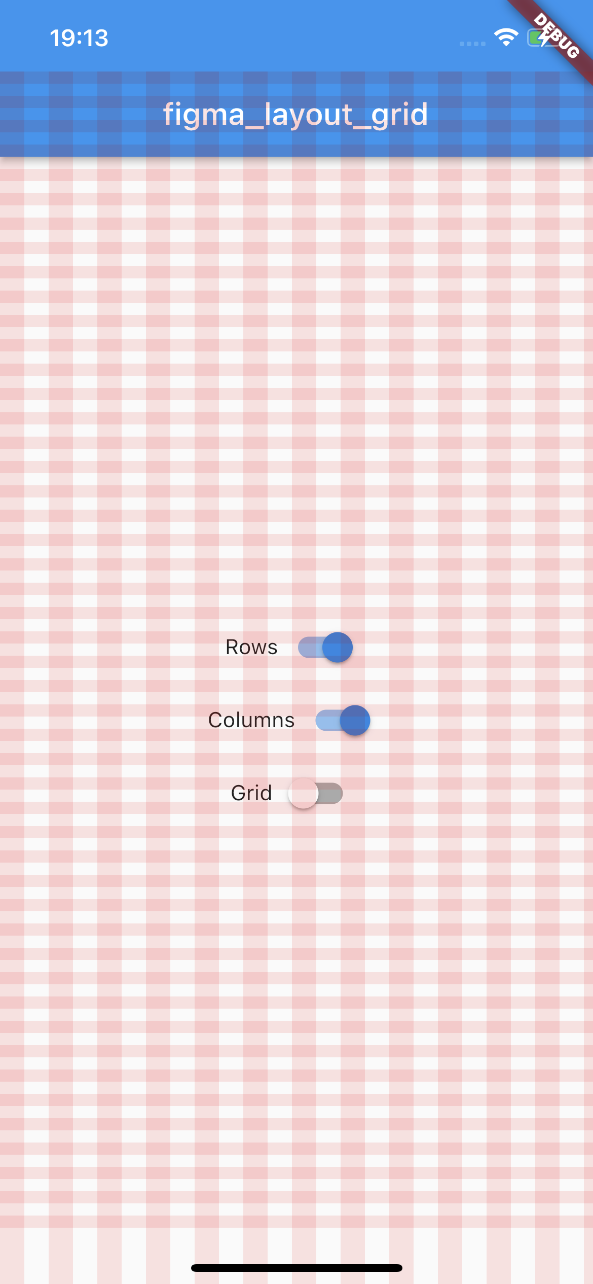
This package supports three types of layout overlays - rows, columns and pixel grid.
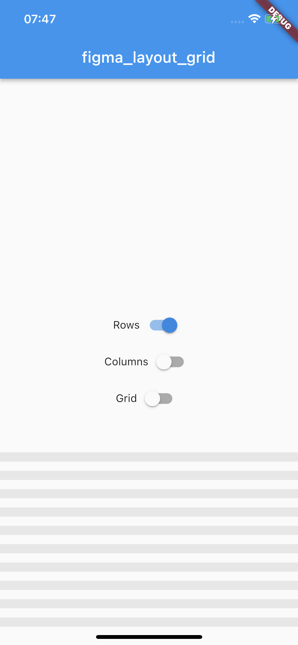
Rows
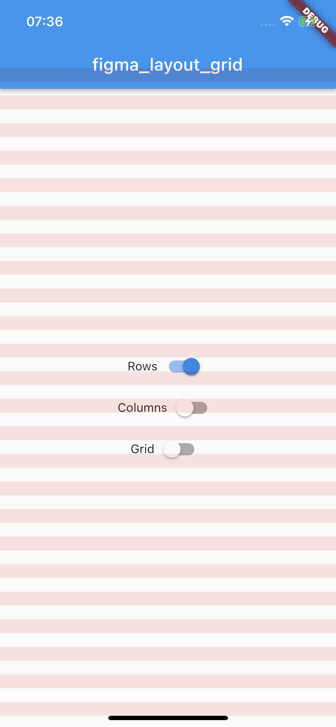
Horizontal stripes with specified height, gutter, margin, offset, arrangement and color.
There is a possibility for fixed rows count with passing desired number in a count parameter, otherwise rows are rendered dynamically due to the screen limits.
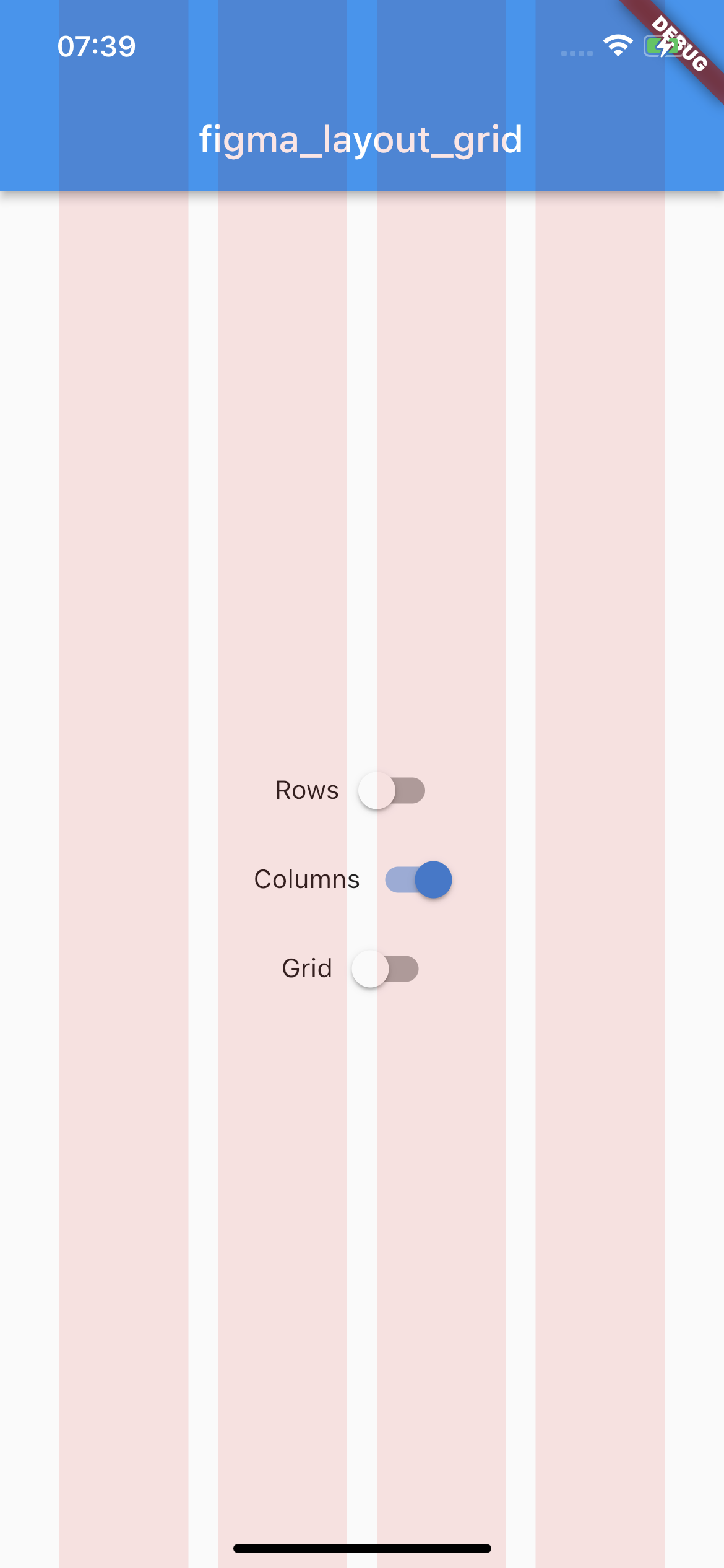
Vertical stripes with specified height, gutter, margin, offset, arrangement and color.
There is a possibility for fixed columns count with passing desired number in a count parameter, otherwise columns are rendered dynamically due to the screen limits.
By default all of the layouts are disabled. In order to manage layout grid state you may use LayoutGrid methods which are accessible via builder context.
bool LayoutGrid.of(context).visibleGrid - returns current grid layout visibility state
Parametrization
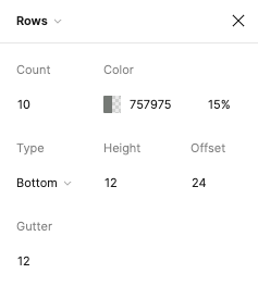
As this package mimics Figma's layout grid features you can directly transfer desired outcome into corresponding parameters. The following example shows columns grid set with count = 10, height = 12, gutter = 12, offset = 24, bottom alignment and some custom color.
There is also a possibility to enable SafeArea for a specific layout.
Each of the three layers has optional SafeAreaParams within you can pass what SafeArea parts should be handled.
The available options are top, bottom, left and right which correspond to SafeArea's parameters with the same names.