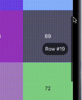
Ein flexible Scrollbar für Flutter. Mit diesem Paket können Sie benutzerdefinierte Scrollbars mit verschiedenen vorbestimmten Verhaltensweisen erstellen.
Aus öffentlichen Paketdaten erstellte Orientierung.
Ein Flutter-Paket, das Entwicklern die Erstellung anpassbarer Scrollbalken mit vordefinierten Verhaltensweisen ermöglicht. Es bietet Flexibilität in Gestaltung und Funktionalität und ermöglicht einzigartige Scrollbalkendesigns auf verschiedenen Plattformen. Ideal für Apps, die maßgeschneiderte Scroll-Erfahrungen erfordern, unterstützt es alle wichtigen Plattformen wie Android, iOS, Web, macOS, Windows und Linux. Das Paket verbessert die Benutzerinteraktion durch visuelle Rückmeldungen während des Scrollens und bewahrt dabei eine saubere, reaktionsfähige Oberfläche.
Anwendungsfälle
Benutzerdefiniertes Scrollbalkendesign in Web-Anwendungen
Verbesserung der Benutzererfahrung in mobilen Scrolllisten
Anpassen von Scrollindikatoren für Desktop-Anwendungen
Verbesserung der Barrierefreiheit auf Bildschirmen mit langem Inhalt
Plattformspezifische Scrollbar-Stile erstellen
Visuelle Rückmeldung in scrollbaren Widgets hinzufügen
Hauptmerkmale
Konfigurierbare Scrollbar-Aussehen
Vordefinierte Verhaltensmodi
Plattformübergreifende Kompatibilität
Unterstützung für benutzerdefinierte Animationen
Einfache Integration mit ScrollViews
Reaktives Design über Geräte hinweg
Geeignet für
UI-Designer, die visuelle Anpassung suchen
Entwickler, die scrollintensive Schnittstellen erstellen
Anwendungen für mehrere Plattformen
Projekte, die zugängliches Scrollen erfordern
Teams, die sich auf ein poliertes Benutzererlebnis konzentrieren
Hinweise
Kann zusätzliche Stilisierung für optimale Leistung erfordern
Verhaltensanpassung erfordert Verständnis des ScrollControllers
Nicht geeignet für minimalistische Designs ohne Scrollrückmeldung
Mögliche Layoutkonflikte in verschachtelten Scrollansichten
Eingeschränkte integrierte Themen im Vergleich zu nativen Scrollbars
Original-README
Originaler README-Schnappschuss aus dem verknüpften Quell-Repository. Aktuelle Inhalte finden Sie im Repository.
A Flexible Scrollbar for Flutter
A flexible solution for custom scroll bars.
Foreword
A package has been designed to allow the creation of complex scroll bars. You can customize the scroll thumb, scroll line and add a label, that is positioned by the center of the scroll thumb by default, but you can customize its position as well. As those three things are created by builders called every time the scroll state is changed, you can add custom animations.
How to use
The usage is as simple as a built-in Scrollbar, only you can customize it a lot more.
Install
To install this package simply add the flexible_scrollbar to your dependencies in pubspec.yaml
To get a scrollbar simply wrap a scrollable widget with FlexibleScrollbar and pass a ScrollController to both FlexibleScrollbar and a scrollable widget:
But it's very simple and we are here to make complex scroll bars so let's see how.
Customization
For the main customization the FlexibleScrollbar widget has three builders: scrollThumbBuilder, scrollLineBuilder and scrollLabelBuilder. Each one of them has a ScrollbarInfo as a parameter and rebuild each time any of the fields of the ScrollbarInfo model has changed.
ScrollbarInfo model has the following properties:
Properties
Description
bool isScrolling
Changes when the user starts/strops the scroll body scrolling. The isDragging is not affected by it.
bool isDragging
Changes when the user starts/strops to drag the scroll thumb. The isScrolling is not affected by it.
double thumbMainAxisSize
Contains the calculated depending on the scroll body size thumb length.
double thumbMainAxisOffset
Contains the offset in pixels of the scroll thumb from the starting position.
AxisDirection scrollDirection
Has the scroll body scroll direction in it (up/down/left/right)
Using those builders you can make custom scrollbars such as the one shown in the example at the beginning. The scroll thumb from the example has been created with the following code: