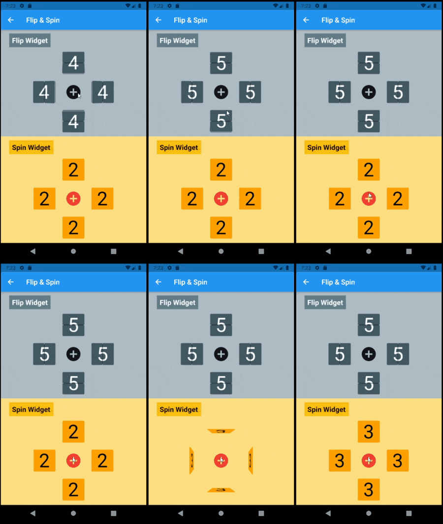
FlipBoards sind Zusammensetzungen aus FlipWidgets, einem Widget, das Inhaltsänderungen mit einer Kippanimation animiert. Dazu gehören FlipFraseBoard, FlipMatrix, FlipClock und andere.
Aus öffentlichen Paketdaten erstellte Orientierung.
FlipBoard ist ein Flutter-Paket, das animierte Inhaltsübergänge mithilfe von Kippanimationen ermöglicht. Es bietet wiederverwendbare Widgets wie FlipFraseBoard, FlipMatrix und FlipClock, die jeweils dafür konzipiert sind, Änderungen in ihrem angezeigten Inhalt nahtlos zu animieren. Aufbauend auf dem Animationssystem von Flutter unterstützt es mehrere Plattformen wie Android, iOS, Web, macOS, Windows und Linux. Das Paket eignet sich hervorragend für ansprechende Benutzeroberflächen, bei denen visuelle Rückmeldungen während Zustandsänderungen die Benutzererfahrung verbessern.
Anwendungsfälle
Animierte Digitalkronen
Dynamische Textanzeige
Interaktive Datenraster
Benutzeroberflächenübergänge
Spiel-Punktzähler
Visuelle Rückmeldung in Formularen
Hauptmerkmale
Glatte Flip-Animationen
vorgefertigte spezialisierte Boards
Plattformübergreifende Kompatibilität
Einfache Integration mit Flutter
Anpassbare Drehrichtung und Geschwindigkeit
Reaktive Inhaltsaktualisierungen
Geeignet für
Entwickler, die interaktive Dashboards erstellen
Designer, die dynamische Benutzeroberflächen-Elemente suchen
Apps, die visuelle Zustandsübergänge erfordern
Bildungs- oder Spielanwendungen
Tools zur Echtzeit-Datenvisualisierung
Hinweise
Kann die Leistung auf Low-End-Geräten beeinträchtigen
Beschränkte Anpassungsmöglichkeiten jenseits von Flip-Effekten
Erfordert Verständnis des Widget-Lebenszyklus von Flutter
Nicht geeignet für einfache statische Inhalte
Animationen können bei minimalistischen Designs ablenken
Abhängig von der Stabilität des Animation-Frameworks von Flutter
Original-README
Originaler README-Schnappschuss aus dem verknüpften Quell-Repository. Aktuelle Inhalte finden Sie im Repository.
Flip Board
Widgets to build displays that resemble Mechanical Flip Boards.
The basic component is a stateful FlipWidget that renders flip transitions for a stream of items and an itemBuilder.
The package also includes other widgets that compose this basic component in useful Flip Boards:
The most distinctive characteristic of a FlipWidget is its flip type to define the type of movement that will animate items rendering, either FlipType.middleFlip or FlipType.spinFlip.
This widget renders flip animations in a configured Axis and AxisDirection, animating the transition to each new item received in the given item stream. It is commonly used to display digits and letters but can actually render any widget you build through the given itemBuilder.
It is constructed with four required parameters (besides many optional parameters):
flipType: either FlipType.middleFlip or FlipType.spinFlip
itemStream: stream of items to be flipped as they are received
itemBuilder: builder to create a widget out of each item
flipDirection: AxisDirection to animate new items flip
Please check the class documentation to see all options.
Middle Flip
When we think of Mechanical Flip Boards as we used to see in airports and sport score boards we think on a Vertical MiddleFlip Widget or, most likely, on a composition (row) of them.
Basic FlipWidgets are usually composed in a layout, this package provides a few configurable compositions of FlipWidgets of the same type and orientation, sometimes varying some elements direction within that axis orientation.
All these composed widgets are described below and explored in the examples folder.
Flip Matrix Board
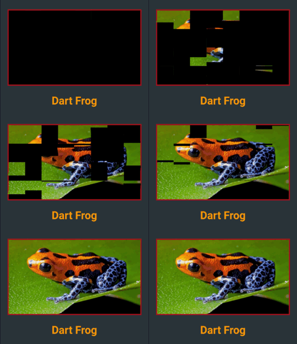
There two classes of FlipMatrixBoard that animate the display in a matrix of FlipWidgets. The first class displays a single child, an image in the given example. The second class animates the display of a stream of items, also given as a stream of images in the example below.
The board is configured with the number of rows and columns, flipping orientation and animation speed and delays parameters.
FlipClock will default to Theme colors but can be further customized through constructor parameters.
The default flip direction is AxisDirection.down and the default animation curve is a custom curve that acceletares like gravity and bounces back at the end (like a mechanical bang).
In the example below some colors are inherited by a parent ThemeData from the amber color scheme. While some colors are defined in the constructor invocation:
This composed widget displays a Frase Board that will animate each letter up to the the given frase letters.
Flip type, initial and end colors, delays and more are all customized at constructor level. Check the class documentation for a run over all configurations.
The provided example looks like this:
This page displays a variety of frase boards, one of them would be constructed like this: