Pakete, Repositories und App-Kategorien suchen

Cover von flip_card
Paketdetailsv0.7.0

flip_card

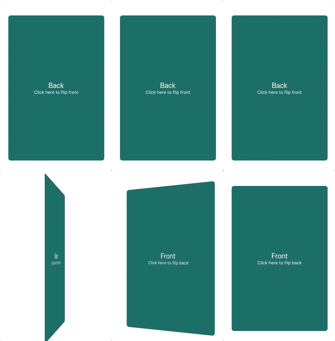
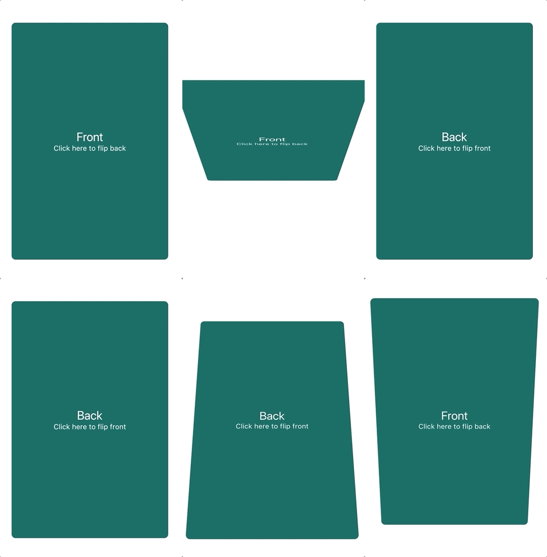
Eine Komponente, die eine Kartenflip-Animation bereitstellt. Kann verwendet werden, um Produktinformationen zu verbergen und anzuzeigen.

AndroidiOSWebmacOSWindowsLinux
30-Tage-Downloads
86.200
Likes
956
Pub-Punkte
135

Paket installieren

flutter pub add flip_card

Paketübersicht

Aus öffentlichen Paketdaten erstellte Orientierung.

FlipCard ist ein Flutter-Paket, das reibungslose Kartenanimationen ermöglicht und ideal für die Darstellung zusätzlicher Informationen wie Produktinformationen ist. Es unterstützt interaktives Umblättern mit anpassbaren Vorder- und Rückseiten-Widgets und eignet sich perfekt für ansprechende Benutzeroberflächen. Das Paket funktioniert auf allen wichtigen Plattformen wie Android, iOS, Web, macOS, Windows und Linux und gewährleistet konsistentes Verhalten. Durch einfache Integration über pub add wird die UI-Interaktivität ohne Komplexität verbessert.

Anwendungsfälle

  • Produktinformationen offenlegen
  • Interaktive Lernkarten
  • Vergleich vorher/nachher
  • Benutzerprofil-Umschalter
  • Gamifizierte Benutzeroberflächenelemente

Hauptmerkmale

  • glatter Flip-Animation
  • Anpassbarer Vorder- und Rückseiteninhalt
  • Plattformübergreifende Unterstützung
  • Einfache Integration mit Flutter
  • gesturebasierte Umkehrung
  • Konfigurierbare Geschwindigkeit und Richtung

Geeignet für

  • E-Commerce-Apps
  • Lern-Apps
  • Interaktive Tutorials
  • Dashboard-Widgets
  • UI-Prototypen

Hinweise

  • Kann die Leistung auf Low-End-Geräten beeinträchtigen
  • Erfordert sorgfältige Gestaltung für Barrierefreiheit
  • Beschränkt auf 2D-Drehwirkungen
  • Nicht geeignet für komplexe Übergänge
  • Animationen können mit anderen Gesten kollidieren

Original-README

Originaler README-Schnappschuss aus dem verknüpften Quell-Repository. Aktuelle Inhalte finden Sie im Repository.

flip_card PRs Welcome Pub Package

A component that provides a flip card animation. It could be used for hiding and showing details of a product.

How to use

Import the package

import 'package:flip_card/flip_card.dart';
Default

Create a flip card as shown below. By default the card is touch controlled.

You can turn off touch control by setting flipOnTouch to false.

FlipCard(
  fill: Fill.fillBack, // Fill the back side of the card to make in the same size as the front.
  direction: Axis.horizontal, // default
  initialSide: CardSide.front, // The side to initially display.
  front: Container(
    child: Text('Front'),
  ),
  back: Container(
    child: Text('Back'),
  ),
)
Programmatically
Controller (Recommended)

To control the card programmatically, you can pass a controller when creating the card.

late FlipCardController _controller = FlipCardController();

@override
Widget build(BuildContext context) {
  return FlipCard(
    controller: _controller,
    front: ...,
    back: ...,
  );
}

void doStuff() {
  // Flip the card a bit and back to indicate that it can be flipped (for example on page load)
  _controller.hint(
    duration: const Duration(milliseconds: 400),
  );

  // Tilt the card a bit (for example when hovering)
  _controller.skew(0.2);

  // Flip the card programmatically
  _controller.flip();

  // Flip the card to front specifically
  _controller.flip(CardSide.front);

  // Flip the card without animation
  _controller.flipWithoutAnimation();
}
Global Key

You can also control the card via a global key as shown below.

This is not the recommended way.

final cardKey = GlobalKey<FlipCardState>();

@override
Widget build(BuildContext context) {
  return FlipCard(
    key: cardKey,
    flipOnTouch: false,
    front: Container(
      child: RaisedButton(
        onPressed: () => cardKey.currentState.toggleCard(),
        child: Text('Toggle'),
      ),
    ),
    back: Container(
      child: Text('Back'),
    ),
  );
}
Timed

You can auto-flip the widget after a certain delay without any external triggering.

FlipCard(
  fill: Fill.back, // Fill the back side of the card to make in the same size as the front.
  direction: Axis.horizontal, // default
  initialSide: CardSide.front, // The side to initially display.
  front: Container(
    child: Text('Front'),
  ),
  back: Container(
    child: Text('Back'),
  ),
  autoFlipDuration: const Duration(seconds: 2), // The flip effect will work automatically after the 2 seconds
)

Kategorien

Quell-Repository

Projekte, die dieses Paket verwenden