Pakete, Repositories und App-Kategorien suchen

Cover von floating_bottom_bar
Paketdetailsv0.0.4

floating_bottom_bar

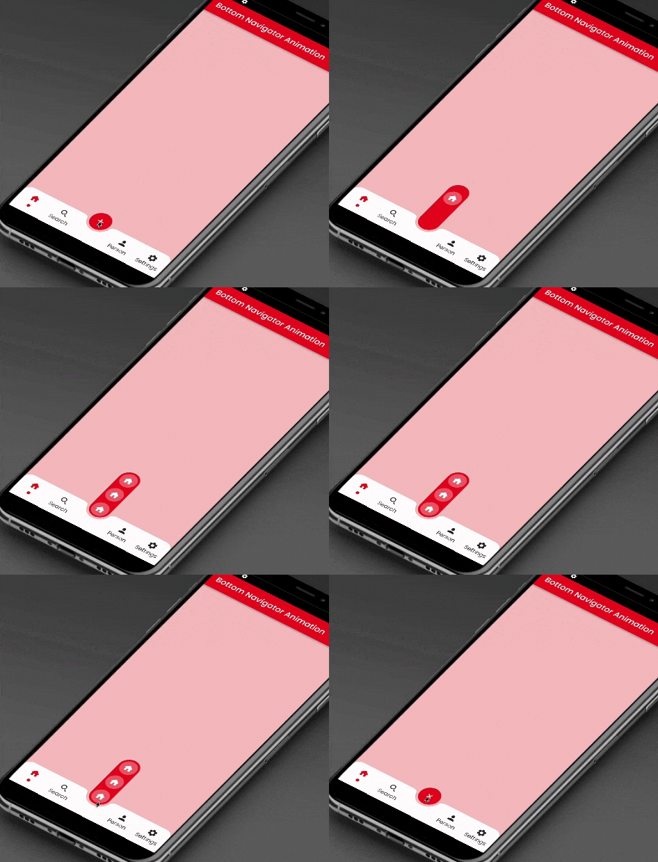
Dieses Paket bietet eine Gleitanimation für die am unteren Zentrum befindliche Schwebende Aktionsschaltfläche und die untere Tab-Schaltfläche.

AndroidiOSWebmacOSWindowsLinux
30-Tage-Downloads
1410
Likes
115
Pub-Punkte
150

Paket installieren

flutter pub add floating_bottom_bar

Paketübersicht

Aus öffentlichen Paketdaten erstellte Orientierung.

Das floating_bottom_bar-Paket verbessert Benutzeroberflächen durch sanfte Gleitanimationen für einen am unteren Rand zentrierten Flottierenden-Aktion-Button und untere Tab-Buttons. Für Flutter-Anwendungen entwickelt, integriert es sich nahtlos mit unteren Navigationsleisten und bietet eine ansprechende und interaktive Erfahrung auf Android, iOS, Web, macOS, Windows und Linux. Das Paket unterstützt anpassbare Übergänge und responsive Layouts, was es ideal für moderne App-Designs macht, die intuitive Navigation und visuelle Attraktivität betonen.

Anwendungsfälle

  • Verbesserung der Navigation in mobilen Apps
  • Animierte Floating-Action-Buttons erstellen
  • Verbesserung der Benutzerengagement in Dashboards
  • Entwurf einer reaktionsfähigen unteren Navigation
  • Dynamische Benutzeroberflächenelemente zu Webanwendungen hinzufügen
  • Unterstützung der Entwicklung von Multiplattform-Apps

Hauptmerkmale

  • Glatte Schiebeanimation für FAB
  • Zentriert ausgerichteter Floating Action Button
  • Unterseitenintegration
  • Plattformübergreifende Kompatibilität
  • Anpassbare Übergangseffekte
  • Responsive-Layout-Unterstützung

Geeignet für

  • Flutter-Entwickler, die animierte Benutzeroberflächen suchen
  • Apps, die eine intuitive untere Navigation erfordern
  • Designer konzentrieren sich auf interaktive Komponenten
  • Multiplattform-Anwendungsbauer
  • Verbesserung der Benutzererfahrung für mobile und Web-Anwendungen

Hinweise

  • Erfordert Flutter SDK 2.0 oder höher
  • Kann die Leistung auf Low-End-Geräten beeinträchtigen
  • Eingeschränkte Anpassungsmöglichkeiten jenseits der Animation
  • Am besten geeignet für einfache Navigationsmuster
  • Abhängig von plattformspezifischer Darstellung
  • Nicht ideal für komplexe Navigationshierarchien

Original-README

Originaler README-Schnappschuss aus dem verknüpften Quell-Repository. Aktuelle Inhalte finden Sie im Repository.

floating_bottom_bar

This package will animate a floating action button at the center and icons at the bottomNavigationBar using AnimatedContainer and SlideTransition respectively.

Floating Bottom Bar

Floating Bottom Bar

Usage

Example
    bottomNavigationBar: AnimatedBottomNavigationBar(
      barColor: Colors.white,
      controller: FloatingBottomBarController(initialIndex: 1),
      bottomBar: [
        BottomBarItem(
          icon: const Icon(Icons.home, size: example.Dimens.iconNormal),
          iconSelected: const Icon(Icons.home,
              color: example.AppColors.cherryRed,
              size: example.Dimens.iconNormal),
          title: example.Strings.home,
          dotColor: example.AppColors.cherryRed,
          onTap: (value) {
            setState(() {
              index = value;
            });
            log('Home $value');
          },
        ),
        BottomBarItem(
          icon:
              const Icon(Icons.photo, size: example.Dimens.iconNormal),
          iconSelected: const Icon(Icons.photo,
              color: example.AppColors.cherryRed,
              size: example.Dimens.iconNormal),
          title: example.Strings.search,
          dotColor: example.AppColors.cherryRed,
          onTap: (value) {
            setState(() {
              index = value;
            });
            log('Search $value');
          },
        ),
        BottomBarItem(
          icon:
              const Icon(Icons.person, size: example.Dimens.iconNormal),
          iconSelected: const Icon(Icons.person,
              color: example.AppColors.cherryRed,
              size: example.Dimens.iconNormal),
          title: example.Strings.person,
          dotColor: example.AppColors.cherryRed,
          onTap: (value) {
            setState(() {
              index = value;
            });
            log('Profile $value');
          },
        ),
        BottomBarItem(
          icon: const Icon(Icons.settings,
              size: example.Dimens.iconNormal),
          iconSelected: const Icon(Icons.settings,
              color: example.AppColors.cherryRed,
              size: example.Dimens.iconNormal),
          title: example.Strings.settings,
          dotColor: example.AppColors.cherryRed,
          onTap: (value) {
            setState(() {
              index = value;
            });
            log('Settings $value');
          },
        ),
      ],
      bottomBarCenterModel: BottomBarCenterModel(
        centerBackgroundColor: example.AppColors.cherryRed,
        centerIcon: const FloatingCenterButton(
          child: Icon(
            Icons.add,
            color: AppColors.white,
          ),
        ),
        centerIconChild: [
          FloatingCenterButtonChild(
            child: const Icon(
              Icons.home,
              color: AppColors.white,
            ),
            onTap: () => log('Item1'),
          ),
          FloatingCenterButtonChild(
            child: const Icon(
              Icons.access_alarm,
              color: AppColors.white,
            ),
            onTap: () => log('Item2'),
          ),
          FloatingCenterButtonChild(
            child: const Icon(
              Icons.ac_unit_outlined,
              color: AppColors.white,
            ),
            onTap: () => log('Item3'),
          ),
        ],
      ),
    ),
Required parameters
bottomBar:

This property takes List as a parameter which are use to show the icons in the bottomNavigationBar.

bottomBarCenterModel:

BottomBarCenterModel class is model class for bottom menu. It takes icon, iconSelected, title, titleStyle as parameters.

controller:

FloatingBottomBarController is used to give the initial index to the bottom bar to have the pre selected item form the bottom bar.

Guideline for contributors

Contribution towards our repository is always welcome, we request contributors to create a pull request to the develop branch only.

Guideline to report an issue/feature request

It would be great for us if the reporter can share the below things to understand the root cause of the issue.

  • Library version
  • Code snippet
  • Logs if applicable
  • Device specification like (Manufacturer, OS version, etc)
  • Screenshot/video with steps to reproduce the issue

LICENSE!

Animated Segment is MIT-licensed.

Let us know!

We’d be really happy if you send us links to your projects where you use our component. Just send an email to sales@mindinventory.com And do let us know if you have any questions or suggestion regarding our work.

Kategorien

Abhängigkeiten

Abhängigkeiten 1 Einträge

Quell-Repository

Projekte, die dieses Paket verwenden

Noch keine Daten verfügbar.