Pakete, Repositories und App-Kategorien suchen

Cover von floating_draggable_widget
Paketdetailsv2.3.0

floating_draggable_widget

Ein Flutter-Paket für schwimmende, ziehbare Widgets. Mit diesem Paket kann ein Entwickler ein Widget implementieren, das frei auf dem Bildschirm verschoben werden kann.

AndroidiOSWebmacOSWindowsLinux
30-Tage-Downloads
6580
Likes
133
Pub-Punkte
140

Paket installieren

flutter pub add floating_draggable_widget

Paketübersicht

Aus öffentlichen Paketdaten erstellte Orientierung.

Ein Flutter-Paket, das Entwicklern ermöglicht, schwebende, frei verschiebbare Widgets innerhalb der App-Oberfläche zu erstellen. Dadurch können Benutzer ein Widget mit intuitiven Touch- oder Zeigerinteraktionen überall auf dem Bildschirm bewegen. Ideal für interaktive UI-Elemente wie schwebende Panels, schnelle Zugriffswerkzeuge oder anpassbare Überlagerungen. Das Paket unterstützt alle wichtigen Plattformen, einschließlich Android, iOS, Web, macOS, Windows und Linux, und sorgt für konsistentes Verhalten über Geräte hinweg.

Anwendungsfälle

  • Erstellen beweglicher schwimmender Panels
  • Implementierung von Drag-and-Drop-Schnellaktionstools
  • Entwerfen von anpassbaren Benutzeroberflächen-Overlays
  • Interaktive Dashboards-Komponenten erstellen
  • Benutzerkontrollierte Widget-Positionierung aktivieren

Hauptmerkmale

  • Freiform-Bildschirmverschiebung
  • Plattformübergreifende Kompatibilität
  • Einfache Integration mit bestehenden Widgets
  • Glatte Ziehanimations
  • Unterstützung für mehrere Plattformen

Geeignet für

  • Entwickler interaktiver Benutzeroberflächen
  • Apps, die bewegliche schwebende Elemente erfordern
  • Projekte für mehrere Plattformen
  • UX-Designer prototypisieren dynamische Layouts

Hinweise

  • Kann zusätzliche Logik für Grenzbeschränkungen erfordern
  • Leistungseinbußen bei komplexen verschachtelten Widgets
  • Eingeschränkte integrierte Gestenanpassung
  • Nicht für Hochfrequenz-Zieh-Szenarien optimiert
  • Erfordert sorgfältige Behandlung des Widget-Lebenszyklus während des Ziehens

Original-README

Originaler README-Schnappschuss aus dem verknüpften Quell-Repository. Aktuelle Inhalte finden Sie im Repository.

Features
  • Support Android, IOS, Web etc.
  • This package is used to make a widget movable or draggable around the screen freely;
  • Works fine for any Widget;
  • Does not affect the functionality or performance of the particular widget;
  • Used physics law supported animation to make it more attractive;

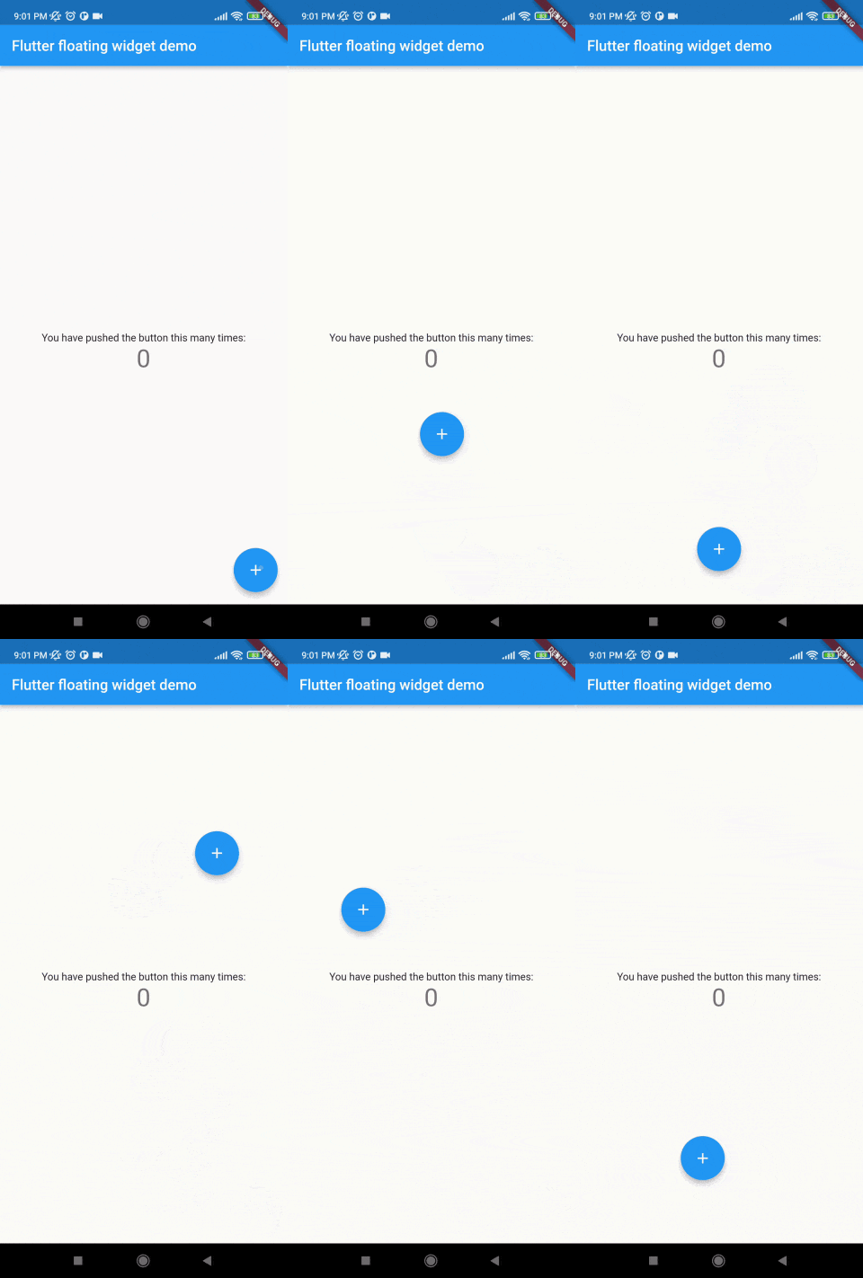
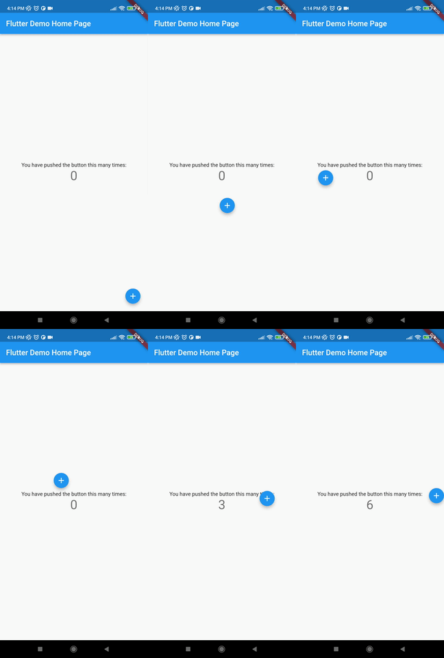
Demo

Without auto align Initially "autoAlign" is false.

    autoAlign = false

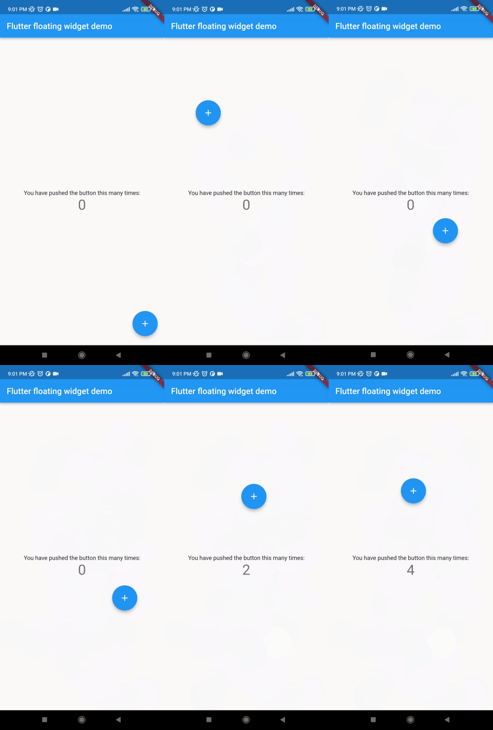
Auto align activated Add this to your code.

    autoAlign = true

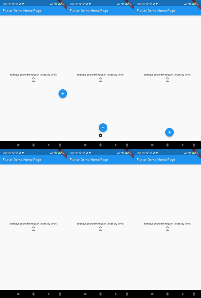
Deletion of the widget Add this to your code.

    deleteWidget: Icon(Icons.cancel),

Getting started
Install

add this in your pubspec.yaml floating_draggable_widget: ^latest_version

Class

This is the constructor of the class.

     FloatingDraggableWidget({
        required this.mainScreenWidget,
        required this.floatingWidget,
        required this.floatingWidgetWidth,
        required this.floatingWidgetHeight,
        this.dy,
        this.dx,
        this.screenHeight,
        this.screenWidth,
        this.speed,
        this.isDraggble = true,
        this.autoAlign = false,
        this.deleteWidgetAlignment = Alignment.bottomCenter,
        this.deleteWidgetAnimationDuration = 200,
        this.hasDeleteWidgetAnimationDuration = 300,
        this.deleteWidgetAnimationCurve = Curves.easeIn,
        this.deleteWidgetHeight = 50,
        this.deleteWidgetWidth = 50,
        this.isCollidingDeleteWidgetHeight = 70,
        this.isCollidingDeleteWidgetWidth = 70,
        this.deleteWidgetDecoration,
        this.deleteWidgetPadding = const EdgeInsets.only(bottom: 8),
        this.onDragging,
        this.widgetWhenDragging,
    });
Where:
  • mainScreenWidget is required and it accept any widget. This is actually the base Widget or the parent widget on where the floating widget will be dragged or moved.
  • floatingWidget is also required and it accept any widget. This is actually the particular widget which will be floated and can be mode or dragged around the screen.
  • floatingWidgetWidth is also required and it accepts a double value which is the width of the floating widget above mentioned.
  • floatingWidgetHeight is also required and it accepts a double value which is the height of the floating widget above mentioned.
  • onDragEvent is a function is not required, which is a event listener of the current position of floating widget, which provides only the x axis as dx and y axis as xy.
  • autoAlignType is a enum type. which has 3 type. onlyRight, onlyLeft, both. by default it is both. if autoAlign is true then this determines the on which side the floating widget will land after dragging ends.
  • disableBounceAnimation is a bool type. if autoAlign is true then then setting true to disableBounceAnimation can disable the bounce animation.
  • dy accepts a double value which is the distance from the top of the screen where floating widget will be positioned initially.
  • dx accepts a double value which is the distance from the left of the screen where floating widget will be positioned initially.
  • screenHeight accepts a double value which is the height of the screen initially.
  • screenWidth accepts a double value which is the width of the screen initially.
  • speed accepts a double value which is the speed factor of the floating widget after it will be let go. The more speed will be provided the slower the object will move after the user let the widget go freely.
  • isDraggable accepts a boolean value which determines if the widget is draggable or not.
  • autoAlign accepts a boolean value which determines if the widget will be auto aligns on the left or right after it is being dragged.
  • deleteWidget accepts a widget which is used to delete the floating widget.
  • onDeleteWidget accepts a function which is used to delete the floating widget.
  • deleteWidgetAlignment accepts an alignment value which is used to align the delete widget.
  • deleteWidgetAnimationCurve accepts an animation curve value which is used to animate the delete widget.
  • deleteWidgetAnimationDuration accepts an animation duration value which is used to animate the delete widget
  • hasDeleteWidgetAnimationDuration accepts an animation duration value which is used to animate the delete widget when it is dragging with the delete widget.
  • deleteWidgetHeight accepts a double value which is used to set the height of the delete widget.
  • deleteWidgetWidth accepts a double value which is used to set the width of the delete widget.
  • isCollidingDeleteWidgetHeight accepts a double value which is used to set the height of the delete widget.
  • isCollidingDeleteWidgetWidth accepts a double value which is used to set the width of the delete widget.
  • boxDecoration optionally accepts a box decoration value which is used to set the decoration of the delete widget.
  • deleteWidgetPadding optionally accepts a padding value which is used to set the padding of the delete widget.
Usage 
import 'package:flutter/material.dart';
import 'package:floating_animated_widget/floating_draggable_widget.dart';
void main() {
  runApp(const MyApp());
}

class MyApp extends StatelessWidget {
  const MyApp({Key? key}) : super(key: key);

  // This widget is the root of your application.
  @override
  Widget build(BuildContext context) {
    return MaterialApp(
      title: 'Flutter Demo',
      theme: ThemeData(

        primarySwatch: Colors.blue,
      ),
      home: const MyHomePage(title: 'Flutter Demo Home Page'),
    );
  }
}

class MyHomePage extends StatefulWidget {
  const MyHomePage({Key? key, required this.title}) : super(key: key);

  final String title;

  @override
  State<MyHomePage> createState() => _MyHomePageState();
}

class _MyHomePageState extends State<MyHomePage> {
  int _counter = 0;

  void _incrementCounter() {
    setState(() {

      _counter++;
    });
  }

  @override
  Widget build(BuildContext context) {

    return FloatingDraggableWidget(
      child: Scaffold(
        appBar: AppBar(

          title: Text(widget.title),
        ),
        body: Center(

          child: Column(

            mainAxisAlignment: MainAxisAlignment.center,
            children: <Widget>[
              const Text(
                'You have pushed the button this many times:',
              ),
              Text(
                '$_counter',
                style: Theme.of(context).textTheme.headline4,
              ),
            ],
          ),
        ),
      ),
      floatingWidget: FloatingActionButton(
        onPressed: _incrementCounter,
        tooltip: 'Increment',
        child: const Icon(Icons.add),
      ),
      floatingWidgetHeight: 40,
      floatingWidgetWidth: 40,
      dx: 200,
      dy: 300
    );
  }
}

Known Limitations
  • Doesn't have functionality of floating on other apps.
  • It does not automatically calculate the size of the parent widget it always takes the whole screen to float around.
  • It does not automatically calculate the size of the floating widget
End

Kategorien

Quell-Repository

Projekte, die dieses Paket verwenden

Noch keine Daten verfügbar.