Pakete, Repositories und App-Kategorien suchen

Paketdetailsv2.0.0

floating_snackbar

Ein Paket, das benutzerdefinierte schwebende Snackbar für Ihr Projekt bereitstellt.

AndroidiOSWebmacOSWindowsLinux
30-Tage-Downloads
953
Likes
28
Pub-Punkte
150

Paket installieren

flutter pub add floating_snackbar

Paketübersicht

Aus öffentlichen Paketdaten erstellte Orientierung.

Ein Flutter-Paket, das anpassbare schwebende Snackbars für verbesserten Benutzerfeedback über mehrere Plattformen hinweg liefert. Entwickelt, um ein modernes, animiertes Benachrichtigungserlebnis zu bieten, unterstützt es reibungslose Übergänge und dynamische Positionierung. Ideal zum Anzeigen kurzer Nachrichten, Warnungen oder Bestätigungen ohne den Benutzerfluss zu unterbrechen. Das Paket ist leichtgewichtig und lässt sich problemlos in bestehende Projekte mit minimalem Aufwand integrieren. Es funktioniert auf Android, iOS, Web, macOS, Windows und Linux und sorgt für konsistentes Verhalten über Geräte hinweg.

Anwendungsfälle

  • Anzeige von schnellen Status-Updates
  • Bestätigungsmitteilungen nach Aktionen anzeigen
  • Benutzerfeedback in Formularen bereitstellen
  • Benachrichtigung von Benutzern über erfolgreiche Operationen
  • Verbesserung der Benutzeroberfläche mit animierten Benachrichtigungen

Hauptmerkmale

  • Anpassbare Erscheinung und Animation
  • schwebendes, nicht blockierendes Design
  • Plattformübergreifende Kompatibilität
  • Einfache Integration mit bestehendem Code
  • Unterstützung mehrerer Anzeigepositionen

Geeignet für

  • Mobile- und Webanwendungen
  • Projekte, die leichte Benachrichtigungen benötigen
  • Entwickler, die moderne UI-Komponenten suchen
  • Apps, die konsistente Rückmeldungen über Plattformen hinweg erfordern
  • UI-orientierte Flutter-Projekte

Hinweise

  • Kann zusätzliche Stilisierung für komplexe Designs erfordern
  • Beschränkt auf grundlegende Snackbar-Funktionen
  • Leistungseinfluss bei häufiger Verwendung
  • Keine eingebaute Unterstützung für Swipe-to-Dismiss
  • Abhängig von plattformspezifischen Renderverhalten

Original-README

Originaler README-Schnappschuss aus dem verknüpften Quell-Repository. Aktuelle Inhalte finden Sie im Repository.

floating_snackbar

pub package CI license

Beautiful, customizable floating snackbars / toasts for Flutter. 🚀

Keep the dead-simple one-liner you already know - or reach for variants, positioning, theming, actions, progress bars, and context-free display when you need them. Pure Dart, zero native code, works on every platform.

Android iOS Linux macOS Web Windows
✅ ✅ ✅ ✅ ✅ ✅

📸 Screenshots

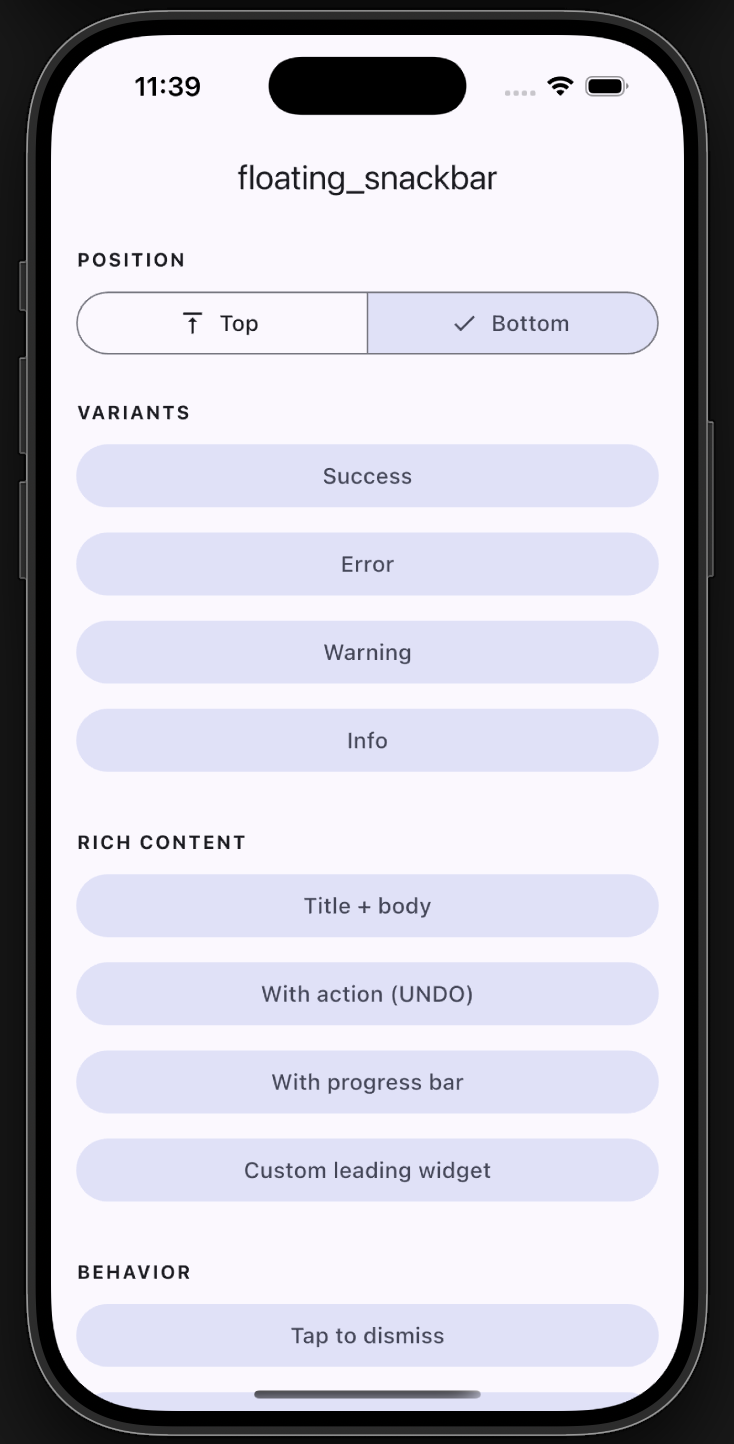
Plain example app screen
Example app
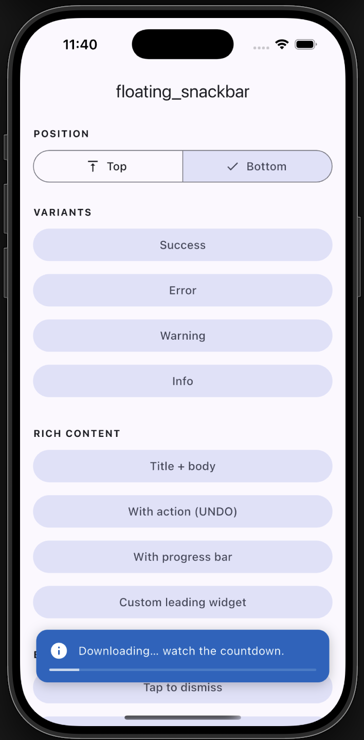
Progress bar
Progress
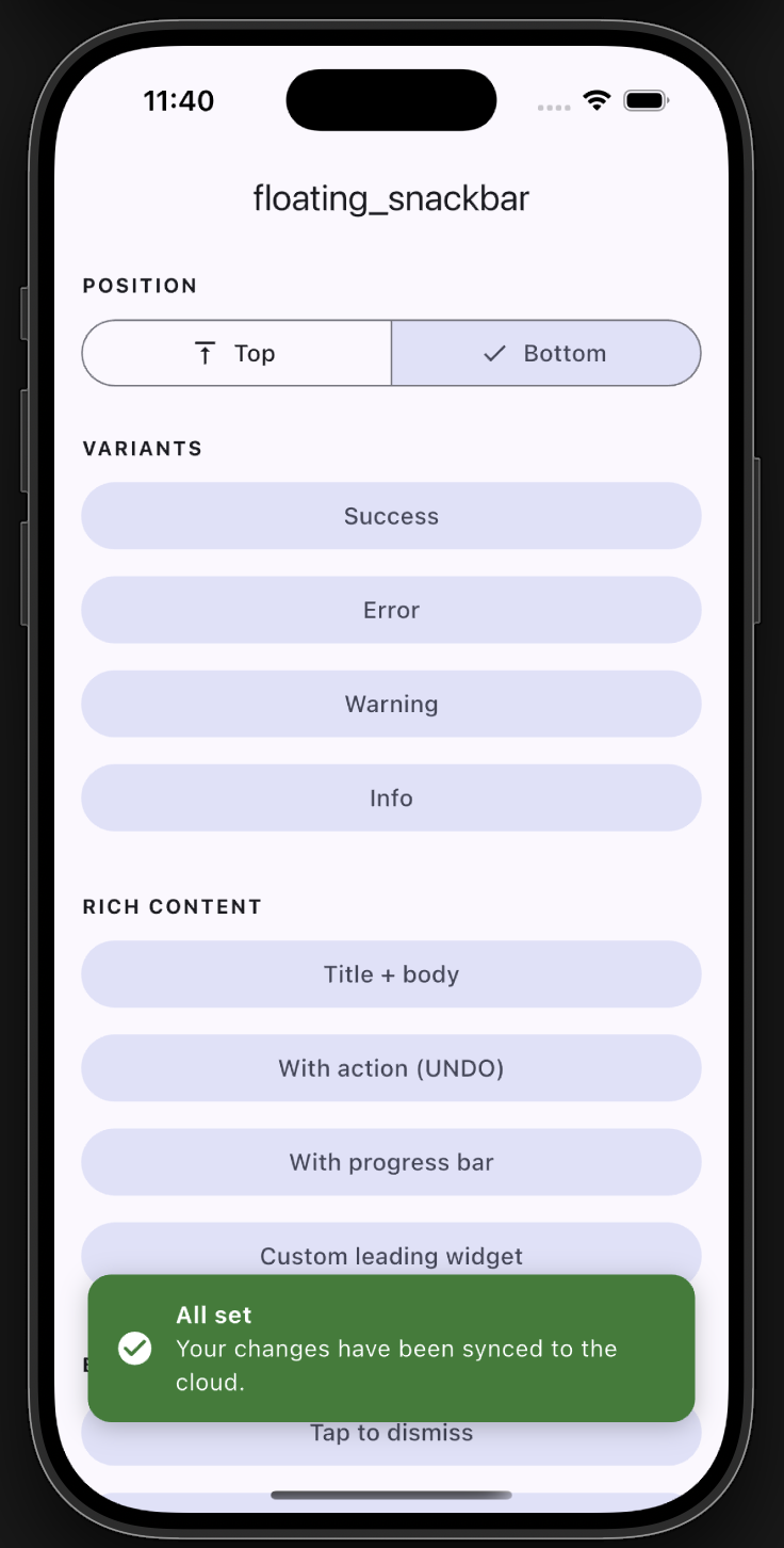
Bottom snackbar with title
Bottom with title
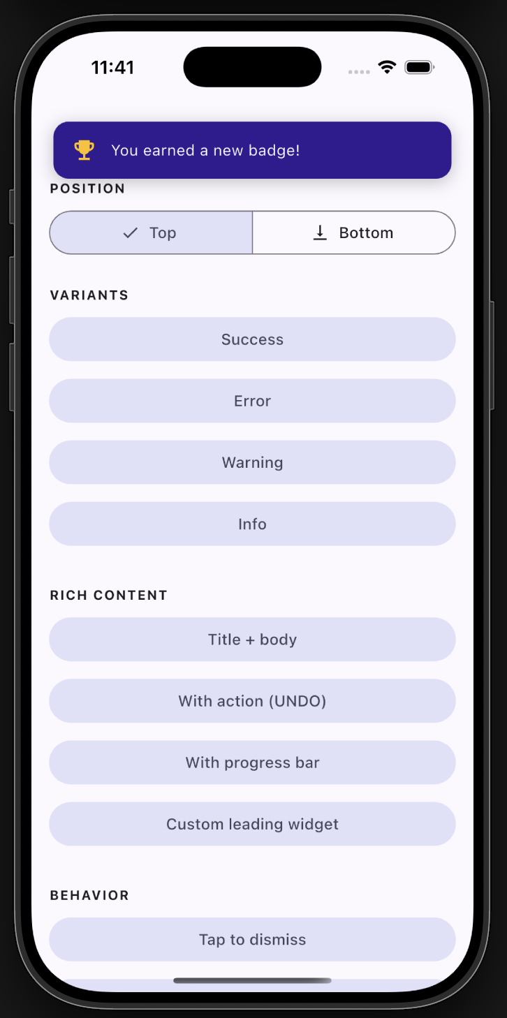
Top position
Top position

✨ Features

  • ✅ Backward compatible - the original floatingSnackBar() still works.
  • 🎨 Variants - success, error, warning, info, with default colors & icons.
  • 📍 Positioning - show at the top or bottom of the screen.
  • 🧩 Rich content - title + body, leading icon/widget, trailing action button.
  • ⏳ Progress bar - optional countdown indicator.
  • 👆 Dismissal - tap-to-dismiss and swipe-to-dismiss.
  • 🌈 Animations - slide, fade, or scale.
  • 🌍 Global theming - set defaults once via FloatingSnackBar.theme.
  • 🪄 Context-free - show from services/blocs with no BuildContext.

📦 Getting started

Add the dependency:

dependencies:
  floating_snackbar: ^2.0.0

Import it:

import 'package:floating_snackbar/floating_snackbar.dart';

🚀 Usage

The simple one-liner (unchanged)
floatingSnackBar(
  message: 'Hi there! I am a floating SnackBar!',
  context: context,
);
Variants
FloatingSnackBar.success(context, 'Saved successfully!');
FloatingSnackBar.error(context, 'Something went wrong.');
FloatingSnackBar.warning(context, 'Battery is running low.');
FloatingSnackBar.info(context, 'A new update is available.');
Positioning
FloatingSnackBar.success(
  context,
  'Shown at the top!',
  position: FloatingSnackBarPosition.top,
);
Title, action & progress
FloatingSnackBar.show(
  context,
  'Item deleted.',
  title: 'Done',
  position: FloatingSnackBarPosition.bottom,
  showProgress: true,
  duration: const Duration(seconds: 5),
  action: FloatingSnackBarAction(
    label: 'UNDO',
    onPressed: () => restoreItem(),
  ),
);
Custom leading widget & colors
FloatingSnackBar.show(
  context,
  'You earned a new badge!',
  leading: const Icon(Icons.emoji_events, color: Colors.amber),
  backgroundColor: const Color(0xFF311B92),
  animation: FloatingSnackBarAnimation.scale,
);
Context-free (no BuildContext)

Wire the navigator key into your app once:

MaterialApp(
  navigatorKey: FloatingSnackBar.navigatorKey,
  // ...
);

Then call from anywhere - a service, a bloc, an interceptor:

FloatingSnackBar.info(null, 'No BuildContext needed!');

Already have a navigator key? Just assign it: FloatingSnackBar.navigatorKey = myExistingKey;

Global theming

Set your defaults once (e.g. in main) and every snackbar follows them:

FloatingSnackBar.theme = const FloatingSnackBarTheme(
  defaultPosition: FloatingSnackBarPosition.top,
  borderRadius: 16,
  duration: Duration(seconds: 3),
  successColor: Colors.teal,
  animation: FloatingSnackBarAnimation.slide,
);
Dismiss programmatically
FloatingSnackBar.dismiss(context); // or dismiss() with the navigatorKey set

📋 API reference

FloatingSnackBar.show(context, message, { ... })
Parameter Type Description
context BuildContext? Required unless navigatorKey is wired up.
message String The body text.
title String? Optional bold title above the message.
type FloatingSnackBarType normal / success / error / warning / info.
position FloatingSnackBarPosition? top or bottom.
animation FloatingSnackBarAnimation? slide / fade / scale.
duration Duration? Visible time before auto-dismiss.
leading Widget? Custom leading widget (overrides the type icon).
action FloatingSnackBarAction? Trailing action button.
backgroundColor Color? Overrides the type/theme background.
textColor Color? Overrides the text color.
textStyle TextStyle? Overrides the message style.
titleStyle TextStyle? Overrides the title style.
dismissOnTap bool? Tap the card to dismiss.
showProgress bool? Show a countdown bar.
replace bool Replace the current snackbar (default) or queue.

success / error / warning / info are thin wrappers over show with the matching type. Every unset argument falls back to FloatingSnackBar.theme.


🧪 Example

A full demo of every feature lives in example/. Run it with:

cd example
flutter run

🤝 Support

Found a bug or have an idea? Open an issue. 🐛


Enjoy building delightful Flutter apps with floating_snackbar! 🎉

Kategorien

Quell-Repository

Projekte, die dieses Paket verwenden