Aus öffentlichen Paketdaten erstellte Orientierung.
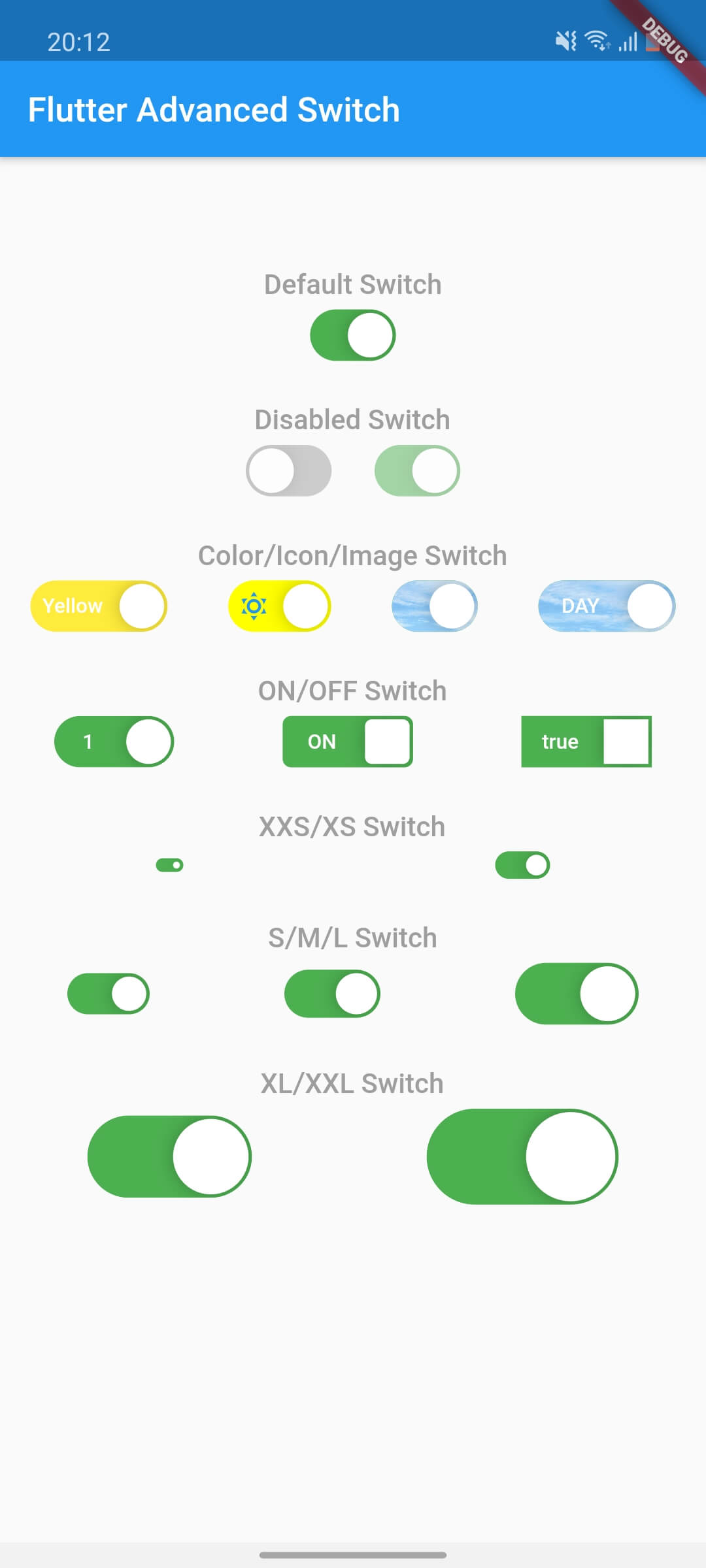
Der Flutter Advanced Switch ist ein anpassbarer Schalter-Widget, der eine umfassende API für umfangreiche Stil- und Verhaltensanpassungen bietet. Er ermöglicht Entwicklern, visuell unterschiedliche Schalter mit reibungslosen Animationen, benutzerdefinierten Track- und Thumb-Designs sowie reaktionsfähigen Interaktionen auf allen wichtigen Plattformen zu erstellen. Ideal für moderne Benutzeroberflächen, die einzigartige Umschaltsteuerelemente erfordern, verbessert er die Benutzererfahrung durch polierte, interaktive Elemente. Das Paket unterstützt Android, iOS, Web, macOS, Windows und Linux und gewährleistet Konsistenz über Plattformen hinweg.
Anwendungsfälle
Benutzerdefinierte Schaltflächen-Schnittstellen
Verbesserte Benutzerfeedback in Formularen
Modernes App-UI-Design
Interaktive Einstellungspanels
Plattformübergreifende Schaltkomponenten
Visuelle Unterscheidung in Dashboards
Hauptmerkmale
Hochgradig anpassbare Track- und Thumb-Elemente
Glatte Animationsübergänge
Plattformübergreifende Kompatibilität
Umfangreiche Stiloptionen
Reaktionsfähige Touch-Rückmeldung
Konfigurierbare Zustände und Verhaltensweisen
Geeignet für
UI-Designer, die visuelle Flexibilität suchen
Entwickler, die moderne Apps erstellen
Teams, die eine konsistente Toggle-UX benötigen
Apps mit komplexen Formularinteraktionen
Projekte für mehrere Plattformen
Hinweise
Erfahrung mit der Anpassung von Flutter-Widgets erforderlich
Kann die Bundle-Größe leicht erhöhen
Stilisierungs-Komplexität kann die Entwicklungs-Geschwindigkeit beeinflussen
Eingeschränkte integrierte Themen
Nicht ideal für einfache Ein/Aus-Schalter ohne Anpassung
Original-README
Originaler README-Schnappschuss aus dem verknüpften Quell-Repository. Aktuelle Inhalte finden Sie im Repository.
flutter_advanced_switch
A highly customizable switch widget for Flutter with support for custom colors, text, icons, images, and more.
Switch Light
Switch Dark
Features
✅ Fully customizable colors, sizes, and shapes
✅ Support for text labels and icons
✅ Background images for active/inactive states
✅ Custom thumb widget support
✅ Smooth animations
✅ Enabled/disabled states
✅ Controller-based or callback-based state management
✅ Customizable thumb padding
✅ Null-safe
Getting Started
In the pubspec.yaml of your flutter project, add the following dependency:
class_MyWidgetStateextendsState<MyWidget> {
final _controller = ValueNotifier<bool>(false);
@overridevoidinitState() {
super.initState();
_controller.addListener(() {
setState(() {
// React to state changesprint('Switch is now: ${_controller.value}');
});
});
}
@overridevoiddispose() {
_controller.dispose();
super.dispose();
}
@overrideWidgetbuild(BuildContext context) {
returnColumn(
children: [
AdvancedSwitch(controller: _controller),
Text('Switch is ${_controller.value ? "ON" : "OFF"}'),
],
);
}
}
Parameters
Parameter
Description
Type
Default
controller
Controls the state of the switch. If provided, the switch will use this controller to manage its state.
ValueNotifier<bool>?
null
activeColor
The background color when the switch is in the active (on) state.
Color
Color(0xFF4CAF50)
inactiveColor
The background color when the switch is in the inactive (off) state.
Color
Color(0xFF9E9E9E)
activeChild
A widget to display on the left side when the switch is active.
Widget?
null
inactiveChild
A widget to display on the right side when the switch is inactive.
Widget?
null
activeImage
An optional background image to display when the switch is active.
ImageProvider?
null
inactiveImage
An optional background image to display when the switch is inactive.
ImageProvider?
null
decoration
The decoration to apply to the switch container. Typically used to set the border radius and shape.
BoxDecoration
BorderRadius.circular(15)
width
The width of the switch.
double
50.0
height
The height of the switch. The thumb size is automatically calculated based on this value.
double
30.0
enabled
Whether the switch is enabled. If false, the switch will be displayed with reduced opacity and will not respond to user interactions.
bool
true
disabledOpacity
The opacity to apply when the switch is disabled.
double
0.5
thumb
A custom widget to use as the thumb (the sliding part of the switch). If null, a default white rounded rectangle with a shadow will be used.
Widget?
null
thumbPadding
The padding around the thumb. This creates space between the thumb and the switch edges.
double
1.0
initialValue
The initial state of the switch when controller is not provided. This value is only used when controller is null.
bool
false
onChanged
Called when the user toggles the switch. The switch will call this callback with the new value. If null and no controller is provided, the switch will be disabled.