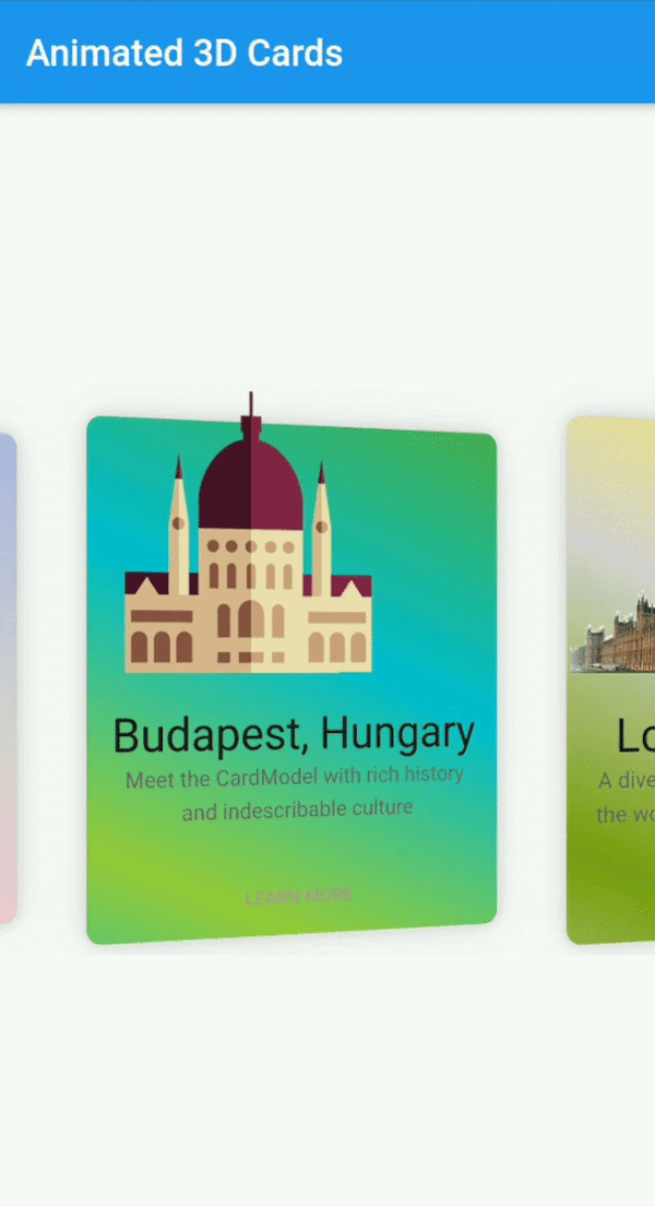
Ein vollständig anpassbarer animierter Karten-Widget mit Funktionen für 3D-Animation und vieles mehr. Dieses Widget funktioniert sowohl unter Android als auch unter iOS.
Aus öffentlichen Paketdaten erstellte Orientierung.
Flutter Animated Cards ist ein anpassbarer Widget zum Erstellen visuell ansprechender Karten mit 3D-Animationen, der darauf ausgelegt ist, die Benutzerinteraktion sowohl auf Android als auch auf iOS zu verbessern. Er unterstützt reibungslose Übergänge und dynamische Effekte und ist daher ideal für moderne App-Interfaces. Das Paket ist leichtgewichtig und einfach zu integrieren und bietet Entwicklern Flexibilität in Design und Verhalten. Durch seinen Fokus auf Animationsqualität und plattformübergreifende Kompatibilität verleiht es kartenbasierten Layouts Tiefe und Interaktivität.
Anwendungsfälle
Interaktive Produktpräsentationen
Animierte Navigationskarten
Gamifizierte Benutzeroberflächenelemente
dynamische Inhaltswalzen
Onboarding-Bildschirme
Hauptmerkmale
3D-Kartenanimationen
Vollständig anpassbare Darstellung
Plattformübergreifende Unterstützung (Android und iOS)
Glatte Übergangseffekte
Einfache Integration über pub
Behandlung von responsive Design
Geeignet für
UI-Designer, die auf visuellen Glanz abzielen
Entwickler, die interaktive Dashboards erstellen
Apps, die ansprechende Onboarding-Erfahrungen erfordern
E-Commerce-Apps mit Produktkarten
Prototyping animierter Schnittstellen
Hinweise
Kann die Leistung auf Low-End-Geräten beeinträchtigen
Erfordert sorgfältige Optimierung für komplexe Animationen
Beschränkte Dokumentation neben der grundlegenden Verwendung
Nicht geeignet für statische oder minimalistische Designs
Am besten mit moderater Animationskomplexität verwenden
Original-README
Originaler README-Schnappschuss aus dem verknüpften Quell-Repository. Aktuelle Inhalte finden Sie im Repository.
flutter_animated_cards
A Fully customizable animated cards widget that has feature of 3D animation and much more. This widget works on both Android & iOS.
Installation
Add following dependency in pubspec.yaml file. And add this import to your file.
// Add AnimatedCards to the widget tree
child: FlutterAnimatedCards(
list: _cardList,
model: _cardModel,
),
Card Model
classCardModel{
finalString title; /// requiredfinalString imagePath; /// required i.e "assets/images/image.png"finalString description; /// (Optional)finalColor color; /// (Optional) add this parameter if you want to have different color on each cardfinalList<Color> colorList; /// (Optional) add this parameter if you want to apply different gradient on each card
}
FlutterAnimatedCards made through model class
If you add Color parameter in your model class and assign each list item a new different color then your widget look like this.
Cards with ModelColor
Cards with Model Gradient
1-
   CardModel(
           title: 'Colors, Vibrant',
           description:'Gardening is how I relax. It\'s another form of creating and playing with colors.',
           color: Color(0xfff9d9e2),  // add color of your choice, add different colors in every list item
           imagePath: "assets/images/colors.png"),

2-
   CardModel(
          title: 'Budapest, Hungary',
          description:'Meet the CardModel with rich history and indescribable culture',
          colorList: [Color(0xFF4CAF50),  // add gradient of your choice, add different gradient in every list item
            Color(0xFF00BCD4),
            Color(0xFF99ca3d)],
          imagePath: "assets/images/city_image.png"),
FlutterAnimatedCards without passing any color in model class
This is another way to give colors or gradient to your card. Now you need to add 'cardWithSingleColor' or 'cardWithGradientColors' as shown below
Cards with Single Color
Cards with Single Gradient
1-
child: FlutterAnimatedCards(
list: _cardList,
model: _cardModel,
cardWithSingleColor: Color(0xfff9d9e2), // you are not asked to add this parameter, but you can this if you want to display your cards withany other single color. By default cards will appear as it is shown in Screenshot
),
2-
child: FlutterAnimatedCards(
list: _cardList,
model: _cardModel,
cardWithGradientColors: [Color(0xffacb6e5), // this parameter is needs to be added to add gradient, there is no default gradient available in lib
Color(0xFFD5D2D2),
Color(0xFFfbc7d4)],
),
Custom Usage
There are several options that allow for more control:
Properties
Description
model
This is the required parameter. You need to pass a model class somehow similar to the one shown in example, you can add more arguments in your class but 'name', 'description', 'image' is necessary
list
This is also the required parameter. You need to pass a list of your model class, this list can not be null or empty
cardHeight
set card height according to your requirement.
cardWidth
set card width according to your requirement.
isRotatingCards
by default it's 'true', you can set it 'false' if you don't want to add 3D rotation in your cards.
cardWithSingleColor
if you want to give all your cards one single color, use this property. You can also give each card a different color through model class
cardWithGradientColors
it takes List as a parameter, this property allows you to apply the same gradient on all of your cards. You can also give each card a different gradient through model class
moreText
by default I have set it to 'LEARN MORE', but you can change it to any text according to your choice.
onMoreBtnPressed
this is a click event, currently it performs nothing you can use it according to your choice.