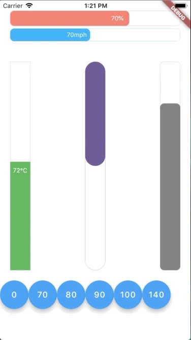
Dieses farbenfrohe Flutter-Widget-Paket zielt darauf ab, eine animierte Fortschrittsleiste im reaktiven Stil anzuzeigen. Es unterstützt sowohl vertikale als auch horizontale Balken.
Aus öffentlichen Paketdaten erstellte Orientierung.
Ein lebendiger Flutter-Paket, das animierte Fortschrittsbalken in horizontaler und vertikaler Ausrichtung liefert. Mit einem reaktiven Stil gestaltet, aktualisiert es die Fortschrittswerte nahtlos und unterstützt Echtzeit-Visueller Rückmeldung auf allen wichtigen Plattformen. Ideal für Ladeanzeiger, Task-Erfolgsverfolgung oder jedes UI-Element, das eine dynamische Fortschrittsvisualisierung erfordert. Das Paket ist leichtgewichtig, anpassbar und lässt sich nahtlos in Flutter-Apps integrieren.
Anwendungsfälle
Ladebildschirme
Aufgabenabschlussindikatoren
Formularfortschrittverfolgung
Interaktive Tutorials
Spiel-Fortschrittsbalken
Hauptmerkmale
Unterstützung für horizontale und vertikale Ausrichtung
Reaktive Animationsupdates
Buntes und anpassbares Design
Plattformübergreifende Kompatibilität
glatte Übergangsanimationen
Einfache Integration über pub
Geeignet für
Entwickler, die interaktive Benutzeroberflächen erstellen
Apps, die visuelle Fortschrittsrückmeldung benötigen
Designer, die animierte Indikatoren suchen
Plattformübergreifende Flutter-Projekte
Benutzer, die eine minimale Einrichtung mit reichhaltigen Visualisierungen wünschen
Hinweise
Kann zusätzliche Stile für den Dunkelmodus erfordern
In this table, you can find all attributes provided by this package:
Attribute
Default value
Description
currentValue
0
Set the current value for progress bar. This value should be in stateful so that whenever setState() has been called, the progress bar will trigger an animation from latest currentValue to new currentValue
maxValue
100
Max value to be displayed as progress bar. Current value can be greater than max value
size
30
The bar height if direction in Axis.horizontal. The bar width if direction in Axis.vertical
animatedDuration
const Duration(milliseconds: 300)
Set the duration for an animation cycle
direction
Axis.horizontal
The bar can be in Axis.horizontal or Axis.vertical direction
verticalDirection
VerticalDirection.down
With vertical direction, the bar can be VerticalDirection.up or VerticalDirection.down direction
borderRadius
8
Set the bar border radius
border
null
Set the bar border style by BoxBorder
backgroundColor
const Color(0x00FFFFFF)
Set the bar background color
progressColor
const Color(0xFFFA7268)
Set the bar progressing color
progressGradient
null
Set the bar progressing gradient. Overrides progressColor
changeColorValue
null
Set a value that progress color should be changed to [0---blue----[70]-red-100]
changeProgressColor
const Color(0xFF5F4B8B)
Color that progressing color will be changed to, whenever currentValue greater than changeColorValue
displayText
null
Text to display belonging with currentValue. Examples: % -> 20% °F -> 80°F