Aus öffentlichen Paketdaten erstellte Orientierung.
Flutter Bootstrap5 ist ein Flutter-Paket, das viele Bootstrap-5-Komponenten und -Hilfsfunktionen in Flutter-Anwendungen bringt. Es ermöglicht Entwicklern, responsive, mobilorientierte Designs mit vertrauter Bootstrap-5-Syntax und Klassen zu implementieren. Das Paket unterstützt alle wichtigen Plattformen wie Android, iOS, Web, macOS, Windows und Linux und ist daher ideal für plattformübergreifende Projekte. Durch die Nutzung des Bootstrap-Grid-Systems, der Typografie, Buttons, Formulare und vieles mehr können Entwickler die UI-Entwicklung beschleunigen und konsistente Stile über Geräte hinweg gewährleisten.
Anwendungsfälle
Reaktive Web- und Mobile-Apps erstellen
Schnelle UI-Prototypen-Erstellung mit Bootstrap-Mustern
Plattformübergreifende App-Entwicklung
Konsistente Designsysteme erstellen
Bootstrap-basierte Layouts in Flutter umsetzen
Hauptmerkmale
Kompatibilität von Bootstrap 5-Komponenten
Reaktives Gitter-System
Plattformunterstützung für alle Ziele
CSS-ähnliche klassenbasierte Styling
Einfache Integration in bestehende Flutter-Projekte
Geeignet für
Entwickler, die mit Bootstrap vertraut sind
Teams, die Designkonsistenz priorisieren
Projekte, die eine schnelle UI-Entwicklung erfordern
Plattformübergreifende Anwendungsbaustein
Frontend-fokussierte Flutter-Entwickler
Hinweise
Kann die Bundle-Größe erhöhen
Eingeschränkte Anpassung über Bootstrap-Klassen hinaus
Abhängig von externer CSS-Logik
Kein vollständiger Bootstrap-Ersatz
Erfordert Verständnis von Bootstrap-Konzepten
Original-README
Originaler README-Schnappschuss aus dem verknüpften Quell-Repository. Aktuelle Inhalte finden Sie im Repository.
FlutterBootstrap5 🚀
This package is used to support the creation of responsive web applications with Flutter.
It is based on the well-known CSS framework Bootstrap 5 and offers many features that can also be found in Bootstrap.
If you like this package it would be nice if you would give a Like ❤️ and a Star ⭐ to support the project!
If you want to have a quick overview of the most important functions and test them directly, you can do so here
You have various possibilities to customize Flutter Bootstrap5 for your needs.
You can also leave it at the default values to get the default behavior of a Bootstrap5 app.
Currently the following customization options are supported:
BreakPoints
To set your own BreakPoints, you can simply pass the BreakPoints class to the [FlutterBootstrap5] widget.
By default the current BreakPoints of Bootstrap5 CSS are used
Beside the normal BreakPoints you can also define your own BreakPoints for the [FB5Container].
These determine which width a [FB5Container] should have at a certain BreakPoint.
By default the current Container BreakPoints of Bootstrap5 CSS are used
With the parameter defaultFontSize you can specify the default font size to be used for the calculation of "rem" values.
Bootstrap CSS uses rem to calculate margins, paddings and also font size.
Similarly, these values are also calculated in Flutter Bootstrap5 depending on the defaultFontSize.
The default value is 16.0
Typography
Flutter Bootstrap5 uses a font size calculation mechanism based on Bootstrap CSS.
So font sizes change dynamically depending on the screen size.
To customize this behavior you can pass the [FB5Typography] class to FlutterBootstrap5.
Use the theme in your MaterialApp
After configuring [FlutterBootstrap5] to your liking,
you can now pass the theme to your MaterialApp to take full advantage of Flutter Bootstrap 5.
MaterialApp(
title: 'Flutter Bootstrap5 Demo',
theme: BootstrapTheme.of(ctx).toTheme( [PASS YOUR THEME TO OVERRIDE BOOTSTRAP THEME IF YOU WANT TO] ),
home: constHome(),
),
So now let's talk about the features
Currently supported Bootstrap classes
NOTE! Responsive support indicates whether the use of -xs, -sm, -md, -lg, -xl, and-xxl is supported
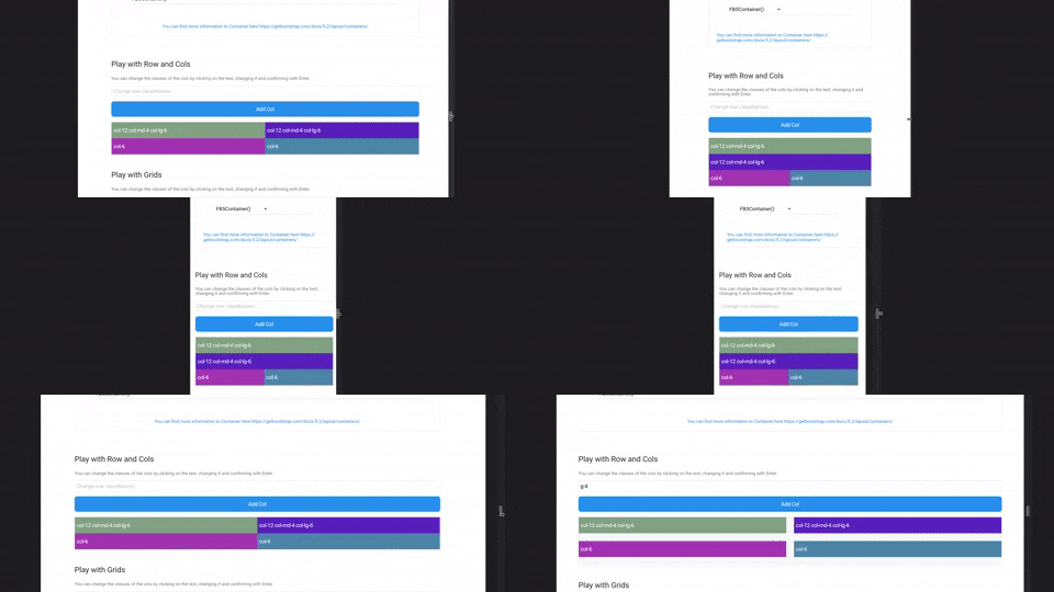
FB5Col are the flutter implementation of the Bootstrap Col. They should be used inside a FB5Row and change their representation according to the classNames.
FB5Grid are used to represent a grid system of your children. They should not contain FB5Cols. FB5Grid automatically adjusts the size of the children so that a row of children always has the same height.
Information about the current screen size and breakpoint is returned by the BootstrapTheme.
For this, nothing more is necessary than to execute the following function.
final screenData = BootstrapTheme.of(context);
It also offers useful functions. For example, the query whether the current breakpoint is larger or smaller than a certain breakpoint.
    final screenData = BootstrapTheme.of(context);
    screenData.currentBreakPoint.isBreakPointOrSmaller(screenData.breakPoints.xl);

    screenData.currentBreakPoint.isBreakPointOrLarger(screenData.breakPoints.xl);
Functions
There are some helper functions to add bootstrap functionality to Flutter widgets:
// e.g. add a 4rem margin-top to a ContainerContainer(
margin: margin(context, 'mt-4'),
);
// e.g. add a 2rem padding to a ContainerContainer(
margin: padding(context, 'p-2'),
);
// add a borderRadius to a ContainerContainer(
decoration: BoxDecoration(
borderRadius: rounded(context), // rounded1 rounded2 rounded3 rounded4 rounded5 roundedPill
),
);
// add a border to a ContainerContainer(
decoration: BoxDecoration(
border: borderPrimary(context), // borderSecondary, borderSuccess, borderDanger, etc...
),
);
// responsiveValue & responsiveValueOrNull// if you need different values for different breakPointsfinal width = responsiveValue<double>(context, defaultValue: 300.0, md: 350.0, xl: 400.0);