Aus öffentlichen Paketdaten erstellte Orientierung.
Ein semantischer Dialog-Paket für Flutter, entwickelt von YY.inc, der zugängliche und anpassbare Dialogkomponenten bereitstellt. Es legt besonderen Wert auf korrekte Semantik zur Verbesserung der Bildschirmleseunterstützung und Benutzererfahrung. Das Paket ist Open Source und begrüßt Beiträge aus der Community. Aufbauend auf Flutter's Widget-System ermöglicht es Entwicklern, konsistente, wiederverwendbare Dialoge mit minimalem Boilerplate zu erstellen. Ideal für Anwendungen, die inklusive UI-Design und strukturierte Dialoginteraktionen erfordern.
Anwendungsfälle
Zugänglichkeitsorientierte Anwendungen
wiederverwendbare Dialogkomponenten
Screenreader-kompatible Schnittstellen
Benutzerdefinierte Modaldialogfelder
Open-Source-Kooperation und Entwicklung
Hauptmerkmale
Semantische Barrierefreiheit
Anpassbarer Dialoginhalt
Open-Source-Mitwirkungsmodell
Minimales Boilerplate
Plattformübergreifende Kompatibilität
Geeignet für
Entwickler, die Barrierefreiheit priorisieren
Teams, die wiederverwendbare UI-Komponenten erstellen
Open-Source-Mitwirkende
Flutter-Projekte mit komplexen Dialoganforderungen
Hinweise
Erfordert Verständnis der Flutter-Semantik
Eingeschränkte plattformspezifische Anpassung
Keine eingebauten Animationen
Community-getriebene Aktualisierungen
Abhängig von externer Wartung
Original-README
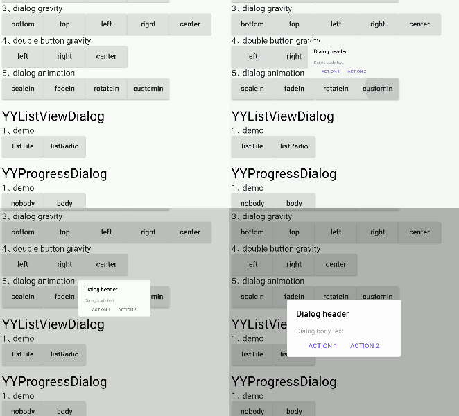
Originaler README-Schnappschuss aus dem verknüpften Quell-Repository. Aktuelle Inhalte finden Sie im Repository.
Global dialog function encapsulation, with a semantic way to fill the content inside the dialog, the current function provided
Support for a few semantic component methods to populate the component content inside dialog
Support for customizing semantic components for developers to freely populate component content inside dialog
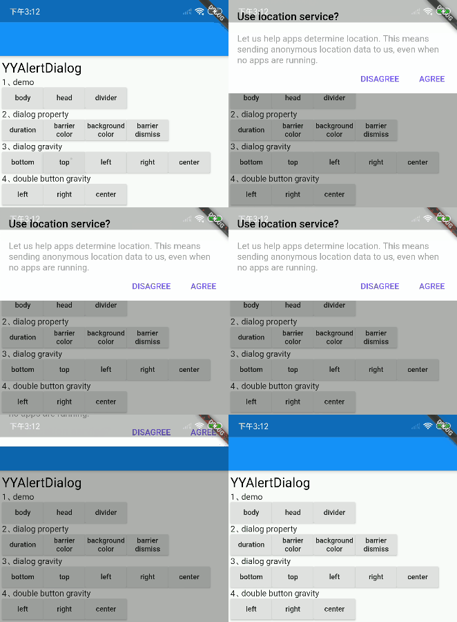
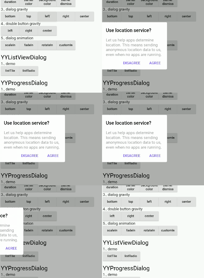
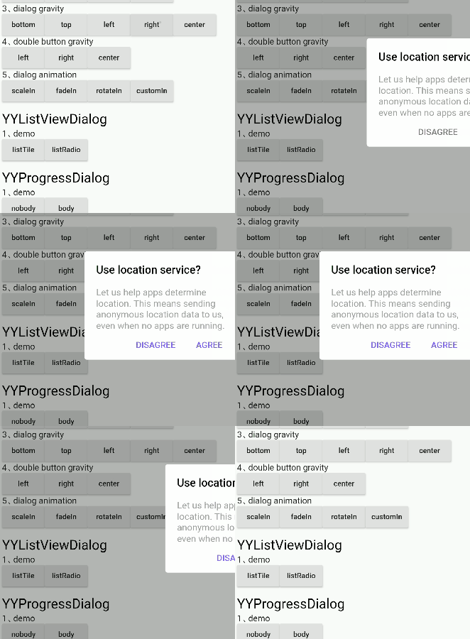
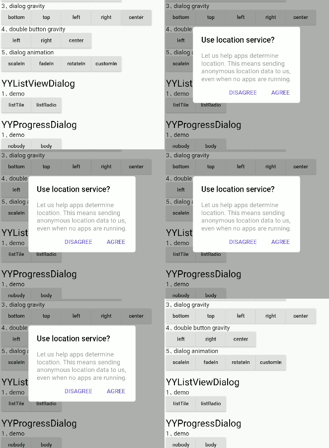
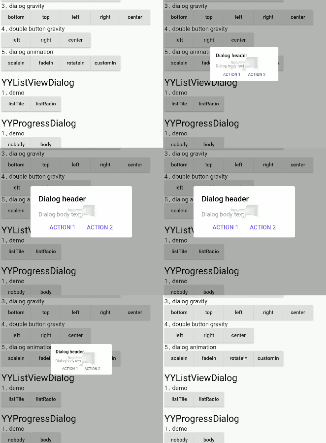
Support setting dialog background color, foreground color, position, animation, click the external disappear and other functions, see the details below
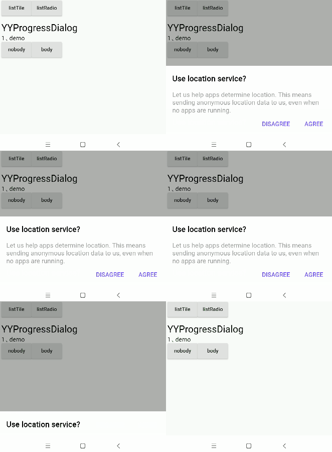
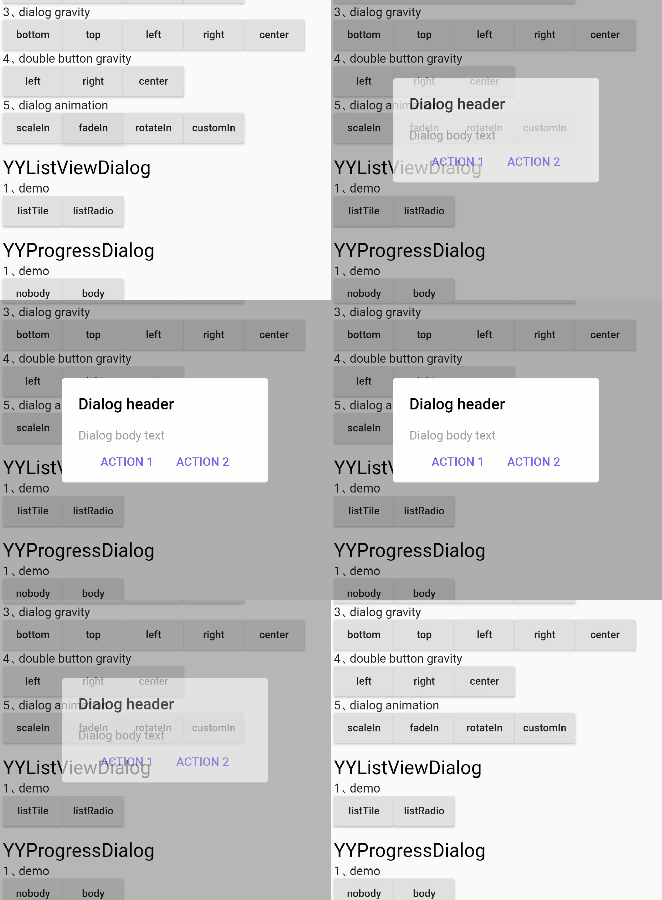
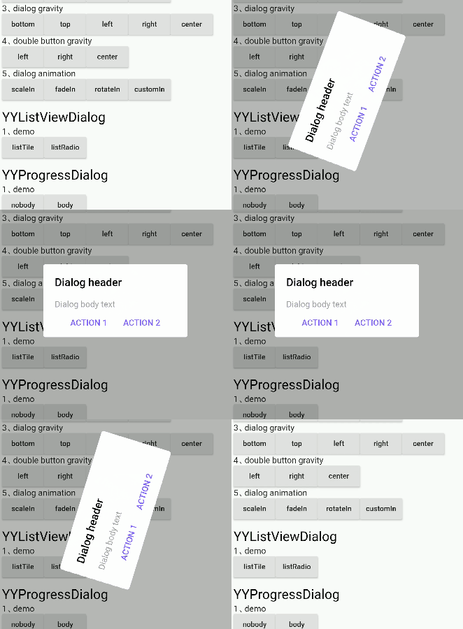
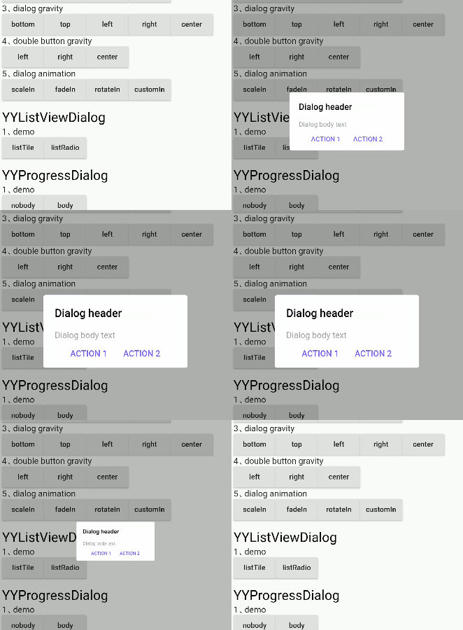
The dialog appears with the default animation available
false
margin
The margin of a dialog
EdgeInsets.all(0.0)
barrierColor
Dialog barrierColor
30% of black
decoration
Dialog decoration
null
backgroundColor
Dialog backgroundColor
white
borderRadius
Dialog borderRadius
0.0
constraints
Dialog constraints
no constraints
animatedFunc
Animation of dialog
Emerge from the middle
showCallBack
dialog show callbacks
not
dismissCallBack
dialog dismiss callbacks
not
barrierDismissible
Whether to click to pop up the external disappear
true
useRootNavigator
Whether to use root navigation
true
After setting gravity, set gravityAnimationEnable = true if animation is needed
If the decoration property is set, the backgroundColor and borderRadius are not in effect; they are mutually exclusive
Supported method
method
description
show[x,y]
show dialog
dismiss
dismiss dialog
isShowing
Is the dialog showing
⚡ Semantic Widget
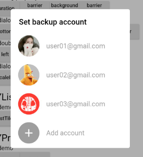
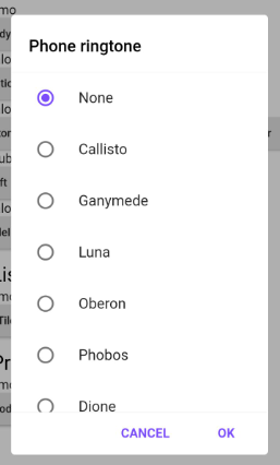
The contents of the components inside the dialog are encapsulated by semantic functions in advance to quickly build the dialog, as shown in the following table
Since the existing semantic components only assist in the rapid UI construction, they are far from meeting the requirements in actual project development
So it provides the ability to insert custom semantic components into dialog
Insert the component into the dialog through 'widget()'
Application scenario: after the network request comes back, there is no Context to refer to in the callback, at this time, the Context needs to be initialized in advance, and then the dialog can be called without the Context
1、init
Call static methods before show dialog YYDialog.init(context);
classAppHomeextendsStatelessWidget{
Widgetbuild(BuildContext context) {
//1、init contextYYDialog.init(context);
//2、Subsequent use may not be required context
......
}
}
2、use
direct use YYDialog,Note that it must be called build()