Pakete, Repositories und App-Kategorien suchen

Cover von flutter_expandable_fab
Paketdetailsv3.0.0

flutter_expandable_fab

Die Speed-Dial-FAB (Floating Action Button), die die Anzeige und das Verbergen mehrerer Aktionsschaltflächen animieren kann.

AndroidiOSWebmacOSWindowsLinux
30-Tage-Downloads
31.700
Likes
448
Pub-Punkte
160

Paket installieren

flutter pub add flutter_expandable_fab

Paketübersicht

Aus öffentlichen Paketdaten erstellte Orientierung.

Ein Flutter-Paket, das einen animierten Speed-Dial-Floating-Action-Button (FAB) bereitstellt, der es Benutzern ermöglicht, mehrere Aktionen mit sanften Übergängen zu erweitern und zu reduzieren. Es verbessert die Benutzerinteraktivität durch eine kompakte, gestenbasierte Möglichkeit, über einen einzigen FAB auf mehrere Aktionen zuzugreifen. Das Paket unterstützt alle wichtigen Plattformen und ist für intuitive Navigation in mobilen und Web-Anwendungen konzipiert. Anpassbare Animationen und Positionierung machen es für moderne, dynamische Oberflächen geeignet.

Anwendungsfälle

  • Unter-Navigation mit mehreren Aktionen
  • Kontextuelle Aktionen-Menüs
  • Erweiterte Benutzeroberfläche für mobile Apps
  • Schneller Zugriff auf häufig verwendete Funktionen
  • interaktive Gestaltungselemente im Web
  • Optimierte Workflows in Produktivitäts-Apps

Hauptmerkmale

  • Glatte Animationsverläufe beim Erweitern/Zusammenklappen
  • Anpassbare Buttonpositionen
  • Unterstützung für mehrere Aktionselemente
  • Plattformübergreifende Kompatibilität
  • Einfache Integration mit bestehender Benutzeroberfläche
  • Konfigurierbare Animationsdauer und Kurve

Geeignet für

  • Entwickler, die interaktive mobile Apps erstellen
  • Designer, die dynamische FAB-Lösungen suchen
  • Teams, die Flutter für Cross-Platform-Projekte verwenden
  • Apps, die kontextbezogene Aktionen benötigen
  • UX-orientierte Anwendungsentwicklung
  • Projekte, die auf gestenbasierte Interaktionen setzen

Hinweise

  • Kann die Leistung beeinträchtigen, wenn viele Aktionsschaltflächen vorhanden sind
  • Erfordert sorgfältige Layoutplanung
  • Das Animationsverhalten kann sich von Plattform zu Plattform unterscheiden
  • Nicht ideal für einfache Szenarien mit einer einzigen Aktion
  • Benötigt Tests auf allen Zielplattformen
  • Eingeschränkte Anpassung über die grundlegende Gestaltung hinaus

Original-README

Originaler README-Schnappschuss aus dem verknüpften Quell-Repository. Aktuelle Inhalte finden Sie im Repository.

flutter_expandable_fab

pub package

English, 日本語

flutter_expandable_fab is a speed dial FAB (Floating Action Button) that can animate the display and hiding of multiple action buttons.
It can be configured to display vertically, horizontally, or in a fan-shaped manner, on either side. It allows for fine-grained customization.

Migration from 1.x to 2.x

In version 2.x, I have made changes to enable free customization of the open/close buttons by setting builders.

Code before migration:
ExpandableFab(
  child: const Icon(Icons.account_box),
  foregroundColor: Colors.amber,
  backgroundColor: Colors.green,
  closeButtonStyle: const ExpandableFabCloseButtonStyle(
    child: Icon(Icons.abc),
    foregroundColor: Colors.deepOrangeAccent,
    backgroundColor: Colors.lightGreen,
  )
  expandedFabSize: ExpandedFabSize.small,
  collapsedFabSize: ExpandableFabSize.regular,
  expandedFabShape: const CircleBorder(),
  collapsedFabShape: const CircleBorder(),
)
Code after migration:
ExpandableFab(
  openButtonBuilder: RotateFloatingActionButtonBuilder(
    child: const Icon(Icons.account_box),
    fabSize: ExpandableFabSize.regular,
    foregroundColor: Colors.amber,
    backgroundColor: Colors.green,
    shape: const CircleBorder(),
  ),
  closeButtonBuilder: DefaultFloatingActionButtonBuilder(
    child: const Icon(Icons.close),
    fabSize: ExpandableFabSize.small,
    foregroundColor: Colors.deepOrangeAccent,
    backgroundColor: Colors.lightGreen,
    shape: const CircleBorder(),
  ),
)

Showcase

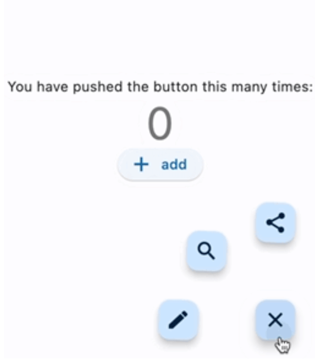
Fan style & Blur overlay
Vertical style & Color overlay
Horizontal style & Custom buttons
Center Fan style
floatingActionButton: ExpandableFab(
  type: ExpandableFabType.fan,
  pos: ExpandableFabPos.center,
  fanAngle: 180,

Getting started

import 'package:flutter_expandable_fab/flutter_expandable_fab.dart';

Scaffold(
  floatingActionButtonLocation: ExpandableFab.location,
  floatingActionButton: ExpandableFab(
    children: [
      FloatingActionButton.small(
        heroTag: null,
        child: const Icon(Icons.edit),
        onPressed: () {},
      ),
      FloatingActionButton.small(
        heroTag: null,
        child: const Icon(Icons.search),
        onPressed: () {},
      ),
    ],
  ),
),

Open/Close programmatically

class _FirstPageState extends State<FirstPage> {
  final _key = GlobalKey<ExpandableFabState>();

  @override
  Widget build(BuildContext context) {
    return Scaffold(
      floatingActionButtonLocation: ExpandableFab.location,
      floatingActionButton: ExpandableFab(
        key: _key,
        children: [
          FloatingActionButton.small(
            child: const Icon(Icons.edit),
            onPressed: () {
              final state = _key.currentState;
              if (state != null) {
                debugPrint('isOpen:${state.isOpen}');
                state.toggle();
              }
            },
          ),
        ],
      ),
    );
  }
}

Customize

You can customize the open/close buttons with your preferred Widget using FloatingActionButtonBuilder. By using DefaultFloatingActionButtonBuilder, you can easily set up the FloatingActionButton. RotateFloatingActionButtonBuilder provides a FloatingActionButton with a rotating animation. Also, the items specified in children don't necessarily have to be FloatingActionButton; you can set any Widget freely.

ExpandableFab(
  openButtonBuilder: RotateFloatingActionButtonBuilder(
    child: const Icon(Icons.account_box),
    fabSize: ExpandableFabSize.regular,
    foregroundColor: Colors.amber,
    backgroundColor: Colors.green,
    shape: const CircleBorder(),
  ),
  closeButtonBuilder: FloatingActionButtonBuilder(
    size: 56,
    builder: (BuildContext context, void Function()? onPressed,
        Animation<double> progress) {
      return IconButton(
        onPressed: onPressed,
        icon: const Icon(
          Icons.check_circle_outline,
          size: 40,
        ),
      );
    },
  ),
  children: [
    FloatingActionButton.large(
      heroTag: null,
      child: const Icon(Icons.edit),
      onPressed: () {},
    ),
    IconButton(
      onPressed: () {
        final state = _key.currentState;
        if (state != null) {
          debugPrint('isOpen:${state.isOpen}');
          state.toggle();
        }
      },
      icon: const Icon(
        Icons.share,
        size: 30,
      ),
    ),
  ],
)

Since children is an array of widgets, you can place any widget you like, not limited to FloatingActionButton.
You can also create buttons with labels as shown below.

floatingActionButton: ExpandableFab(
  key: _key,
  type: ExpandableFabType.up,
  childrenAnimation: ExpandableFabAnimation.none,
  distance: 70,
  overlayStyle: ExpandableFabOverlayStyle(
    color: Colors.white.withOpacity(0.9),
  ),
  children: const [
    Row(
      children: [
        Text('Remind'),
        SizedBox(width: 20),
        FloatingActionButton.small(
          heroTag: null,
          onPressed: null,
          child: Icon(Icons.notifications),
        ),
      ],
    ),
    Row(
      children: [
        Text('Email'),
        SizedBox(width: 20),
        FloatingActionButton.small(
          heroTag: null,
          onPressed: null,
          child: Icon(Icons.email),
        ),
      ],
    ),
    Row(
      children: [
        Text('Star'),
        SizedBox(width: 20),
        FloatingActionButton.small(
          heroTag: null,
          onPressed: null,
          child: Icon(Icons.star),
        ),
      ],
    ),
    FloatingActionButton.small(
      heroTag: null,
      onPressed: null,
      child: Icon(Icons.add),
    ),
  ],
),

Properties

ExpandableFab
Property Description Default
distance Distance from children 100
duration Animation duration 250ms
fanAngle Angle of opening when fan type 90
initialOpen Open at initial display false
type The type of behavior of this widget fan
pos Position for displaying the widget right
closeButtonBuilder Builder for the close button
openButtonBuilder Builder for the open button
childrenOffset For positioning of children widgets
childrenAnimation Types of animations for Children rotate
children The widgets below this widget in the tree
onOpen Will be called before opening the menu
afterOpen Will be called after opening the menu
onClose Will be called before the menu closes
afterClose Will be called after the menu closes
overlayStyle Provides the style for overlay. No overlay when null.
openCloseStackAlignment Defines how [openButtonBuilder] and [closeButtonBuilder] are aligned in a [Stack] Alignment.center
FloatingActionButtonBuilder
Property Description Default
builder Callback to build the Widget
size Size of the Widget
DefaultFloatingActionButtonBuilder
Property Description Default
fabSize Size of the button regular
foregroundColor Foreground color of the button
backgroundColor Background color of the button
shape Shape of the close button
heroTag Tag to apply to the [Hero] widget of the button
child Child widget of the button
RotateFloatingActionButtonBuilder
Property Description Default
angle Angle of rotation (in radians) math.pi / 2
... Same as DefaultFloatingActionButtonBuilder

Thanks

I referred to the code from this article: https://docs.flutter.dev/cookbook/effects/expandable-fab

Kategorien

Abhängigkeiten

Abhängigkeiten 1 Einträge

Quell-Repository

Projekte, die dieses Paket verwenden