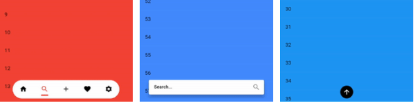
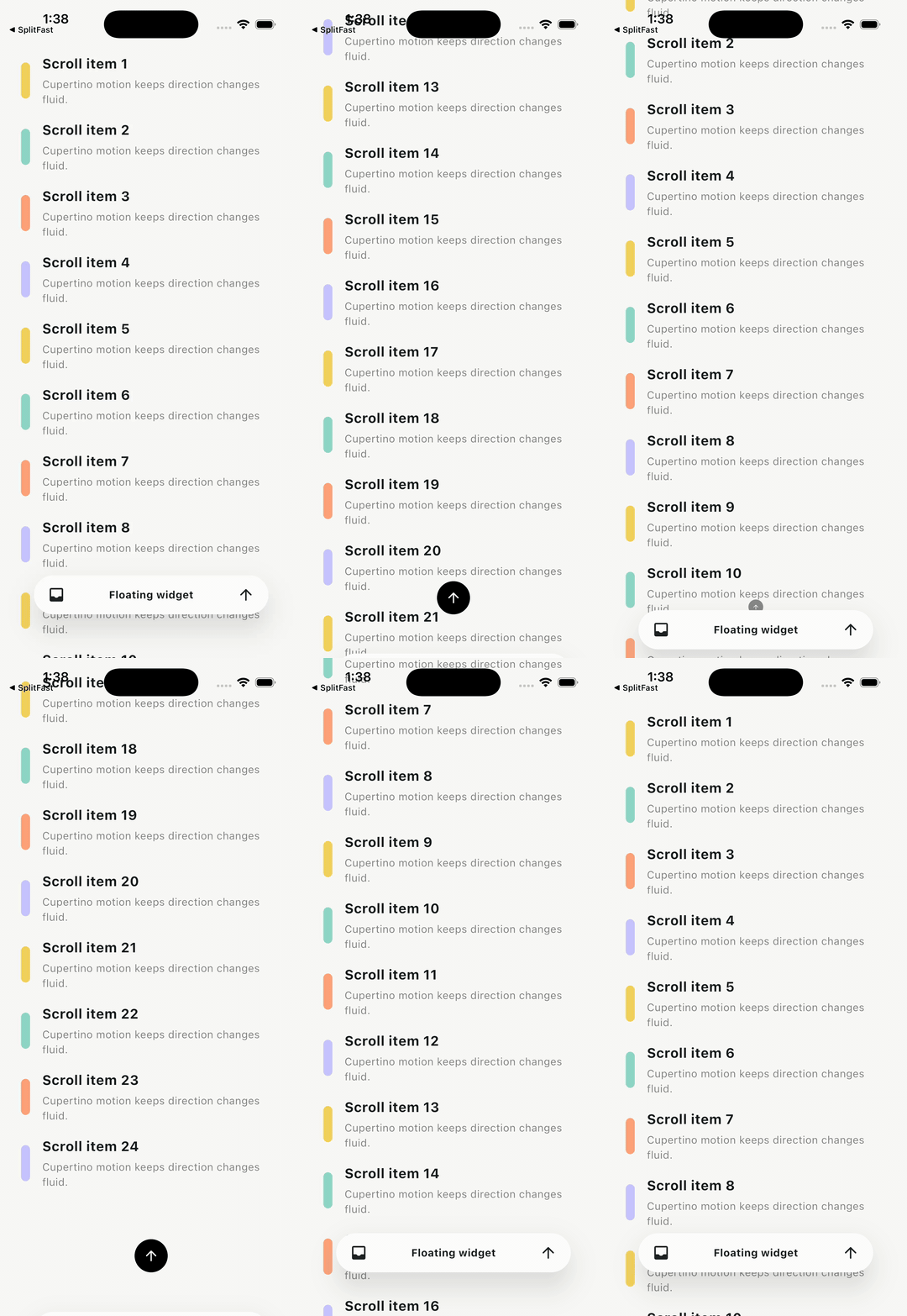
Ein Flutter-Paket, das die Anzeige eines schwebenden Widgets ermöglicht, das beispielsweise als Registerkartenleiste oder untere Navigationsleiste verwendet werden kann. Das Widget reagiert außerdem auf Scrollereignisse.
Aus öffentlichen Paketdaten erstellte Orientierung.
Ein Flutter-Paket, das ein schwimmendes unteres Menüwidget bereitstellt, ideal für die Verwendung als Registerkartenleiste oder untere Navigationsleiste. Es reagiert dynamisch auf Scrollereignisse und zeigt sich automatisch an oder versteckt sich basierend auf dem Scrollverhalten des Benutzers. Für eine nahtlose Integration über Plattformen hinweg entwickelt, unterstützt es Android, iOS, Web, macOS, Windows und Linux. Das Paket verbessert die Benutzererfahrung, indem es die Navigation zugänglich hält, ohne den Inhalt zu blockieren. Es ist leichtgewichtig und anpassbar, was es für Apps mit intuitiver unterer Navigation und reaktionsfähigen Verhalten geeignet macht.
Anwendungsfälle
Unter-Navigation in scrollbaren Listen
Schwebende Tab-Leiste in mobilen Apps
Reaktive Navigation in Web-Anwendungen
Dynamische Benutzeroberflächenelemente in plattformübergreifenden Anwendungen
Verbesserte Benutzererfahrung in inhaltsintensiven Schnittstellen
Hauptmerkmale
Scroll-basierte Anzeige/Ausblendung
Plattformübergreifende Kompatibilität
Anpassbare Erscheinung
Einfache Integration mit bestehenden Widgets
Unterstützt mehrere Plattformen
Geeignet für
Mobile-App-Entwickler
Webanwendungsdesigner
Plattformübergreifende Flutter-Projekte
UI/UX-orientierte Entwicklung
Apps mit umfangreichem scrollbarem Inhalt
Hinweise
Kann zusätzliche Stilisierung für komplexe Layouts erfordern
Leistungsbeeinträchtigung bei sehr langen Listen
Eingeschränkte Anpassungsmöglichkeiten für fortgeschrittene Animationen
Nicht ideal für statische Navigationsleisten
Erfordert sorgfältige Handhabung in verschachtelten Scrollansichten
Original-README
Originaler README-Schnappschuss aus dem verknüpften Quell-Repository. Aktuelle Inhalte finden Sie im Repository.
Floating Bottom Bar
A Flutter package that floats any widget above your content and reacts to
scrolling. Use it as a tab bar, bottom navigation bar, search bar, command
surface, or any custom child.
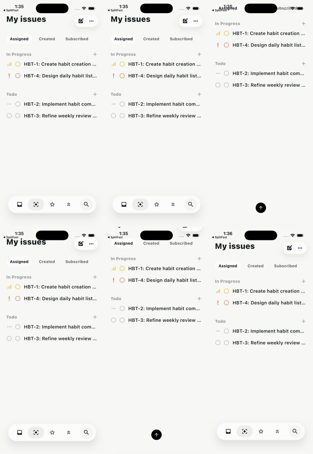
Issues dock
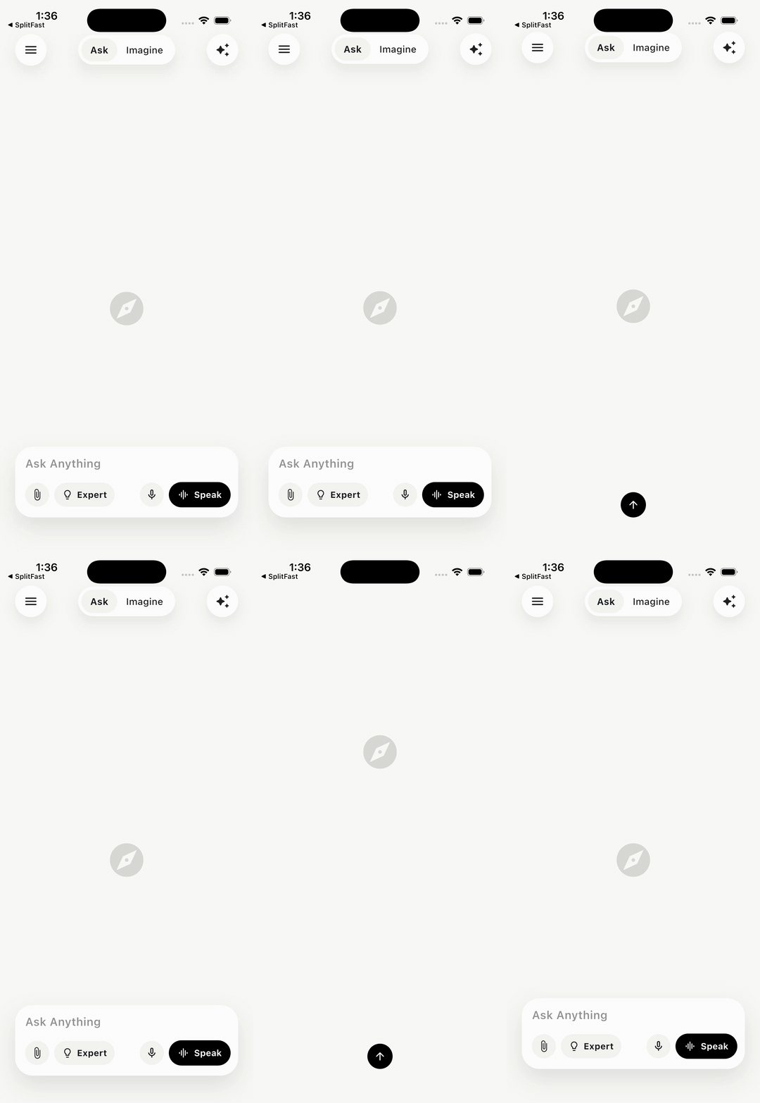
AI prompt dock
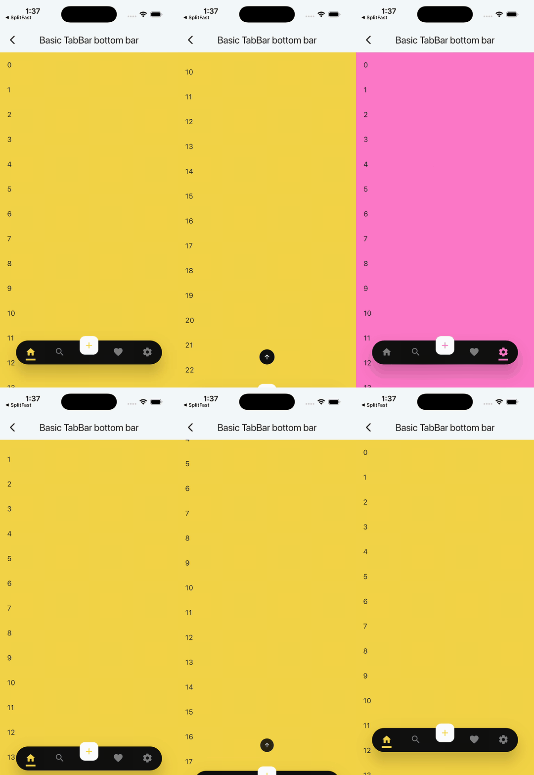
Basic TabBar
Minimal API
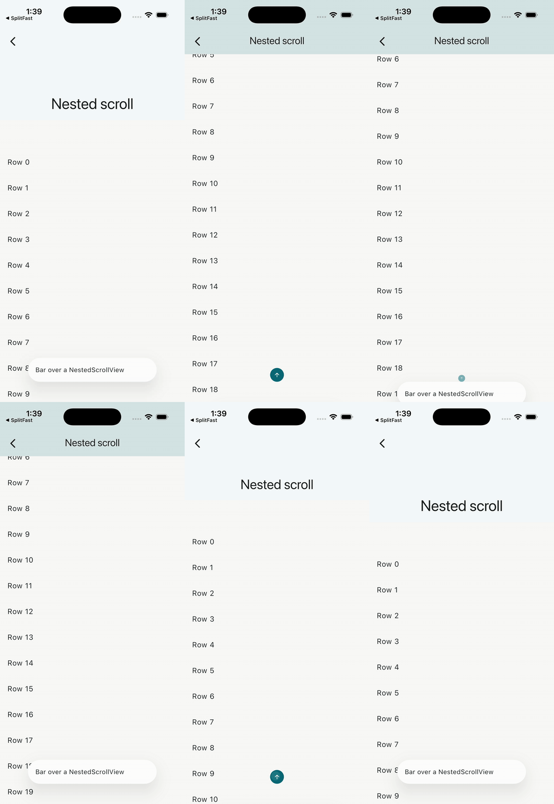
Nested scroll
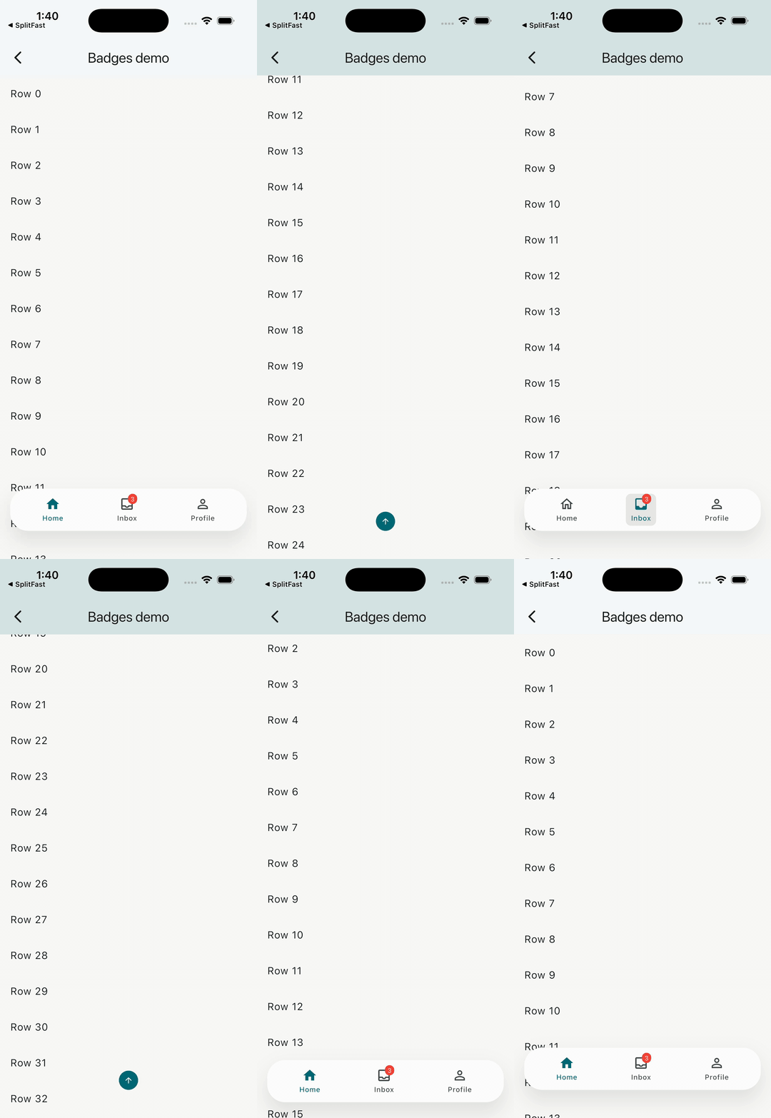
Badged nav
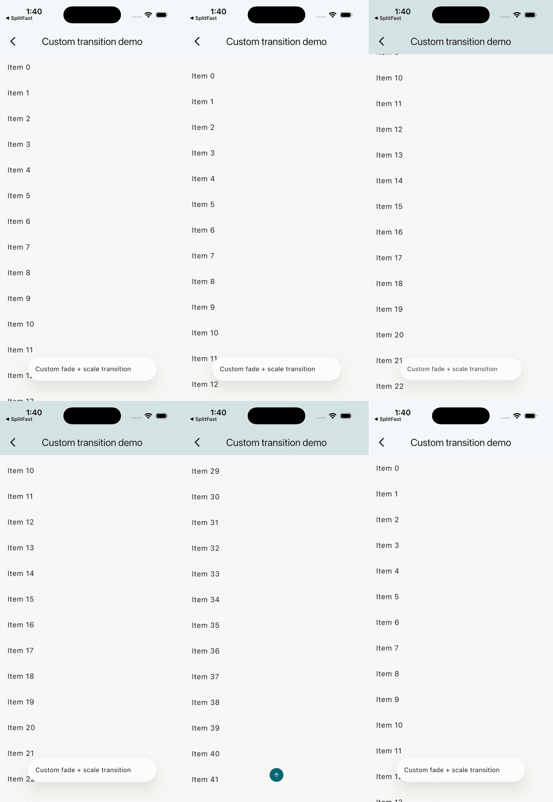
Custom transition
Why this package
Host any widget as the floating bar: TabBar, BottomBarItems, a search
composer, or a custom Row.
Scroll detection is notification-based. Most setups need no
ScrollController plumbing.
BottomBarLayout.adaptive(maxWidth: ...) fills the host width while keeping
a hard cap for tablets, desktop, and wide layouts.
BottomBarBodyPadding reserves the bar's full measured footprint, including
configured offset and bottom safe-area, so body content stays clear even
while the bar is hidden.
BottomBarMotion() defaults to Motor-backed Cupertino spring motion with
velocity-preserving redirects when scroll direction changes mid-animation.
Custom transitions are supported, but they must stay paint-only and preserve
the child's layout footprint.
The hidden action is accessibility-safe by default: it is non-interactive and
excluded from semantics while the bar is visible, keeps at least a 48x48 hit
target when active, uses direction-aware icon/tooltip text, and defaults its
glyph color to ColorScheme.onPrimary.
Reduced-motion environments snap directly to the final shown/hidden state.
BottomBarController supports imperative show/hide plus
scrollToStart()/scrollToEnd(), including correct NestedScrollView
boundary targeting.
Motion from the motor package is re-exported intentionally for
BottomBarMotion.motor(...).
Install
Requires Dart >=3.12.0 and Flutter >=3.44.0.
See the 3.0.0 release notes for the complete list of new
layout, scrolling, accessibility, and reliability improvements.
The bar is stacked above the body, so use BottomBarBodyPadding when your body
should reserve enough bottom space to stay clear of the bar.
Common recipes
Adaptive width + stable body padding
Use BottomBarLayout.adaptive(maxWidth: ...) to span narrow screens while
stopping at a defined maximum on wide screens. Pair it with
BottomBarBodyPadding when the body should reserve the full footprint.
BottomBarScope.barHeight and BottomBarBodyPadding use the bar's measured
layout footprint, not its animated transform. The reported value includes the
bar height plus configured layout.offset and bottom safe-area when
respectSafeArea is enabled.
Nested scroll views
BottomBarController.scrollToStart() always targets the minimum extent and
scrollToEnd() always targets the maximum extent. In a NestedScrollView, the
controller automatically chooses the correct coordinated boundary controller:
scrollToStart() drives the outer controller so pinned/expanded header
slivers return to their true top state.
scrollToEnd() drives the inner controller so the body scrolls to the end
and the header collapses naturally.
If your body emits unrelated notifications, use
BottomBarScrollBehavior.predicate to filter them.
BottomBar normally drives visibility from ScrollNotifications bubbled up
from body. Some content — most notably an embedded WebView — scrolls
internally without ever emitting one. For those cases, call
BottomBarController.reportScroll from the WebView's own scroll callback:
This drives the same threshold/reverse/hideOnScroll visibility rules as
body scrolling. It only affects visibility — scrollToStart()/scrollToEnd()
still require a real ScrollPosition, which a WebView cannot provide.
Custom transitions
Custom transition builders must preserve the child's layout footprint. Use
paint-only wrappers such as Opacity, Transform.translate, or
Transform.scale.
Do not use layout-changing widgets such as SizeTransition or Align with a
heightFactor; those break the stable footprint contract used by
BottomBarScope.barHeight and BottomBarBodyPadding.
When semanticLabel or tooltip provides the explicit accessible name,
descendant semantics are excluded to avoid duplicate announcements.
In bounded rows wide enough for each item's 48x48 minimum target,
BottomBarItems wraps every child in Expanded, so items share the row's
width equally. Narrow bounded rows use a horizontal scroll view to preserve
the minimum targets; unbounded rows keep their raw children.
A BottomBarItem's Text label (with non-null data) is truncated to a
single line with an ellipsis. Text.rich and other label widgets are left
untouched.
BottomBarItems.labelBehavior (BottomBarLabelBehavior.alwaysShow by
default) controls when descendant labels render: alwaysShow,
onlySelected, or alwaysHide. An item used outside a BottomBarItems
row always shows its label.
Migration from v1.x
v1.x
v2.x
Migration
body: (context, controller) => Widget
body: Widget
Drop the builder. The bar listens to ScrollNotifications from descendant scrollables.
The old controller provider was replaced by BottomBarScope, which exposes barHeight and isVisible.
No backward-compatibility shim ships with v2.
API quick reference
BottomBar
Parameter
Type
Default
Notes
child
Widget
required
Floating content shown above the body.
body
Widget
required
Descendant scrollables here drive hide/show via notifications.
controller
BottomBarController?
null
Imperative show/hide/scroll API.
layout
BottomBarLayout?
null
Falls back to theme layout, then const BottomBarLayout().
motion
BottomBarMotion?
null
Falls back to theme motion, then const BottomBarMotion().
scrollBehavior
BottomBarScrollBehavior?
null
Falls back to theme scroll behavior, then const BottomBarScrollBehavior().
theme
BottomBarThemeData?
null
Per-instance theme overrides.
icon
BackToTopIconBuilder?
null
Custom hidden action visual.
showIcon
bool
true
Enables or removes the built-in hidden action.
iconSemanticLabel
String?
null
Defaults to the direction-aware tooltip text.
iconTooltip
String?
null
Defaults to Scroll to top or Scroll to bottom.
The hidden action is only interactive while the bar is hidden. While the bar is
visible it is ignored for hit testing and removed from the semantics tree.
BottomBarLayout
Field
Type
Default
Notes
width
double
300
Requested bar width before viewport/max-width clamping.
maxWidth
double?
null
Optional explicit width cap after host constraints.
offset
double
10
Outer padding applied around the bar or hidden action.
borderRadius
BorderRadius
BorderRadius.circular(28)
Matches the default Material 3 bar decoration; pass BorderRadius.zero for a square bar.
iconOffset
Offset
Offset.zero
Extra translation applied only to the hidden action.
alignment
Alignment
Alignment.bottomCenter
Shared alignment for the bar and hidden action.
fit
StackFit
StackFit.loose
Host stack fit.
clip
Clip
Clip.hardEdge
Host stack clip behavior.
respectSafeArea
bool
true
Wraps the bar and hidden action in SafeArea.
avoidKeyboard
bool
true
Pads the bar and hidden action by MediaQuery.viewInsets.bottom so they sit above the keyboard. No-op when insets are 0 (typical inside a Scaffold body).
Use BottomBarLayout.adaptive(maxWidth: ...) to fill available width up to a
hard cap. When deriving layouts, copyWith(clearMaxWidth: true) explicitly
removes an existing cap.
BottomBarMotion
Field
Type
Default
Notes
mode
BottomBarMotionMode
cupertino
BottomBarMotion() defaults to Cupertino spring mode.
duration
Duration
500ms in default Cupertino mode
Used for curved motion and scroll-to-boundary animation timing.
curve
Curve
Curves.easeOutCubic
Used by curved motion and controller boundary scrolling.
cupertinoPreset
BottomBarCupertinoMotion
snappy
Default Cupertino preset.
transition
BottomBarTransition
slide
Built-in transition when transitionBuilder is null.
Overrides the enum. Must preserve layout footprint and stay paint-only.
slideStart
Offset
Offset(0, 2)
Hidden offset for slide and slideAndFade.
slideEnd
Offset
Offset.zero
Visible offset for slide and slideAndFade.
Reduced-motion environments snap to the target shown/hidden state instead of
animating.
BottomBarScrollBehavior
Field
Type
Default
Notes
hideOnScroll
bool
true
Disables scroll-driven hiding when false.
reverse
bool
false
Inverts the scroll direction that hides vs shows the bar.
scrollOpposite
bool
false
Changes only the built-in hidden action direction, tooltip, and glyph. It does not change scrollToStart() or scrollToEnd().
deltaThreshold
double
8
Minimum absolute delta required before visibility can flip.
showAtStart
bool
false
Forces the bar visible when a scrollable reaches its minimum extent.
showOnScrollEnd
bool
false
Forces the bar visible when scrolling settles.
keepVisibleOnFocus
bool
true
Skip scroll-hide while the floating child has focus. BottomBarController.hide() still hides it.
predicate
bool Function(ScrollNotification)?
null
Skip notifications entirely when it returns false.
BottomBarController
Member
Notes
isVisible
Tracks the currently attached bar's visibility.
isAttached
Whether the controller is attached to a live bar.
show() / hide() / toggle()
Imperative visibility controls.
scrollToStart()
Always scrolls the last active scrollable to its minimum extent.
scrollToEnd()
Always scrolls the last active scrollable to its maximum extent.
reportScroll(delta: ...)
Drives visibility from a source that doesn't emit ScrollNotifications (e.g. WebView). Visibility only; doesn't affect scrollToStart/scrollToEnd.
A controller can own only one live bar at a time. Double-attach fails in both
debug and release, and visibility updates are accepted only from the owning bar
binding.
BottomBarScope
BottomBarScope exposes two listenables inside BottomBar.body:
barHeight: the live measured bar footprint, including offset and bottom
safe-area when enabled.
isVisible: the current shown/hidden target state.
Use BottomBarBodyPadding when you want the common "reserve the bottom
footprint for me" behavior without wiring your own ValueListenableBuilder.