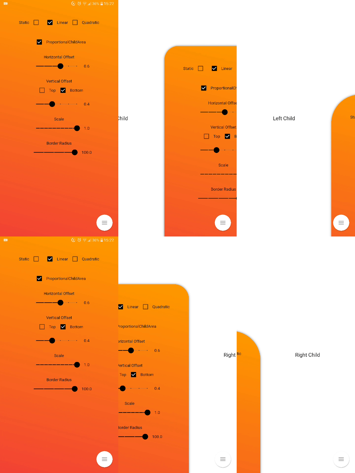
Der innere Drawer ist eine einfache Möglichkeit, eine interne Seitenleiste (links/rechts) zu erstellen, in die Sie eine Menüliste oder andere Elemente einfügen können.
Aus öffentlichen Paketdaten erstellte Orientierung.
Flutter Inner Drawer ist ein leichtgewichtiges Paket, das Entwicklern ermöglicht, innerhalb einer Flutter-Anwendung eine innere Seitenleiste (links oder rechts) zu implementieren. Es bietet eine einfache und anpassbare Möglichkeit, Navigationsmenüs oder zusätzliche Inhaltsbereiche hinzuzufügen, ohne den Haupt-UI-Fluss zu stören. Die Leiste gleitet von der Bildschirmkante heran und bietet ein sauberes und modernes Benutzererlebnis. Sie unterstützt sowohl horizontale als auch vertikale Gesten zum Öffnen und Schließen und integriert sich nahtlos in bestehende Widgets. Ideal für Apps, die ein kompaktes, zugängliches Navigationspanel benötigen.
Anwendungsfälle
Klappbare Navigationsmenüs hinzufügen
Kontextbezogene Aktionen erstellen
Seitenbasierte Filter oder Einstellungen implementieren
Verbesserung von mobilen App-Layouts mit verstecktem Inhalt
Responsive Schnittstellen mit verschachtelten Schubladen gestalten
Hauptmerkmale
Einfache Integration mit bestehenden Widgets
Unterstützt linke und rechte Schubladeneinstellungen
Geste gesteuerte Öffnen/Schließen-Interaktionen
Anpassbare Animation und Gestaltung
Leicht und leistungsstark
Konfigurierbare Schubladenbreite und Ausrichtung
Geeignet für
Mobile-App-Entwickler, die intuitive Navigation suchen
Designer, die schlanke Seitenplatten wollen
Apps mit minimalistischer, aber funktioneller Benutzeroberfläche
Projekte, die Material-Design-Prinzipien verwenden
Entwickler, die reibungslose, gestenbasierte Interaktionen anstreben
Hinweise
Kann eine sorgfältige Behandlung überlappender Inhalte erfordern
Eingeschränkter integrierter Support für komplexe verschachtelte Schubladen
Nicht ideal für Vollbild-Overlay-Szenarien
Erfordert Aufmerksamkeit für Barrierefreiheit bei Berührungsgesten
Am besten geeignet für einstufige Navigationsstrukturen
Original-README
Originaler README-Schnappschuss aus dem verknüpften Quell-Repository. Aktuelle Inhalte finden Sie im Repository.
flutter_inner_drawer
Inner Drawer is an easy way to create an internal side section (left/right) where you can insert a list menu or other.
Installing
Add this to your package's pubspec.yaml file:
dependencies:
  flutter_inner_drawer: "^1.0.0+1"
Demo
Simple usage
import'package:flutter_inner_drawer/inner_drawer.dart';
.
.
.
@overrideWidgetbuild(BuildContext context)
{
returnInnerDrawer(
key: _innerDrawerKey,
onTapClose: true, // default false
swipe: true, // default true
colorTransitionChild: Color.red, // default Color.black54
colorTransitionScaffold: Color.black54, // default Color.black54//When setting the vertical offset, be sure to use only top or bottom
offset: IDOffset.only(bottom: 0.05, right: 0.0, left: 0.0),
scale: IDOffset.horizontal( 0.8 ), // set the offset in both directions
proportionalChildArea : true, // default true
borderRadius: 50, // default 0
leftAnimationType: InnerDrawerAnimation.static, // default static
rightAnimationType: InnerDrawerAnimation.quadratic,
backgroundDecoration: BoxDecoration(color: Colors.red ), // default Theme.of(context).backgroundColor//when a pointer that is in contact with the screen and moves to the right or left
onDragUpdate: (double val, InnerDrawerDirection direction) {
// return values between 1 and 0print(val);
// check if the swipe is to the right or to the leftprint(direction==InnerDrawerDirection.start);
},
innerDrawerCallback: (a) => print(a), // return true (open) or false (close)
leftChild: Container(), // required if rightChild is not set
rightChild: Container(), // required if leftChild is not set// A Scaffold is generally used but you are free to use other widgets// Note: use "automaticallyImplyLeading: false" if you do not personalize "leading" of Bar
scaffold: Scaffold(
appBar: AppBar(
automaticallyImplyLeading: false
),
)
/* OR
CupertinoPageScaffold(
navigationBar: CupertinoNavigationBar(
automaticallyImplyLeading: false
),
),
*/
)
}
// Current State of InnerDrawerStatefinalGlobalKey<InnerDrawerState> _innerDrawerKey = GlobalKey<InnerDrawerState>();
void_toggle()
{
_innerDrawerKey.currentState.toggle(
// direction is optional // if not set, the last direction will be used//InnerDrawerDirection.start OR InnerDrawerDirection.end
direction: InnerDrawerDirection.end
);
}
InnerDrawer Parameters
PropName
Description
default value
scaffold
A Scaffold is generally used but you are free to use other widgets
required
leftChild
Inner Widget
required if rightChild is not set
rightChild
Inner Widget
required if leftChild is not set
leftOffset(deprecated)
Offset drawer width
0.4
rightOffset(deprecated)
Offset drawer width
0.4
leftScale(deprecated)
Left scaffold scaling
1
rightScale(deprecated)
Right scaffold scaling
1
offset
Offset InnerDrawer width
IDOffset.horizontal(0.4)
scale
Scaffold scaling
IDOffset.horizontal(1)
proportionalChildArea
If true, dynamically sets the width based on the selected offset, otherwise it leaves the width at 100% of the screen.
true
borderRadius
For scaffold border
0
onTapClose
Tap on the Scaffold closes it
false
swipe
activate or deactivate the swipe
true
swipeChild
activate or deactivate the swipeChild
false
duration
Animation Controller duration
Duration(milliseconds: 246)
velocity
Allows you to set the opening and closing velocity when using the open/close methods
Optional callback that is called when a InnerDrawer is opened or closed
onDragUpdate
When a pointer that is in contact with the screen and moves to the right or left
_innerDrawerKey.currentState.open
Current State of GlobalKey(check example) - OPEN
_innerDrawerKey.currentState.close
Current State of GlobalKey(check example) - CLOSE
_innerDrawerKey.currentState.toggle
Current State of GlobalKey(check example) - OPEN or CLOSE
Donate
It takes time to carry on this project. If you found it useful or learned something from the source code please consider the idea of donating 5, 20, 50 € or whatever you can to support the project.
Issues
If you encounter problems, open an issue. Pull request are also welcome.