Pakete, Repositories und App-Kategorien suchen

Paketdetailsv1.0.3

flutter_multi_carousel

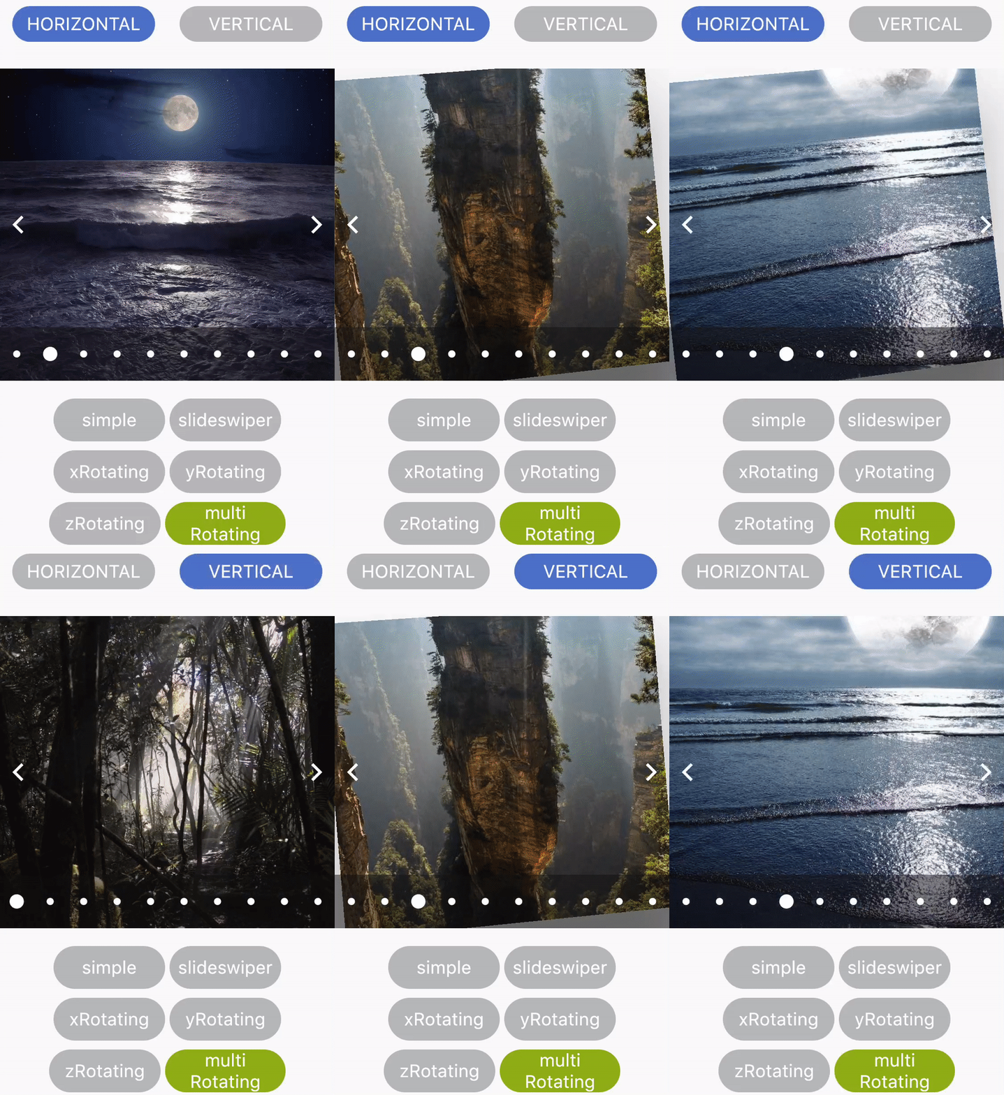
Ein einfaches Carousel-Paket mit mehreren Typen und Konfigurationen.

30-Tage-Downloads
53
Likes
30
Pub-Punkte
25

Paket installieren

flutter pub add flutter_multi_carousel

Paketübersicht

Aus öffentlichen Paketdaten erstellte Orientierung.

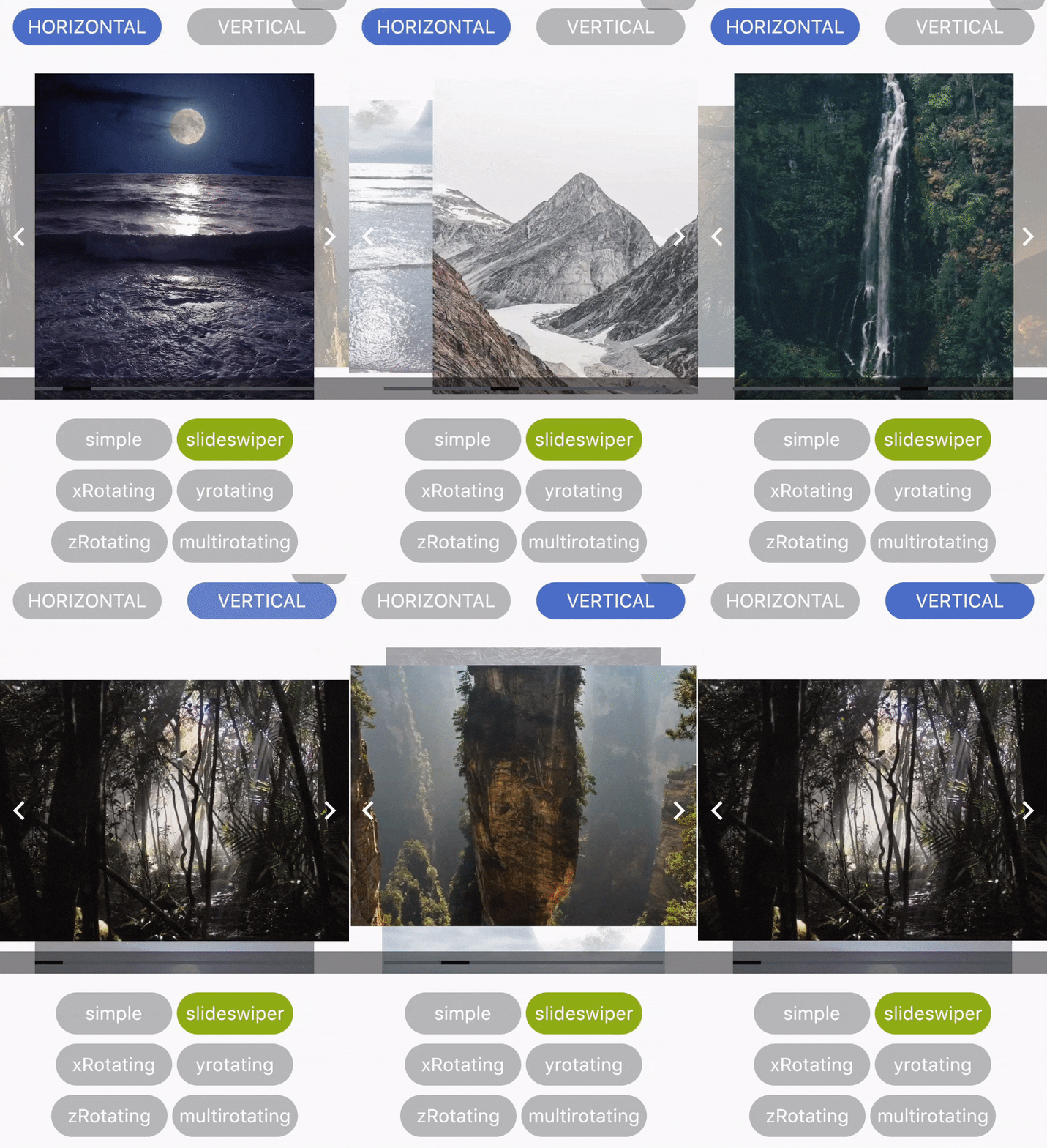
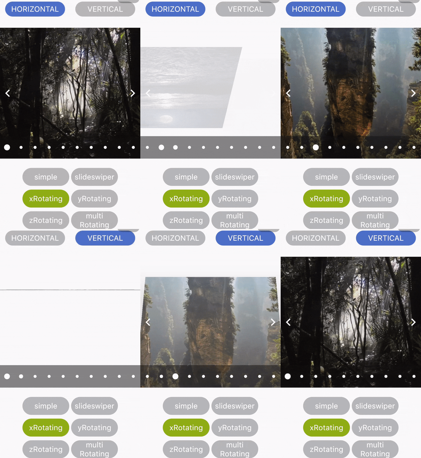
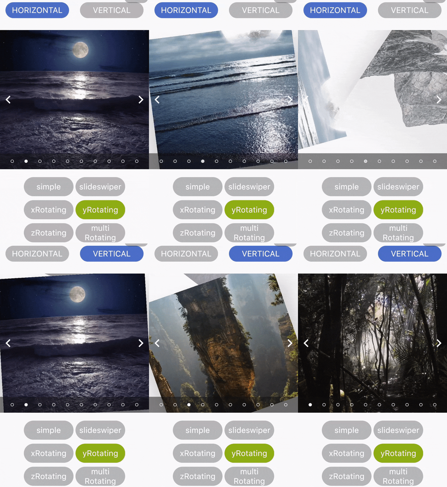
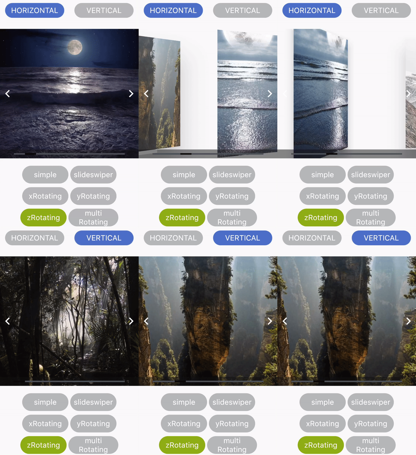
Ein vielseitiges Flutter-Paket zum Erstellen verschiedener Arten von Karussells mit anpassbaren Konfigurationen. Es unterstützt verschiedene Karussell-Stile wie Standard-, Coverflow- und interaktive Layouts, ermöglicht reibungsloses Scrollen und responsive Gestaltung. Perfekt geeignet, um Bilder, Produkte oder Inhalte visuell ansprechend darzustellen. Das Paket ist leichtgewichtig und einfach zu integrieren und bietet Flexibilität durch konfigurierbare Animationen, Indikatoren und Swipe-Gesten. Speziell für Entwickler konzipiert, die dynamische, wiederverwendbare Karussell-Komponenten ohne komplizierte Einrichtung suchen.

Anwendungsfälle

  • Bildergalerien anzeigen
  • Produktlisten präsentieren
  • Interaktive Inhaltsschieberegler erstellen
  • Onboarding-Bildschirme erstellen
  • Hervorgehobene Artikel in Apps präsentieren
  • Verbesserung der Benutzerengagement durch visuelle Übergänge

Hauptmerkmale

  • Mehrere Carousel-Typen (Standard, Cover Flow)
  • Anpassbare Animationen und Übergänge
  • Eingebaute Paginierungsindikatoren
  • Swipe-Gestenunterstützung
  • Reaktionssicheres Layout-Handling
  • Einfache Integration mit minimaler Konfiguration

Geeignet für

  • Mobile-App-Entwickler
  • UI/UX-Designer
  • E-Commerce-Anwendungen
  • Inhaltsreiche Anwendungen
  • Interaktive Prototypen
  • Apps, die dynamische Inhaltsanzeige erfordern

Hinweise

  • Eingeschränkte plattformspezifische Anpassung
  • Keine integrierte Autoplay-Steuereinheit
  • Erfordert manuelle Behandlung großer Datensätze
  • Möglicherweise sind zusätzliche Stile für komplexe Layouts erforderlich
  • Nicht für sehr leistungsstarke Szenarien optimiert
  • Abhängig von externem Repository für Updates
Original-README

Originaler README-Schnappschuss aus dem verknüpften Quell-Repository. Aktuelle Inhalte finden Sie im Repository.

Flutter_Carosel

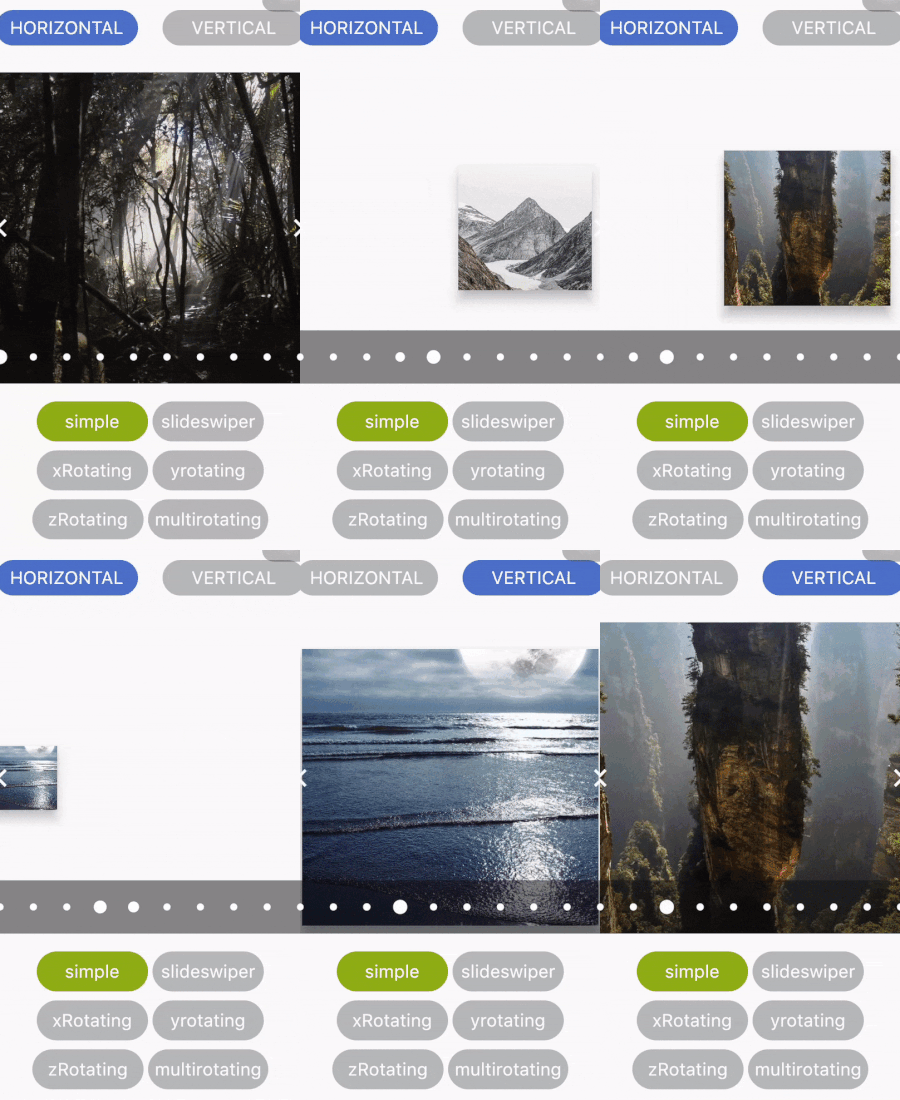
A simple Carousel Widget with multiple configuration option.

...
dependencies:
 ...
 flutter_multi_carousel: ^1.0.0
...

And install it using flutter packages get on your project folder. After that, just import the module and use it:

import 'package:flutter/material.dart';
import 'package:flutter_multi_carousel/carousel.dart';

void main() => runApp(MyApp());

class MyApp extends StatelessWidget {
  // This widget is the root of your application.
  @override
  Widget build(BuildContext context) {
    return MaterialApp(
      title: 'Carousel Demo',
      home: CarouselExample(),
    );
  }
}

class CarouselExample extends StatelessWidget {
  @override
  Widget build(BuildContext context) {
    return Scaffold(
      body: Center(
        child: Carousel(
            height: 350.0,
            width: 350,
            initialPage: 3,
            allowWrap: false,
            type: Types.slideSwiper,
            onCarouselTap: (i) {
              print("onTap $i");
            },
            indicatorType: IndicatorTypes.bar,
            arrowColor: Colors.black,
            axis: Axis.horizontal,
            showArrow: true,
            children: List.generate(
                7,
                (i) => Center(
                      child:
                          Container(color: Colors.red.withOpacity((i + 1) / 7)),
                    ))),
      ),
    );
  }
}

For detailed demonstration refer this GitHub link

https://github.com/jaiswalshubham84/Flutter-Carousel

Getting Startedslide

Properties Type Default Value Description
height Double null Defines height of carousel.This field is required
width Double null Defines width of carousel. This field is required
axis Axis Axis.horizontal Defines axis of carousel.
type Types "simple" Defines type of carousel.
for ex: Types.simple, Types.slideSwiper, Types.xRotating, Types.yRotating, Types.zRotating, Types.multiRotating
onCarouselTap Function null A callback function
arrowColor Color Colors.white Define the color of arrow
showIndicator Bool true Choice to show indicator in carousel
indicatorType IndicatorTypes bar Defines the type of indicator.
For ex: IndicatorTypes.bar, IndicatorTypes.dot, IndicatorTypes.bubble
initialPage int 0 Start your carousel with custom initial page number
activeIndicatorColor Color Colors.white Defines the color of active indicator
unActiveIndicatorColor Color Colors.black Defines the color of unactive indicator
indicatorBackgroundColor Color Color(0xff121212) Defines the background color of indicator
indicatorBackgroundOpacity Double 0.5 Defines the opacity of indicator background
allowWrap bool true Defines if the carousel should wrap once you reach the end or if your at the begining and go left if it should take you to the end


Credits

Developed by Shubham Jaiswal <jaiswal.shubham84@gmail.com>

Contributing

Feel free to Contribute!

For help getting started with Flutter, view our online documentation.

Kategorien

Quell-Repository

Projekte, die dieses Paket verwenden

Noch keine Daten verfügbar.