Pakete, Repositories und App-Kategorien suchen

Cover von flutter_neumorphic
Paketdetailsv3.2.0

flutter_neumorphic

Ein komplettes, sofort verwendbares Neumorphic-UI-Kit für Flutter. Kompatibel mit dunklen Themen und vollständig anpassbar.

30-Tage-Downloads
1760
Likes
1790
Pub-Punkte
70

Paket installieren

flutter pub add flutter_neumorphic

Paketübersicht

Aus öffentlichen Paketdaten erstellte Orientierung.

Flutter Neumorphic ist ein umfassendes UI-Kit zum Erstellen weicher, realistischer und moderner Neumorphismus-Designs in Flutter-Anwendungen. Es bietet eine Reihe an anpassbaren Widgets, die die subtile Tiefe und Lichteffekte charakteristisch für Neumorphismus nachahmen, mit Unterstützung für Dunkelthemen und vollständigen Anpassungsoptionen. Das Paket ermöglicht Entwicklern, visuell ansprechende Oberflächen mit minimalem Aufwand zu erstellen, ideal für Apps, die ein taktiles, 3D-ähnliches Ästhetik erfordern. Es integriert sich nahtlos in bestehende Flutter-Projekte und wird aktiv von der Community gepflegt.

Anwendungsfälle

  • Erstellen moderner App-Oberflächen
  • Weichberührungs-Buttons und Karten gestalten
  • Dunkle, neumorphe Layouts erstellen
  • Prototyping interaktiver UI-Komponenten
  • Verbesserung des visuellen Reizes durch Tiefeneffekte

Hauptmerkmale

  • Vollständig anpassbare Schatten und Farben
  • Dark Theme Kompatibilität
  • fertige neumorphe Widgets
  • Unterstützt sowohl hell als auch dunkel Modus
  • Einfache Integration in bestehende Flutter-Projekte

Geeignet für

  • UI-Designer, die neumorphe Ästhetik suchen
  • Entwickler, die moderne mobile Apps erstellen
  • Projekte, die weiche, taktilen Benutzeroberflächenelemente erfordern
  • Teams, die sich auf visuelle Aufwertung und Benutzererfahrung konzentrieren
  • Apps, die sich an einem Premium- oder Minimalistischen Designstil orientieren

Hinweise

  • Kann die Leistung auf Low-End-Geräten beeinträchtigen
  • Erfordert sorgfältige Farbkontraste für Barrierefreiheit
  • Nicht für alle Designsysteme geeignet
  • Kann bei übermäßiger Verwendung visuell überwältigend werden
  • Eingeschränkter native Support im Vergleich zu Standard-Flutter-Widgets

Original-README

Originaler README-Schnappschuss aus dem verknüpften Quell-Repository. Aktuelle Inhalte finden Sie im Repository.

flutter_neumorphic

A complete, ready to use, Neumorphic ui kit for Flutter

flutter_logo

Try Flutter-Neumorphic on your browser : 👉 https://flutter-neumorphic.firebaseapp.com/ 🌐

neumorphic_playground

⚙️ Installation

https://pub.dev/packages/flutter_neumorphic

pub package pub package

dependencies:
  flutter_neumorphic: ^3.0.3

//requires flutter > 1.13.18

The in your .dart files

import 'package:flutter_neumorphic/flutter_neumorphic.dart';

🗂 Widgets

Preview Widget Description
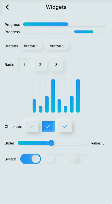
Neumorphic The main Neumorphic Widget, a container which adds white/dark gradient depending on a lightsource and a depth
NeumorphicButton A neumorphic button that plays with the depth to respond to user interraction
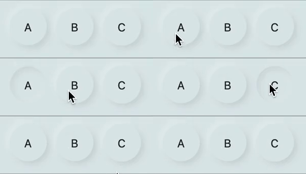
NeumorphicRadio A set of neumorphic button whith only one selected at time, depending on a value and groupValue
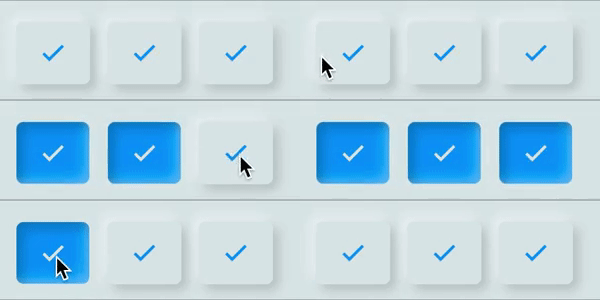
NeumorphicCheckbox A button associated with a value, can be checked/unckecked, if checked, takes the accent color
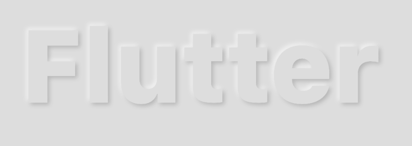
NeumorphicText A Neumorphic text (only work with positive depth)
NeumorphicIcon A Neumorphic icon (only work with positive depth)
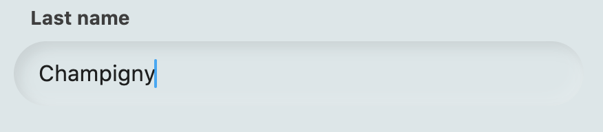
material.TextField For TextFields, just surround your existing material textfield widget with a Neumorphic (container)
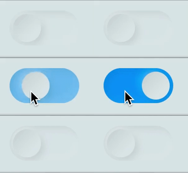
NeumorphicSwitch An On/Off toggle, associated with a value, if toggled, takes the accent color
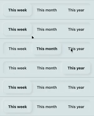
NeumorphicToggle An mutiple value toggle, associated with a selecteedIndex
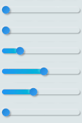
NeumorphicSlider A Neumorphic seekbar (range slider), the user can select a value in a range
NeumorphicProgress A determinate progress, takes the displayed percentage
NeumorphicProgressIndeterminate An inderminate progress-bar
NeumorphicBackground Take the background color of the theme, can clip the screen with a borderRadius
NeumorphicApp An application that uses Neumorphic design. Handle theme, navigation, localisation, and much more
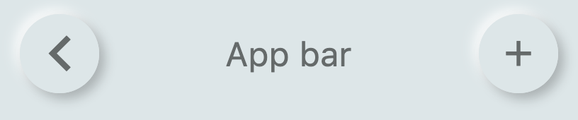
NeumorphicAppBar A Neumorphhic design app bar. Can be used inside Scaffold

👀 Showcases

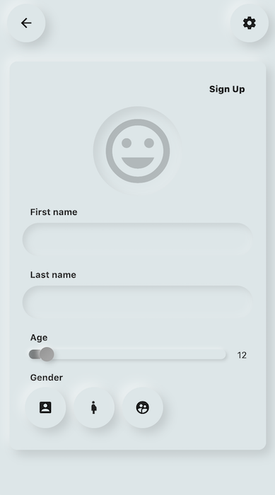
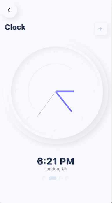
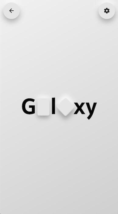
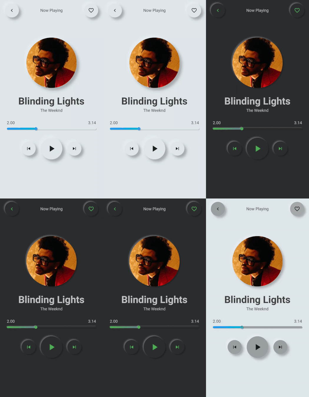
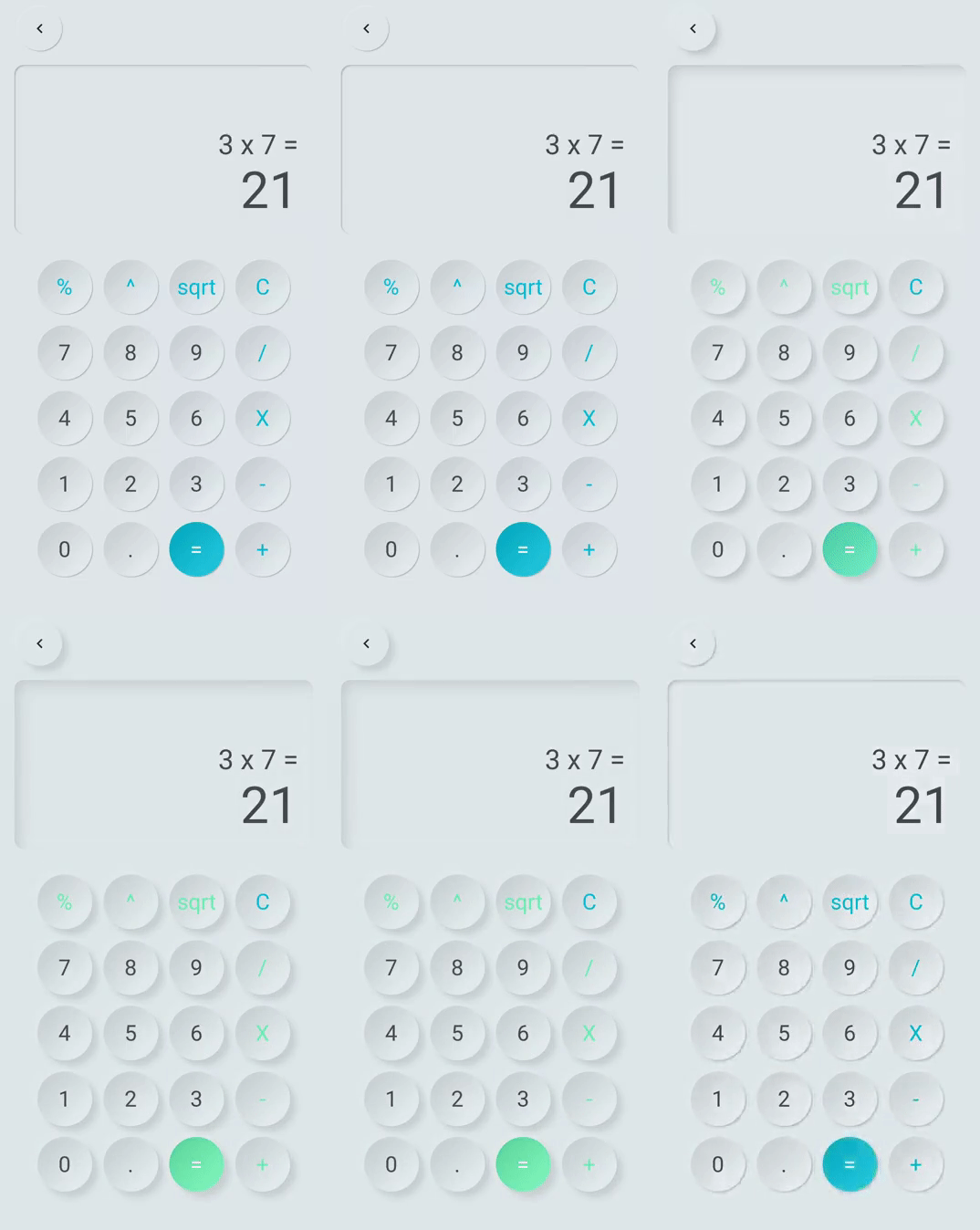
Neumorphic Neumorphic

Neumorphic Neumorphic

📦 Neumorphic


Neumorphic(
  style: NeumorphicStyle(
    shape: NeumorphicShape.concave,
    boxShape: NeumorphicBoxShape.roundRect(BorderRadius.circular(12)), 
    depth: 8,
    lightSource: LightSource.topLeft,
    color: Colors.grey
  ),
  child: ...
)

Neumorphic Neumorphic

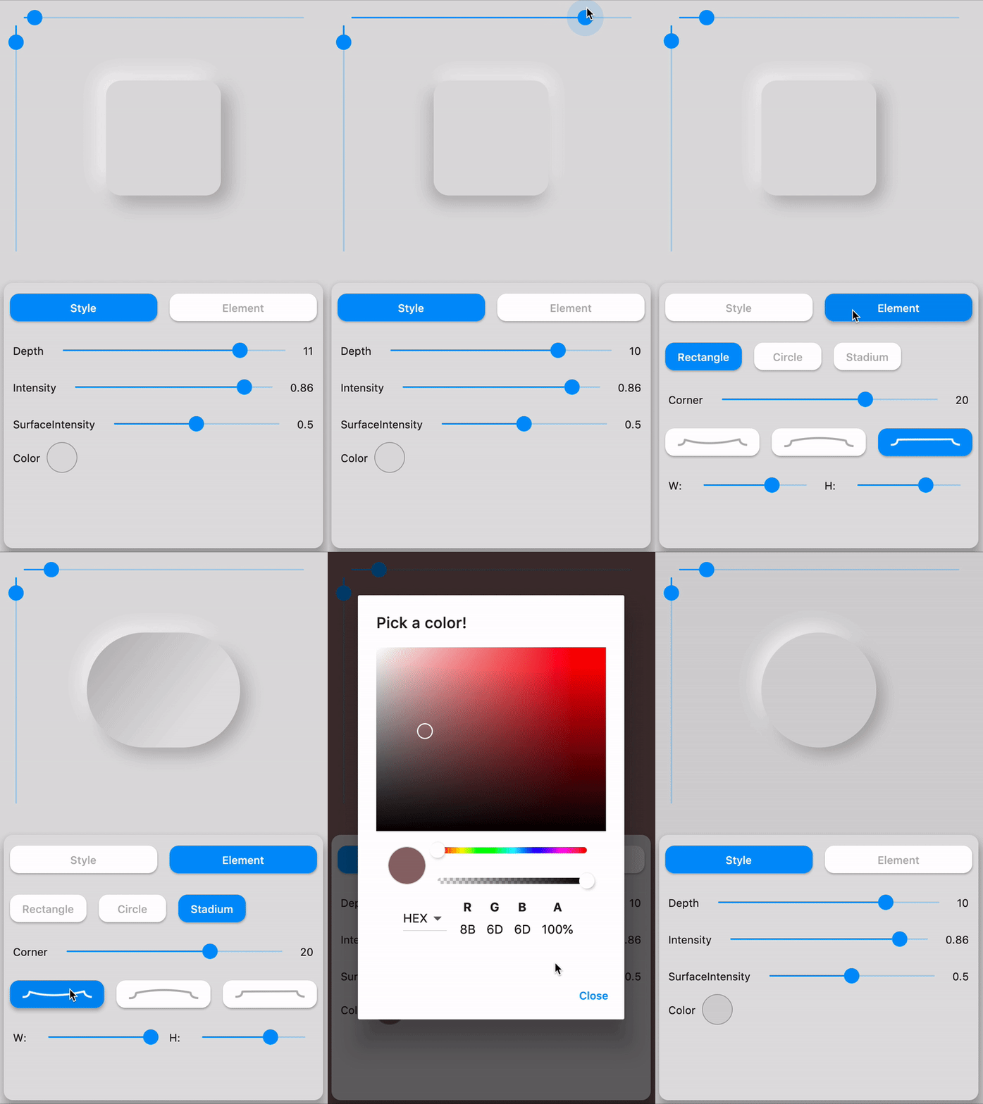
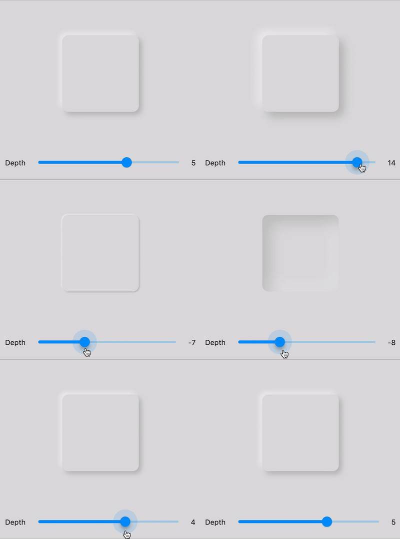
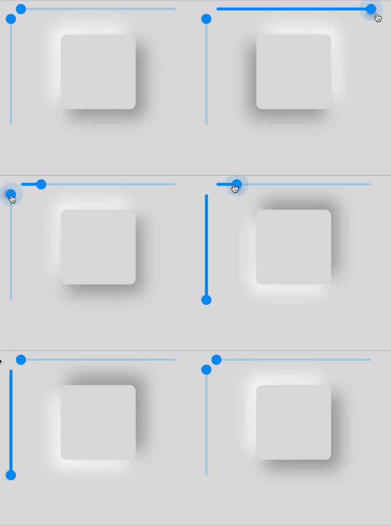
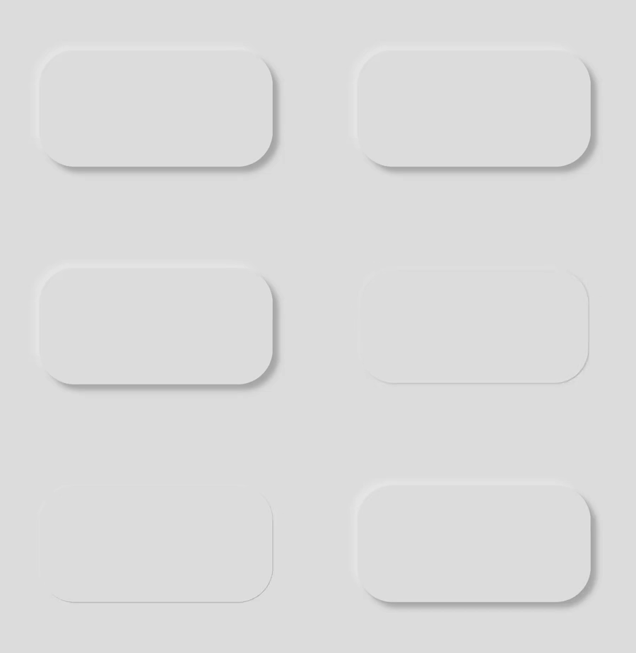
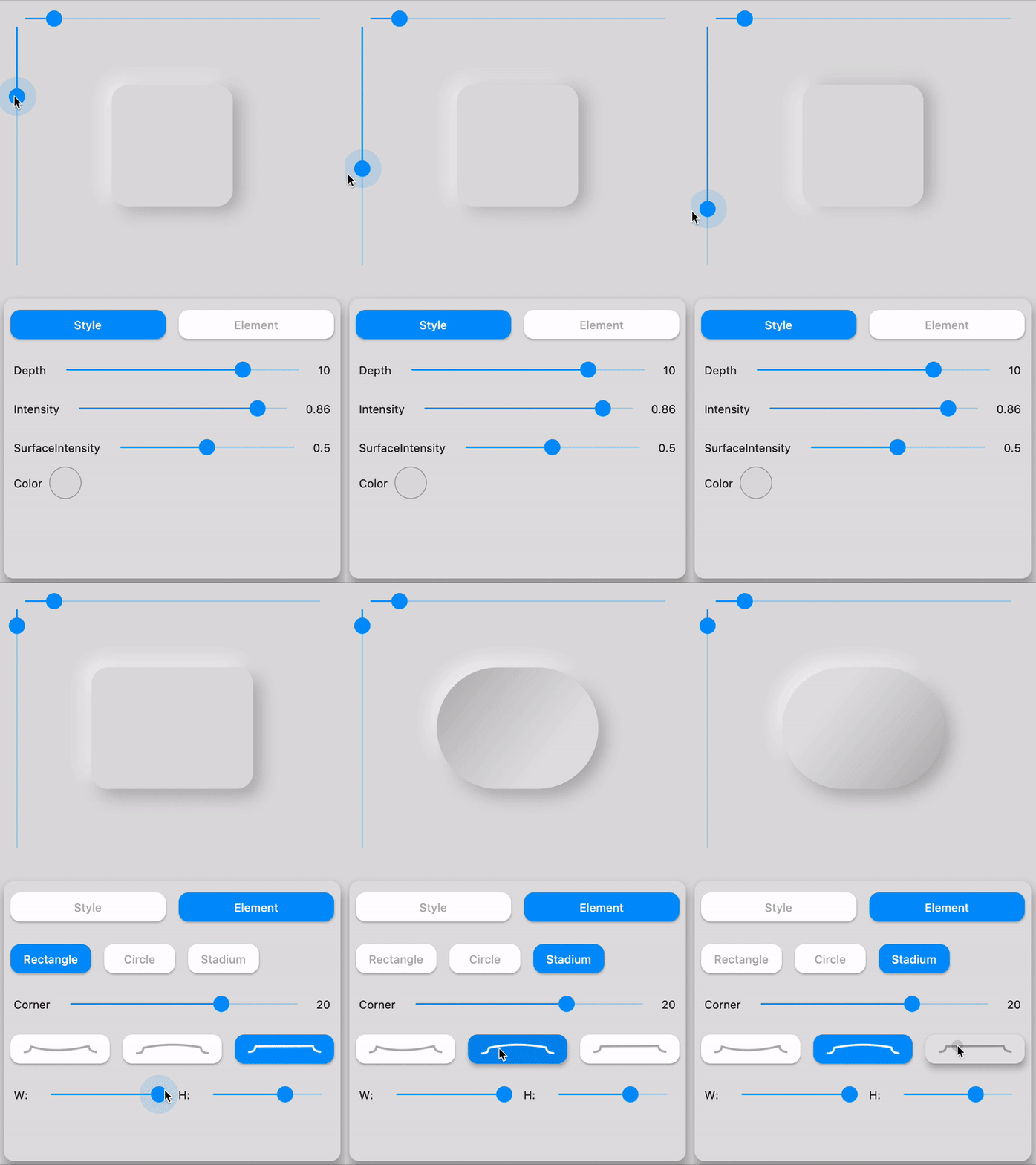
☝️ Playing with LightSource & Depth

🛠️ Attributes
Attributes Values Description
LightSource TopLeft, BottomRight, etc. / (dx, dy) The source of light specifit to the theme or the widget, used to project white/dark shadows on neumorphic elements
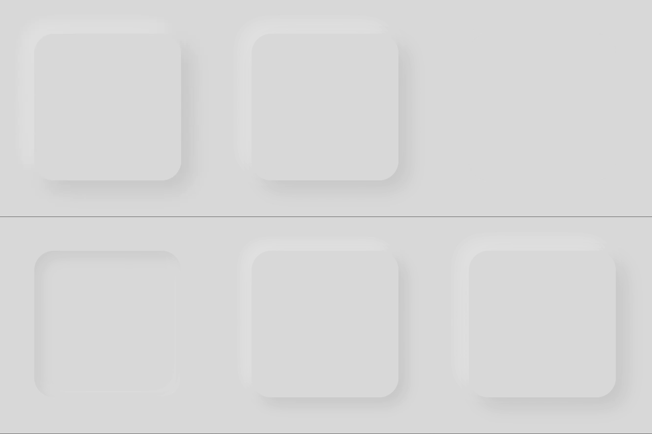
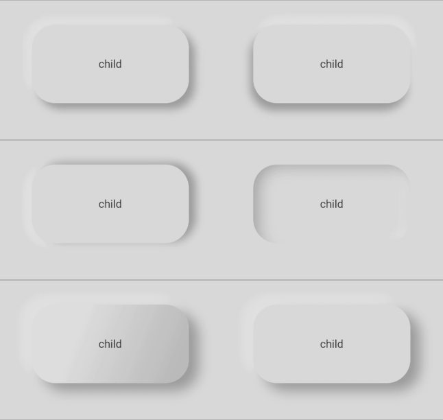
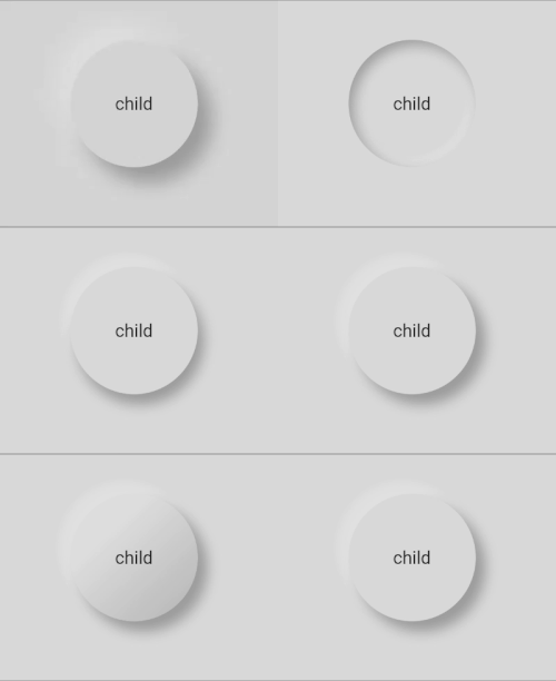
Shape Concave / Convex / Flat The shape of the curve used in the neumorphic container
Depth -20 <= double <= 20 The distance of the widget to his parent. Can be negative => emboss. It influences on the shadow's color and its size/blur
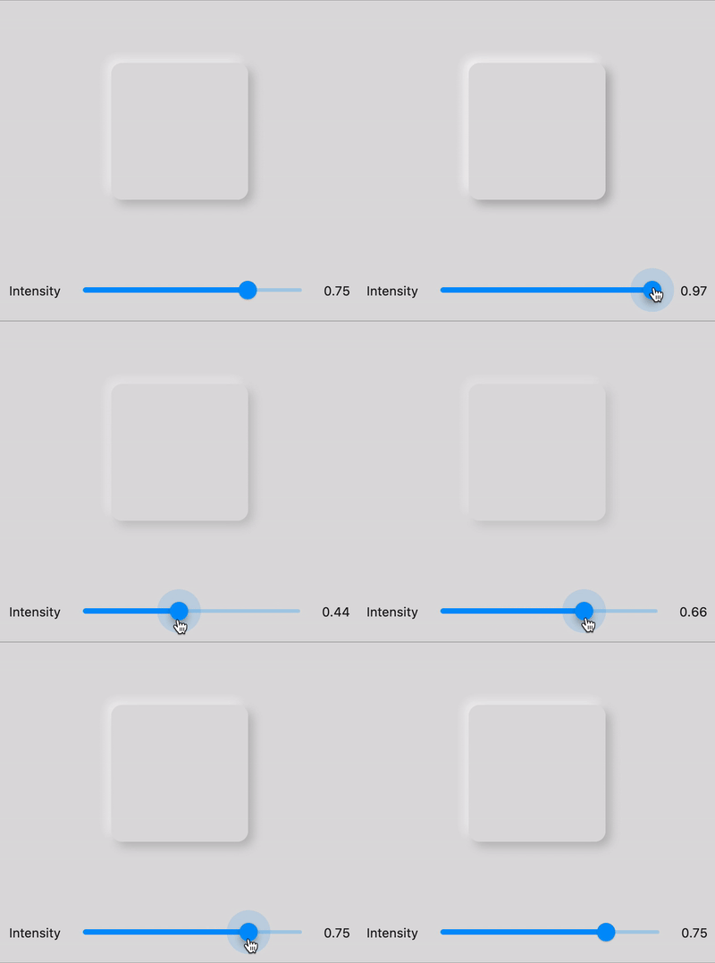
Intensity 0 <= double <= 1 The intensity of the Light, it influences on the shadow's color
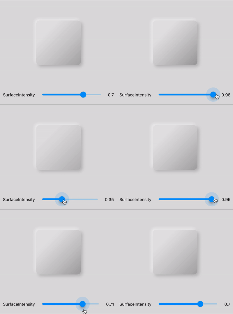
SurfaceIntensity 0 <= double <= 1 The intensity of the Surface, it influences on the concave/convex darkness
Color any Color The default color of Neumorphic elements
Accent any Color The default accent color of the Neumorphic element when activated (eg: checkbox)
Variant any Color The default secondary color of the Neumorphic element (eg: used as second color on the progress gradient)
BoxShape Circle, RoundRect(radius), Stadium, Path The box shape of a Neumorphic element. Stadium : roundrect with cirlces on each side
Border NeumorphicBorder A border (color/width) to enhance contrast with background and others elements

Neumorphic Neumorphic Neumorphic Neumorphic

🔧 Shapes
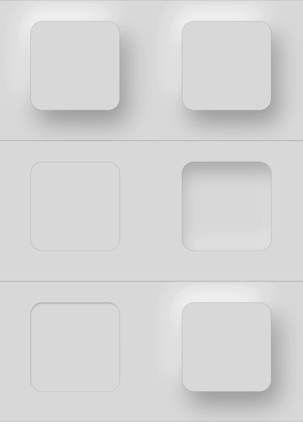
Shape Widget Image Condition
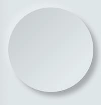
Flat depth >= 0 && shape == Flat
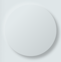
Convex depth >= 0 && shape == Convex
Concave depth >= 0 && shape == Concave
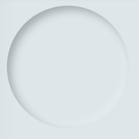
Emboss depth < 0

Neumorphic Text

text

Text only handle positive depth

child: NeumorphicText(
        "I love flutter",
        style: NeumorphicStyle(
          depth: 4,  //customize depth here
          color: Colors.white, //customize color here
        ),
        textStyle: NeumorphicTextStyle(
          fontSize: 18, //customize size here
          // AND others usual text style properties (fontFamily, fontWeight, ...)
        ),
    ),

Neumorphic Icon

custom_shape

child: NeumorphicIcon(
        Icons.add_circle,
        size: 80,
    ),

How to display SVG icons ?

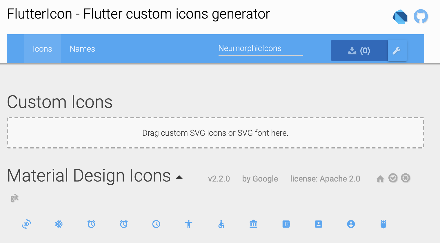
Simply use https://fluttericon.com/ to export your svg as .ttf & use NeumorphicIcon(YOUR_ICON)

custom_shape

🎨 Custom Shape

custom_shape

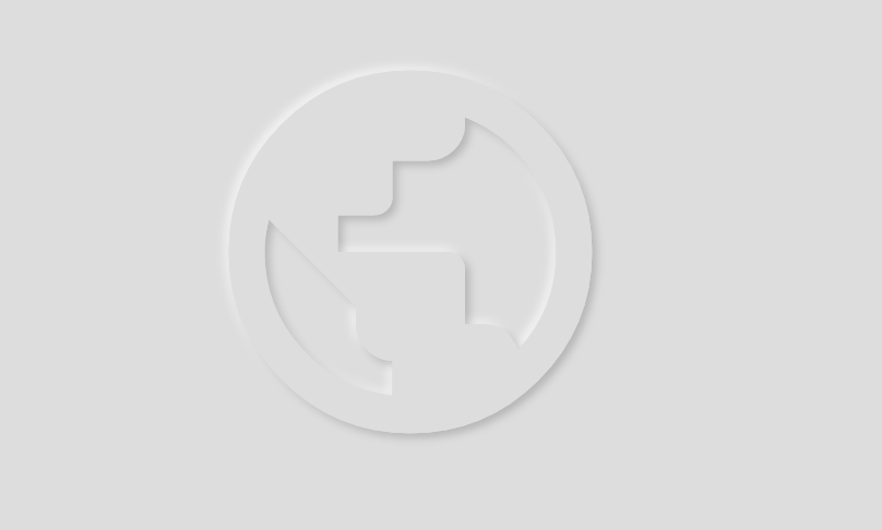
Flutter Neumorphic supports custom shapes, just provide a path to

class MyShapePathProvider extends NeumorphicPathProvider {
  @override
  bool shouldReclip(NeumorphicPathProvider oldClipper) {
    return true;
  }

  @override
  Path getPath(Size size) {
    return Path()
      ..moveTo(0, 0)
      ..lineTo(size.width/2, 0)
      ..lineTo(size.width, size.height/2)
      ..lineTo(size.width/2, size.height/2)
      ..lineTo(size.width, size.height)
      ..lineTo(0, size.height)
      ..close();
  }
}

And use NeumorphicBoxShape.path

Neumorphic(
  style: NeumorphicStyle(
     boxShape: NeumorphicBoxShape.path(MyShapePathProvider()),
  ),
  ...
),

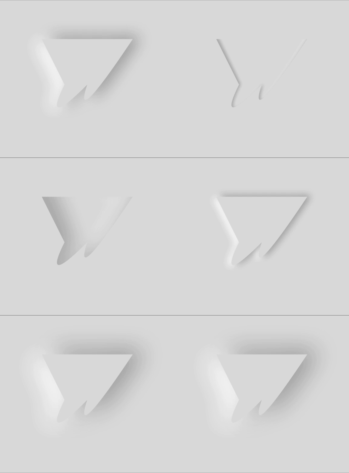
You can import the Flutter logo as a custom shape using

Neumorphic(
  style: NeumorphicStyle(
    shape: NeumorphicBoxShape.path(NeumorphicFlutterLogoPathProvider()),
  ),
  ...
),

🔲 Accessibility / Border

For design purposes, or simply to enhance accessibility, you can add a border on Neumorphic widgets

Neumorphic

Neumorphic(
      style: NeumorphicStyle(
        border: NeumorphicBorder(
          color: Color(0x33000000),
          width: 0.8,
        )
      ),
      ...
)

You can enable/disable it (eg: listening an Accessibility Provider) with isEnabled

border: NeumorphicBorder(
    isEnabled: true,
    color: Color(0x33000000),
    width: 0.8,
)

Note that borderColor and borderWidth default values has been added to NeumorphicThemeData

🎨 Neumorphic Theme

neumorphic_theme neumorphic_theme

NeumorphicTheme(
    themeMode: ThemeMode.light, //or dark / system
    darkTheme: NeumorphicThemeData(
        baseColor: Color(0xff333333),
        accentColor: Colors.green,
        lightSource: LightSource.topLeft,
        depth: 4,
        intensity: 0.3,
    ),
    theme: NeumorphicThemeData(
        baseColor: Color(0xffDDDDDD),
        accentColor: Colors.cyan,
        lightSource: LightSource.topLeft,
        depth: 6,
        intensity: 0.5,
    ),
    child: ...
)

To retrieve the current used theme :

final theme = NeumorphicTheme.currentTheme(context);
final baseColor = theme.baseColor;
final accentColor = theme.accentColor;
...

Toggle from light to dark

NeumorphicTheme.of(context).themeMode = ThemeMode.dark;

Know if using dark

if(NeumorphicTheme.of(context).isUsingDark){
  
}

NeumorphicApp

You can use direcly in your project a NeumorphicApp, surrounding your code

It handle directly NeumorphicTheme & Navigation (and all possibilities of MaterialApp )

void main() => runApp(MyApp());

class MyApp extends StatelessWidget {
  // This widget is the root of your application.
  @override
  Widget build(BuildContext context) {
    return NeumorphicApp(
      debugShowCheckedModeBanner: false,
      title: 'Neumorphic App',
      themeMode: ThemeMode.light,
      theme: NeumorphicThemeData(
        baseColor: Color(0xFFFFFFFF),
        lightSource: LightSource.topLeft,
        depth: 10,
      ),
      darkTheme: NeumorphicThemeData(
        baseColor: Color(0xFF3E3E3E),
        lightSource: LightSource.topLeft,
        depth: 6,
      ),
      home: MyHomePage(),
    );
  }
}

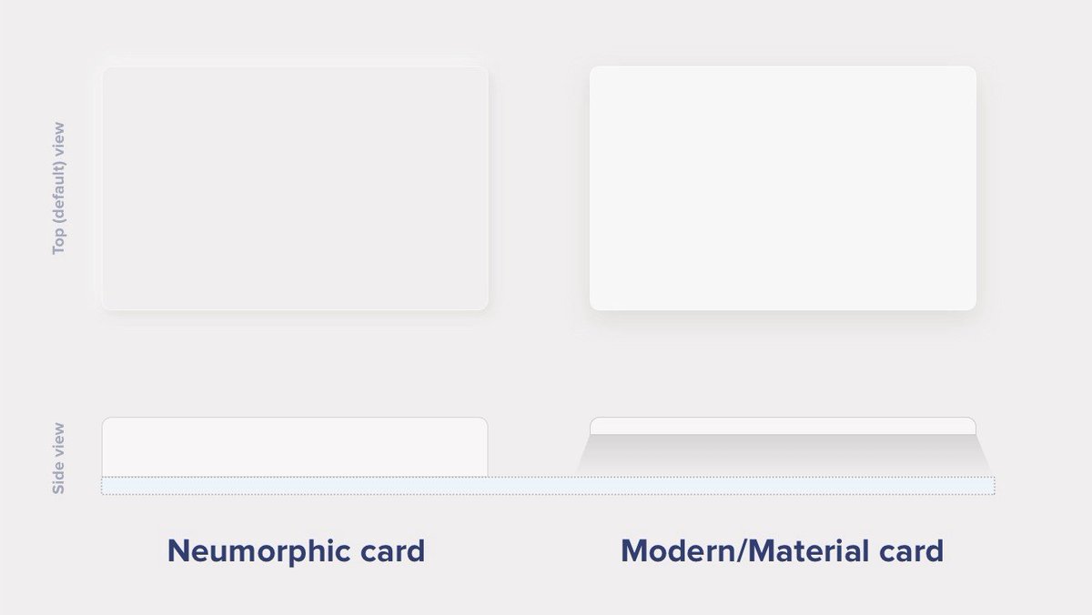
What's neumorphic

neumorphic

Material Cards

A Modern / Material (upgraded) card usually is a surface floating on top of our perceived background and casting a shadow onto it. The shadow both gives it depth and also in many cases defines the shape itself — as it’s quite often borderless.

Neumorphic cards

Neumorphic card however pretends to extrude from the background. It’s a raised shape made from the exact same material as the background. When we look at it from the side we see that it doesn’t “float”.

neumorphic_button

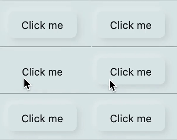
Here's a Nereumorphic Button tap (slowed x2) from the sample app, you can see how the element seems to change its depth to its surface.

👥 Contributors

Contributors
florent Florent Champigny
olivier Olivier Bonvila
gyl Gyl Jean Lambert
jaumard Jimmy Aumard
Overman775 Overman775
schopy schopy

📄 License

Flutter-Neumorphic is released under the Apache2 license. See LICENSE for details.

If you use the open-source library in your project, please make sure to credit and backlink to www.idean.com

bottom_banner

Kategorien

Quell-Repository

Projekte, die dieses Paket verwenden