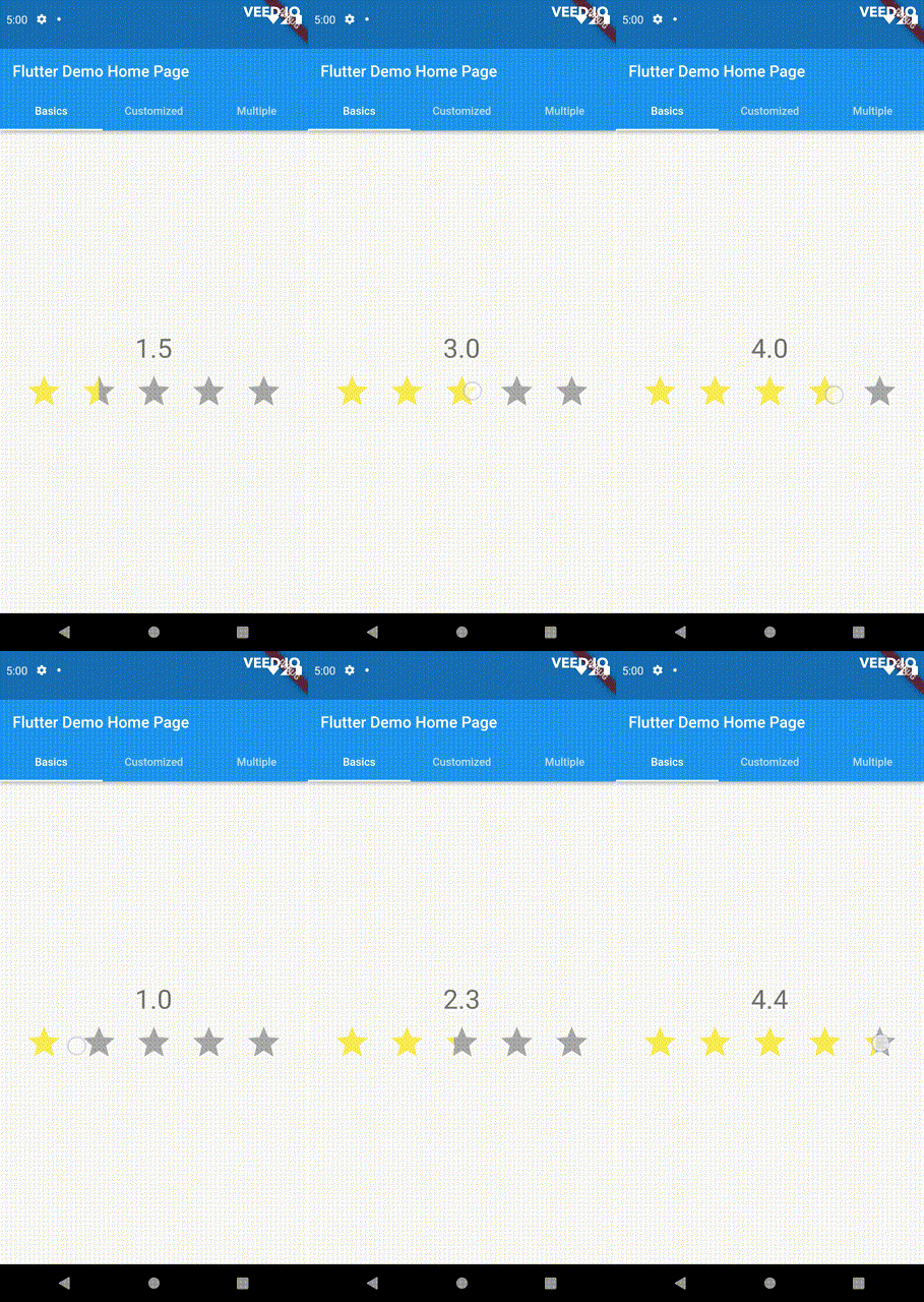
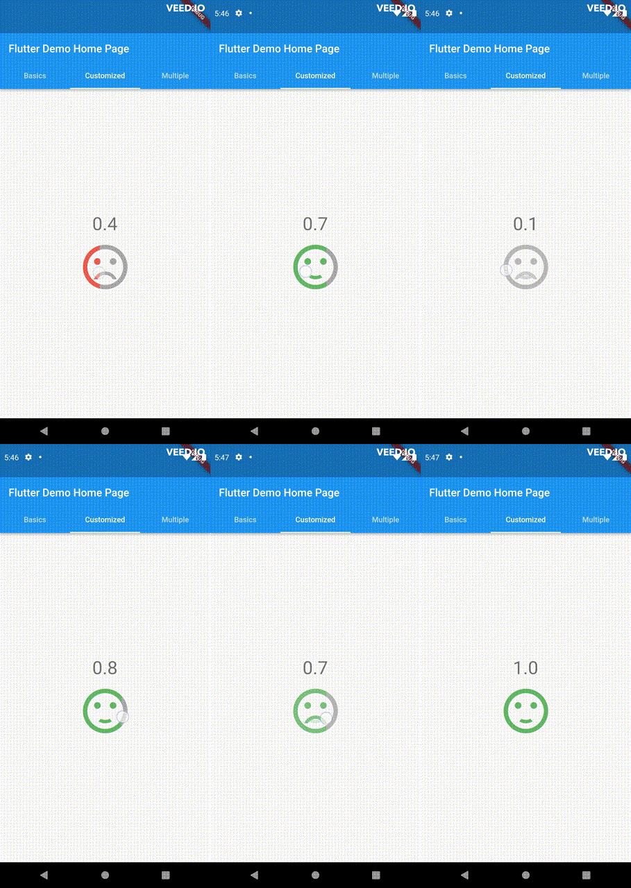
Eine vielseitige und anpassbare Bewertungsleiste für Flutter. Diese Leiste unterscheidet sich von anderen durch ihre Fähigkeit, beliebige Bruchwerte auszuwählen. Ziehen, Tippen und Hover-Ereignisse werden alle unterstützt.
Aus öffentlichen Paketdaten erstellte Orientierung.
Eine hochgradig anpassbare Bewertungsleiste für Flutter, die die Auswahl beliebiger Bruchwerte ermöglicht. Im Gegensatz zu herkömmlichen Bewertungsleisten bietet sie eine reibungslose Interaktion über Drag-, Tap- und Hover-Ereignisse und liefert ein responsives und intuitives Benutzererlebnis auf allen Geräten. Ideal für Anwendungen, die präzise Feedbackeingaben erfordern, wie z. B. Rezensionen oder Umfragen. Das Paket ist mit allen wichtigen Plattformen kompatibel, darunter Android, iOS, Web, macOS, Windows und Linux.
Anwendungsfälle
Benutzerbewertungen mit feinkörnigen Bewertungen
Interaktive Umfrage-Schnittstellen
Feedback-Sammlung in Apps
Echtzeit-Bewertungsanpassungen
touchfreundliche UI-Komponenten
Hauptmerkmale
Unterstützt gebrochene Bewertungen
Ziehen, Tippen und Hover-Interaktionen
Hochgradig anpassbarer Entwurf
Plattformübergreifende Kompatibilität
Glatte Animationsübergänge
Einstellbare Schrittgröße
Geeignet für
Entwickler, die interaktive Feedback-Systeme erstellen
Apps, die präzise Bewertungseingaben erfordern
Designer, die touchoptimierte Benutzeroberflächen wollen
Projekte für mehrere Plattformen
Prototypen, die dynamische Bewertungssteuerungen erfordern
Hinweise
Kann zusätzliche Stilisierung für komplexe Themen erfordern
Leistungsbeeinträchtigung bei großen Listen von Bewertungsleisten
Erfordert sorgfältige Behandlung von Gestenkonflikten
Beschränkte Dokumentation über die grundlegende Verwendung hinaus
Nicht für sehr hohe Aktualisierungshäufigkeiten optimiert
Original-README
Originaler README-Schnappschuss aus dem verknüpften Quell-Repository. Aktuelle Inhalte finden Sie im Repository.
PannableRatingBar
Introducing a new and improved rating bar for Flutter, offering versatility and full customization.
Unlike other rating bars, this one allows for any value to be selected, not just full or half
ratings when interacted. Tap, drag and hover gestures are seamlessly supported, providing a smooth
user experience.
Features
Offers fractional values for rating
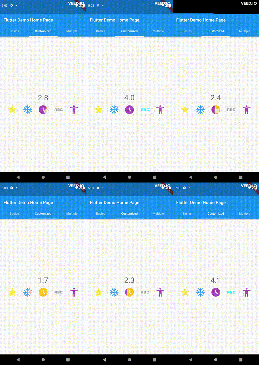
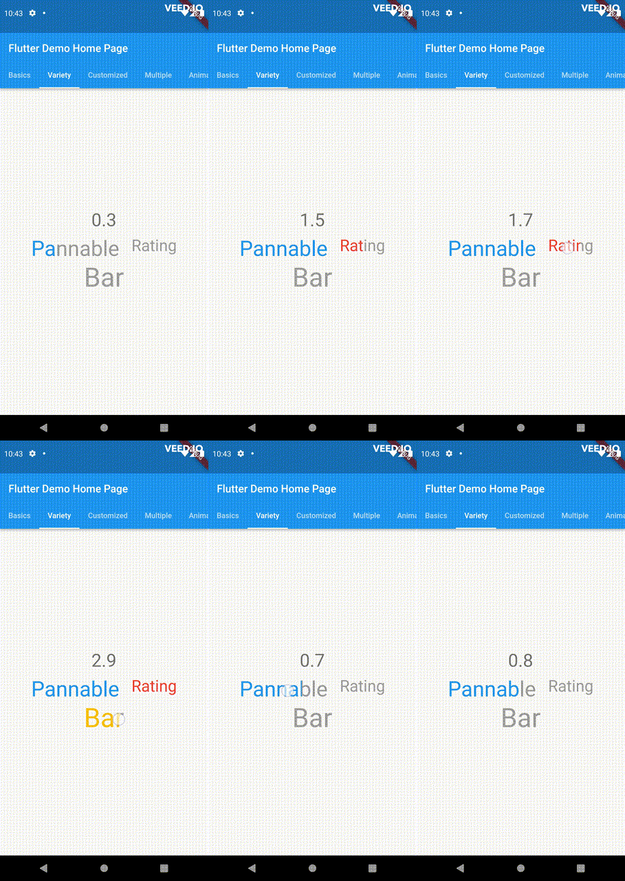
High degree of customization for the rating widgets, which can be of different sizes, shapes, and colors.
Precise hit testing, as the child widget's render object is utilized to determine the results.
Allows for filtering gestures with either tapOnly, dragOnly or tapAndDrag options.
Rating reports on cursor hovering supported.
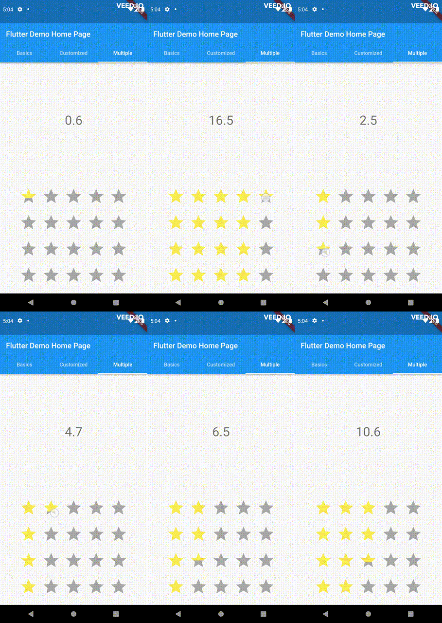
Built on Flutter's Wrap widget, offering a variety of supported layouts, including consideration
of Wrap properties such as textDirection and verticalDirection when painting the indicators.
This widget is stateless and highly flexible, allowing you to easily manipulate values and
customize the display of the PannableRatingBar. Simply rebuild the widget with the value provided
in the onChanged callback or onHover callback and the widget will automatically adjust the
rating distribution across each rating widget.
double rating = 0.0;
PannableRatingBar(
rate: rating,
items: List.generate(5, (index) =>
constRatingWidget(
selectedColor: Colors.yellow,
unSelectedColor: Colors.grey,
child: Icon(
Icons.star,
size: 48,
),
)),
onChanged: (value) { // the rating value is updated on tap or drag.setState(() {
rating = value;
});
},
)
The widget also supports getting the rate value by hovering with the onHover callback. It works
best on devices that support a mouse cursor, including desktop web browsers.
double rating = 0.0;
PannableRatingBar(
rate: rating,
items: List.generate(5, (index) =>
constRatingWidget(
selectedColor: Colors.yellow,
unSelectedColor: Colors.grey,
child: Icon(
Icons.star,
size: 48,
),
)),
onHover: (value) { // the rating value is updated every time the cursor moves over a new item.setState(() {
rating = value;
});
},
)
Utilize your own custom widgets as the rating indicators. With complete customization freedom, they
don't have to be uniform in size, color, or any other aspect.
This widget utilizes the layout capabilities of Flutter's built-in Wrap widget, allowing for a wide
range of possible layouts to be achieved. The properties of the Wrap widget, such as textDirection
and verticalDirection, are also considered when painting the indicators, giving you even greater
control over the final look and feel of the rating bar.
Some of the pre-built RatingValueTransformers available are:
// Rounding to nearest single fractional digit. This is also the default one that // `PannableRatingBar` used.doublesingleFractionalValueTransformer(double value);
// Rounding to nearest .5.doublehalfFractionalValueTransformer(double value);
// Leave the rating as is.doublerawValueTransformer(double value);
Additional information
For more, checkout and play with the example file.
If you have any suggestions for improvement, simply create an issue in the repository!