Pakete, Repositories und App-Kategorien suchen

Cover von flutter_sliding_toast
Paketdetailsv1.8.0

flutter_sliding_toast

Ein Flutter-Paket zum Anzeigen von Nachrichten mit benutzerdefiniertem Styling und Animationsverhalten.

AndroidiOSWebmacOSWindowsLinux
30-Tage-Downloads
1030
Likes
51
Pub-Punkte
160

Paket installieren

flutter pub add flutter_sliding_toast

Paketübersicht

Aus öffentlichen Paketdaten erstellte Orientierung.

Ein Flutter-Paket, das die Anzeige anpassbarer Toast-Nachrichten mit sanften Schiebeanimationen auf mehreren Plattformen ermöglicht. Es unterstützt maßgeschneiderte Stile, einschließlich Farben, Schriftarten und Positionierung, und erlaubt Entwicklern, benutzerdefinierte Animationsverhalten zu definieren, um ein professionelles Nutzererlebnis zu schaffen. Ideal zur Bereitstellung kurzer Rückmeldungen oder Benachrichtigungen ohne Unterbrechung des App-Flows. Das Paket ist leichtgewichtig und lässt sich nahtlos in bestehende Flutter-Projekte integrieren.

Anwendungsfälle

  • Benutzerfeedback nach Aktionen anzeigen
  • Erfolg- oder Fehlermeldungen anzeigen
  • Vorübergehende Warnungen in Apps bereitstellen
  • Verbesserung der Benutzeroberfläche mit animierten Benachrichtigungen
  • Anpassen von Nachrichten-Erscheinungsbild und -Verhalten

Hauptmerkmale

  • Schwunganimationseffekte
  • Anpassbare Stiloptionen
  • Plattformübergreifende Kompatibilität
  • Einfache Integration mit Flutter
  • Unterstützung für verschiedene Nachrichtentypen
  • Konfigurierbare Animationsdauer und -richtung

Geeignet für

  • Mobile- und Webanwendungen
  • Apps, die subtile Benachrichtigungen erfordern
  • Entwickler, die animierte Rückmeldung suchen
  • UI-orientierte Flutter-Projekte
  • Teams, die leichtgewichtige Toast-Lösungen suchen

Hinweise

  • Beschränkt auf grundlegende Toast-Funktionen
  • Keine integrierte Unterstützung für komplexe Layouts
  • Animationserweiterungen erfordern Programmierkenntnisse
  • Kann zusätzliche Stilisierung für den Dunkelmodus erfordern
  • Nicht geeignet für dauerhafte Benachrichtigungen

Original-README

Originaler README-Schnappschuss aus dem verknüpften Quell-Repository. Aktuelle Inhalte finden Sie im Repository.

Flutter Sliding Toast

pub license: MIT

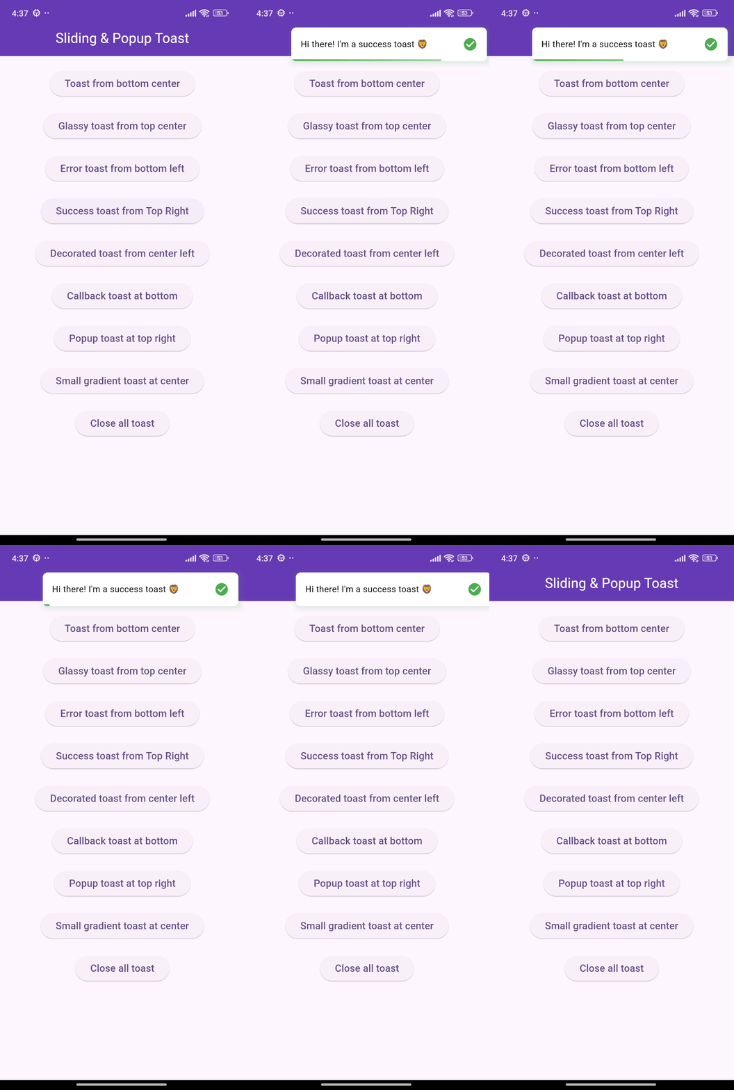
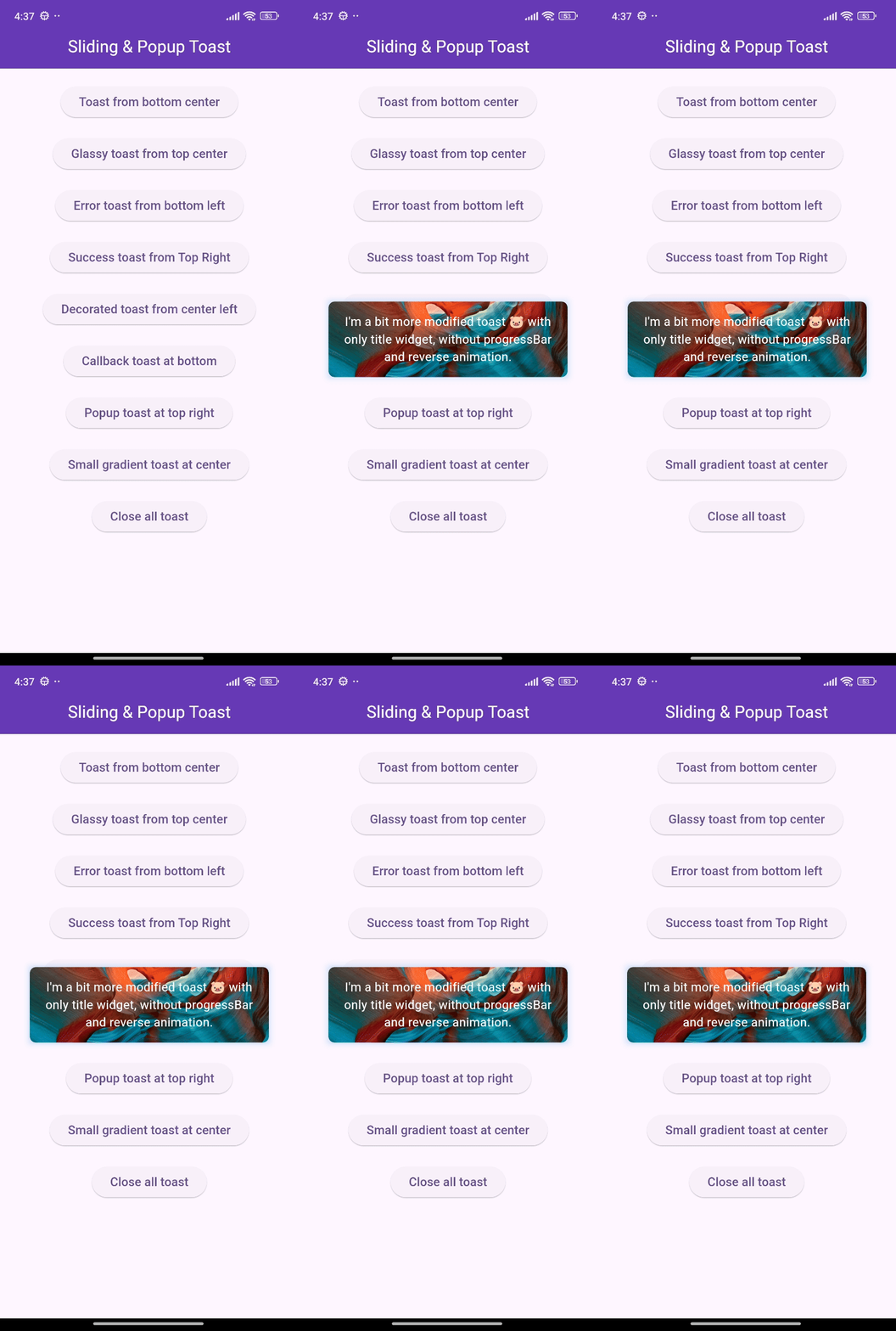
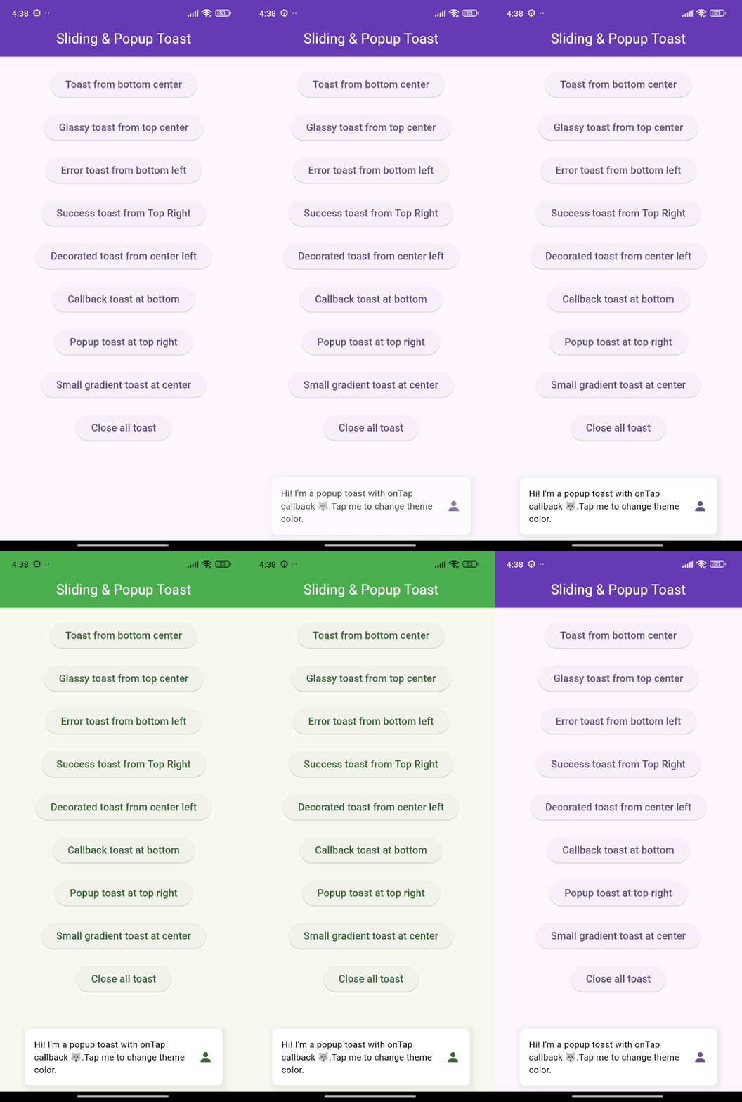
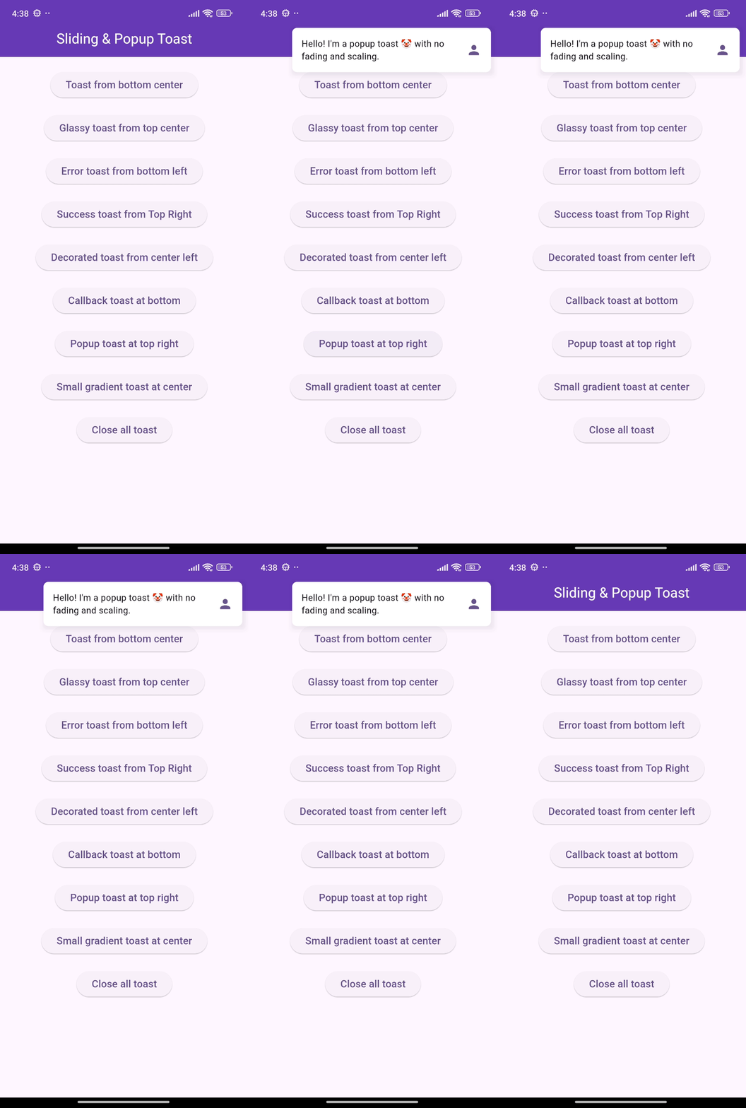
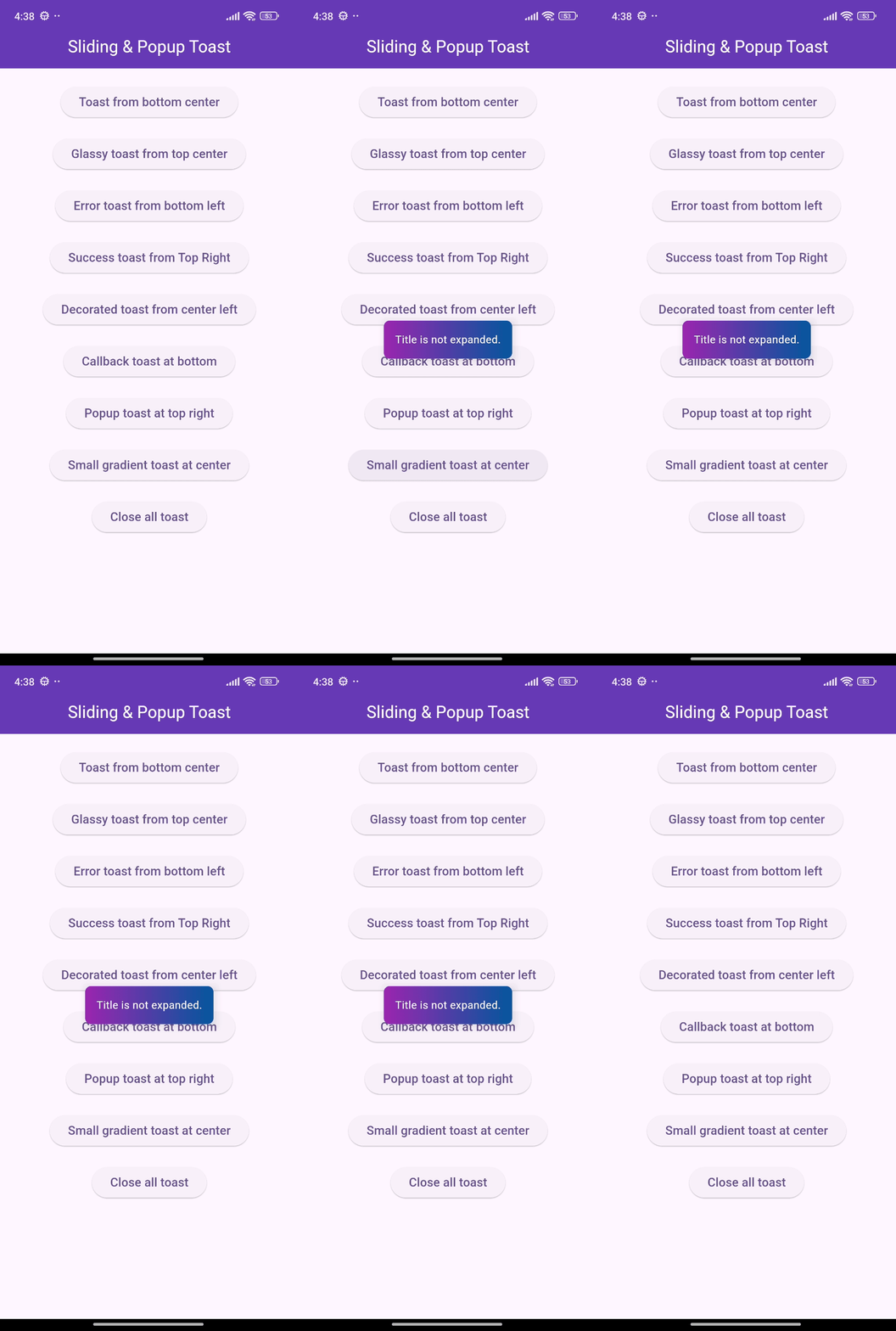
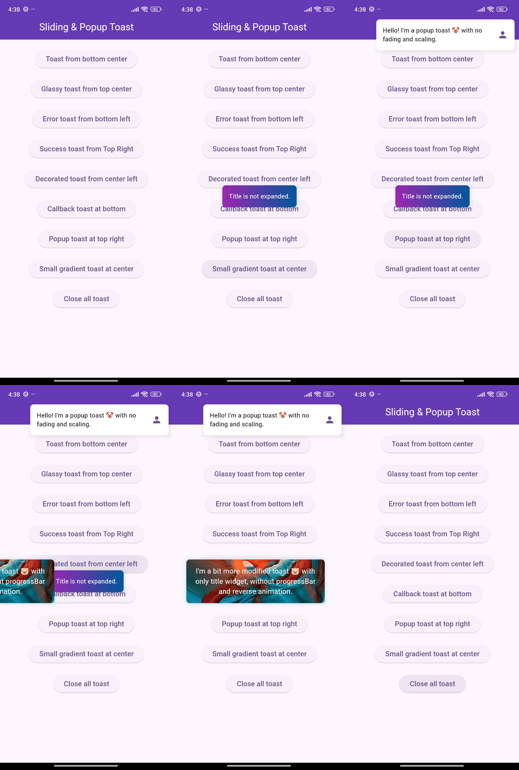
Enhance your app's UI with customizable, interactive toasts! This package offers both sliding & popup styles, with features like animation control, tap actions, and multiple dismiss options.

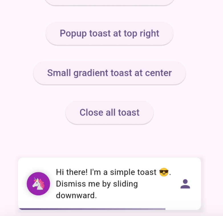
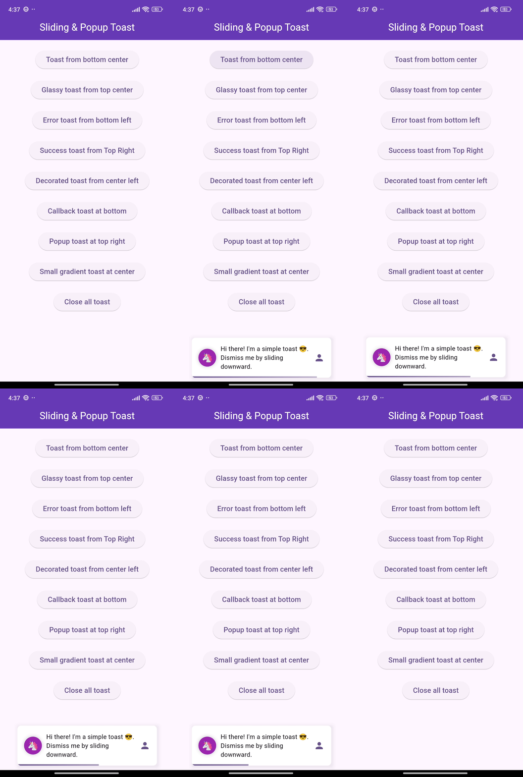
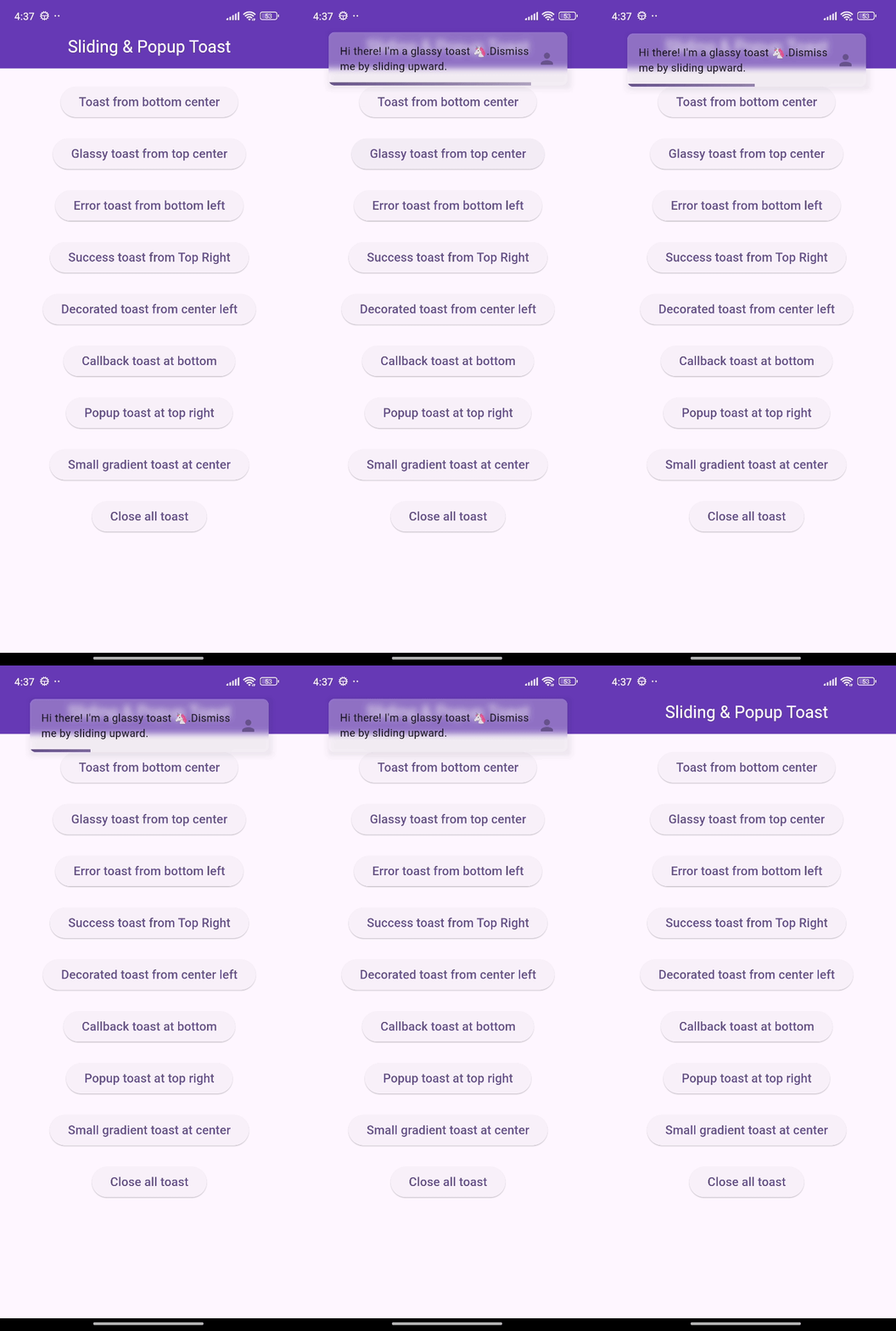
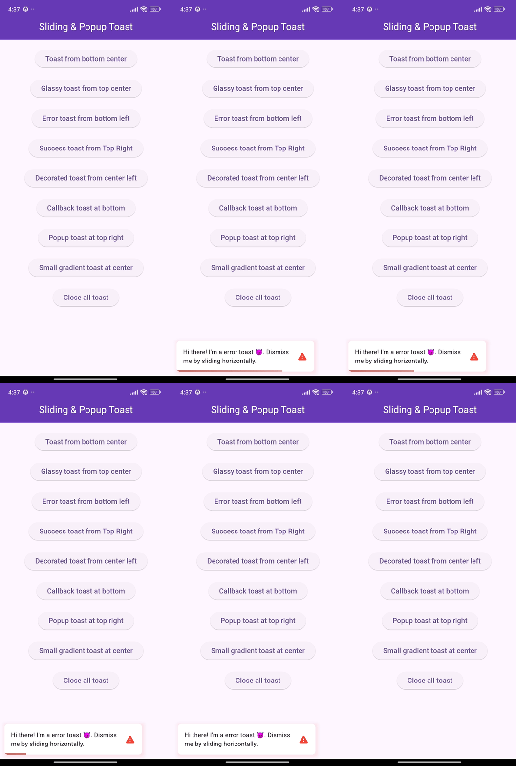
🎨 Screenshots

🎯 Features

  • Show sliding toasts, modify sliding behaviors
  • Show popup toasts, disable or modify fading and scaling behaviors
  • Change toast's alignment positions and sliding toast's sliding directions
  • Define animation and display duration, max height and width, padding
  • Set title, leading, trailing widgets and make title width dynamic or expanded
  • Disable the progressbar in sliding toast if needed
  • Use glassmorphism/gradient/decorated background or default success and error toast
  • Slide any direction to dismiss sliding toast and vertically for popup toast
  • Dismiss an individual or all toasts programmatically
  • Pause the animation with long press and release it to continue
  • Execute a function after the toast is tapped or disposed
  • Disable Multiple tapping to execute 'onTap' callback only one time
  • Initialize context or overlay state early for persistent toast availability

⚙️ Getting Started

Requires Flutter 3.47.0 or newer.

Add the following line to pubspec.yaml:

dependencies:
  flutter_sliding_toast: ^1.6.0

🚀 Usage

class MyHomePage extends StatelessWidget {
  const MyHomePage({super.key});

  @override
  Widget build(BuildContext context) {
    return Scaffold(
      appBar: AppBar(
        iconTheme: const IconThemeData(color: Colors.white),
        title: const Text('Sliding & Popup Toast'),
        centerTitle: true,
      ),
      body: SafeArea(
        child: Column(
          mainAxisAlignment: MainAxisAlignment.center,
          children: [
            const SizedBox(width: double.maxFinite),
            ElevatedButton(
              onPressed: () {
                InteractiveToast.slide(
                  context: context,
                  leading: _leadingWidget(),
                  title: const Text(
                    "Hi there! I'm a sliding toast 😎. "
                    'Dismiss me by sliding upward.',
                  ),
                  trailing: _trailingWidget(),
                  toastStyle: const ToastStyle(titleLeadingGap: 10),
                  toastSetting: const SlidingToastSetting(
                    displayDuration: Duration(seconds: 2),
                    toastStartPosition: ToastPosition.top,
                    toastAlignment: Alignment.topCenter,
                  ),
                );
              },
              child: _textWidget('Sliding toast from top center'),
            ),
            const SizedBox(height: 30),
            ElevatedButton(
              onPressed: () {
                final overlayState = Overlay.of(context);
                InteractiveToast.pop(
                  overlayState: overlayState,
                  title: const Text(
                    "Hi! I'm a popup toast 🐺. "
                    'I have fading and scaling effect.',
                  ),
                  trailing: _trailingWidget(),
                  toastSetting: const PopupToastSetting(
                    animationDuration: Duration(seconds: 1),
                    displayDuration: Duration(seconds: 3),
                  ),
                );
              },
              child: _textWidget('Popup toast at bottom center'),
            ),
          ],
        ),
      ),
    );
  }

  Text _textWidget(String text) =>
      Text(text, style: const TextStyle(fontSize: 16));

  Icon _trailingWidget() => const Icon(Icons.person, color: Colors.deepPurple);

  Container _leadingWidget() {
    return Container(
      width: 40,
      height: 40,
      decoration: BoxDecoration(
        shape: BoxShape.circle,
        color: Colors.purple,
        boxShadow: [
          BoxShadow(
            color: Colors.black.withAlpha(25),
            spreadRadius: 3,
            blurRadius: 4,
          ),
        ],
      ),
      alignment: Alignment.center,
      child: const Text('🦄', style: TextStyle(fontSize: 20)),
    );
  }
}

❤️ Additional information

Pull requests are welcomed!

If you encounter any problems or you have any ideas, feel free to open an issue:

Kategorien

Abhängigkeiten

Abhängigkeiten 1 Einträge

Quell-Repository

Projekte, die dieses Paket verwenden

Noch keine Daten verfügbar.