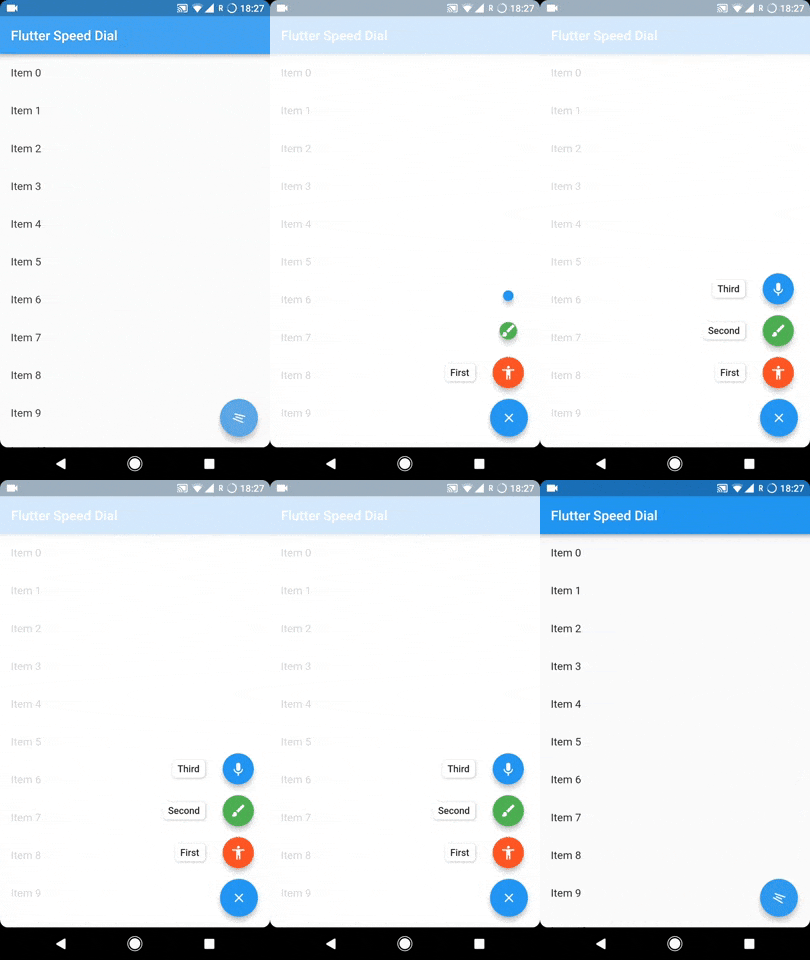
Flutter-Plugin zur Implementierung eines schönen und dynamischen Material Design Speed Dial mit Beschriftungen, animierten Symbolen, mehrfach gerichteten Kindern und vielem mehr.
Aus öffentlichen Paketdaten erstellte Orientierung.
Ein Flutter-Plugin, das einen dynamischen und visuell ansprechenden Material-Design-Speed-Dial implementiert. Es unterstützt animierte Symbole, Beschriftungen, mehrfach gerichtete Kindpositionierung und reibungslose Übergänge. Ideal zur Verbesserung der Navigation in Apps mit begrenztem Platz, bietet es eine intuitive Möglichkeit, über einen einzigen schwebenden Button auf mehrere Aktionen zuzugreifen. Das Plugin ist auf allen wichtigen Plattformen wie Android, iOS, Web, macOS, Windows und Linux kompatibel.
Anwendungsfälle
Verbesserung der Navigation in mobilen Apps
Bereitstellung schnellen Zugriffs auf mehrere Aktionen
Verbesserung der Benutzeroberflächeneffizienz bei kompakten Layouts
Interaktive Elemente in Dashboards hinzufügen
Modernes, gestenfreundliches Interface erstellen
Hauptmerkmale
Animierte Icon-Übergänge
Beschriftungssupport für Kindaktionen
Mehrdirektionale Kindplatzierung
Anpassbares Speed-Dial-Verhalten
Plattformübergreifende Kompatibilität
Glatte Öffnungs-/Schließanimationen
Geeignet für
Mobile-App-Entwickler
UI/UX-Designer, die Material-Design-Komponenten suchen
Apps, die kompakte Aktionen-Menüs erfordern
Entwickler, die mehrere Plattformen ansprechen
Projekte, die Material Design-Richtlinien verwenden
Hinweise
Kann die Leistung bei vielen Kindern beeinträchtigen
Erfordert sorgfältige Layoutplanung
Begrenzte Anpassungsmöglichkeiten jenseits der integrierten Optionen
Nicht ideal für komplexe verschachtelte Interaktionen
Am besten geeignet für einfache, fokussierte Aktionssätze
Original-README
Originaler README-Schnappschuss aus dem verknüpften Quell-Repository. Aktuelle Inhalte finden Sie im Repository.
To sustain the development of this library we need someone who can help this library either through code or by donating it. Donation will help us to live up in the world of unmaintained open source packages and to dedicate more time in improving this to live up to the mark. We will also add the name of the contributors or the donaters in the README section.
To donate directly you can use below link, don't forget to leave a message there:
Or become a Github sponser by clicking on the Sponser button in this repository.
Usage
The SpeedDial widget is built to be placed in the Scaffold.floatingActionButton argument, replacing the FloatingActionButton widget.
You can set its position using Scaffold.floatingActionButtonLocation argument.
It can also be used with Scaffold.bottomNavigationBar and Snackbar.
Null safety is available from version 3.0.5( It is also backward compatible, meaning you can use it with non null safe code too )
Labels
SpeedDial can take any Widget as labelSpeedDial will use Extended FloatingActionButton property if label is specified. It also have activeLabel property by which you can specify the label which is shown when SpeedDial is open. It also comes with its labelTransitionBuilder which defaults to fade transition.
Also Every child's button have label property which accepts String which can be styled by using labelStyle. If you want to specify a widget then you can use labelWidget.
If the label parameter is not provided, then the label will be not rendered.
Types of child for SpeedDial (Ordered by their priority)
Animated Icon using animatedIcon property
SpeedDial's AnimatedIcon has two specific parameters:
animatedIcon takes an AnimatedIconData widget
animatedIconTheme takes IconThemeData
Widget using child & activeChild property
SpeedDial's Widget has two specific parameters:
child takes a widget and is the default placeholder if dial is not open.
activeChild takes a widget and is the child's Widget which is used when dial is open, not required.
IconData using icon & activeIcon property
SpeedDial's IconData has three specific parameters:
icon takes a IconData and is the default placeholder if dial is not open.
activeIcon takes a IconData and is the child's IconData which is used when dial is open, not required.
iconTheme takes its IconThemeData which includes color and size.
The package will handle the animation by itself.
Handle spacing
There are various properties for SpeedDial by which you can adjust the spacing:
spacing - This parameter handles the space b/w speed dial and its children.
spaceBetweenChildren - As the name suggests, this is used to adjust the space b/w every child element
childPadding - This will adjust the padding of children speed dial button, this will help you to control the size of the children button more effectively.
childMargin - This will help you to adjust the margin b/w children speed dial button and its label.
Close on WillPop
Closes automatically on back button press, if dial is open.
If you don't want this behaviour then simply change the value of closeDialOnPop to false.