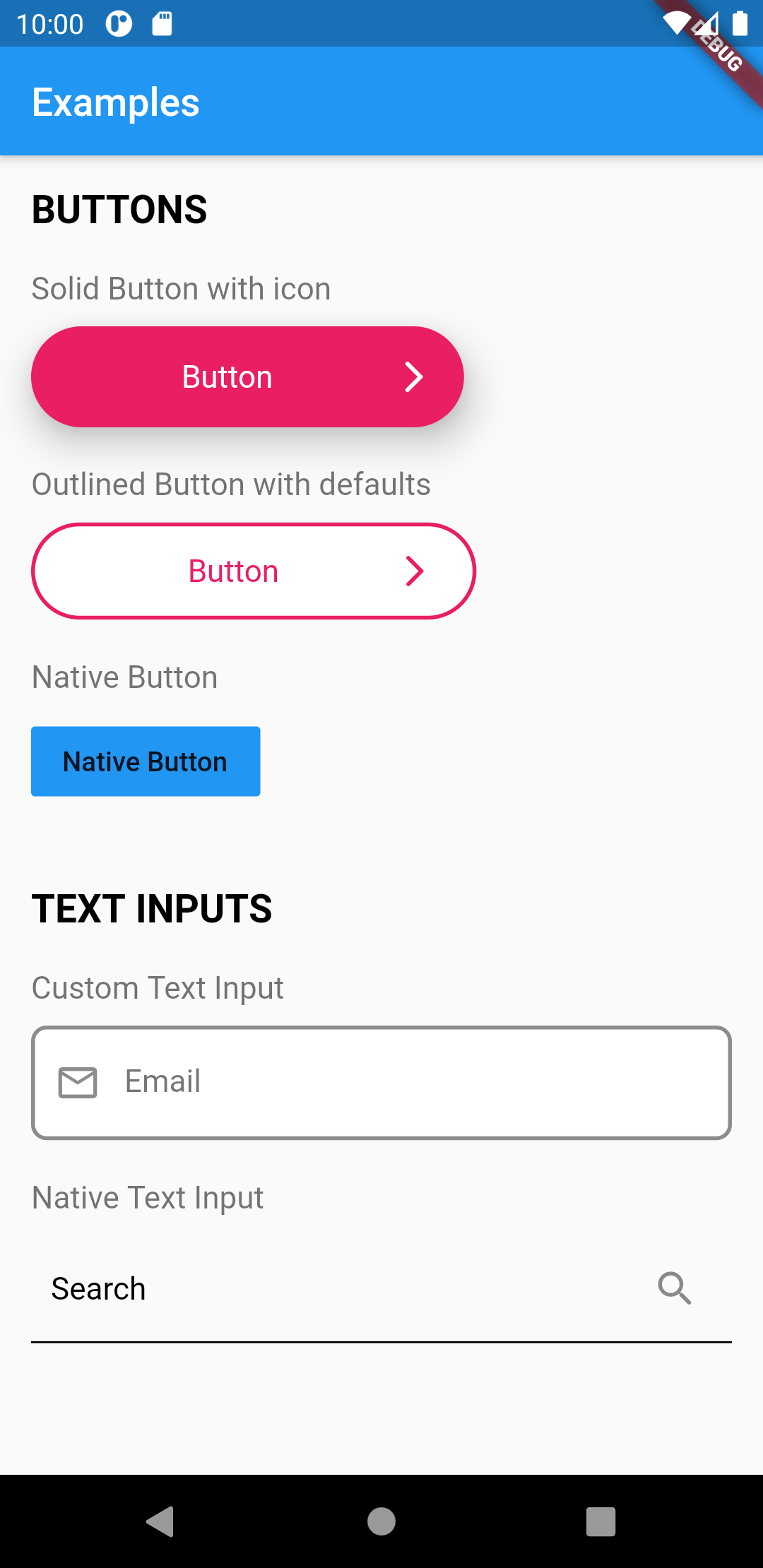
Das Flutter UI-Toolkit ist eine vorab erstellte Sammlung der am häufigsten verwendeten Widgets zur Erstellung von Apps. Der Gedanke ist, dass Sie diese Widgets so verwenden können wie Klassen in HTML und CSS.
Aus öffentlichen Paketdaten erstellte Orientierung.
Der Flutter UI Toolkit ist eine umfassende Bibliothek vordefinierter, wiederverwendbarer Widgets, die die App-Entwicklung beschleunigen sollen. Inspiriert durch die Einfachheit von HTML- und CSS-Klassen ermöglicht er Entwicklern, schnell Schnittstellen mit vorgefertigten Komponenten zusammenzustellen. Der Toolkit legt Wert auf Konsistenz, Anpassungsfähigkeit und Benutzerfreundlichkeit und reduziert Boilerplate-Code. Er unterstützt mehrere Plattformen wie Android, iOS, macOS, Windows und Linux und ist daher ideal für plattformübergreifende Projekte, die schnelle UI-Iterationen erfordern.
Anwendungsfälle
Schnellprototypen
Plattformübergreifende App-Entwicklung
Konsistente Benutzeroberflächengestaltung
Wiederholten Widget-Code reduzieren
Wiederverwendung von UI-Komponenten vereinfachen
Hauptmerkmale
vorgefertigte, anpassbare Widgets
CSS-ähnliches Klassensystem zur Formatierung
Multiplattform-Unterstützung
Minimale Boilerplate
Einfache Integration über pub
Geeignet für
Frontend-Entwickler
UI-ausgerichtete Teams
Schnell wachsende Start-ups
Implementierung des Design-Systems
Anfänger bis mittlere Flutter-Nutzer
Hinweise
Kann die feinabgestimmte Steuerung des Widget-Verhaltens einschränken
Abhängig von externer Wartung
Nicht geeignet für hochgradig angepasste Benutzeroberflächen ohne Erweiterung
Potenzial für Bloat, wenn nicht verwendete Widgets enthalten sind
Lernkurve für den klassenbasierten Ansatz zur Styling-Methodik
Original-README
Originaler README-Schnappschuss aus dem verknüpften Quell-Repository. Aktuelle Inhalte finden Sie im Repository.
Flutter UI Toolkit
The development of this  package is still in progress. More widgets are to come.
However because the widgets are purely Flutter widgets, you can use it with no fear :)
Flutter UI Toolkit is a pre-built collection of the most used widgets to create apps,
the basic ones like: Buttons, Inputs, Headings, Dialogs, Action Sheets, etc..
The idea is that you can use these widgets the way you use classes in HTML and CSS and be a simple helper.
The widgets can receive an argument called as that will carry the widget's styles.
The advantage of this approach is that we don't need to repeat styling every time we create a new widget.
In addition to custom styles, this package also provides native look and feel to the widgets.
This is useful when you want to have one widget that displays the right look and feel based on the Platform.
We can also add custom styles to UIHeading as well
/// Use Google Fonts to set font family and extend stylyes

final articleTitleLato = UIHeadingDefaults(
    color: Colors.pink,
    style: GoogleFonts.lato(
      fontSize: 40.0,
    ),
);
Then use the headings anywhere in your application.
import'styles/headings.dart'// Use articleTitleUIHeading(
as: articleTitle,
text: 'Article Title',
),
// Use articleTitleLatoUIHeading(
as: articleTitleLato,
text: 'Big title using font Lato',
),
UIBottomSheet
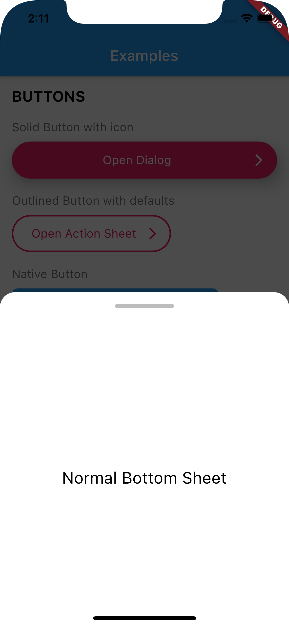
Use UIBottomSheet when you want to display a bottomsheet.
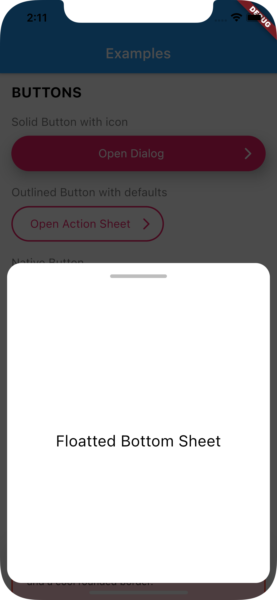
Set floatted: true if you want the bottom sheet to be floatted (have margin all around it, like some iOS bottom sheets)
You can also have a trailing Widget that can be useful for a close button when you have enableDrag set to false.
Full Width
Floatted
How to use:
Create a function that calls UIBottomSheet.show().
Call the function when you need it (eg.: on tap on a button)
// Set up the bottom sheetFuture<void> _openBottomSheet(BuildContext context) async {
awaitUIBottomSheet.show(
context: context,
floatted: true,
hideHead: false,
content: Container(
alignment: Alignment.center,
height: 400,
child: UIHeading(
heading: 3,
text: 'Some cool content',
),
),
);
}
// Open the bottom sheet UIButton.native(
label: 'Open Bottom Sheet',
onPressed: () async {
// OPEN BOTTOM SHEET// and wait until it's closedawait_openBottomSheet(context);
// proceedprint('Bottom sheet closed');
},
),
UITextField
This widget renders a input text field.
There are two kind of text fields you can choose from:
UITextField(),
UITextField.native(),
To create default styles for the text field you need to create a class of type UITextFieldDefaults.
You can have a separated directory where you add all your default styles.
import'styles/containers.dart';
// Show container with error stylingUIContainer(
as: errorContainer,
child: Text('This is a box with a nice shadow\nand a cool rounded border.'),
),
UIActionSheet
This widget creates a Native Action Sheet.
Compared with the other classes in this package,UIActionSheet is a bit more verbose.
However you write once for all platforms.
How to use:
Create a function that calls UIActionSheet.show().
The actions need to be of type UIAction.
Call the function when you need it (eg.: on tap on a button)
See example below:
// Creates a Native Action Sheet Factoryvoid_openActionSheet(BuildContext context) {
UIActionSheet.show(
context,
/// TITLE
title: UIHeading(
text: 'Select you favorite color',
color: Colors.blue,
textAlign: TextAlign.center,
heading: 5,
),
/// CONTENT
content: Text('We will use the color on your profile.'),
/// ACTIONS
actions: [
UIAction(
child: Text('Red'),
onPressed: () => Navigator.of(context).pop(),
),
UIAction(
child: Text('Green'),
onPressed: () => Navigator.of(context).pop(),
),
UIAction(
child: Text('Bue'),
onPressed: () => Navigator.of(context).pop(),
),
UIAction(
child: Text('Pink'),
onPressed: () => Navigator.of(context).pop(),
),
],
/// CANCEL BUTTON
cancel: UIAction(
child: UIHeading(
text: 'Cancel',
color: Colors.red,
heading: 4,
),
onPressed: () => print('Cancel'),
),
);
}
// Will open action sheet based on the current OSUIButton.solid(
as: solidButtonStyles,
label: "Open Action SHeet",
onPressed: () => _openActionSheet(context),
),
UIDialog
This widget creates a Native Dialog.
Compared with the other classes in this package, UIDialog is a bit more verbose.
However you write once for all platforms.
How to use:
Create a function that calls UIDialog.show().
The actions need to be of type UIAction.
Call the function when you need it (eg.: on tap on a button)
See example below:
// Creates a Native Dialog Factoryvoid_openDialog(BuildContext context) {
UIDialog.show(
context,
/// TITLE
title: Text('Are you sure?'),
/// CONTENT
content: Text('You cannot reverse this action.'),
/// ACTIONS
actions: [
UIAction(
child: Text('YES'),
onPressed: () => print('YES'),
),
UIAction(
child: Text('NO'),
onPressed: () => Navigator.of(context).pop(),
),
],
);
}
// Will open a dialog based on the current OSUIButton.solid(
as: solidButtonStyles,
label: "Open Dialog",
onPressed: () => _openDialog(context),
),
If you find any bug or want to request a feature, feel free to open an issue on Github.