Aus öffentlichen Paketdaten erstellte Orientierung.
Ein leichtgewichtiger Flutter-Paket, der die Erstellung und Verwaltung gruppierten Checkboxes und Radiobuttons vereinfacht. Es bietet eine saubere, wiederverwendbare Möglichkeit, mehrere Auswahlmöglichkeiten mit konsistenter Gestaltung und Zustandsverwaltung zu handhaben. Ideal für Formulare oder Einstellungen, bei denen Benutzer ein oder mehrere Elemente aus einer vordefinierten Menge auswählen müssen. Das Paket reduziert Boilerplate-Code und erhöht die Produktivität von Entwicklern, indem häufige Muster abstrahiert werden.
Anwendungsfälle
Formularingaben mit mehreren Auswahlmöglichkeiten
Benutzereinstellungen
Umfrage- oder Quiz-Schnittstellen
Dynamische Optionenauswahl
Einfache Zustandsverwaltung für Gruppen
Konsistente Benutzeroberfläche für wählbare Optionen
Hauptmerkmale
Einfaches Gruppieren von Kontrollkästchen und Radiobuttons
Eingebautes Zustandsmanagement
Anpassbare Erscheinung
Minimales Boilerplate
Unterstützt sowohl Einzel- als auch Mehrfachauswahl
Klare, lesbare API
Geeignet für
Entwickler, die Formulare mit Optionsgruppen erstellen
UI-Designer, die konsistente Toggle-Komponenten suchen
Projekte, die einfache aber skalierbare Auswahl-Widgets erfordern
Teams, die der Code-Wartbarkeit Priorität einräumen
Flutter-Anfänger lernen die Formularverarbeitung
Hinweise
Beschränkt auf Checkbox- und Radiobutton-Typen
Keine integrierte Überprüfung
Untergruppen werden nicht unterstützt
Benötigt manuelle Stilisierung für komplexe Designs
Nicht geeignet für erweiterte Formularlogik jenseits der Auswahl
Original-README
Originaler README-Schnappschuss aus dem verknüpften Quell-Repository. Aktuelle Inhalte finden Sie im Repository.
grouped_buttons
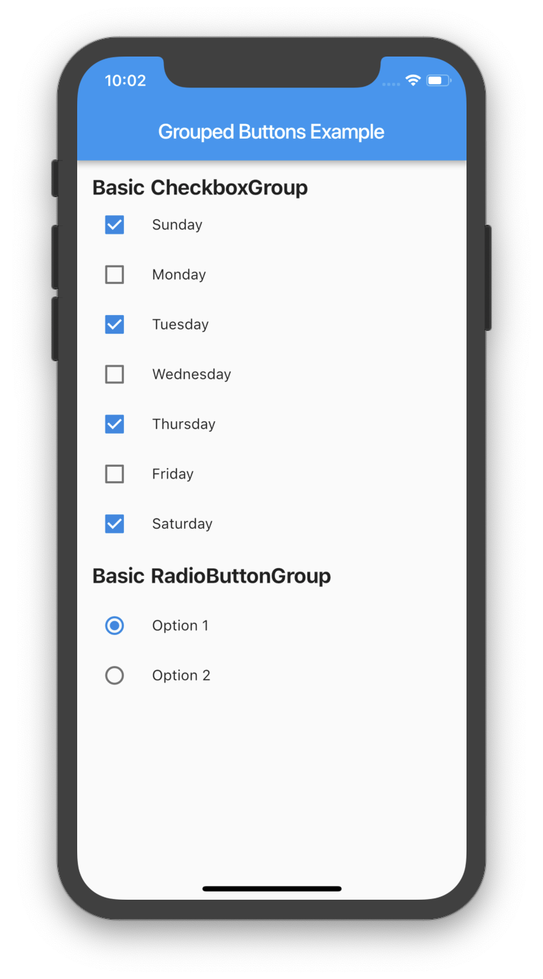
A set of Flutter widgets that makes grouping Checkboxes and Radio Buttons much easier!
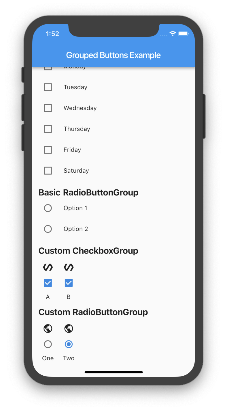
There are several options that allow for more control.
Custom CheckboxGroup
Properties
Description
activeColor
The color to use when a Checkbox is checked.
checkColor
The color to use for the check icon when a Checkbox is checked.
checked
Specifies which boxes to be automatically checked. Every element must match a label. This is useful for clearing all selections (set it to []). If this is non-null, then the user must handle updating this list; otherwise, the state of the CheckboxGroup won't change.
disabled
Specifies which boxes should be disabled. If this is non-null, no boxes will be disabled. The strings passed to this must match the labels.
itemBuilder
Called when needed to build a CheckboxGroup element.
labels
(required) A list of strings that describes each Checkbox. Each label must be distinct.
labelStyle
The style to use for the labels.
margin
Empty space surrounding the CheckboxGroup.
onChange
Called when the value of the CheckboxGroup changes.
onSelected
Called when the user makes a selection.
orientation
Specifies the orientation to display elements. Either GroupedButtonsOrientation.HORIZONTAL or GroupedButtonsOrientation.VERTICAL.
padding
Empty space in which to inset the CheckboxGroup.
tristate
If true the checkbox's value can be true, false, or null.
Specifies which buttons should be disabled. If this is non-null, no buttons will be disabled. The strings passed to this must match the labels.
itemBuilder
Called when needed to build a RadioButtonGroup element.
labels
(required) A list of strings that describes each Radio button. Each label must be distinct.
labelStyle
The style to use for the labels.
margin
Empty space surrounding the RadioButtonGroup.
onChange
Called when the value of the RadioButtonGroup changes.
onSelected
Called when the user makes a selection.
orientation
Specifies the orientation to display elements. Either GroupedButtonsOrientation.HORIZONTAL or GroupedButtonsOrientation.VERTICAL.
padding
Empty space in which to inset the RadioButtonGroup.
picked
Specifies which Radio button to automatically pick. Every element must match a label. This is useful for clearing what is picked (set it to ""). If this is non-null, then the user must handle updating this; otherwise, the state of the RadioButtonGroup won't change.