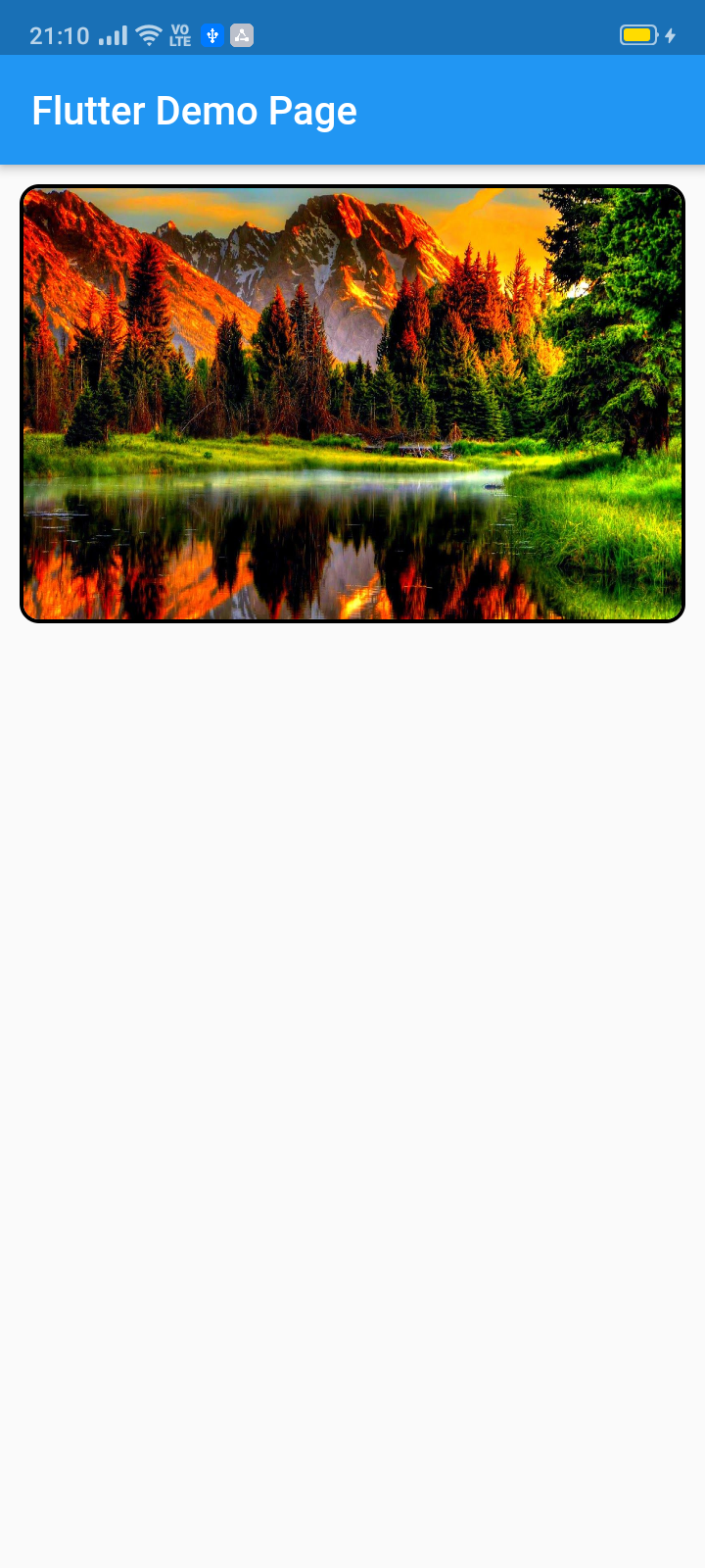
Dieses Pub ermöglicht die Erstellung eines Widget-Sliders (automatisches/manuelles Scrollen) mit vollständiger Anpassungsmöglichkeit. Hauptsächlich für Bildsliders gedacht, akzeptiert es auch alle anderen Widgets.
Aus öffentlichen Paketdaten erstellte Orientierung.
Das image_slider-Paket ermöglicht die Erstellung anpassbarer Slider in Flutter mit Unterstützung für automatische und manuelle Übergänge. Hauptsächlich für die Anzeige von Bildern konzipiert, unterstützt es auch beliebige Widget-Typen und bietet Flexibilität bei der Inhaltpräsentation. Mit umfassenden Anpassungsmöglichkeiten können Entwickler das Aussehen und Verhalten des Sliders an verschiedene Designanforderungen anpassen. Es ist ideal zur Darstellung von Galerien, Produktpräsentationen oder Werbeinhalten in Apps. Das Paket ist Open Source und wird auf GitHub gepflegt, wodurch es für Community-Beiträge und Anpassungen zugänglich ist.
Anwendungsfälle
Bildgalerien
Produktkarussells
Werbebanner
Dynamische Inhaltsfolien
Interaktive Benutzeroberflächenelemente
Hauptmerkmale
Automatisches und manuelles Schieben
Vollständige Widget-Anpassung
Unterstützung für jedes Widget-Typ
Open-Source und communitygetrieben
Einfache Integration über pub add
Geeignet für
Mobile-App-Entwickler
UI/UX-Designer
E-Commerce-Anwendungen
Inhaltsreiche Anwendungen
Benutzerdefinierte Carousel-Implementierungen
Hinweise
Eingeschränkte plattformspezifische Optimierungen
Keine integrierten Paginierungsindikatoren
Benötigt manuelle Styling für anspruchsvolle Designs
Abhängig von externer Wartung
Könnte zusätzliche Abhängigkeiten für Animationen benötigen
Original-README
Originaler README-Schnappschuss aus dem verknüpften Quell-Repository. Aktuelle Inhalte finden Sie im Repository.
image_slider
This pub lets you make a widget slider (automatic/manual sliding) with full customization. Mainly intended for image slider, this also accepts all other widgets.
ImageSlider(
/// Shows the tab indicating circles at the bottom
showTabIndicator: false,
/// Cutomize tab's colors
tabIndicatorColor: Colors.lightBlue,
/// Customize selected tab's colors
tabIndicatorSelectedColor: Color.fromARGB(255, 0, 0, 255),
/// Height of the indicators from the bottom
tabIndicatorHeight: 16,
/// Size of the tab indicator circles
tabIndicatorSize: 16,
/// tabController for walkthrough or other implementations
tabController: tabController,
/// Animation curves of sliding
curve: Curves.fastOutSlowIn,
/// Width of the slider
width: MediaQuery.of(context).size.width,
/// Height of the slider
height: 220,
/// If automatic sliding is required
autoSlide: false,
/// Time for automatic sliding
duration: newDuration(seconds: 6),
/// If manual sliding is required
allowManualSlide: true,
/// Children in slideView to slide
children: links.map((String link) {
returnnewClipRRect(
borderRadius: BorderRadius.circular(8.0),
child: Image.network(
link,
width: MediaQuery.of(context).size.width,
height: 220,
fit: BoxFit.fill,
));
}).toList(),
),
License
Copyright 2020 Jay Mehta

Licensed under the Apache License, Version 2.0 (the "License");
you may not use this file except in compliance with the License.
You may obtain a copy of the License at

    http://www.apache.org/licenses/LICENSE-2.0

Unless required by applicable law or agreed to in writing, software
distributed under the License is distributed on an "AS IS" BASIS,
WITHOUT WARRANTIES OR CONDITIONS OF ANY KIND, either express or implied.
See the License for the specific language governing permissions and
limitations under the License.
Getting Started
This project is a starting point for a Dart
package,
a library module containing code that can be shared easily across
multiple Flutter or Dart projects.
For help getting started with Flutter, view our
online documentation, which offers tutorials,
samples, guidance on mobile development, and a full API reference.
Example
As time based...
import'package:flutter/material.dart';
import'package:image_slider/image_slider.dart';
voidmain() {
runApp(MyApp());
}
classMyAppextendsStatelessWidget{
@overrideWidgetbuild(BuildContext context) {
returnMaterialApp(
title: 'Flutter Demo',
debugShowCheckedModeBanner: false,
theme: ThemeData(
primarySwatch: Colors.blue,
visualDensity: VisualDensity.adaptivePlatformDensity,
),
home: MyHomePage(title: 'Flutter Image Slider Demo Page'),
);
}
}
classMyHomePageextendsStatefulWidget{
MyHomePage({Key key, this.title}) : super(key: key);
finalString title;
@override_MyHomePageStatecreateState() => _MyHomePageState();
}
class_MyHomePageStateextendsState<MyHomePage>
withSingleTickerProviderStateMixin{
/// This pub allows you to make image_slider widget and also multiple other useful widgets like walkthrough etc.@overridevoidinitState() {
super.initState();
tabController = TabController(length: 3, vsync: this);
}
TabController tabController;
staticList<String> links = [
"https://i.pinimg.com/originals/cc/18/8c/cc188c604e58cffd36e1d183c7198d21.jpg",
"https://www.kyoceradocumentsolutions.be/blog/wp-content/uploads/2019/03/iStock-881331810.jpg",
"https://resources.matcha-jp.com/resize/720x2000/2020/04/23-101958.jpeg"
];
@overrideWidgetbuild(BuildContext context) {
returnScaffold(
appBar: AppBar(
title: Text(widget.title),
),
body: Column(
children: [
Container(
margin: EdgeInsets.all(10),
decoration: BoxDecoration(
borderRadius: BorderRadius.circular(10),
border: Border.all(width: 2)),
child: ImageSlider(
/// Shows the tab indicating circles at the bottom
showTabIndicator: false,
/// Cutomize tab's colors
tabIndicatorColor: Colors.lightBlue,
/// Customize selected tab's colors
tabIndicatorSelectedColor: Color.fromARGB(255, 0, 0, 255),
/// Height of the indicators from the bottom
tabIndicatorHeight: 16,
/// Size of the tab indicator circles
tabIndicatorSize: 16,
/// tabController for walkthrough or other implementations
tabController: tabController,
/// Animation curves of sliding
curve: Curves.fastOutSlowIn,
/// Width of the slider
width: MediaQuery.of(context).size.width,
/// Height of the slider
height: 220,
/// If automatic sliding is required
autoSlide: false,
/// Time for automatic sliding
duration: newDuration(seconds: 6),
/// If manual sliding is required
allowManualSlide: true,
/// Children in slideView to slide
children: links.map((String link) {
returnnewClipRRect(
borderRadius: BorderRadius.circular(8.0),
child: Image.network(
link,
width: MediaQuery.of(context).size.width,
height: 220,
fit: BoxFit.fill,
));
}).toList(),
),
),
Row(
mainAxisAlignment: MainAxisAlignment.spaceEvenly,
children: [
tabController.index == 0
? Container(
width: 0,
height: 0,
)
: RaisedButton(
onPressed: () {
tabController.animateTo(tabController.index - 1);
setState(() {});
},
child: Text("Previous"),
),
tabController.index == 2
? Container(
width: 0,
height: 0,
)
: RaisedButton(
onPressed: () {
tabController.animateTo(2);
setState(() {});
},
child: Text("Skip"),
),
tabController.index == 2
? Container(
width: 0,
height: 0,
)
: RaisedButton(
onPressed: () {
tabController.animateTo(tabController.index + 1);
setState(() {});
},
child: Text("Next"),
),
],
)
],
));
}
}