Pakete, Repositories und App-Kategorien suchen

Cover von info_popup
Paketdetailsv4.3.2

info_popup

Die einfache Möglichkeit, dem Benutzer Informationen zu Ihrem ausgewählten Widget anzuzeigen.

AndroidiOSWebmacOSWindowsLinux
30-Tage-Downloads
46.200
Likes
165
Pub-Punkte
150

Paket installieren

flutter pub add info_popup

Paketübersicht

Aus öffentlichen Paketdaten erstellte Orientierung.

InfoPopup ist ein leichtgewichtiges Flutter-Paket, das Entwicklern ermöglicht, informierende Popups auf beliebigen Widgets mit minimalem Aufwand anzuzeigen. Es bietet eine saubere und anpassbare Möglichkeit, kontextbezogene Informationen an Benutzer zu übermitteln, wodurch die Benutzererfahrung durch direkte Tooltips oder Anleitungen auf UI-Elementen verbessert wird. Das Paket unterstützt mehrere Plattformen wie Android, iOS, Web, macOS, Windows und Linux und gewährleistet konsistentes Verhalten über Geräte hinweg. Durch einfache Integration mittels eines einzigen Befehls eignet es sich ideal für die Hinzufügung subtiler, aber effektiver Benutzerfeedback-Mechanismen.

Anwendungsfälle

  • Tooltips auf Schaltflächen anzeigen
  • kontextsensitive Hilfe bereitstellen
  • Verbesserung der Formularfeldanleitung
  • Verbesserung von Onboarding-Erlebnissen
  • Interaktive Hinweise hinzufügen
  • Statuserklärungen anzeigen

Hauptmerkmale

  • Einfache Einzeilige Integration
  • Anpassbarer Popup-Inhalt
  • Plattformübergreifende Kompatibilität
  • Unterstützt verschiedene Widget-Ziele
  • Konfigurierbare Positionierung
  • Leicht und schnell

Geeignet für

  • UI/UX-Designer, die schnelle Feedback-Tools suchen
  • Entwickler, die Bildungs-Apps erstellen
  • Teams, die sich auf Barrierefreiheit konzentrieren
  • Apps, die eine intuitive Benutzerführung erfordern
  • Projekte mit engen Entwicklungszeitrahmen

Hinweise

  • Beschränkt auf grundlegende Popup-Stilisierung
  • Keine integrierte Animationsanpassung
  • Am besten geeignet für kleine Textinhalte
  • Kann manuelle Positionierungsanpassungen erfordern
  • Nicht ideal für komplexe Modalsinteraktionen

Original-README

Originaler README-Schnappschuss aus dem verknüpften Quell-Repository. Aktuelle Inhalte finden Sie im Repository.

Introduction

The info_popup package allows you to easily show a simple, customizable popup on your wrapped widget. The highlight feature, which can be activated at will, helps draw the user's attention to the desired location.

You can test it now on the Info Popup preview page. Note that the website experience may be different.

Features

  • Display a customizable popup on your wrapped widget
  • Activate the highlight feature to draw the user's attention to the desired location
  • Fully customize the content of the popup
  • Add margins to the popup from any side

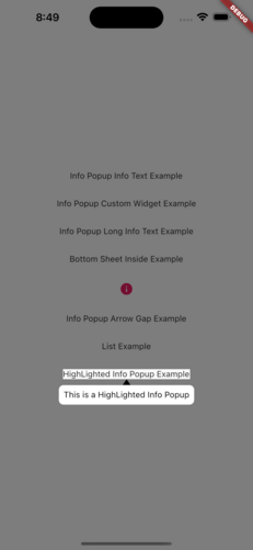
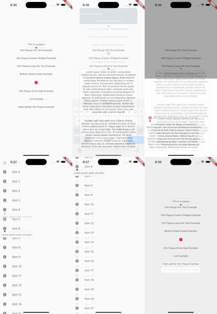
MainPresentation HighlightExample

Getting Started

To use this package, add info_popup as a dependency in your pubspec.yaml file.

dependencies:
  info_popup: ^3.0.0

Alternatively, you can add it to your project by running the following commands in your terminal:

with Dart:

$ dart pub add info_popup

with Flutter:

$ flutter pub add info_popup

Usage

To show a popup, wrap the widget that you want to display the popup on with the InfoPopupWidget widget. All you have to do is wrap it in the widget you want to show information with the InfoPopupWidget widget. With the InfoPopupController, you can customize it as you wish, and turn it on and off.

import 'package:info_popup/info_popup.dart';
	InfoPopupWidget(
		contentTitle: 'Info Popup Details',
		child: Icon(
			Icons.info,
			color: Colors.pink,
		),
	),

Example

This is a normal info text displayed using the InfoPopupWidget widget with several optional parameters.

              InfoPopupWidget(
                contentTitle: 'Info Popup Details',
                arrowTheme: InfoPopupArrowTheme(
                  color: Colors.pink,
                  arrowDirection: ArrowDirection.up,
                ),
                contentTheme: InfoPopupContentTheme(
                  infoContainerBackgroundColor: Colors.black,
                  infoTextStyle: TextStyle(color: Colors.white),
                  contentPadding: const EdgeInsets.all(8),
                  contentBorderRadius: BorderRadius.all(Radius.circular(10)),
                  infoTextAlign: TextAlign.center,
                ),
                dismissTriggerBehavior: PopupDismissTriggerBehavior.onTapArea,
                areaBackgroundColor: Colors.transparent,
                indicatorOffset: Offset.zero,
                contentOffset: Offset.zero,
                onControllerCreated: (controller) {
                  print('Info Popup Controller Created');
                },
                onAreaPressed: (InfoPopupController controller) {
                  print('Area Pressed');
                },
                infoPopupDismissed: () {
                  print('Info Popup Dismissed');
                },
                onLayoutMounted: (Size size) {
                  print('Info Popup Layout Mounted');
                },
                child: Icon(
                  Icons.info,
                  color: Colors.pink,
                ),
              ),

"This is a custom popup example created using the InfoPopupWidget widget.

Custom Popup Widget
              InfoPopupWidget(
                customContent: Container(
                  decoration: BoxDecoration(
                    color: Colors.blueGrey,
                    borderRadius: BorderRadius.circular(10),
                  ),
                  padding: const EdgeInsets.all(10),
                  child: Column(
                    children: const <Widget>[
                      TextField(
                        decoration: InputDecoration(
                          hintText: 'Enter your name',
                          hintStyle: TextStyle(color: Colors.white),
                          enabledBorder: OutlineInputBorder(
                            borderSide: BorderSide(color: Colors.white),
                          ),
                        ),
                      ),
                      SizedBox(height: 10),
                      Center(
                        child: Text(
                          'Example of Info Popup inside a Bottom Sheet',
                          style: TextStyle(
                            color: Colors.white,
                          ),
                        ),
                      ),
                    ],
                  ),
                ),
                arrowTheme: const InfoPopupArrowTheme(
                  color: Colors.pink,
                  arrowDirection: ArrowDirection.up,
                ),
                dismissTriggerBehavior: PopupDismissTriggerBehavior.onTapArea,
                areaBackgroundColor: Colors.transparent,
                indicatorOffset: Offset.zero,
                contentOffset: Offset.zero,
                onControllerCreated: (controller) {
                  print('Info Popup Controller Created');
                },
                onAreaPressed: (InfoPopupController controller) {
                  print('Area Pressed');
                },
                infoPopupDismissed: () {
                  print('Info Popup Dismissed');
                },
                onLayoutMounted: (Size size) {
                  print('Info Popup Layout Mounted');
                },
                child: Icon(
                  Icons.info,
                  color: Colors.pink,
                ),
              ),

Conclusion

The info_popup package provides a simple and effective way to show a customizable popup on your wrapped widget. With the highlight feature, you can draw the user's attention to the desired location.

License

This project is licensed under the MIT License - see the LICENSE file for details.

Kategorien

Quell-Repository

Projekte, die dieses Paket verwenden

Noch keine Daten verfügbar.