Pakete, Repositories und App-Kategorien suchen

Cover von kf_drawer
Paketdetailsv2.1.0

kf_drawer

Seitenmenü (Drawer)

AndroidiOSWebmacOSWindowsLinux
30-Tage-Downloads
817
Likes
144
Pub-Punkte
160

Paket installieren

flutter pub add kf_drawer

Paketübersicht

Aus öffentlichen Paketdaten erstellte Orientierung.

kf_drawer ist ein Flutter-Paket, das für Anwendungen auf mehreren Plattformen einen anpassbaren Seitenmenü (Drawer) bereitstellt. Es bietet eine saubere, leichte Implementierung für die Navigation mit Unterstützung für verschiedene Anpassungsoptionen wie Breite, Animation und Elementgestaltung. Durch seine einfache Handhabung lässt es sich nahtlos in Flutter-Apps für Android, iOS, Web, macOS, Windows und Linux integrieren. Das Paket ist ideal für Apps, die eine konsistente und reaktionsfähige Navigations-Drawer-Erfahrung benötigen.

Anwendungsfälle

  • Mobile App-Navigation
  • Web-Dashboard-Seitenleiste
  • Menüs für Desktop-Anwendungen
  • Plattformübergreifende Navigation
  • Anpassbare Schubladenlayouts

Hauptmerkmale

  • Plattformübergreifende Kompatibilität
  • Anpassbare Schubladenbreite
  • Glatte Animationen
  • Einfache Integration
  • Unterstützung für benutzerdefinierte Widgets

Geeignet für

  • Entwickler, die Multiplattform-Apps erstellen
  • Teams, die eine konsistente Navigation benötigen
  • Apps mit komplexen Seitenleistenanforderungen
  • UI-orientierte Projekte
  • Schnellprototypen

Hinweise

  • Eingeschränkte integrierte Themen
  • Benötigt manuelle Styling für anspruchsvolle Designs
  • Keine integrierte Dunkelmodus-Unterstützung
  • Abhängig von der Flutter-Drawer-API
  • Könnte zusätzliche Zustandsverwaltung benötigen

Original-README

Originaler README-Schnappschuss aus dem verknüpften Quell-Repository. Aktuelle Inhalte finden Sie im Repository.

KFDrawer

pub package CI

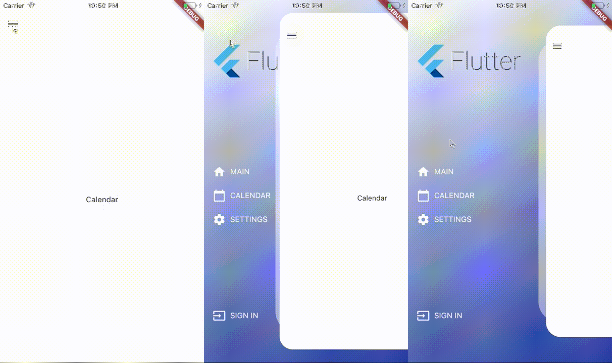
A dependency-free animated side drawer for Flutter. KFDrawer supports controller and context-based control, gestures, pinned or centered menus, page history, right-side drawers, and RTL layouts on every Flutter platform.

KFDrawer demo

Install

dependencies:
  kf_drawer: ^2.1.0

KFDrawer 2.1 supports Dart 3 and Flutter 3.10 or newer. The package is tested against both its compatibility floor and the current Flutter stable release.

Quick start

Create a controller, give each page item a widget, and place KFDrawer in your Scaffold body:

late final KFDrawerController drawerController;

@override
void initState() {
  super.initState();
  drawerController = KFDrawerController(
    initialPage: const HomePage(),
    items: <KFDrawerItem>[
      KFDrawerItem.withPage(
        alias: 'home',
        icon: const Icon(Icons.home, color: Colors.white),
        text: const Text('HOME', style: TextStyle(color: Colors.white)),
        page: const HomePage(),
      ),
      KFDrawerItem.withPage(
        alias: 'settings',
        icon: const Icon(Icons.settings, color: Colors.white),
        text: const Text('SETTINGS', style: TextStyle(color: Colors.white)),
        page: const SettingsPage(),
      ),
    ],
  );
}

@override
Widget build(BuildContext context) {
  return Scaffold(
    body: KFDrawer(
      controller: drawerController,
      decoration: const BoxDecoration(
        gradient: LinearGradient(
          colors: <Color>[Colors.white, Color(0xFF2C48AB)],
        ),
      ),
    ),
  );
}

@override
void dispose() {
  drawerController.dispose();
  super.dispose();
}

The page widgets do not need to extend a KFDrawer-specific base class. Open or close the nearest drawer directly from a descendant page:

IconButton(
  tooltip: 'Open navigation menu',
  icon: const Icon(Icons.menu),
  onPressed: () => KFDrawer.of(context)?.toggle(),
)

The controller callbacks remain available for existing integrations:

drawerController.open?.call();
drawerController.close?.call();
drawerController.toggle?.call();

Custom content without a controller

Use content when your application manages navigation elsewhere, such as with a bottom navigation bar:

KFDrawer(
  content: Scaffold(
    body: pages[currentIndex],
    bottomNavigationBar: BottomNavigationBar(
      currentIndex: currentIndex,
      onTap: onBottomNavigationTap,
      items: const <BottomNavigationBarItem>[
        BottomNavigationBarItem(icon: Icon(Icons.home), label: 'Home'),
        BottomNavigationBarItem(icon: Icon(Icons.person), label: 'Profile'),
      ],
    ),
  ),
  items: <KFDrawerItem>[
    KFDrawerItem(
      text: const Text('Open profile'),
      onPressed: openProfile,
    ),
  ],
)

Menu layout

By default, header, items, and footer use the original scrollable layout. Two opt-in properties cover fixed-footer and centered-menu use cases:

KFDrawer(
  controller: drawerController,
  header: const MyDrawerHeader(),
  footer: const MyDrawerFooter(),
  footerPinned: true,
  centerScrollableItems: true,
)
  • footerPinned keeps the footer outside the scrolling item list.
  • centerScrollableItems centers a shrink-wrapped item list between a fixed header and footer.
  • scrollable: false retains the non-scrolling centered column layout.

Right-side and RTL drawers

KFDrawerDirection is logical, so start automatically follows the ambient text direction:

// Left in LTR, right in RTL (default).
KFDrawer(direction: KFDrawerDirection.start)

// Right in LTR, left in RTL.
KFDrawer(direction: KFDrawerDirection.end)

Translation, edge dragging, content tap regions, shadow offset, icon padding, and menu alignment all follow the resolved side.

Dynamic items

Controller changes rebuild the drawer automatically:

drawerController.items = <KFDrawerItem>[...newItems];
drawerController.addItem(newItem);
drawerController.removeItem(oldItem);
drawerController.clearItems();

// If you mutate drawerController.items directly:
drawerController.items.add(newItem);
drawerController.refreshItems();

drawerController.selectItem('settings');

Optional page history and Back handling

KFDrawer swaps page widgets; it does not push Navigator routes. Enable the lightweight controller history only if this is the behavior your app needs:

final drawerController = KFDrawerController(
  initialPage: const HomePage(),
  maintainPageHistory: true,
);

AnimatedBuilder(
  animation: drawerController,
  builder: (context, child) {
    return PopScope<Object?>(
      canPop: !drawerController.canGoBack,
      onPopInvokedWithResult: (didPop, result) {
        if (!didPop) drawerController.goBack();
      },
      child: child,
    );
  },
  child: KFDrawer(controller: drawerController),
)

Use replacePage to change the current page without adding a history entry and clearHistory after a navigation reset.

Page item callbacks

When an item has both page and onPressed, KFDrawer now performs both actions: it selects the page, optionally closes the drawer, and invokes the callback.

KFDrawerItem.withPage(
  page: const ProfilePage(),
  text: const Text('PROFILE'),
  onPressed: logProfileSelection,
  closeOnTap: true,
)

Use an item without page when the callback should fully own navigation.

Useful options

Property Default Purpose
drawerWidth 0.66 Revealed fraction of available width
minScale 0.86 Content scale while open
borderRadius 32 Open content corner radius
shadowColor translucent white Decorative layer color; use transparent to hide it
disableContentTap true Absorb content interaction and close it on tap
dragEnabled true Enable pointer dragging
edgeDragWidth 8 Edge gesture activation width
animationDuration 280 ms Programmatic animation duration
slideCurve easeInOutCubic Translation curve
scaleCurve easeInOutBack Scale curve
onDrawerChanged null Observe open-state targets
semanticLabel localized drawer label Accessibility label

See the runnable example for a complete integration.

Support

If KFDrawer saves you time, you can support its ongoing maintenance on Buy Me a Coffee.

License

KFDrawer is released under the MIT License.

Kategorien

Quell-Repository

Projekte, die dieses Paket verwenden