Pakete, Repositories und App-Kategorien suchen

Cover von loader_overlay
Paketdetailsv5.0.0

loader_overlay

Ein einfaches Paket zur Vereinfachung der Bildschirmverwaltung. Beim Laden einer asynchronen Aufgabe verhindert dieses Paket, dass der Benutzer mit dem Bildschirm interagiert, bis die asynchrone Aufgabe abgeschlossen ist.

AndroidiOSWebmacOSWindowsLinux
30-Tage-Downloads
70.000
Likes
567
Pub-Punkte
160

Paket installieren

flutter pub add loader_overlay

Paketübersicht

Aus öffentlichen Paketdaten erstellte Orientierung.

LoaderOverlay ist ein Flutter-Paket, das die Bildschirmverwaltung während asynchroner Operationen vereinfacht. Es zeigt eine Ladeüberlagerung an, um Benutzerinteraktion zu verhindern, während Aufgaben wie API-Aufrufe oder Datenverarbeitung ausgeführt werden. Die Überlagerung kann einfach ein- und ausgeschaltet werden, wodurch eine reibungslose Benutzererfahrung gewährleistet wird, indem Eingaben bis zum Abschluss der Aufgabe blockiert werden. Es unterstützt alle wichtigen Plattformen, einschließlich Android, iOS, Web, macOS, Windows und Linux. Ideal zur Verbesserung der Benutzererfahrung während Ladezustände, ohne komplexe benutzerdefinierte Implementierungen zu erfordern.

Anwendungsfälle

  • UI während asynchroner Operationen blockieren
  • Zufällige Berührungen während des Ladevorgangs verhindern
  • Ladeanzeiger in Formularen anzeigen
  • Verwaltung von langlaufenden Hintergrundaufgaben
  • Verbesserung der App-Reaktionsfähigkeit
  • Vereinfachung der Handhabung des Ladezustands

Hauptmerkmale

  • Einfache Overlay-Aktivierung
  • Automatische UI-Sperrung
  • Plattformübergreifende Unterstützung
  • Einfache Integration mit asynchronen Aufgaben
  • Anpassbare Ladeansicht
  • Nicht-intrusive Gestaltung

Geeignet für

  • Entwickler, die schnelle Ladeüberlagerungen suchen
  • Apps mit häufigen asynchronen Operationen
  • UIs, die klare Ladefeedback erfordern
  • Teams, die UX-Konsistenz priorisieren
  • Projekte, die minimales Boilerplate benötigen

Hinweise

  • Kann manuelle Deaktivierung des Overlays erfordern
  • Begrenzte Anpassungsoptionen
  • Möglicher Leistungseinbruch bei häufigem Umschalten
  • Nicht geeignet für komplexe Ladeanimationen
  • Abhängig von der richtigen Koordination asynchroner Aufgaben

Original-README

Originaler README-Schnappschuss aus dem verknüpften Quell-Repository. Aktuelle Inhalte finden Sie im Repository.

Buy Me A Coffee

Introduction

Have you ever found yourself in the situation of doing some async processing your screen and wanting to prevent the user from interacting with the screen while the application is loading? If so, this package was made just for you.

Basic Usage

The most simple usage is just wrap the widget that you want an overlay on LoaderOverlay. Default loader will be shown.

class MyApp extends StatelessWidget {
  @override
  Widget build(BuildContext context) {
    return MaterialApp(
      title: 'Flutter Demo',
      theme: ThemeData(
        primarySwatch: Colors.blue,
      ),
      home: LoaderOverlay(
        child: MyHomePage(title: 'Flutter Demo Home Page'),
      ),
    );
  }
}

This simple step will already configure the loader overlay for use.

After that configuration you can just call:

context.loaderOverlay.show();

This will show the overlay with the default loading indicator. The default loading configured is to just show a centered CircularProgressIndicator

To hide the overlay (after the async processing, for example), just call:

context.loaderOverlay.hide();

You can check if overlay is visible:


final isVisible = context.loaderOverlay.visible;

*Note: You will always need the context to show or hide the loader overlay

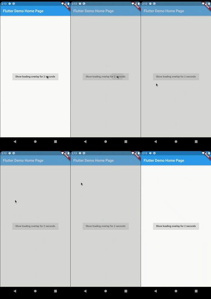
Simple Overlay

Basic Usage on Navigation

To use this package with named routes you can just wrap your MaterialApp with GlobalLoaderOverlay. This widget has all the features of LoaderOverlay but it is provided for all the routes of the app.

@override
Widget build(BuildContext context) {
  return GlobalLoaderOverlay(
    child: MaterialApp(
      debugShowCheckedModeBanner: false,
      title: 'Flutter Demo',
      theme: ThemeData(primarySwatch: Colors.teal, fontFamily: 'Baloo'),
      initialRoute: '/',
      routes: {
        '/': (context) => Page1(),
        '/page2': (context) => Page2(),
      },
    ),
  );
}

Customization

Your overlay loader widget can be any widget you want. For example you can import the package flutter_spinkit and customise your widget like this. To do that just pass your widget to overlayWidget and set useDefaultLoading to false.

class MyApp extends StatelessWidget {
  @override
  Widget build(BuildContext context) {
    return MaterialApp(
      title: 'Flutter Demo',
      theme: ThemeData(
        primarySwatch: Colors.blue,
      ),
      home: LoaderOverlay(
        useDefaultLoading: false,
        overlayWidgetBuilder: (_) { //ignored progress for the moment
          return Center(
            child: SpinKitCubeGrid(
              color: Colors.red,
              size: 50.0,
            ),
          );
        },
        child: MyHomePage(title: 'Flutter Demo Home Page'),
      ),
    );
  }
}

Simple Custom Overlay

Another customisation you can do is configure the color and opacity of the overlay. The default opacity is grey with 0.4 opacity, but you can change it with the overlayColor: Colors.yellow.withValues(alpha: 0.8).

class MyApp extends StatelessWidget {
  @override
  Widget build(BuildContext context) {
    return MaterialApp(
      title: 'Flutter Demo',
      theme: ThemeData(
        primarySwatch: Colors.blue,
      ),
      home: LoaderOverlay(
        useDefaultLoading: false,
        overlayWidgetBuilder: (_) { //ignored progress for the moment
          return Center(
            child: SpinKitCubeGrid(
              color: Colors.red,
              size: 50.0,
            ),
          );
        },
        overlayColor: Colors.yellow.withValues(alpha: 0.8),
        child: MyHomePage(title: 'Flutter Demo Home Page'),
      ),
    );
  }
}

This is a much opaque yellow overlay:

Simple More Custom Overlay

You may want to have several different loaders in your app. In this case just pass any widget to the loaderOverlay.show:

class ReconnectingOverlay extends StatelessWidget {
  String? progress;

  ReconnectingOverlay(this.progress);

  @override
  Widget build(BuildContext context) =>
      Center(
        child: Column(
          mainAxisSize: MainAxisSize.min,
          mainAxisAlignment: MainAxisAlignment.center,
          children: [
            CircularProgressIndicator(),
            SizedBox(height: 12),
            Text(
              'Reconnecting...',
            ),
            SizedBox(height: 12),
            Text(
              progress ?? '',
            ),
          ],
        ),
      );
}
context.loaderOverlay.show(
  widgetBuilder: (progress) {
    return ReconnectingOverlay(
      progress != null ? progress as String : null,
    );
  },
);

If you pass widget to context.loaderOverlay.show, then defaultLoader and widgetOverlay will be ignored;

Simple More Custom Overlay

Progress

If you want to show some progress while the loader overlay is visible, you can do it with the context.loaderOverlay.show(progress: 'Doing progress #0',) for an initial progress, and with context.loaderOverlay.progress('Doing progress #1'); every time the progress need to change. Both this methods pass the progress to the current widgetBuilder on every call.

Setting up the builder to use the progress

class MyApp extends StatelessWidget {
  @override
  Widget build(BuildContext context) {
    return MaterialApp(
      title: 'Flutter Demo',
      theme: ThemeData(
        primarySwatch: Colors.blue,
      ),
      home: LoaderOverlay(
        useDefaultLoading: false,
        overlayWidgetBuilder: (dynamic? progress) {
          return Column(
            mainAxisAlignment: MainAxisAlignment.center,
            children: [
              SpinKitCubeGrid(
                color: Colors.red,
                size: 50.0,
              ),
              SizedBox(
                height: 50,
              ),
              if (progress != null) Text(progress)
            ],
          );
        },
        child: MyHomePage(title: 'Flutter Demo Home Page'),
      ),
    );
  }
}

Once the builder is configured, you can call it and update the progress by calling:

context.loaderOverlay.show(
  progress: 'Doing progress #0',
);

await Future.delayed(Duration(seconds: 1));
context.loaderOverlay.progress('Doing progress #1');
await Future.delayed(Duration(seconds: 1));
context.loaderOverlay.progress('Doing progress #2');
await Future.delayed(Duration(seconds: 1));
context.loaderOverlay.progress('Doing progress #3');
await Future.delayed(Duration(seconds: 1));

if (_isLoaderVisible) {
  context.loaderOverlay.hide();
}

This will have as result:

Progress Overlay

You can also remove by complete the overlayColor (set to transparent), set the useDefaultLoading to false, and use a fully personalized overlayWidgetBuilder to make your own 100% customizable overlay.

    LoaderOverlay(
      overlayColor: Colors.transparent,
      useDefaultLoading: false,
      overlayWidgetBuilder: (progress) {
        return BackdropFilter(
          filter: ImageFilter.blur(
            sigmaX: 4.5,
            sigmaY: 4.5,
          ),
          child: Center(
            child: Container(
              width: 100,
              height: 100,
              color: Colors.purple,
              child: Column(
                mainAxisAlignment: MainAxisAlignment.center,
                children: [
                  CircularProgressIndicator(),
                  Text(
                    'Doing stuff... bip...bup',
                    textAlign: TextAlign.center,
                  )
                ],
              ),
            ),
          ),
        );
      },
    )

Complete Custom Overlay

Breaking changes

1 - Since version 3.0.0 the overlay widget's got changed by a builder to manage the progress.

Before:

      LoaderOverlay(
        //...
        useDefaultLoading: false,
        overlayWidget: Center(
          child: SpinKitCubeGrid(
            color: Colors.red,
            size: 50.0,
          ),
        ),
        //...      
      )

After:

      LoaderOverlay(
        //...
        useDefaultLoading: false,
        overlayWidgetBuilder: (_) {
          return Center(
            child: SpinKitCubeGrid(
              color: Colors.red,
              size: 50.0,
            ),
          );
        },
        //...
      )

2 - overlayOpacity was removed. Now use the opacity direct in the overlayColor

Before:

      LoaderOverlay(
        //...
        overlayColor: Colors.black,
        overlayOpacity: 0.8,
        //...
      )

After:

      LoaderOverlay(
        //...
        overlayColor: Colors.black.withValues(alpha: 0.8),
        //...
      )

Animation

By default, the overlay does not animate in or out. You can enable animations by passing the appropriate parameters to LoaderOverlay. Internally, an AnimatedSwitcher is used to manage animations, so the parameters are passed directly to the AnimatedSwitcher. By specifying a duration and reverseDuration, the overlay will animate in and out using a fade (the default transition used by AnimatedSwitcher). You can also pass curves, a transition builder and a layout builder for further customisation.

class MyApp extends StatelessWidget {
  @override
  Widget build(BuildContext context) {
    return MaterialApp(
      title: 'Flutter Demo',
      theme: ThemeData(
        primarySwatch: Colors.blue,
      ),
      home: LoaderOverlay(
        duration: const Duration(milliseconds: 250),
        reverseDuration: const Duration(milliseconds: 250),
        // switchInCurve,
        // switchOutCurve,
        // transitionBuilder,
        // layoutBuilder,
        child: MyHomePage(title: 'Flutter Demo Home Page'),
      ),
    );
  }
}

Todo

  • [ ] Tests

Suggestions & Bugs

For any suggestions or bug report please head to issue tracker.

Kategorien

Abhängigkeiten

Abhängigkeiten 1 Einträge

Quell-Repository

Projekte, die dieses Paket verwenden