Pakete, Repositories und App-Kategorien suchen

Cover von material_dialogs
Paketdetailsv1.1.5

material_dialogs

Ein Flutter-Paket soll Ihnen helfen, animierte, einfache und stilvolle Material-Dialogfelder in Ihrer App zu erstellen.

AndroidiOSWebmacOSWindowsLinux
30-Tage-Downloads
4080
Likes
360
Pub-Punkte
155

Paket installieren

flutter pub add material_dialogs

Paketübersicht

Aus öffentlichen Paketdaten erstellte Orientierung.

Material Dialogs ist ein Flutter-Paket, das die Erstellung animierter, stilvoller und anpassbarer Material-Design-Dialo­ge vereinfacht. Es bietet eine benutzerfreundliche API zum Erstellen moderner Dialogoberflächen, die auf allen Plattformen den Material-Richtlinien entsprechen. Das Paket unterstützt verschiedene Dialogtypen wie Warnungen, Bestätigungen und benutzerdefinierte Dialoge mit fließenden Animationen und reaktionsfähigen Layouts. Ideal zur Verbesserung der Benutzerinteraktion durch ansprechende Pop-ups in Apps für Android, iOS, Web, macOS, Windows und Linux.

Anwendungsfälle

  • Warnungen und Bestätigungen anzeigen
  • Benutzerdefinierte Modaldialogfelder erstellen
  • Benutzerfeedback durch Animationen verbessern
  • Implementierung von Onboarding- oder Tutorial-Erinnerungen
  • Interaktive Bottom Sheets hinzufügen
  • Verbesserung der UI-Konsistenz mit Material Design

Hauptmerkmale

  • Animierte Übergänge
  • Anpassbare Themen
  • Plattformübergreifende Unterstützung
  • Einfache API
  • Eingebaute Dialogtypen
  • Reaktionsfähiges Design

Geeignet für

  • Entwickler, die eine schnelle Dialogimplementierung suchen
  • Apps mit konsistenter Material-Design-Optik
  • Projekte für mehrere Plattformen
  • Benutzeroberflächenorientierte Anwendungen
  • Teams, die auf Entwicklererfahrung achten
  • Prototyping und schnelle Entwicklung

Hinweise

  • Beschränkt auf Material Design Ästhetik
  • Kann zusätzliche Stilisierung für nicht-Material-Themen erfordern
  • Abhängig von der Material-Bibliothek von Flutter
  • Nicht geeignet für komplexe benutzerdefinierte Modals
  • Am besten mit dem Standard-Themensystem von Flutter verwendet
  • Kenntnis der Widget-Baumstruktur von Flutter erforderlich

Original-README

Originaler README-Schnappschuss aus dem verknüpften Quell-Repository. Aktuelle Inhalte finden Sie im Repository.

Flutter Material Dialogs

pub

Flutter Material Dialogs 📱

A Flutter library aims to help you create 💪🏻animated, 😃 simple, 😎 stylish Material Dialogs in your app.

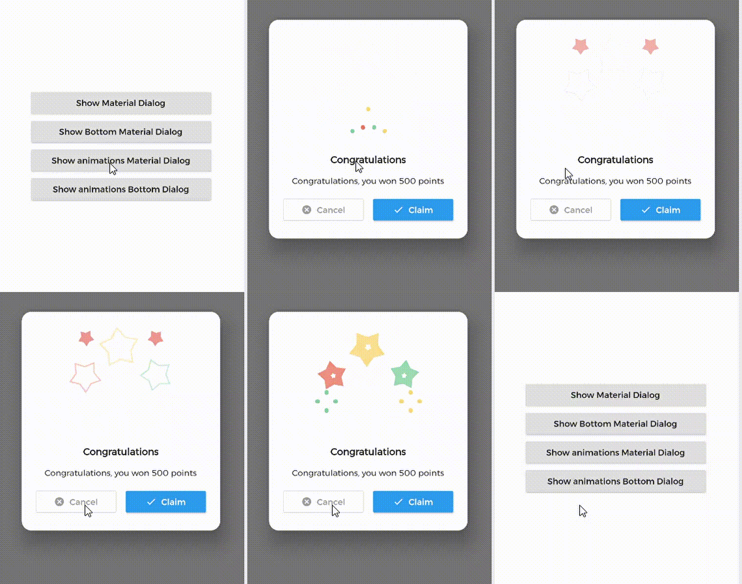
1. Material Dialog 2. Animations Material Dialog 3. Bottom Material Dialog 4. Animations Bottom Dialog

Table of Contents:

Introduction

MaterialDialog This Plugin will be useful to create simple, animated, and beautiful dialogs in your next Flutter app. This library implements Airbnb's Lottie library to render After Effects animation in app.

Types of Dialog

MaterialDialog library provides two types of dialog i.e.

1. Material Dialog 2. Bottom Sheet Material Dialog
A normal material dialog which can have one or two buttons. A Bottom Sheet material dialog which can have one or two buttons, is showed from bottom of device.

Implementation

Implementation of Material Dialog library is so easy. You can check /example directory for demo. Let's have look talk in details about it.

install
i. pubspec

In pubspec.yaml

dependencies:
  material_dialogs: _latest_version

Now in your Dart code, you can use:

import 'package:material_dialogs/material_dialogs.dart';

Details see pub.dev.

Create Dialog

As there are two types of dialogs in library. Material Dialogs are instantiated as follows.

i. Material Dialog

Dialogs class will be used to create your dialog, below is an example to show your dialog in the app.

Dialogs.materialDialog(
          msg: 'Are you sure ? you can\'t undo this',
          title: "Delete",
          color: Colors.white,
          context: context,
          actions: [
            IconsOutlineButton(
              onPressed: () {},
              text: 'Cancel',
              iconData: Icons.cancel_outlined,
              textStyle: TextStyle(color: Colors.grey),
              iconColor: Colors.grey,
            ),
            IconsButton(
              onPressed: () {},
              text: 'Delete',
              iconData: Icons.delete,
              color: Colors.red,
              textStyle: TextStyle(color: Colors.white),
              iconColor: Colors.white,
            ),
          ])

IconsOutlineButton and IconsButton are both buttons widgets provided by the plugin to make things easier for you read more, you can use any other buttons if you want.

ii. Bottom Sheet Material Dialog

Dialogs class will be used to create your dialog, use bottomMaterialDialog. Below is an example to show your dialog in the app.

Dialogs.bottomMaterialDialog(
          msg: 'Are you sure? you can\'t undo this action',
          title: 'Delete',
          context: context,
          actions: [
            IconsOutlineButton(
              onPressed: () {},
              text: 'Cancel',
              iconData: Icons.cancel_outlined,
              textStyle: TextStyle(color: Colors.grey),
              iconColor: Colors.grey,
            ),
            IconsButton(
              onPressed: () {},
              text: 'Delete',
              iconData: Icons.delete,
              color: Colors.red,
              textStyle: TextStyle(color: Colors.white),
              iconColor: Colors.white,
            ),
          ]),

Show Animations

Animations in this library are implemented using Lottie animation library. You can get free animations files here.

*.json file downloaded from LottieFiles should be placed in flutter project.

For example, here cong_example.json animation file is used in the assets folder to show congratulations animation in the example app.

In code, set lottieBuilder arg in Widget to set Animation to the dialog.

Dialogs.materialDialog(
          color: Colors.white,
          msg: 'Congratulations, you won 500 points',
          title: 'Congratulations',
          lottieBuilder: Lottie.asset(
          'assets/cong_example.json',
          fit: BoxFit.contain,
          ),
          context: context,
          actions: [
            IconsButton(
              onPressed: () {},
              text: 'Claim',
              iconData: Icons.done,
              color: Colors.blue,
              textStyle: TextStyle(color: Colors.white),
              iconColor: Colors.white,
            ),
          ]),

Icons buttons

The plugin provide you some out of the box customized buttons to help you creating your dialog.

IconsOutlineButton

This widget helps you create an outline button easily

    IconsOutlineButton(
      onPressed: () {},
      text: 'Cancel',
      iconData: Icons.cancel_outlined,
      textStyle: TextStyle(color: Colors.grey),
      iconColor: Colors.grey,
    ),
IconsButton

This widget helps you create a material button with icons in few lines of code

    IconsButton(
      onPressed: () {},
      text: 'Delete',
      iconData: Icons.delete,
      color: Colors.red,
      textStyle: TextStyle(color: Colors.white),
      iconColor: Colors.white,
    ),
CustomView

You can add your own Widget inside the dialog by using the customView attribute and CustomViewPosition to place it wherever you want.

Possible values
BEFORE_ANIMATION
BEFORE_TITLE (Default)
BEFORE_MESSAGE
BEFORE_ACTION
AFTER_ACTION
Dialogs.materialDialog(
          color: Colors.white,
          msg: 'Congratulations, you won 500 points',
          title: 'Congratulations',
          lottieBuilder: Lottie.asset(
          'assets/cong_example.json',
          fit: BoxFit.contain,
          ),
          customView: MySuperWidget(),
          customViewPosition: CustomViewPosition.BEFORE_ACTION,
          context: context,
          actions: [
            IconsButton(
              onPressed: () {},
              text: 'Claim',
              iconData: Icons.done,
              color: Colors.blue,
              textStyle: TextStyle(color: Colors.white),
              iconColor: Colors.white,
            ),
          ]),

Limitations

it's better to make your animation to have the same background color as your dialog's background color, please use lottie editor to remove the background layer of your animation or make it same as your dialog background color before using it in the plugin.

Contribute

Let's develop with collaborations. We would love to have contributions by raising issues and opening PRs. Filing an issue before PR is must.

Credits

This library is built using following open-source libraries.

License

Project is published under the Apache 2.0 license. Feel free to clone and modify repo as you want, but don't forget to add reference to authors :)

Kategorien

Abhängigkeiten

Abhängigkeiten 1 Einträge

Quell-Repository

Projekte, die dieses Paket verwenden

Noch keine Daten verfügbar.