Pakete, Repositories und App-Kategorien suchen

Cover von menu_button
Paketdetailsv1.4.2+1

menu_button

Eine Menüschaltfläche, die es ermöglicht, einfach ein Element in einer Dropdown-Liste auszuwählen und leicht anzupassen

30-Tage-Downloads
72
Likes
134
Pub-Punkte
70

Paket installieren

flutter pub add menu_button

Paketübersicht

Aus öffentlichen Paketdaten erstellte Orientierung.

Das menu_button-Paket bietet ein anpassbares Dropdown-Menü-Button-Widget für Flutter, das Benutzern die einfache Auswahl eines Elements aus einer Liste ermöglicht. Es bietet eine saubere und intuitive Oberfläche zur Darstellung von Optionen in kompakter Form, ideal für Formulare oder Einstellungen mit begrenztem Platzbedarf. Das Widget unterstützt die Anpassung von Aussehen, Verhalten und Animation, wodurch es sich an verschiedene Gestaltungsanforderungen anpassen lässt. Es integriert sich nahtlos in bestehende Flutter-Anwendungen und verbessert die Benutzerinteraktion ohne aufwändige Implementierung.

Anwendungsfälle

  • Formularingaben mit Dropdown-Auswahlen
  • Einstellungs-Panels mit Optionsauswahl
  • Anpassbare Navigationsmenüs
  • mobilefreundliche Dropdown-Schnittstellen
  • Einfache Daten-Eingabeprozesse

Hauptmerkmale

  • Hochgradig anpassbare Erscheinung
  • Glatte Übergangsanimationen
  • Einfache Integration mit Flutter-Oberfläche
  • Unterstützt benutzerdefinierte Item-Baukästen
  • Barrierefreies und reaktives Design

Geeignet für

  • Entwickler, die interaktive Formulare erstellen
  • Designer, die flexible Dropdown-Komponenten suchen
  • Apps, die leichte Menülösungen benötigen
  • Projekte, die Benutzererfahrung priorisieren
  • Teams, die Flutter für plattformübergreifende Apps verwenden

Hinweise

  • Eingeschränkte plattformspezifische Stiloptionen
  • Keine integrierte Validierungssupport
  • Benötigt manuelle Behandlung von Auswahlrückrufen
  • Nicht für sehr lange Listen optimiert
  • Abhängig von externen Abhängigkeiten für erweiterte Funktionen

Original-README

Originaler README-Schnappschuss aus dem verknüpften Quell-Repository. Aktuelle Inhalte finden Sie im Repository.

menu_button

Pub Package License

Flutter widget to display a popup menu button very simply and easily customizable.

Resources

Installations

Add menu_button: ^1.4.2+1 in your pubspec.yaml dependencies. And import it:

import 'package:menu_button/menu_button.dart';

Usage

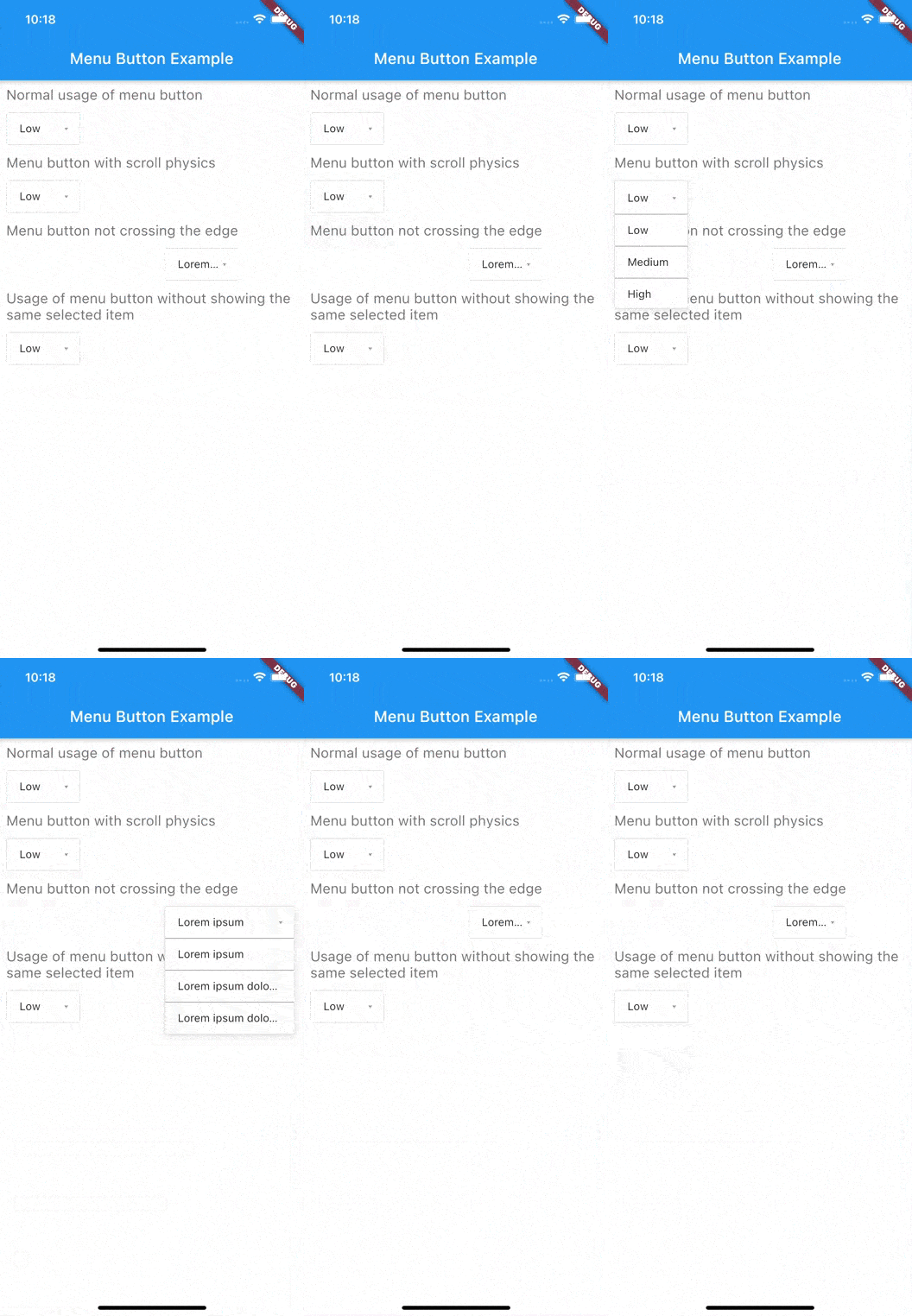
The widget has a lot of properties to customize it, we will see here the ones needed to get a "basic" menu button.

Firstly we have to declare a variable to keep the selected item (selectedKey) and a list that contains all the items we want to display in this menu button.

Here we will make a list of strings that we will call keys and that contains the values Low, Medium & High.

String selectedKey;

List<String> keys = <String>[
  'Low',
  'Medium',
  'High',
];

Now that we have these two elements we can start using the MenuButton<T> widget.

MenuButton<String>(
  child: normalChildButton,
  items: keys,
  itemBuilder: (String value) => Container(
   height: 40,
   alignment: Alignment.centerLeft,
   padding: const EdgeInsets.symmetric(vertical: 0.0, horizontal: 16),
   child: Text(value),
  ),
  toggledChild: Container(
    child: normalChildButton,
  ),
  onItemSelected: (String value) {
    setState(() {
      selectedKey = value;
    });
  },
  onMenuButtonToggle: (bool isToggle) {
    print(isToggle);
  },
)

And finally here is an example of the child widget used for the MenuButton above:

final Widget normalChildButton = SizedBox(
  width: 93,
  height: 40,
  child: Padding(
    padding: const EdgeInsets.only(left: 16, right: 11),
    child: Row(
      mainAxisAlignment: MainAxisAlignment.spaceBetween,
      children: <Widget>[
        Flexible(
          child: Text(selectedKey, overflow: TextOverflow.ellipsis)
        ),
        const SizedBox(
          width: 12,
          height: 17,
          child: FittedBox(
            fit: BoxFit.fill,
            child: Icon(
              Icons.arrow_drop_down,
              color: Colors.grey,
            ),
          ),
        ),
      ],
    ),
  ),
);

Of course you can make your own according to your needs.

Basic Parameters

Parameter Description
child A widget to display the default button to trigger the menu button
items The list that contains all values that you want to display on the menu button
itemBuilder A widget to design each item of the menu button
onItemSelected Function triggered when an item is selected
onMenuButtonToggle Function triggered when menu button is triggered (true if displayed, false if not)
toggledChild Same as child but when the menu button is opened

More Parameters

Parameter Description
crossTheEdge By default false you can set it to true if you want the button to expand
divider A custom divider between each items
decoration A custom decoration for menu button
edgeMargin By default 0 add a custom value to prevent the button to not touch the edge, check the example edge_menu_button.dart for more information
itemBackgroundColor By default Colors.white add custom Colors to customize the background of every items
label Add a widget to display a custom label as MaterialDesign on top of the button, check label_menu_button.dart for more information
labelDecoration If you use a label you can set a custom LabelDecoration
menuButtonBackgroundColor By default Colors.white add custom Colors to customize the background of the menu button
popupHeight By default popupHeight is automatically calculated but if you need a custom height use this property
scrollPhysics By default items are not scrollable (NeverScrollableScrollPhysics), add a ScrollPhysics to enable it, for instance AlwaysScrollableScrollPhysics
showSelectedItemOnList By default true, set it to false if you don't want the selected items in the list

For a more detail example please take a look at the example folder.

Example

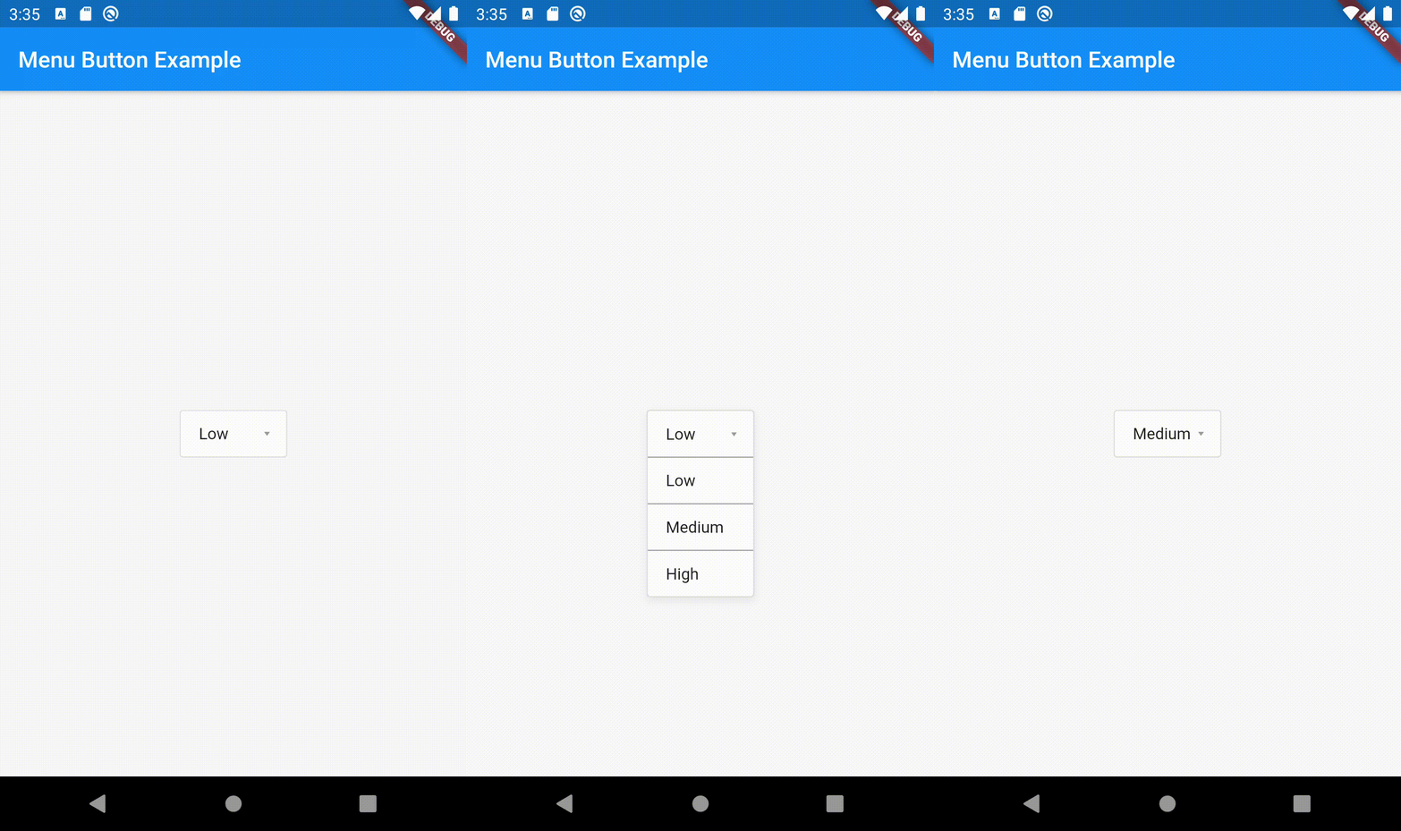
Menu button with 3 items:


If something is missing, feel free to open a ticket or contribute!

Kategorien

Quell-Repository

Projekte, die dieses Paket verwenden