Pakete, Repositories und App-Kategorien suchen

Cover von modals
Paketdetailsv1.0.0+1

modals

Modals, ein Flutter-Paket zur Vereinfachung all Ihrer Overlay-Anforderungen!

AndroidiOSWebmacOSWindowsLinux
30-Tage-Downloads
337
Likes
49
Pub-Punkte
140

Paket installieren

flutter pub add modals

Paketübersicht

Aus öffentlichen Paketdaten erstellte Orientierung.

Modals ist ein Flutter-Paket, das die Erstellung und Verwaltung von Überlagerungen wie Dialogen, Bottom Sheets und benutzerdefinierten Popups vereinfacht. Es bietet eine saubere, konsistente API zum Anzeigen und Verwalten von Modals auf allen Plattformen, reduziert Boilerplate-Code und verbessert die Entwicklererfahrung. Mit integrierter Unterstützung für Animationen, Schließbarkeit und responsive Layouts vereinfacht es häufige Überlagerungsmuster in Flutter-Apps. Das Paket ist ideal für Entwickler, die eine leichte, zuverlässige Lösung zur Verwaltung von UI-Überlagerungen ohne komplizierte Einrichtung suchen.

Anwendungsfälle

  • Dialoge und Warnungen anzeigen
  • Benutzerdefinierte Overlay-Bildschirme erstellen
  • Verwaltung von Bottom-Sheet-Interaktionen
  • Geführte Benutzerflüsse umsetzen
  • Modale Navigation verwalten
  • Popup-Logik vereinfachen

Hauptmerkmale

  • Einheitliche Modala-API
  • Plattformübergreifende Kompatibilität
  • eingebaute Animationen
  • Einfache Handhabung der Aufhebung
  • Unterstützung für responsive Design
  • Minimales Boilerplate

Geeignet für

  • Flutter-Anfänger
  • UI-intensive Anwendungen
  • Apps mit häufigen Überlagerungen
  • Entwickler, die Konsistenz suchen
  • Teams, die Wartbarkeit priorisieren
  • Projekte, die eine schnelle Prototypenerstellung erfordern

Hinweise

  • Beschränkt auf overlay-spezifische Funktionen
  • Kein eingebauter Zustandsmanagement
  • Erfordert manuelle Integration mit bestehenden Zustandslösungen
  • Nicht geeignet für komplexe Navigationsstapel
  • Abhängig von Flutter's Rendering-Pipeline
  • Kann zusätzliche Stilisierung für fortgeschrittene Designs benötigen

Original-README

Originaler README-Schnappschuss aus dem verknüpften Quell-Repository. Aktuelle Inhalte finden Sie im Repository.

Modals

Modals

Flutter overlays simplified!

Pub

Motivation

Working with Flutter overlays is quite cumbersome. Adding a simple context menu next to your button should not be hard.

Say hello 👋  to Modals, a package to simplify all your overlay needs!

Features

  • Show modals easily
    • Position modals using absolute position
    • Position modals using alignment
    • Position modals based on another widget position
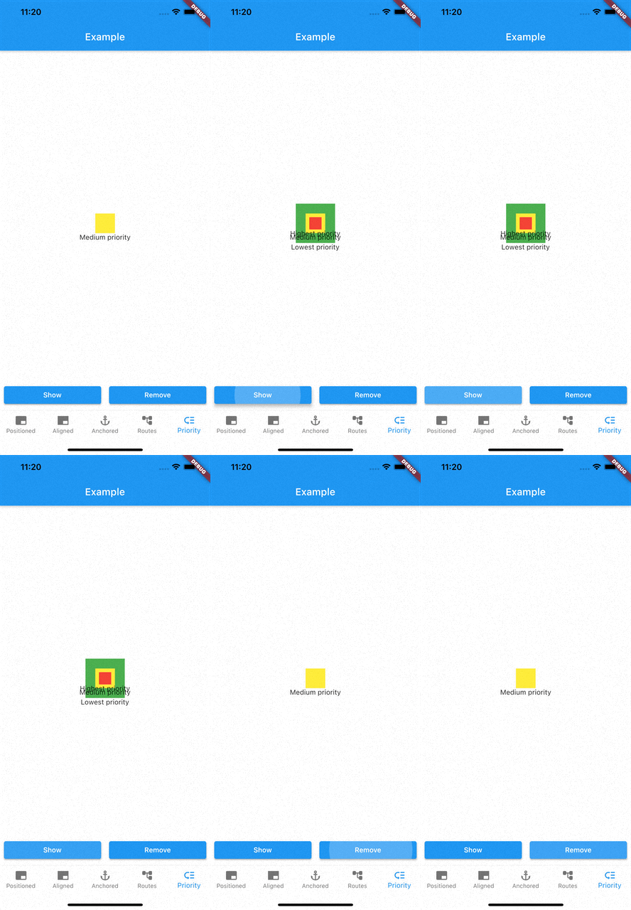
  • Prioritise modal visibility
  • Remove modals easily
    • Remove modal by id
    • Remove all modals at once
    • Remove modal by tapping modal barrier
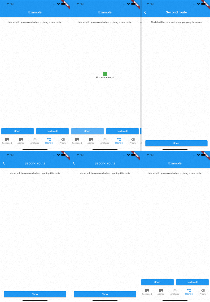
    • Remove modals on route changes

How to use

Showing modals

showModal is used to show modals. Function accepts a ModalEntry as parameter. ModalEntry has 3 options ModalEntry.positioned, ModalEntry.aligned and ModalEntry.anchored

Positioned
class PositionedModalExample extends StatelessWidget {
  const PositionedModalExample({Key? key}) : super(key: key);

  @override
  Widget build(BuildContext context) {
    return Center(
      child: ElevatedButton(
        onPressed: () {
          showModal(ModalEntry.positioned(context,
              tag: 'containerModal',
              left: 200,
              top: 200,
              child: Container(
                color: Colors.red,
                width: 50,
                height: 50,
              )));
        },
        child: const Text('Show Modal'),
      ),
    );
  }
}

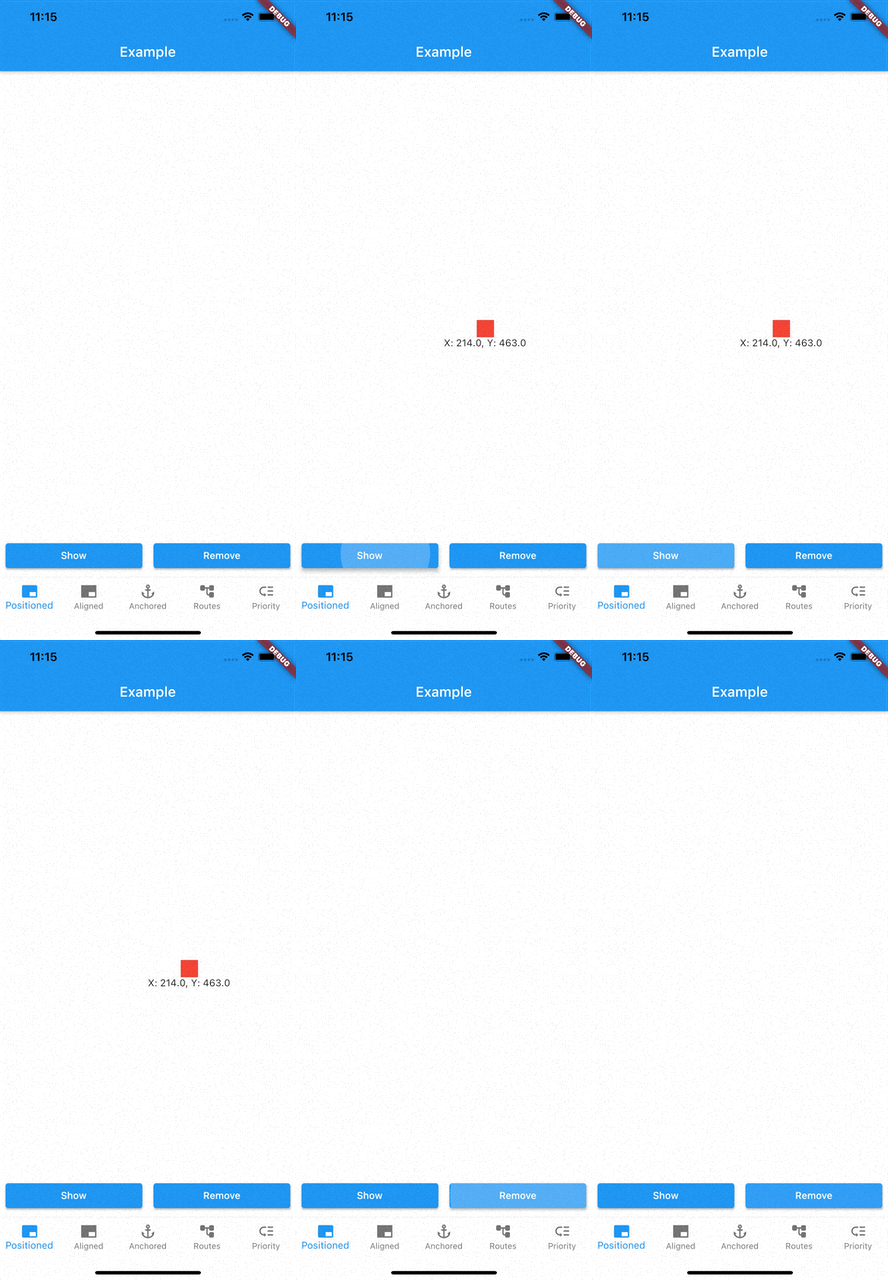
Above example positions your widget to absolute position of left: 200 and top 200.

Aligned
class AlignmentModalExample extends StatelessWidget {
  const AlignmentModalExample({Key? key}) : super(key: key);

  @override
  Widget build(BuildContext context) {
    return Center(
      child: ElevatedButton(
        onPressed: () {
          showModal(ModalEntry.aligned(context,
              tag: 'containerModal',
              alignment: Alignment.center,
              child: Container(
                color: Colors.red,
                width: 50,
                height: 50,
              )));
        },
        child: const Text('Show Modal'),
      ),
    );
  }
}

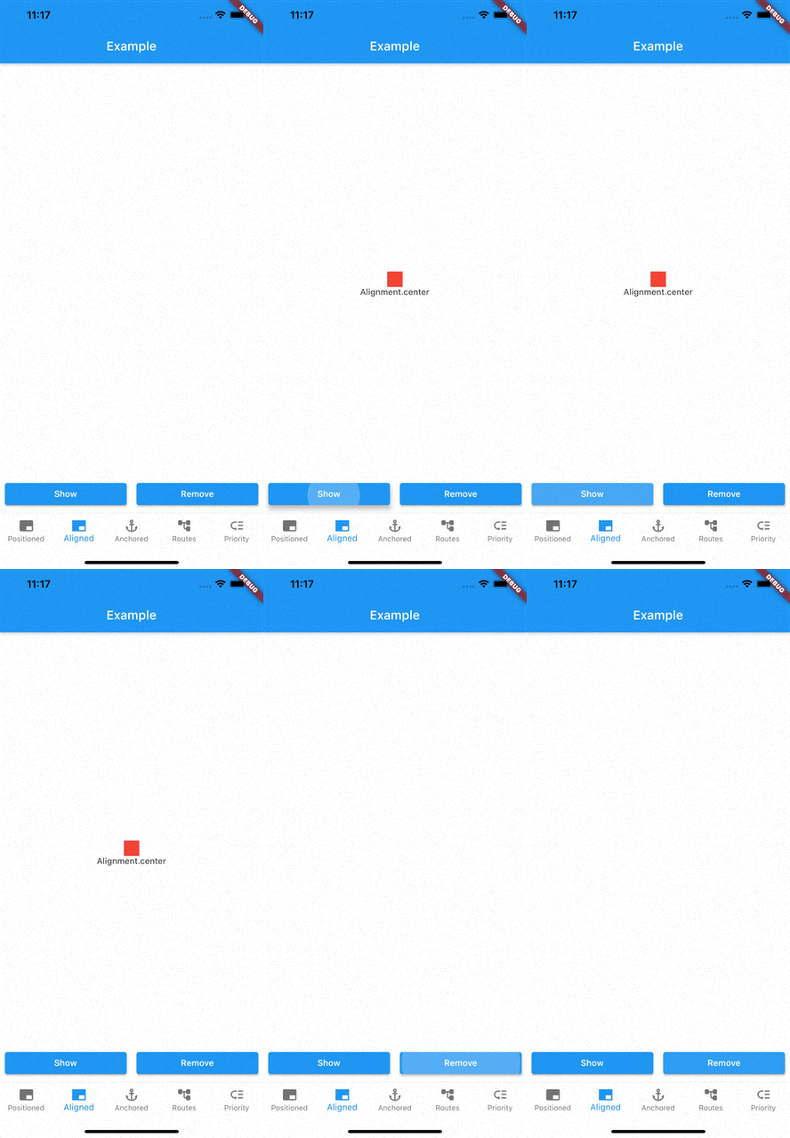
Above example aligns your widget to center of the screen.

Anchored

class AnchoredModalExample extends StatelessWidget {
  const AnchoredModalExample({Key? key}) : super(key: key);

  @override
  Widget build(BuildContext context) {
    return Center(
      child: Column(
        children: [
          const ModalAnchor(
              tag: 'anchor',
              child: Card(
                color: Colors.grey,
                child: Padding(
                  padding: EdgeInsets.all(8.0),
                  child: Icon(Icons.anchor),
                ),
              )),
          Column(
            mainAxisSize: MainAxisSize.min,
            children: [
              ElevatedButton(
                onPressed: () {
                  showModal(ModalEntry.anchored(context,
                      tag: 'anchoredModal',
                      anchorTag: 'anchor',
                      modalAlignment: Alignment.centerLeft,
                      anchorAlignment: Alignment.centerRight,
                      child: Container(
                        color: Colors.red,
                        width: 50,
                        height: 50,
                      )));
                },
                child: const Text('Show Modal'),
              ),
            ],
          ),
        ],
      ),
    );
  }
}

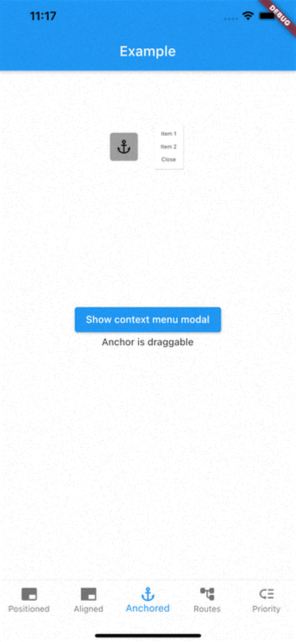
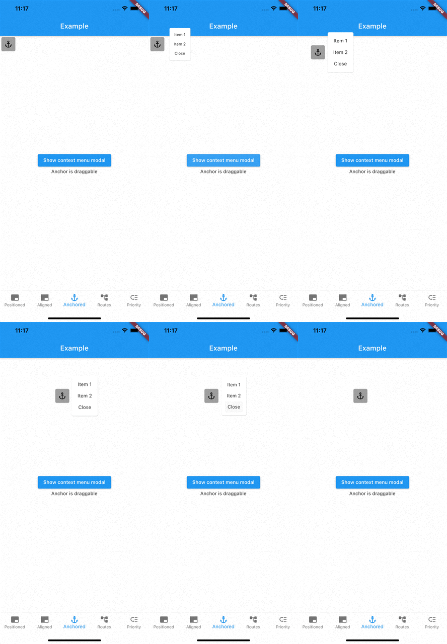
Above example positions widget at next to ModalAnchor widget.

To make widget act as an anchor, wrap widget with ModalAnchor widget.

Prioritising modals

To prioritise modals, use aboveTag and belowTag parameters.

  • aboveTag

    • Modal will be positioned just above given aboveTag
  • belowTag

    • Modal will be positioned just above given belowTag
Removing modals

You have 4 options to remove modals

removeModal(String id) removes modal by the given id

removeAllModals() removes all modals

Below parameters are configured in ModalEntry.

  • Tapping modal barrier

    • barrierDismissible when true (defaults to false) removes modal when tapping the barrier
    • barrierColor change barrier color (defaults to Colors.transparent)
  • Observing route changes

    • removeOnPop
      • The modal is removed when route is popped where the modal exists
    • removeOnPushNext
      • The modal is removed when new route is pushed on top of the route where the modal exists

To enable observing route changes, add navigator observer to root widget.

class MyApp extends StatelessWidget {
  const MyApp({Key? key}) : super(key: key);

  @override
  Widget build(BuildContext context) {
    return MaterialApp(
      title: 'AppModals',
      navigatorObservers: [modalsRouteObserver], // <- This line here. Imported from modals
      theme: ThemeData(
        primarySwatch: Colors.blue,
      ),
      home: const _Home(),
    );
  }
}

Gallery

See the Examples for more information

Kategorien

Quell-Repository

Projekte, die dieses Paket verwenden

Noch keine Daten verfügbar.