Pakete, Repositories und App-Kategorien suchen

Cover von modular_ui
Paketdetailsv0.0.5

modular_ui

Vorab erstellte schöne Flutter-Widgets, inspiriert von Material-Tailwind und Shadcn/UI

AndroidiOSWebmacOSWindowsLinux
30-Tage-Downloads
31
Likes
118
Pub-Punkte
150

Paket installieren

flutter pub add modular_ui

Paketübersicht

Aus öffentlichen Paketdaten erstellte Orientierung.

Modular UI ist ein Flutter-Paket, das vorab erstellte, ästhetisch ansprechende Widgets bietet, die von Material Tailwind und shadcn/ui inspiriert sind. Für schnelle Entwicklung konzipiert, liefert es ein konsistentes, modernes Design-System mit anpassbaren Komponenten, die den aktuellen UI-Trends entsprechen. Das Paket unterstützt mehrere Plattformen wie Android, iOS, Web, macOS, Windows und Linux und ist daher ideal für plattformübergreifende Anwendungen. Mit sauberem, semantischem Code und intuitiven APIs hilft Modular UI Entwicklern, professionelle Oberflächen zu erstellen, ohne von Grund auf neu beginnen zu müssen.

Anwendungsfälle

  • Schnellprototypen
  • Plattformübergreifende App-Entwicklung
  • Modernes UI-Design
  • Komponentenbasierte Benutzeroberflächen-Erstellung
  • Implementierung des Design-Systems

Hauptmerkmale

  • Vorab erstellte schöne Widgets
  • Inspriert durch Material Tailwind & shadcn/ui
  • Plattformübergreifende Unterstützung
  • Anpassbare Komponenten
  • Semantische und saubere API

Geeignet für

  • Frontend-Entwickler
  • UI/UX-Designer
  • Startups, die MVPs bauen
  • Teams, die Designsysteme verwenden
  • Entwickler, die schnelle UI-Lieferung suchen

Hinweise

  • Erfahrung mit der Flutter-Widget-Struktur erforderlich
  • Begrenzte Anpassungsmöglichkeiten jenseits der bereitgestellten Themen
  • Abhängig von externer Designinspiration
  • Möglicherweise sind zusätzliche Stile für ein einzigartiges Branding erforderlich
  • Am besten geeignet für moderne, minimalistische Designs

Original-README

Originaler README-Schnappschuss aus dem verknüpften Quell-Repository. Aktuelle Inhalte finden Sie im Repository.

ModularUI : Pre-built beautiful flutter widgets Inspired by material-tailwind and shadcn/ui

Modular UI Badge Github Badge Twitter Badge Discord Badge

Craft beautiful, accessible, and responsive Flutter UIs with a Modular-UI Design-inspired component library


How to use

Installation

Run this command in your terminal

flutter pub add modular_ui
Import

Add this line to import the package.

import 'package:modular_ui/modular_ui.dart';

Modular UI Widgets:

Primary Cards

Image 2 Image 3 Image 5 Image 1 Image 4

Carousels

Gif 1 Gif 2 Gif 5
Gif 4 Gif 6 Gif 3

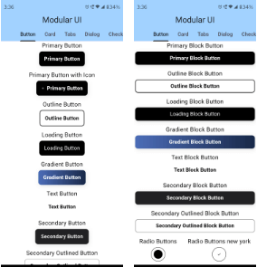
Buttons

Image 2 Image 3

Tab Bar

Image 2

Dialog Box

Image 2

Sliders

Image 2

Switch

Image 2

Our Widget Catalog

Cards
Buttons
Carousels
CheckBox
Dialogs
Footers
Input Fields
List Tiles
Rating Bars
Switch
Slider
Tabs

Code Samples

Buttons

Primary Button

 MUIPrimaryButton(
      text: "Primary Button",
      onPressed: () => onButtonPressed("Primary Button"),
    ),
Cards

Primary Card

  MUIPrimaryCard(
          title: 'UI/UX Review Check',
          description:
              'The place is close to Barceloneta Beach and bus stop just 2 min by walk and near to "Naviglio" where you can enjoy the main night life in Barcelona',
          image: Image.network(
            'https://images.unsplash.com/photo-1540553016722-983e48a2cd10?ixlib=rb-1.2.1&ixid=MnwxMjA3fDB8MHxwaG90by1wYWdlfHx8fGVufDB8fHx8&auto=format&fit=crop&w=800&q=80',
            fit: BoxFit.cover,
          ),
          buttons: [
            MUIPrimaryButton(
              text: 'Read More',
              onPressed: () {},
            ),
          ],
        ),
Carousal

Primary Carousal

  MUICarousel(
            images: [
              "https://github.com/shadcn.png",
              "https://github.com/shadcn.png",
              "https://github.com/shadcn.png",
              "https://github.com/shadcn.png",
              "https://github.com/shadcn.png"
            ],
            indicatorType: CarouselIndicatorType.dot,
            duration: Duration(seconds: 2),
          ),

For more code samples, you can head on to our documentaion at . https://modularui.site


Features

  • Comprehensive Modular-UI Design components: Build modern and feature-rich interfaces with a wide range of buttons, cards, forms, navigation elements, and more.
  • Highly customizable: Tailor components to your exact needs with extensive styling options.
  • Responsive design: Ensure optimal UI experiences across different screen sizes.
  • Accessibility focus: Built with accessibility in mind, adhering to best practices.
  • Lightweight and performant: Efficiently crafted for smooth user interactions.

Additional Features

  • Custom themes and color palettes: Define your own visual style for a cohesive look.
  • Dark mode support: Seamlessly adapt your UI to user preferences.

Contributing

Calling on all the trendsetting Flutter enthusiasts! ❤️‍🔥 Join forces as we pioneer the creation of the ultimate, expansive, and seamless UI Library for Flutter. Let's make waves together! 🚀 Please refer to our contribution guidelines for details and don't forget to drop a Hi at discord


Kategorien

Quell-Repository

Projekte, die dieses Paket verwenden

Noch keine Daten verfügbar.