Pakete, Repositories und App-Kategorien suchen

Cover von progress_state_button
Paketdetailsv1.0.4

progress_state_button

Ein anpassbarer Fortschritts-Button-Widget für Flutter Android, iOS und Web.

AndroidiOSWebmacOSWindowsLinux
30-Tage-Downloads
2420
Likes
373
Pub-Punkte
130

Paket installieren

flutter pub add progress_state_button

Paketübersicht

Aus öffentlichen Paketdaten erstellte Orientierung.

Ein anpassbarer Fortschritts-Button-Widget für Flutter, der Android, iOS, Web, macOS, Windows und Linux unterstützt. Er ermöglicht Entwicklern, Buttons mit dynamischen Zuständen wie Laden, Erfolg, Fehler und Leerlauf zu erstellen, wodurch die Benutzerfeedback während Aktionen wie Formularübermittlungen oder API-Aufrufen verbessert wird. Das Widget ist hochgradig konfigurierbar und erlaubt die Anpassung von Farben, Beschriftungen, Symbolen und Animationen. Es integriert sich nahtlos in bestehende Flutter-Anwendungen und bietet eine konsistente Erfahrung über alle Plattformen hinweg.

Anwendungsfälle

  • Formulariumschreibung mit Ladezustand
  • Fortschritt des Authentifizierungsflusses
  • Datei-Upload-Anzeiger
  • Zahlungsverarbeitungs-UI
  • Schritte des Onboarding-Wizards

Hauptmerkmale

  • Mehrere Zustandsunterstützung (ruhend, laden, erfolgreich, Fehler)
  • Anpassbare Erscheinung und Verhalten
  • Plattformübergreifende Kompatibilität
  • Animierte Übergänge zwischen Zuständen
  • Konfigurierbare Beschriftungen und Symbole
  • Einfache Integration mit bestehenden Widgets

Geeignet für

  • Entwickler, die interaktive Formulare erstellen
  • Teams, die UX-Konsistenz priorisieren
  • Anwendungen, die Echtzeit-Rückmeldung erfordern
  • Plattformübergreifende mobile und Web-Anwendungen
  • Projekte mit komplexen Benutzerworkflows

Hinweise

  • Kenntnisse im Flutter-State-Management erforderlich
  • Für komplexe Designs sind möglicherweise zusätzliche Stile erforderlich
  • Beschränkt auf button-spezifische Anwendungsfälle
  • Nicht geeignet für nicht-interaktive Elemente
  • Abhängig von plattformspezifischen Rendering-Verhalten
Original-README

Originaler README-Schnappschuss aus dem verknüpften Quell-Repository. Aktuelle Inhalte finden Sie im Repository.

Progress State Button

A customizable progress button for Flutter

Test with DartPad

Installation

https://pub.dev/packages/progress_state_button

progress_state_button: "^1.0.4"

Usage

Icon

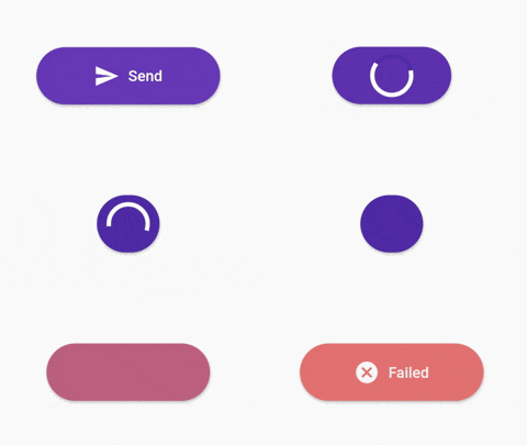
ProgressButton.icon(iconedButtons: {
      ButtonState.idle:
        IconedButton(
            text: "Send",
            icon: Icon(Icons.send,color: Colors.white),
            color: Colors.deepPurple.shade500),
      ButtonState.loading:
        IconedButton(
            text: "Loading",
            color: Colors.deepPurple.shade700),
      ButtonState.fail:
        IconedButton(
            text: "Failed",
            icon: Icon(Icons.cancel,color: Colors.white),
            color: Colors.red.shade300),
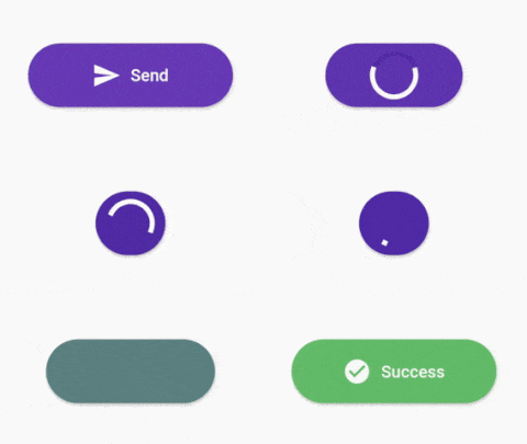
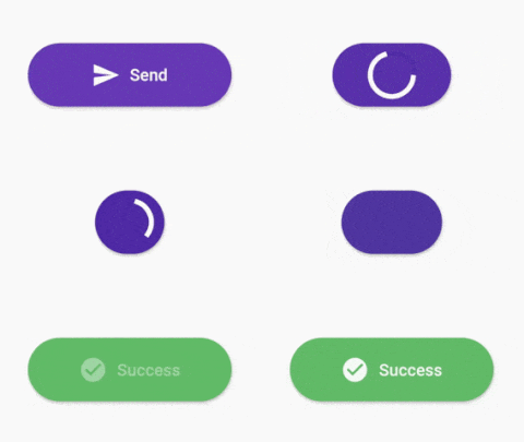
      ButtonState.success:
        IconedButton(
            text: "Success",
            icon: Icon(Icons.check_circle,color: Colors.white,),
            color: Colors.green.shade400)
    }, 
    onPressed: onPressed,
    state: ButtonState.idle);
With Custom Widgets

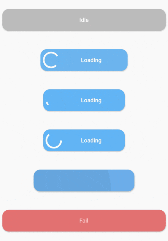
ProgressButton(
      stateWidgets: {
        ButtonState.idle: Text("Idle",style: TextStyle(color: Colors.white, fontWeight: FontWeight.w500),),
        ButtonState.loading: Text("Loading",style: TextStyle(color: Colors.white, fontWeight: FontWeight.w500),),
        ButtonState.fail: Text("Fail",style: TextStyle(color: Colors.white, fontWeight: FontWeight.w500),),
        ButtonState.success: Text("Success",style: TextStyle(color: Colors.white, fontWeight: FontWeight.w500),)
      },
      stateColors: {
        ButtonState.idle: Colors.grey.shade400,
        ButtonState.loading: Colors.blue.shade300,
        ButtonState.fail: Colors.red.shade300,
        ButtonState.success: Colors.green.shade400,
      },
      onPressed: onPressed,
      state: ButtonState.idle,
    );
Constructors
Default constructor of ProgressButton
stateWidgets - Widgets of states
stateColors - Background color oof states
state = ButtonState.idle` - Current state of button
onPressed - onPressed function same like MaterialButton
onAnimationEnd - onAnimatedEnd function calls like that onAnimatedEnd(AnimationStatus animationStatus,ButtonState currentState).
minWidth = 200.0 - Loading state width
maxWidth = 400.0 - failed,success,idle states width
radius = 16.0 - Button radius
height = 53.0 - Button height
circularProgressIndicator - CircularProgressIndicator widget, default is instating with current state color.
progressIndicatorAlignment = MainAxisAlignment.spaceBetween` - ProgressIndicator aligment
progressIndicatorSize = 35.0 - size of progress indicator
padding = EdgeInsets.zero - Padding of button
minWidthStates = List of min width states, loading is the default. If you want to make small only icon states define them on this.
animationDuration = Transition animation duration.
ProgressButton.icon() specific constructors
Map<ButtonState, IconedButton> iconedButtons- State and IconedButton map
double iconPadding: 4.0 - Padding of icon 
TextStyle textStyle - TextStyle of all of states

License

This project is licensed under the MIT License - see the LICENSE.md file for details

Kategorien

Quell-Repository

Projekte, die dieses Paket verwenden

Noch keine Daten verfügbar.