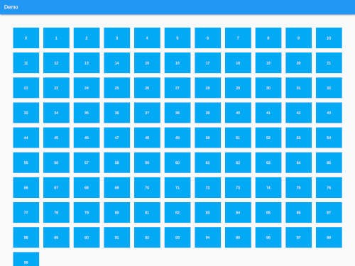
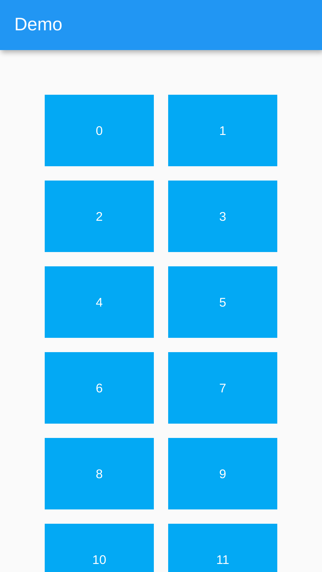
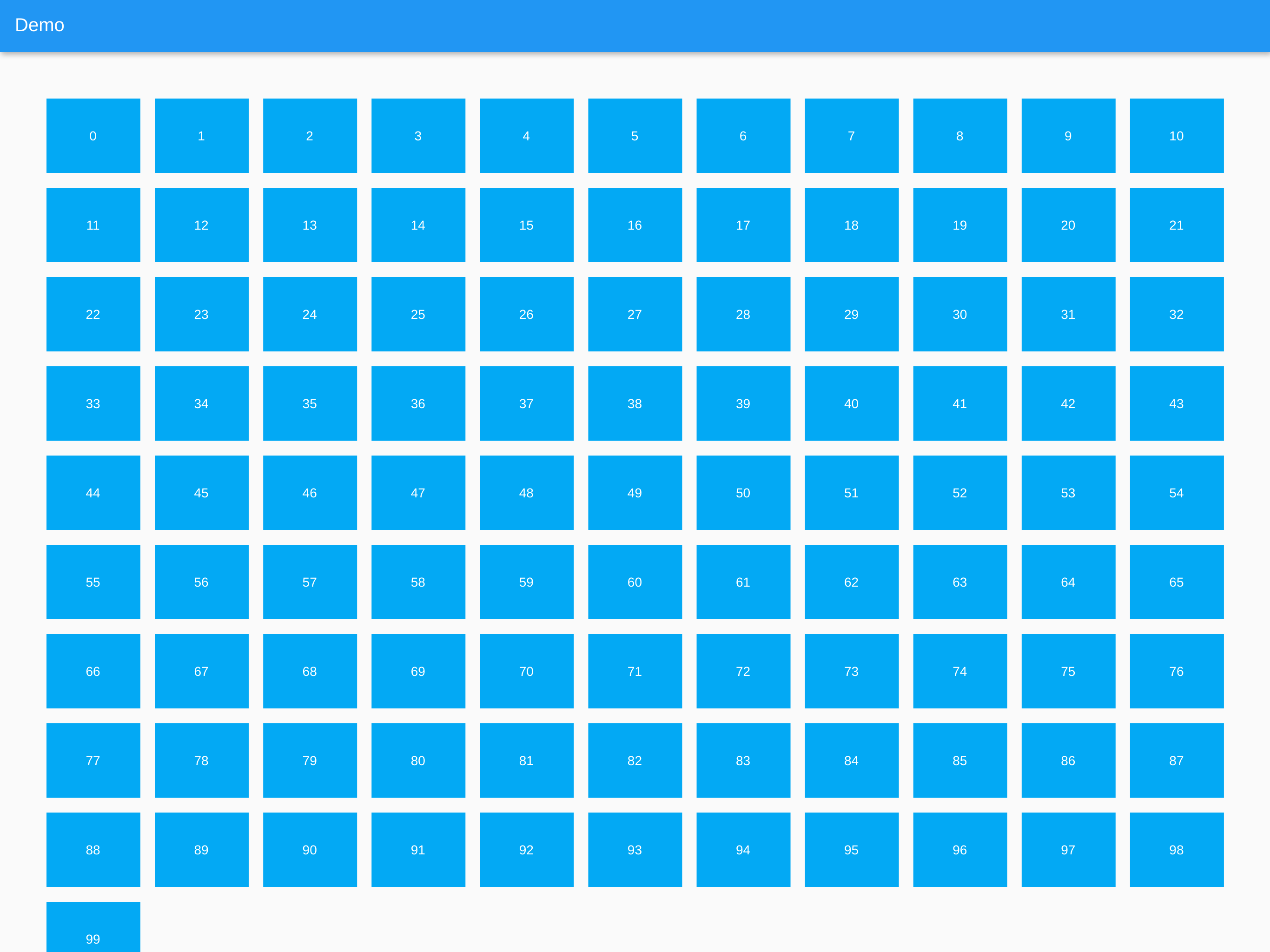
Aus öffentlichen Paketdaten erstellte Orientierung.
Ein Flutter-Paket, das die Erstellung von responsive Grid-Listen mit ListView.builder() oder SliverList mit einem SliverChildBuilderDelegate ermöglicht. Es passt automatisch die Anzahl der Spalten an die Bildschirmgröße an und sorgt so für eine optimale Darstellung auf allen Geräten. Ideal zur Anzeige von Sammlungen wie Bildern, Karten oder Produkten in einer fließenden, anpassungsfähigen Art. Das Paket unterstützt alle wichtigen Plattformen, darunter Android, iOS, Web, macOS, Windows und Linux.
Anwendungsfälle
Bildergalerien anzeigen
Produktkataloge erstellen
Adaptive Card-Layouts erstellen
Responsive Dashboards implementieren
Dynamische Inhaltsnetzwerke rendern
Hauptmerkmale
Passt die Spalten automatisch an die Bildschirmgröße an
Unterstützt ListView.builder und SliverList
Plattformübergreifende Kompatibilität
Einfache Integration mit bestehenden Widgets
Flexible Elementgrößenanpassung
Geeignet für
Entwickler, die responsive Benutzeroberflächen erstellen
Apps für mehrere Gerätegrößen
inhaltsintensive Anwendungen
Designsysteme, die Grid-Konsistenz erfordern
Hinweise
Erfordert sorgfältige Behandlung der Elementverhältnisse
Die Leistung hängt von der Komplexität des Elements ab
Beschränkt auf grundlegende Rasterverhalten ohne erweiterte Anpassung
Original-README
Originaler README-Schnappschuss aus dem verknüpften Quell-Repository. Aktuelle Inhalte finden Sie im Repository.
Responsive Grid List
A Flutter plugin to create responsive grid lists using ListView.builder(), SliverList with a SliverChildBuilderDelegate or any other list.
The provided Widgets essentially work like a Flutter Wrap Widget but they are more performant with large lists because of the internal use of ListView.builder() functions.
The items in the grid are all the same width and have the same height per row. This means when a Card widget for example is higher because of a large description or so, the whole row will get higher. The row after that can be lower since it will be the height of it's highest child.
A Responsive Grid List which uses ListView.builder() internally.
ResponsiveGridList(
    horizontalGridSpacing: 16, // Horizontal space between grid items
    verticalGridSpacing: 16, // Vertical space between grid items
    horizontalGridMargin: 50, // Horizontal space around the grid
    verticalGridMargin: 50, // Vertical space around the grid
    minItemWidth: 300, // The minimum item width (can be smaller, if the layout constraints are smaller)
    minItemsPerRow: 2, // The minimum items to show in a single row. Takes precedence over minItemWidth
    maxItemsPerRow: 5, // The maximum items to show in a single row. Can be useful on large screens
    listViewBuilderOptions: ListViewBuilderOptions(), // Options that are getting passed to the ListView.builder() function
    children: [...], // The list of widgets in the list
);
ResponsiveSliverGridList
A Responsive Grid List which uses SliverList with a SliverChildBuilderDelegate internally.
ResponsiveSliverGridList(
    horizontalGridSpacing: 16, // Horizontal space between grid items
    verticalGridSpacing: 16, // Vertical space between grid items
    horizontalGridMargin: 50, // Horizontal space around the grid
    verticalGridMargin: 50, // Vertical space around the grid
    minItemWidth: 300, // The minimum item width (can be smaller, if the layout constraints are smaller)
    minItemsPerRow: 2, // The minimum items to show in a single row. Takes precedence over minItemWidth
    maxItemsPerRow: 5, // The maximum items to show in a single row. Can be useful on large screens
    sliverChildBuilderDelegateOptions: SliverChildBuilderDelegateOptions(), // Options that are getting passed to the SliverChildBuilderDelegate() function
    children: [...], // The list of widgets in the list
);
ResponsiveGridListBuilder
A Responsive Grid List which offers a builder in which every List / Column can be used with this package.
ResponsiveGridListBuilder(
horizontalGridSpacing: 16, // Horizontal space between grid items
verticalGridSpacing: 16, // Vertical space between grid items
horizontalGridMargin: 50, // Horizontal space around the grid
verticalGridMargin: 50, // Vertical space around the grid
minItemWidth: 300, // The minimum item width (can be smaller, if the layout constraints are smaller)
minItemsPerRow: 2, // The minimum items to show in a single row. Takes precedence over minItemWidth
maxItemsPerRow: 5, // The maximum items to show in a single row. Can be useful on large screens
gridItems: [...], // The list of widgets in the grid
builder: (context, items) {
// Place to build a List or Column to access all properties.// Set [items] as children attribute for example.
}
);
Extending AbstractResponsiveGridList
To create a Responsive Grid you can extend the AbstractResponsiveGridList class and access the getResponsiveGridListItems(double maxWidth) function to generate the grid and pipe it into your custom list.
classMyResponsiveGridListextendsAbstractResponsiveGridList{
/// Constructor etc...
[...]
@overrideWidgetbuild(BuildContext context) {
returnLayoutBuilder(
builder: (BuildContext context, BoxConstraints constraints) {
// The abstract class has a function to generate the grid from// the constructor's paramters and the layout constraints max widthvar items = getResponsiveGridListItems(constraints.maxWidth);
return [...]
},
);
}
}
Future Features
[x] Optional padding at the edges of the grid
[x] Tests
[ ] Optional delta in which the width of the children can vary instead of setting the just the minimum width
[ ] Option to constrain the height of the items to a fixed value
Probably better to use the Flutter GridView instead. It offers aspectRatio.