Pakete, Repositories und App-Kategorien suchen

Cover von rolling_bottom_bar
Paketdetailsv0.2.2

rolling_bottom_bar

Paket zur Anzeige einer dynamischen Unterleiste mit einer Kugel als Indikator.

AndroidiOSWebmacOSWindowsLinux
30-Tage-Downloads
162
Likes
38
Pub-Punkte
140

Paket installieren

flutter pub add rolling_bottom_bar

Paketübersicht

Aus öffentlichen Paketdaten erstellte Orientierung.

Ein Flutter-Paket, das eine dynamische Bottom-Navigation-Bar mit einem rollenden Kugel-Indikator implementiert. Die Kugel bewegt sich reibungslos über die Leiste, um die aktuell ausgewählte Registerkarte anzuzeigen und ein modernes und interaktives Benutzererlebnis zu bieten. Es unterstützt mehrere Plattformen wie Android, iOS, Web, macOS, Windows und Linux. Das Paket ist leichtgewichtig und anpassbar, sodass Entwickler Farben, Größen und Animationsgeschwindigkeit anpassen können. Ideal für Apps, die eine visuell ansprechende Navigationsoberfläche mit flüssigen Übergängen suchen.

Anwendungsfälle

  • Mobile App-Navigation
  • Webanwendungs-Schnittstellen
  • Plattformübergreifendes UI-Design
  • Interaktive Registerwechsel
  • Moderne App-Asthetik

Hauptmerkmale

  • Rolling-Ball-Anzeige
  • Glatte Animationen
  • Plattformübergreifende Unterstützung
  • Anpassbare Erscheinung
  • Leichte Implementierung

Geeignet für

  • Entwickler, die moderne Navigation suchen
  • Apps mit mehreren Tabs
  • Designorientierte Flutter-Projekte
  • Interaktive Benutzeroberflächenkomponenten
  • Multiplattform-Anwendungen

Hinweise

  • Kann eine Leistungsoptimierung auf Geräten mit geringer Leistung erfordern
  • Eingeschränkte Anpassungsmöglichkeiten für komplexe Animationen
  • Nicht ideal für einfache statische Navigation
  • Erfordert Verständnis der Flutter-Animationsprinzipien
  • Am besten geeignet für Apps mit 3–5 Registerkarten
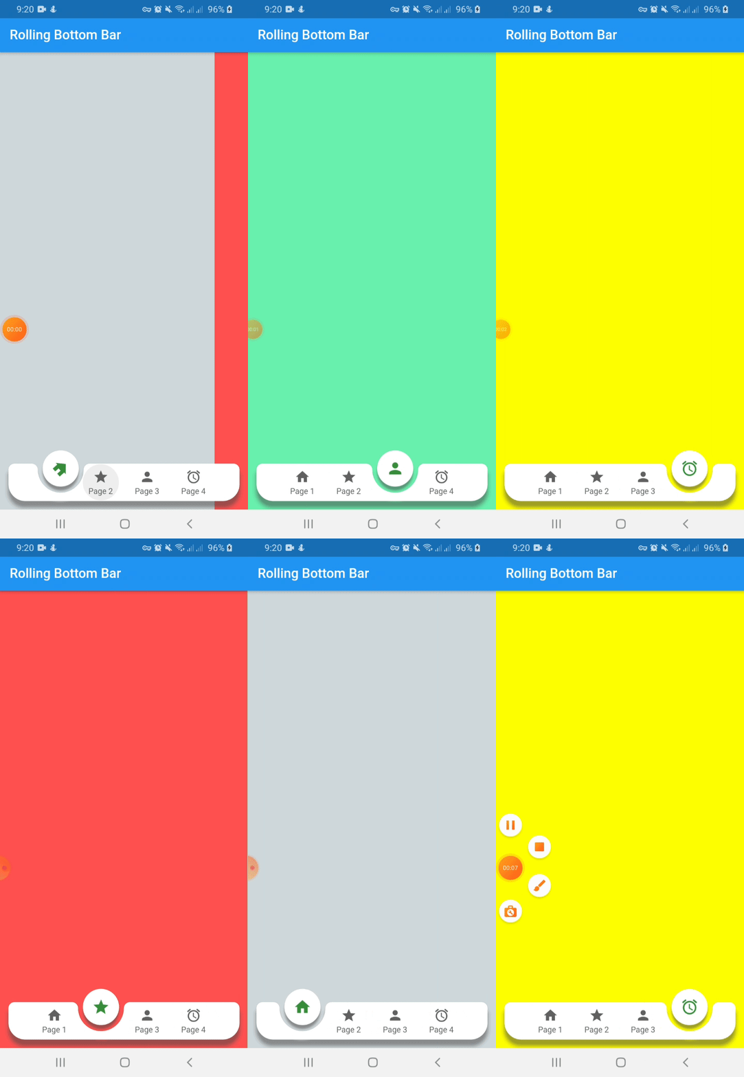
Original-README

Originaler README-Schnappschuss aus dem verknüpften Quell-Repository. Aktuelle Inhalte finden Sie im Repository.

Rolling Bottom Bar

This packages, based on this demo by Kabo showing a bottom bar with a dynamic ball indicator.

New Features 💥
  • Capability to avoid the bottom bar shadow by flat property on false
  • Setting active color by each item define on color property of RollingBottomBarItem widget

Demo

Instalation

Include rolling_bottom_bar in your pubspec.yaml file:

dependencies:
  flutter:
    sdk: flutter
  rolling_bottom_bar: version

Usage

To use this package, just import it into your file, build your bottom bar together with a PageView and enjoy it.

import 'package:rolling_bottom_bar/rolling_bottom_bar.dart';
import 'package:rolling_bottom_bar/rolling_bottom_bar_item.dart';

...

@override
  Widget build(BuildContext context) {
    return Scaffold(
      appBar: AppBar(
        title: Text('Rolling Bottom Bar'),
      ),
      body: PageView(
        controller: _controller,
        children: <Widget>[
          ColoredBox(color: Colors.blueGrey.shade100),
          ColoredBox(color: Colors.redAccent),
          ColoredBox(color: Colors.greenAccent),
          ColoredBox(color: Colors.yellowAccent),
        ],
      ),
      extendBody: true,
      bottomNavigationBar: RollingBottomBar(
        controller: _controller,
        items: [
          RollingBottomBarItem(Icons.home, label: 'Page 1'),
          RollingBottomBarItem(Icons.star, label: 'Page 2'),
          RollingBottomBarItem(Icons.person, label: 'Page 3'),
          RollingBottomBarItem(Icons.access_alarm, label: 'Page 4'),
        ],
        activeItemColor: Colors.green.shade700,
        enableIconRotation: true,
        onTap: (index) {
          _controller.animateToPage(
            index,
            duration: const Duration(milliseconds: 400),
            curve: Curves.easeOut,
          );
        },
      ),
    );
  }
}

...

Options for Rolling Bottom Bar Item use

Name Description Required Default
iconData IconData to use as item icon True
label String to use as label item False
activeColor Color to use when icon is active. Only works with useActiveColorByDefault property of RollingBottomBarItem set on true False Colors.green

Options for Rolling Bottom Bar use

Name Description Required Default
controller PageView controller to use to move between pages True
items List of RollingBottomBarItem to render into bottom bar True
onTap Function triggered when an item is tapped True
color Color value to use as background False Colors.white
itemColor Color value to use with inactive items False Colors.grey[700]
activeItemColor Color value to use with active items False Colors.green
enableIconRotation Boolean value to indicate when rotation effect is triggered False false
flat Boolean value to indicate if the bottom bar has shadow or not False false
useActiveColorByDefault Boolean value to indicate when to use individual active color for each child False true

Kategorien

Quell-Repository

Projekte, die dieses Paket verwenden

Noch keine Daten verfügbar.