Aus öffentlichen Paketdaten erstellte Orientierung.
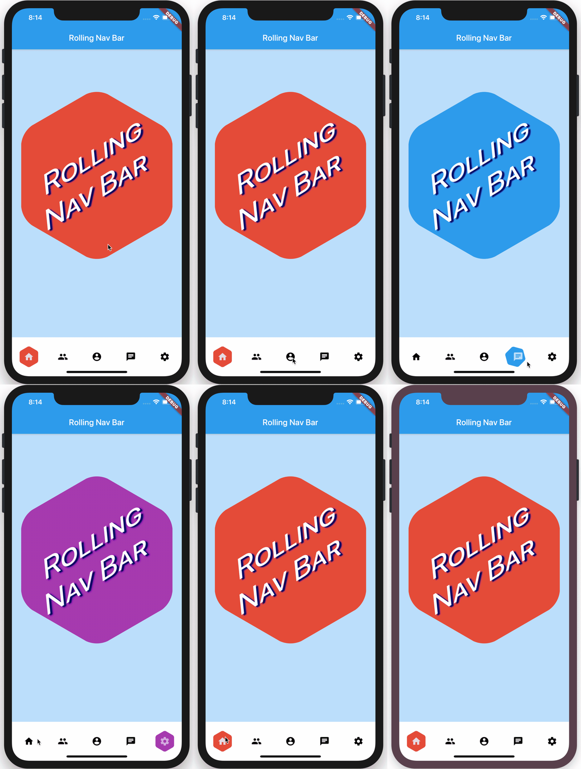
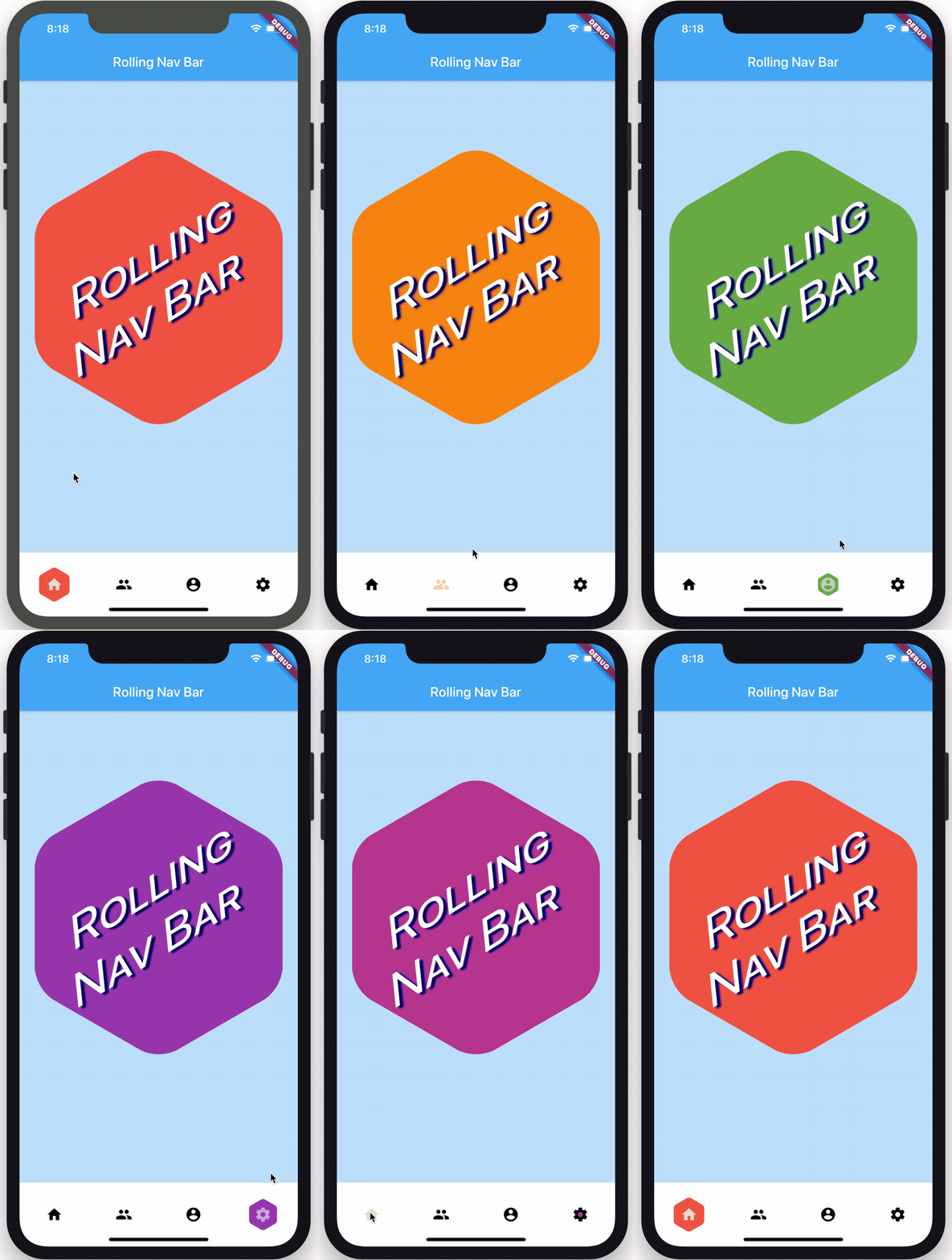
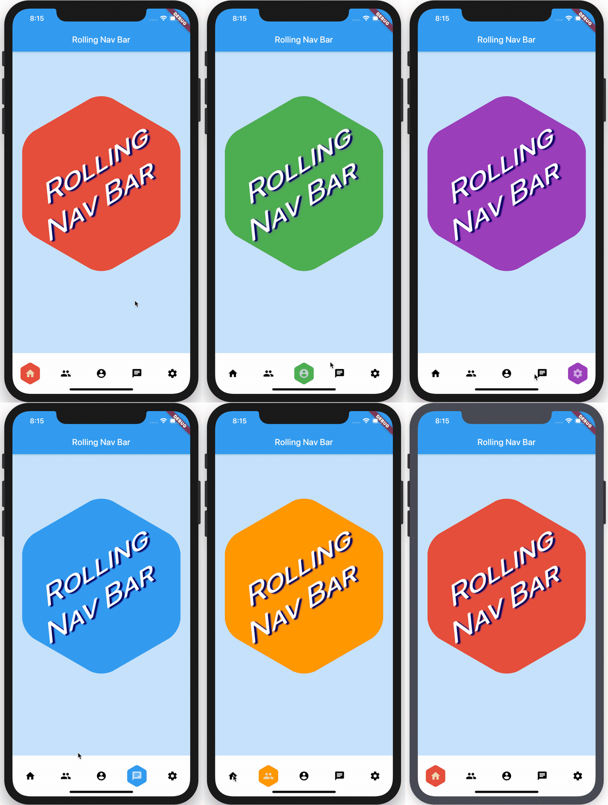
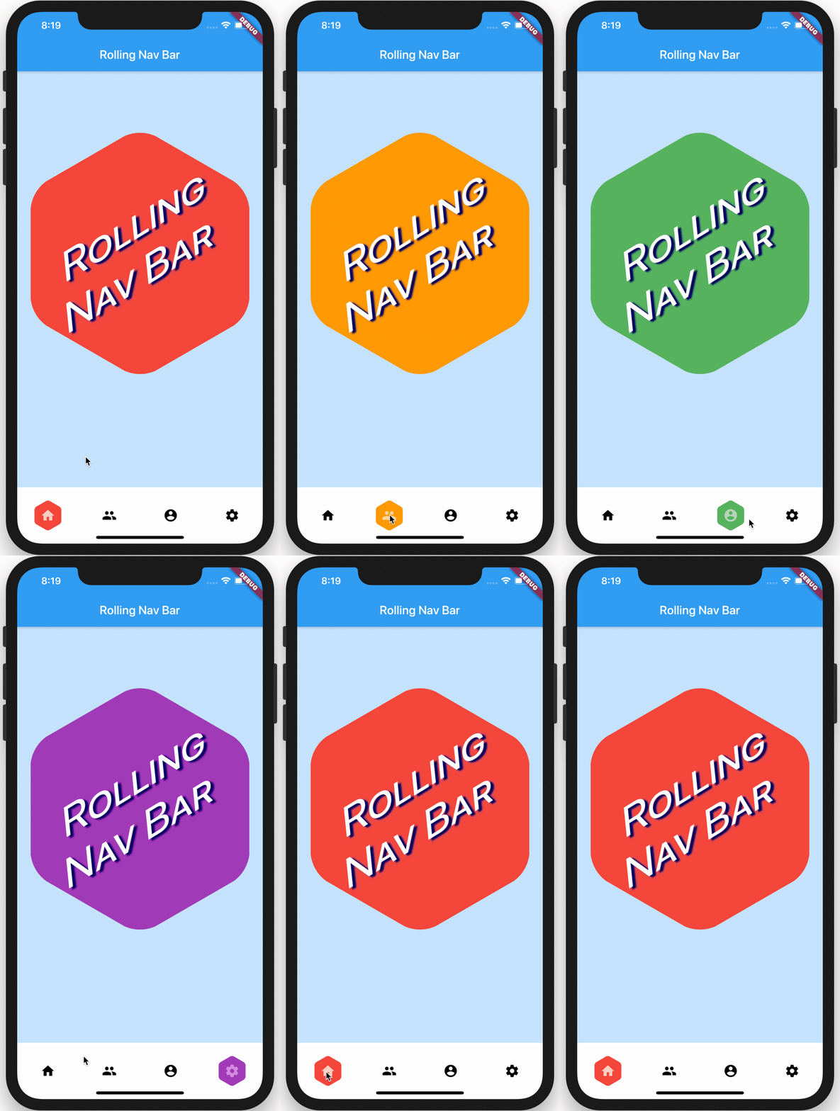
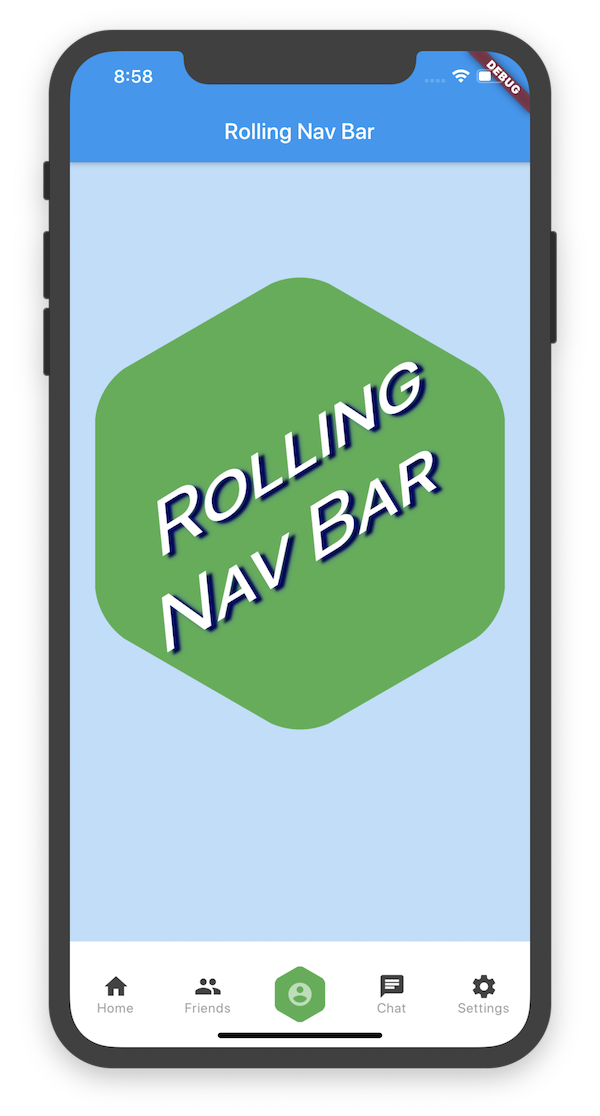
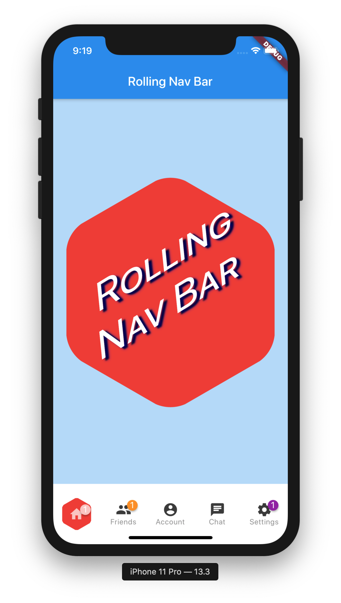
Eine Flutter-Bottom-Navigation-Bar mit einem glatten, rollenden Aktivindikator, der hinter jedem Icon animiert, wenn es ausgewählt wird. Entworfen, um die Benutzererfahrung durch visuelle Rückmeldung und moderne Ästhetik zu verbessern. Das Paket ist leichtgewichtig und einfach zu integrieren und bietet anpassbare Farben, Größen und Animationsgeschwindigkeiten. Es unterstützt sowohl helle als auch dunkle Themen und funktioniert nahtlos mit standardmäßigen Flutter-Navigationsmustern. Ideal für Apps, die intuitive Navigation mit dynamischen visuellen Hinweisen erfordern.
Anwendungsfälle
Mobile Apps mit unterer Navigation
Verbessertes Benutzerfeedback in der Navigation
Moderne UI-Designs mit animierten Indikatoren
Apps, die visuelle Optik priorisieren
Anpassbare untere Leisten
Hauptmerkmale
Rolling-Active-Indikator-Animation
Anpassbare Farben und Größen
Glatte Übergangseffekte
Unterstützung für helle und dunkle Themen
Einfache Integration mit MaterialApp oder Navigator
Geeignet für
Entwickler, die moderne Navigations-UIs suchen
Designorientierte Flutter-Projekte
Apps mit mehreren unteren Tabs
Teams, die eine minimale Einrichtung wünschen
Projekte, die auf Benutzererfahrung setzen
Hinweise
Eingeschränkte plattformspezifische Anpassung
Keine integrierten Icon-Badges
Erfordert manuelle Handhabung der Routenverwaltung
Nicht für sehr große Tab-Zahlen optimiert
Die Animationsleistung kann auf älteren Geräten variieren
Original-README
Originaler README-Schnappschuss aus dem verknüpften Quell-Repository. Aktuelle Inhalte finden Sie im Repository.
rolling_nav_bar
A bottom nav bar with layout inspired by this design and with heavily customizable animations, colors, and shapes.
Getting Started
To get started, place your RollingNavBar in the bottomNavigationCar slot of a
Scaffold, wrapped in a widget that provides max height. For example:
RollingNavBar is heavily customizable and works with 3, 4, or 5 navigation elements.
Each element is also fully customizable through the two primary ways to specify child
navigation elements.
The first option is to pass a list of IconData objects, along with optional lists
of Color objects.
The second option is to provide a widget builder, though this comes with some loss of
helpful active state management.
RollingNavBar.builder(
builder: (context, index, info, update) {
// The `iconData` constructor handles all active state management,// but this constructor, as it deals with completed widgets, must// assume that you have already made all relevant considerations.var textStyle = index == info.nextIndex
? TextStyle(color: Colors.white)
: TextStyle(color: Colors.grey);
returnText('${index + 1}', style: style);
},
indicatorColors: <Color>[
Colors.red,
Colors.yellow,
Colors.blue,
],
numChildren: 3,
)
Animation Types
RollingNavBar comes with four animation flavors for the active indicator's transition from
tab to tab.
The first animation type is the namesake: AnimationType.roll:
RollingNavBar.iconData(
  animationCurve: Curves.easeOut,  // `easeOut` (the default) is recommended here
  animationType: AnimationType.roll,
  baseAnimationSpeed: 200, // milliseconds
  iconData: <IconData>[
    ...
  ],
)
Note: For the roll animation type, your supplied animation speed is a multiplier considered against the distance the indicator must travel. This ensures a constant speed of travel no matter where the user clicks.
The second animation type is a fade-and-reappear effect:
RollingNavBar.iconData(
  animationCurve: Curves.linear, // `linear` is recommended for `shrinkOutIn`
  animationType: AnimationType.shrinkOutIn,
  baseAnimationSpeed: 500, // slower animations look nicer for `shrinkOutIn`
  iconData: <IconData>[
    ...
  ],
)
Note: For the shinkOutIn animation type, your supplied animation speed is constant, since the active indicator never travels the intermediate distance.
The third animation type is a spinning version of fade-and-reappear:
RollingNavBar.iconData(
  animationCurve: Curves.linear, // `linear` is recommended for `spinOutIn`
  animationType: AnimationType.spinOutIn,
  baseAnimationSpeed: 500, // slower animations look nicer for `spinOutIn`
  iconData: <IconData>[
    ...
  ],
)
Note: Like with shinkOutIn, for the spinOutIn animation type, your supplied animation speed is constant, since the active indicator never travels the intermediate distance.
The final animation flavor is a non-animation:
RollingNavBar.iconData(
  // `animationCurve` and `baseAnimationSpeed` are ignored
  animationType: AnimationType.snap,
  iconData: <IconData>[
    ...
  ],
)
Hooking into the animation
In the demo, the background of the larger hexagon matches the background of
the nav bar hexagon. To achieve this and similar effects, two callbacks, onTap and
onAnimate, are available. onAnimate can be particularly helpful for syncing
visual effects elsewhere in your app with nav bar progress.
Tab Item Text
If using the iconData constructor, you are also able to pass a list of widgets
to render as text below inactive icons.
RollingNavBar.iconData(
  // A list of length one implies the same color for all icons
  iconColors: <Color>[
    Colors.grey[800],
  ],
  iconData: <IconData>[
    Icons.home,
    Icons.friends,
    Icons.settings,
  ],
  iconText: <Widget>[
    Text('Home', style: TextStyle(color: Colors.grey, fontSize: 12)),
    Text('Friends', style: TextStyle(color: Colors.grey, fontSize: 12)),
    Text('Settings', style: TextStyle(color: Colors.grey, fontSize: 12)),
  ]
)
Icon badges
Using the Badges library, RollingNavBar is able to easily expose nav bar badges. The following works with either constructor.
You can programmatically change the active navigation bar tab by passing a new activeIndex to the RollingNavBar widget. However, there are two steps to successfully keeping everything in sync.
class_MyAppStateextendsState<MyApp> {
int activeIndex;
/// Handler that responds to navigation events (likely derived/// from user clicks) and keeps the parent in sync.void_onTap(int index) {
setState(() {
activeIndex = index;
});
}
/// Handler for when you want to programmatically change/// the active index. Calling `setState()` here causes/// Flutter to re-render the tree, which `RollingNavBar`/// responds to by running its normal animation.////// Note: This is an example function that you can define/// and call wherever you like. That is why it is not passed/// to `RollingNavBar.iconData` in the `build` method.voidchangeActiveIndex(int index) {
setState((){
activeIndex = index;
});
}
Widgetbuild(BuildContext context) {
returnRollingNavBar.iconData(
activeIndex: activeIndex,
iconData: iconData,
onTap: _onTap,
);
}
}